May 21, 2018

Sensory expert Kate McLean says NYC streets smell of garlic and tarmac

All the rain this weekend in New York City stunk. Do sunny days stink too? Kate McLean can give us the definitive answer. McLean, a Ph.D. candidate at the Royal College of Art in London, has created an extensive system of urban “smellscape” maps based on her olfactory research. For instance, after studying her Astor Place, pedestrians are much better off walking north and south on 2nd Avenue, which smells of floral perfume and grass, versus walking up and down Broadway, which is loaded with eau de subway exhaust.
So what's NYC's smelliest hood?
May 10, 2018

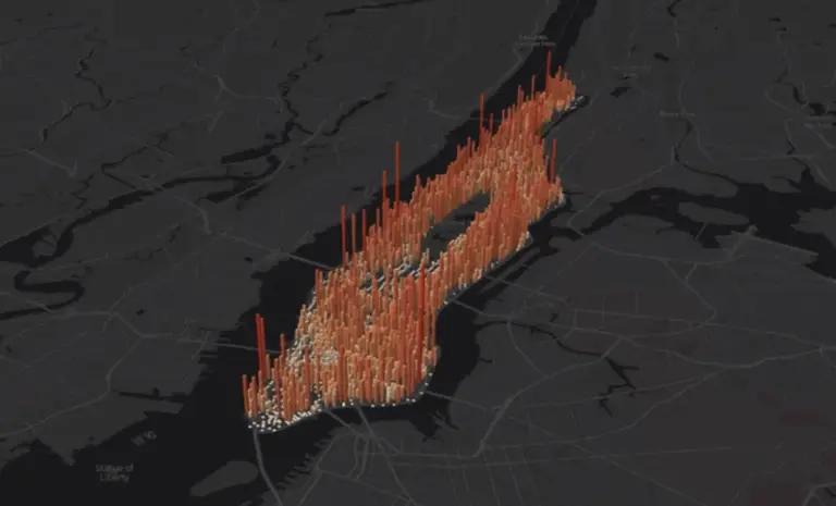
See Manhattan’s population pulse over 24 hours

There are two million people who reside in Manhattan, but during the workday, thanks to the overwhelming number of commuters, the number of people on the island doubles to four million. This is the highest ratio of daytime-to-nighttime population anywhere in the country. To show how this population pulses over the course of a day, data visualization designer and researcher Justin Fung created the interactive Manhattan Population Explorer. First picked up by Fast Co. Design, the map highlights just how many people fill each city block for 24 hours. The height of crowdedness comes between 12 and 3pm, during which time, unsurprisingly, Midtown and Lower Manhattan show populations nearing 13,000. During the day, these 'hoods see their populations jump by 10 and four times respectively.
See what's going on with the rest of the island
April 18, 2018

Living Lots map helps New Yorkers transform vacant land into community spaces

It's time to think about gardening–a seasonal rite that's something of a challenge for most city-dwellers. Living Lots NYC is a clearinghouse of information that New Yorkers can use to turn vacant land into community spaces. Begun as a pilot project that ran from 2011 to 2015, which led to the to the official transformation of 32 vacant lots, Living Lots NYC was created by community organization 596 Acres as a database that New Yorkers can use to find, unlock, and protect the shared resource of the city's vacant lots. According to the map, at this particular moment, there are 877 sites throughout 626 acres of vacant public land, 18 sites on 8 acres of private land opportunities, and 559 sites on 211 acres to which people have access.
Check out the city's green opportunities
April 13, 2018

DOB Elevator Report reveals the ups and downs of NYC’s 84,000+ elevator parts and where to find them

Again taking a look at New York City one tiny, moving part at a time: New York City has the world’s oldest population of elevators, and more elevator devices–over 84,000–than any other city in North America. The NYC Department of Buildings Elevator Report 2017 brings us an overview of the city’s elevator stock, including interactive maps that show which neighborhoods have the most elevators, elevator history, and, trust us, much more. That big number includes dumbwaiters, escalators, freight elevators, passenger elevators, private elevators, permanent amusement rides, personnel hoists (used for construction), sidewalk elevators and wheelchair lifts.
This way for more maps and facts
April 12, 2018

Interactive map tracks New York City’s 270 miles of sidewalk sheds in real time

As of this week, New York City is home to 7,342 sidewalk sheds, totaling nearly 270 miles of sprawling eye-sores. Although this may sound like a lot, the number of sidewalk sheds has actually decreased from last year, when the Department of Buildings found over 7,700 sidewalk sheds throughout the city. The DOB on Wednesday released a new map highlighting the exact location of permitted sidewalk sheds. The map, which will update automatically in real-time, has a new feature that allows users to search sidewalk sheds by age, borough, community board and permit applicant.
Explore the map
March 21, 2018

Watch the nor’easter unfold with this animated map, complete with webcams

With the National Weather Service now predicting up to 18 inches of snow for NYC, this handy web app will make storm groupies happy with future and current weather conditions in animated form. It’s all here in the Ventusky web application, developed by Pilsen-based Czech meteorological company InMeteo in collaboration with Marek Mojzík and Martin Prantl. The fascinating app displays meteorological data from around the world so you can monitor weather development for any place on earth and waver between complete denial and the thrill of a good natural disaster ahead of–and during–today's Winter Storm Toby.
See what's coming
March 15, 2018

In anticipation of a Landmarks overhaul, maps lay out the commission’s applications and decisions

This January, the Landmarks Preservation Commission released a series of amendments that would overhaul how the commission reviews certain applications--with the idea to cut down the time it takes to approve routine applications. And later this month, on Tuesday, March 27th, the Commission will hold a public hearing on how these changes would affect the city's landmark process. In advance of the meeting, the Municipal Art Society of New York created a pair of interactive maps to better inform New Yorkers on the LPC's process. One map, the Commission Review Map, shows what type of alterations have been permitted or denied by the full LPC commission. The other, the Staff Review Map, shows what type of alterations have been permitted by the LPC staff or withdrawn by the applicant. As MAS puts it, "We hope these maps help bring to light how the LPC fulfills its 'purpose of safeguarding the buildings and places that represent New York City’s cultural, social, economic, political, and architectural history' through regulation."
Get the details
March 12, 2018

This map shows you the vacant lots in NYC that were sold by the city for $1

If you live in New York City, and you're hoping to own–or trying to buy–property, you might not want to hear about vacant lots being given away for $1. But this is really a thing: An interesting little map courtesy of the One Dollar Lots project by 596 acres shows us where in New York City, according to Untapped Cities, city-owned lots of land have been sold to developers for $1 since the current mayor took office in January 2014. These $1 deals often happen as token transactions as part of a development incentive for prospective buyers, who will eventually need to prove they possess plans and the means to carry out their vision.
Investigate the map, this way
March 7, 2018

The Real MTA map shows only the subway lines that are currently functioning

There's been a lot of recent attention about the deterioration of the New York City subway, both in ridership and service. And, in the past, the subway map has done little more than inspire some cool art. Real-time information that could be very useful to riders, like a major delay or line shutdown, is only accessible “live” once you have already swiped your card and arrived on the subway platform. What good is it then? Now, thanks to web developer Eric Markfield, from Unfounded Labs, the Real MTA map, “a realistic subway map,” provides an up-to-the-minute, visual representation of any delays, service changes or planned work (h/t Curbed).
Get the scoop
February 27, 2018

Support women-led restaurants in New York City with this new map from Grubhub

What could go better together than feminism and food delivery? Thanks to Grubhub, the online takeout service, hungry New Yorkers can now easily order from women-run restaurants. The company on Tuesday launched an app called RestaurantHER that aims to empower and promote women chefs and owners, who are often underrepresented and underpaid in the restaurant industry. Available nationwide, the app includes a map that looks similar to Grubhub's typical page, but only highlights restaurants owned or co-owned by a woman or a kitchen led by a woman executive chef.
Learn more
February 15, 2018

A 10-minute walk to the subway could save you 10 percent on rent

While amenities like on-site laundry and air conditioning are big selling points in New York City rentals, the building's proximity to the subway remains one of the most important factors when looking for new digs. And like other amenities, there is an added cost to live near the subway. New data from RentHop breaks down how much renters can save by living further from the subway in Manhattan, Brooklyn and Queens. According to their report, as Curbed NY reported, apartments closest to the subway cost 6 to 8 percent more than the borough median, with the furthest costing 8 to 10 percent less.
Details here
February 15, 2018

Tired of NYC’s light pollution? Use this map to find ‘dark sky’ escapes

The omnipresence of artificial light, brilliant in its intentions, has become as much of a nuisance as a blessing in cities where we almost can’t tell night from day. Enter global light pollution. Is there any escape? The bright lights get in the way of astronomy–and affect animals and plants (who can’t just pull the shades down). Scientists are looking to “dark sky” initiatives to protect areas unscathed by light pollution; there are now dark-sky-designated areas in North America, South America and Europe. Interactive dark sky maps, courtesy of Esri, show where on Earth one might find respite from the glare–and where it’s at its most intense.
Check out the map
February 13, 2018

See NYC’s hot spots in real-time on Snapchat’s new crowd-sourced web map

Snapchat on Monday announced that its "Snap Map," a feature which allows users to view posts from around the world, will be available on the web, giving those without the social media app a chance to check out events happening near them. In addition to now existing outside of the Snapchat app, the browser version of the map lets snappers embed content from the map onto web pages, much like how Twitter or Instagram permits (h/t WIRED). Hot spots on the map, areas with lots of posts, glow green or blue; heavy traffic locations light up red and orange. Today in New York users are filling up "Our Story" with posts from New York Fashion Week, the September 11th Memorial, and the Empire State Building.
More here
February 12, 2018

Interactive map identifies the New York City neighborhoods most underserved by transit

Nearly 29 percent of New York City households are underserved by transit, according to data from the Center for Neighborhood Technology and TransitCenter. In a joint project, called AllTransit, the team put together a collection of transit data that includes 15,000 routes and 800 agencies in the United States. A tool called Gap Finder identifies gaps in U.S. cities where underserved communities would benefit from improved service.
Explore it here
February 8, 2018

Find and apply for current affordable housing lotteries in NYC with this new map

The Department of Housing Preservation and Development on Wednesday released an interactive map of housing lotteries currently accepting applications. Users can click icons displayed on the NYC Housing Connect Map for more information on a lottery, including required income levels, household size and the application deadline. Earlier this week, the department launched a map that displays all of the affordable housing units, buildings and projects which count towards Mayor Bill de Blasio's Housing New York 2.0 plan.
Explore the map
February 7, 2018

Treat your sweetie (or yourself) to a chocolate tour of Brooklyn this Valentine’s Day

This Valentine's Day, leave the heart-shaped candy box at Duane Reade and enjoy locally-made chocolate instead. Explore Brooklyn released their "Brooklyn Chocolate Trail Map" this month with 12 must-eat delicious destinations in the borough. The list includes chocolatiers, factories and tasting rooms. Follow the chocolate trail and taste-test your way through Greenpoint, DUMBO, Williamsburg and Downtown Brooklyn. What could be sweeter?
Learn more
February 5, 2018

City releases map with all of the affordable housing units created or preserved since 2014

In addition to upping the number of affordable housing units created or preserved in New York City, Mayor Bill de Blasio is pushing for greater transparency of his ambitious plan to bring 300,000 affordable units to the city by 2026. The Department of Housing Preservation and Development (HPD) launched an interactive map on Monday that displays all of the units, buildings, and projects that count towards the mayor's Housing New York 2.0 plan (h/t Curbed NY). The counted units, with data starting with units from January 1, 2014 on and will be updated quarterly, are shown by the number of units and occupancy size.
See it here
January 23, 2018

This map tells you how far you can walk, bike, drive or ride public transit in a set amount of time

Here's a handy map that will allow you to find areas you can reach by walking, cycling, driving or using public transport, anywhere in New York, in a set amount of time. Called TimeTravel, it's a pretty straightforward tool: you plug in an address, a time frame, and mode of transportation. The map then comes up with a layout where you can go from that point in a given amount of time on a certain mode of transit. Above, you're looking at how far a New Yorker could travel in 15 minutes, from Union Square East, on public transit. The map even allows you to specify what date and time you're leaving, to give you the most accurate estimate possible.
You can also search for nearby amenities
Pitch a story icon Know of something cool happening in New York? Let us know:
January 16, 2018

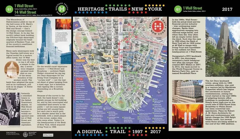
Travel along the historic trails of Lower Manhattan with this interactive map

The Skyscraper Museum has released a new interactive web project and digital archive called Heritage Trails New York, which revives a landmark history project from 1997. Heritage Trails focuses on the historic blocks of Lower Manhattan, from the Battery to the African Burial Ground and Foley Square, stretching from the Hudson River to the South Street Seaport. The updated map expands on the original, which was designed by architect Richard D. Kaplan, by letting users more easily follow along with the dotted path via smartphone or computer.
Explore the map here
January 8, 2018

New York to be first major city with flood maps based on climate change factors

For the first time since 1983, the Federal Emergency Mangement Agency is redrawing New York's flood maps, taking into account the consequences of climate change like rising sea levels and stronger storms. With hundreds of miles of coastline and a growing number of developments sprouting along its waterfront, New York has more residents living in high-risk flood zones than any other city in the United States, according to the New York Times. FEMA's new map, while still years away from completion, could have a profound effect on the city's future developments and zoning regulations. It could place more residents and buildings in high-risk flood zones, requiring pricey flood insurance as well as tougher building codes and restrictions on new developments.
More this way
December 21, 2017

Artist uses the classic Vignelli design to reimagine the NYC subway map in concentric circles

Map via Max Roberts The classic NYC subway map is instantly recognizable--but what if you were to turn the design on its head? That was the thinking behind mapmaker and subway enthusiast Max Roberts, who wanted to visualize the city’s cohesiveness in a map that focused on aesthetics, rather than the angles and geographic accuracy New Yorkers are more familiar with. According to Untapped Cities, this isn't the first time Roberts has experimented with a concentric design. A few years back, he released a map that re-imagined the tradition map in concentric circles. This latest version uses Massimo Vignelli's design, a distinctive map released in the 1970s in which each subway route is represented.
Check it out
December 20, 2017

Interactive map shows how NYC’s waterways have evolved over the years

This map will delight any NYC geography buffs out there: The Changing Shoreline of New York City uses historical maps from the New York Public Library’s digital collection to explore how Manhattan has managed its waterways to expand its small city footprint. Created by Laura Blaszczak during her internship with NYPL, it's an interactive map that highlights waterfront locales around the city. Zoom in, and you can peruse historical maps and photographs that show how our rivers, creeks, brooks, and bays have been managed or built over. There's even an opacity control, so you can directly compare the historical map with the modern map and see how much Manhattan's landscape has changed.
Check it out
December 19, 2017

Will New York get a White Christmas this year?

In the United States, if at least one inch of snow falls on the morning of December 25, it gets labeled as a "White Christmas." While some states in the north and Midwest are the most likely to enjoy a snow day on Christmas, the phenomenon is uncommon in New York, but not impossible.  The National Oceanic and Atmospheric Administration, a federal agency that provides timely information about climate and weather patterns, created a map that shows the historic probability of there being at least one inch of snow on the ground in 48 states on Christmas. The darkest gray shows places where the probability is less than 10 percent and the white areas show probabilities greater than 90 percent.
Is New York dreaming of a White Christmas?
December 18, 2017

MAP: Explore nearly 34,000 landmarks in New York City

New York City is home to over 36,000 architecturally, historically and culturally significant buildings and sites, as designated by the city's Landmarks Preservation Commission. To make information about the thousands of landmarks in the city more accessible, the LPC launched on Monday an enhanced interactive map that allows users to search and filter building data by architectural style, architect, building type and era. The nearly 34,000 sites on the map build upon the existing 1,400 individual landmarks and 141 historic districts the commission had mapped last year.
Check it out
December 13, 2017

This map of NYC’s subway distorts geography to give commuters more realistic arrival times

While the standard map of New York City's subway from the MTA might be easier to read, it distorts the geographic distance between stops making it tough to really know how far apart they are from one another. Many designers and architects have taken a stab at creating more accurate maps to ease the struggle of subway straphangers. And now designer Nate Parrott has released his own interactive subway map that shows how many minutes it takes between point A and point B, as Co.Design reported. Click on a station and the whole map changes to show the travel time to reach every stop.
Find out more

Our Mission

More than just current events, here you'll learn about the places, people, and ideas that are shaping your city.