November 21, 2017

What do New Yorkers search for on Thanksgiving? Bakeries, BBQ, and bowling alleys

You might be frantically putting the finishing touches on the Thanksgiving feast, stockpiling the “homemade” cookies you’ll bring for dessert, or making sure you’ve got the local pizza joint on speed dial, but Google News Lab knows what you’re up to, of course. Based on data from Google Maps and an analysis of the number of times people request directions to a location, you can find out how fellow New Yorkers (or Angelinos, or Baltimoreans) are planning to spend the precious hours of holiday weekend time.
More astonishing map facts this way
November 13, 2017

MAP: Where to find all 300 works in Ai Weiwei’s ‘Good Fences Make Good Neighbors’ exhibition

Ai Weiwei's New York City art installation, "Good Fences Make Good Neighbors," is expansive: it features ten large fence-themed structures, more than 90 smaller installations and 200 banners found in all five boroughs. While the multi-site, multi-media exhibition might seem like a lot to explore, the Public Art Fund, which commissioned the project, has made enjoying Weiwei's sprawling exhibition easy. The fund has created an interactive map that displays all 300 of the famed artist-activist's artworks currently found at public spaces, transit sites, lampposts and monuments all over the city, as well as additional information for each.
Explore the map
November 8, 2017

MAP: Explore the women’s suffrage movement through the lens of NYC landmarks

To commemorate the 100th anniversary of women gaining the right to vote in New York State, the city’s Landmarks Preservation Commission released an interactive story map that highlights places where suffragists lived and worked in New York City. The map, called NYC Landmarks and the Vote at 100, designates 43 sites associated with impactful activists, organizations, and institutions. Explore significant sites like the Cooper Union, the Panhellenic Tower, the New School for Social Research and much more, while learning about their role in the suffrage movement.
Explore the map here
November 7, 2017

MAP: Where to find free rent and concessions across NYC

Complimentary Netflix, reduced security deposits, amenity memberships, and best of all, free rent–there’s no shortage of concessions in the NYC rental market, but with landlords offering twice the amount of deals as last year, it’s hard to pinpoint where the best bargains are. Which is why CityRealty has put together a city-wide interactive map of leasing […]
October 18, 2017

New RPA report is ‘a wake up call’ on rising sea levels and growing flood risk

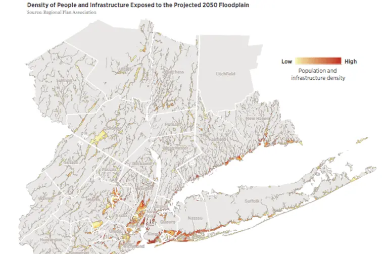
Hurricane season is impossible to ignore, and as the October 29th anniversary date of Superstorm Sandy approaches, the Regional Plan Association (RPA) has released a report titled "Coastal Adaptation: A Framework for Governance and Funding to Address Climate Change" that warns of the imminent threat of rising sea levels and outlines a strategy to protect the many vulnerable stretches of New York, New Jersey and Connecticut. According to the report, 59 percent of the region's energy capacity, four major airports, 21 percent of public housing units, and 12 percent of hospital beds will be in areas at risk of flooding over the next 30 years. RPA research found that even in light of these projections, the region’s climate change planning tends to be reactive and local rather than pro-active and regional–and it's not nearly enough.
Find out more about who's at risk and what can be done
October 17, 2017

MAS’ new ‘Accidental Skyline’ report offers 10-point plan to keep supertalls in check

6sqft has reported previously on the increasing alarm caused by New York City's future skyline and its growing army of skyscrapers-to-be, with community groups expressing deep concern about the shadows cast across the city's parks by the tall towers. The Municipal Art Society (MAS) has been leading the pack when it comes to thorough analysis of the issue, which they see as having its roots not only in the sheer height of the new buildings but in a lack of regulation of how and where they rise in the larger context of the city. This "accidental skyline" effect reflects the fact that New York City currently has no restrictions on the shadows a tower may cast–the city doesn’t limit height, it only regulates FAR (floor area ratio). At this week's MAS Summit for New York City, the organization released its third Accidental Skyline report, calling for immediate reform in light of an unprecedented boom in as-of-right–and seemingly out-of-scale–development. MAS president Elizabeth Goldstein said, “New York doesn’t have to settle for an ‘accidental skyline.’”
See more future NYC skyscrapers, mapped
October 5, 2017

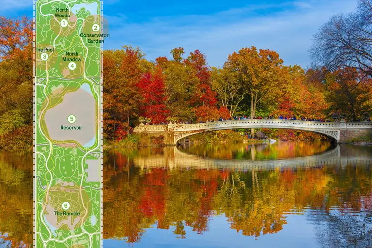
MAP: Find the colorful fall foliage of Central Park’s 20,000 trees

Central Park's most dazzling and vibrant season has arrived. With over 20,000 trees and 150 species of trees spread across 843-acres, Central Park in autumn remains a cannot-miss spectacle for New Yorkers. Thankfully, the Central Park Conservancy created a fall foliage map making it easy to find the leaves with the brightest shades of gold, yellow, red and orange this season.
Check it out
October 3, 2017

MAP: Watch 1 million+ NYC buildings being constructed since 1880

A walk down any block in today's New York City feels like taking a tour of a giant, noisy, scaffolded construction site. But the map mavens at Esri show us that this is definitely not the only time in history when living in the city felt like occupying a giant beaver colony. Their fascinating New York construction map brings new life to the word "built environment" with time lapse coverage of over a million buildings being built in NYC starting in 1880.
Check out the map
September 26, 2017

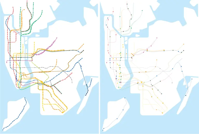
Map shows less than 1/4 of NYC subway stations are accessible

Out of NYC's 472 subway stations, only 117 are fully accessible, a major problem considering more than 800,000 or one-in-ten New Yorkers have a physical disability (and this doesn't take into account those who get injured or are with a stroller). The reason for this is that our subway system was built starting in 1904, long before the Americans with Disabilities Act (ADA) became law in 1990. To highlight the issue, the Guardian put together these startling maps that show worldwide metro systems in their entirety as compared to versions that only include fully accessible stations.
Get all the facts
September 18, 2017

Map shows how many years of life a house costs, and in NYC the numbers aren’t pretty

New Yorkers know that taking on a mortgage in the city is no easy feat. But a recent map shows that, compared to the rest of the country, we'll spend many more years than most everyone else (except San Franciscans) in our attempts to pay it off. This map, which measures "mortgage magnitude," looked at the median local income and median local home value to show the relative affordability of property in each US county. The value of the average property was then expressed in the number of years salary it costs. In some counties, a house will only set you back a total of one year's pay. But as you move out toward costal cities like New York, that number gets dramatically higher.
Here's how many years New Yorkers should expect
September 15, 2017

Explore 1980s NYC street by street with this interactive map

From Broadway to Bowery, 1980s New York City was a very different place compared to today's manicured metropolis. Courtesy of Maps Mania, the 80s.NYC street map picks up where the Finance Department of New York City left off. In the mid ‘80s the bureau photographed every single building in the five boroughs in order to accurately assess building taxes and estimate property taxes. Brandon Liu and Jeremy Lechtzin have finessed this trove of photographic information into a nifty map that allows users to travel the city's streets in the bad old 1980s with a map-based street view for an easy-to-browse glimpse of the streetscape 30 years ago. You can browse by location by clicking anywhere on the map for vintage street views on that spot, or type in an address. For more context there are curated “stories” that provide historical background where it’s available (and interesting).
Check out the map
August 30, 2017

MAP: Find out when fall foliage will hit its peak in your area

The temperature is falling, the air is brisk, and the kids are heading back to school. This can only mean one thing: Autumn is upon us. While you may lament the end of days spent sunning beachside, don't forget that sweater weather brings with it a bounty of fiery colors. If you're hoping to catch the changing season in all its beauty, there's no better tool to plan your leaf peeping expedition than SmokeyMountains.com's Fall Foliage Map. This handy interactive cartograph will tell you when and where foliage is expected to appear, and more importantly, when it will peak in your area.
try the map out
August 16, 2017

The Manhattan Skyscraper Explorer is your building-by-building skyline map

Tall buildings—from supertalls to garden-variety skyscrapers—seem to grow like weeds in New York City: A recent boom in tall Midtown residential towers has ushered in a new focus on life in the clouds. And we're always comparing ourselves to other vertical cities. We also know there have been growth cycles and slower periods when it comes to the city's skyscrapers. Now we can survey the landscape of Manhattan's tallest buildings all at once thanks to the mapping wizards at Esri (via Maps Mania). The Manhattan Skyscraper Explorer reveals each of the city's tall towers, showing its height, when it was built, what it's used for and more.
Explore New York's tallest
August 15, 2017

Taxi map shows where New Yorkers take cabs and how they pay for them

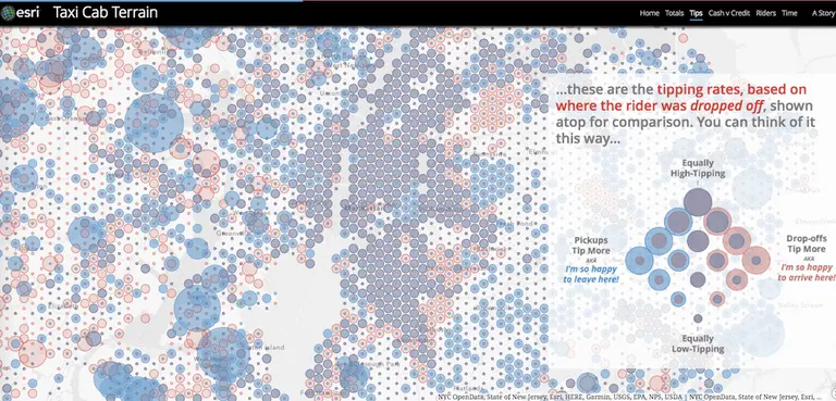
Looked at from any distance, New York City may appear to be a honking sea of cars and taxis, with the latter making the biggest visual impact (and probably doing the most honking). Thanks to GIS gurus Esri via Maps Mania, we have a snapshot–an aggregate vision, if you will–of a year of life in the Big Apple made up of the city's taxi journeys. The Taxi Cab Terrain map allows you to zoom in and find out about the many millions of rides that start and end in the New York City and New Jersey metro areas based on data from the NYC Taxi & Limousine Commission. Mapping yellow cab travel data covering July 2015 to June 2016, the map shows how different NYC boroughs use taxis and how they pay for their rides. Esri's John Nelson then takes a look at socioeconomic data to look for influences that might impact how different neighborhoods use and pay for cab rides.
More from the map, this way
August 14, 2017

Chinese immigrants use slang names and maps to navigate the streets of NYC

Many New Yorkers navigate Chinatown by its famous street names; East Broadway, Mulberry, Canal and Orchard. However, for many Chinese immigrants living in the area who do not speak English, these names are not used. Instead, descriptive nicknames (translated from Chinese) exist like “Hatseller Street,” “Garbage Street,” and “Dead Person Street.” Even more interesting, to help Chinese New Yorkers navigate the city, maps with these streets labeled in their Chinese nicknames are made and distributed. A reporter from This American Life, Aaron Reiss, began collecting these maps and discovered the lesser-known nicknames for a lot of these city streets, many which have four or five different labels.
More this way
August 8, 2017

‘X-ray’ subway station maps help navigate NYC’s complex underground paths

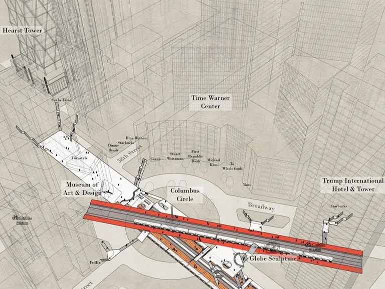
While the official map of the New York City subway clearly labels which station comes next, it’s not very good at showing the actual geographic distance between stations or what the paths and tunnels look like in order to take the right exit. Like many New Yorkers, architect Candy Chan developed a love-hate relationship with the subway. As CityLab shares, after feeling constantly lost when trying to navigate the city underground, Chan created Project NYC Subway, which includes photographs, architectural drawings, and a series of three-dimensional sketches that display what the complex stations really look like.
See the x-ray-esque drawings
August 4, 2017

No state is spared a roasting in this 19th-century nickname map

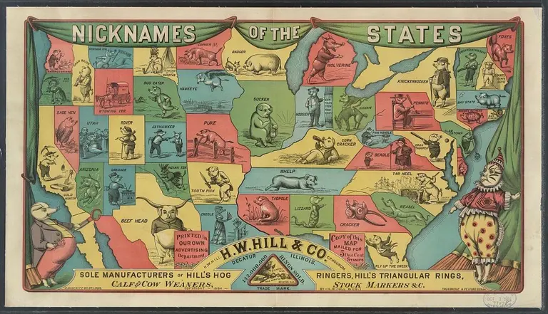
When a livestock supply company tries to get clever, the result is likely to be something like this "odd and obscure" (h/t Slate) map of the U.S. showing common state nicknames of the day, many of which haven't changed since the map was printed as a promotional offering by H.W. Hill & Co. in 1884. Each state's nickname is illustrated by a portly porker doing whatever it is that state would probably rather not be known for doing best: New York's "knickerbocker," Ohio's "buckeye" and Michigan's "wolverine" are present and accounted for; Kentucky's "corn cracker" and Georgia's "cracker" are similarly skewered.
This way for more pig tales
August 3, 2017

ARCHIPORN is an interactive map for lovers of architecture and design

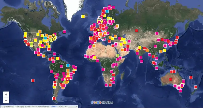
While it may sound NSFW, the online guide ARCHIPORN is simply an informative guide to the world’s most beautiful architectural works, including various bookshops and institutions that specialize in architecture. First developed in 2008 by Brazilian architects Marcio Novaes Coelho Jr. and Silvio Sguizzardi, the project aims to identify and share information about iconic works from professionals around the world. The guide is chronologically organized, with different colors representing different eras. According to ArchDaily, cateogories range from before the year 1750, prior to the Machine Age, to recent works of 2010 and beyond.
Explore the map
Pitch a story icon Know of something cool happening in New York? Let us know:
July 20, 2017

Help the NYPL geotag historic photos of New York City

The New York Public Library has a challenge for all history gurus and NYC experts: Place unlabeled historic photos of the city at the correct location on a map. The new website called Surveyor crowdsources geotags of the NYPL's photo collections with the goal of creating a digital database to make it easier to find images by the location they were taken. While some photos come with helpful titles that describe the location or the address, others only include the neighborhood or vague details. Since algorithms and search engines won’t be able to pick up locations of these old photos, the NYPL is seeking help from the public.
Get more info
July 18, 2017

Crowd-sourced maps show where tourists and hipsters land in every big city

While most New Yorkers can describe each neighborhood in just a word or two, a new website takes these definitions and puts them on a map, giving users a better understanding of how locals see each city block. As ArchDaily learned, the platform, Hoodmaps, crowd sources information, letting the public “paint” parts of the city using six colors to represent “uni”, “hipster,” “tourists,” “rich,” “suits” and “normies.” In NYC, it’s no surprise users painted Times Square, Hell’s Kitchen and the High Line in red, marking high tourist spots. And of course, Williamsburg was yellow marking it “hipster central” on the map.
Find out more
July 17, 2017

Vintage maps reflect the population distribution of Americans in 1930

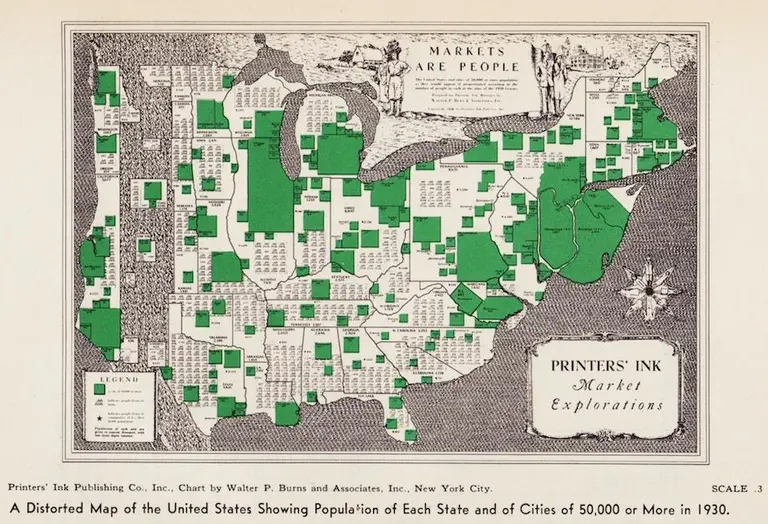
Using the 1930 census for their data, two distorted maps show where residents in the United States lived during this period of time. Both vintage cartogram maps exhibit how bunched Americans were in the north and the east coast, clustered in urban areas, despite the westward expansion of the previous century. As the Making Maps blog first featured and as Slate discovered, the size of New York and New Jersey grows in proportion to its expanding populations, moving further east into the ocean.
Find out more
July 14, 2017

On this day in 1645, a freed slave became the first non-Native settler to own land in Greenwich Village

In 1626, the Dutch West India Company imported 11 African slaves to New Amsterdam, beginning New York’s 200 year-period of slavery. One man in this group, Paolo d’Angola, would become the city’s first non-Native settler of Greenwich Village. As the Greenwich Village Society for Historic Preservation (GVSHP) discovered, and added to their Civil Rights and Social Justice Map, as a recently freed slave, d’Angola was granted land around today’s Washington Square Park for a farm. While this seems like a generous gesture from a slave owner, d’Angola’s land actually served as an intermediary spot between the European colonists and the American Indians, who sometimes raided settlements. This area, in addition to Chinatown, Little Italy, and SoHo, was known as the “Land of the Blacks.”
Find out more
July 10, 2017

Interactive map reveals how your daily commute time compares with the nation’s worst

For something to ponder while trapped in subway hell or highway gridlock, a detailed visualization by statistician Chase Sawyer shows typical commute times clocked in every U.S. county, based on census data from 2011-2015. Citylab reports on the findings revealed therein; for example, we probably could guess that the top 10 easy-peasy commutes were in Alaska (where you can always find a seat on the subway), but you may not have guessed that Pike County, Pennsylvania has the worst transit time at an average of 44 minutes.
Find out how your daily trek stacks up
July 5, 2017

MAP: Where to find NYC’s HDFC apartments, affordable co-ops for low- and middle-income buyers

When it comes to affordable housing, the city's offerings primarily focus on rentals, but the little-known pool of HDFC units (Housing Development Fund Corporation) provide low- and middle-income New Yorkers a chance to own a slice of NYC real estate below market rate. The program was created several decades ago so that tenants in poorly managed buildings could take control of their property and form cooperatives. At this time, they were selling for a mere $250 each, and though today's prices range from $500,000 two-bedrooms to $1.8 million three-bedrooms depending on the neighborhood, the deals are still out there based on qualifying incomes. And to make the HDFC hunt a bit easier, CityRealty has put these current listings into a handy interactive map.
Explore the full map here
June 28, 2017

Map: Where to watch the Macy’s fireworks this July 4th

Here's a handy guide outlining some prime spots for experiencing Macy's Fourth of July live fireworks extravaganza this Tuesday evening; in addition, the folks that put on the show have provided a helpful interactive neighborhood finder so you're well situated when things go boom. Take a fun quiz here, then find out the best spots to watch from. Or just check out some prime spots here.
More info this way

Our Mission

More than just current events, here you'll learn about the places, people, and ideas that are shaping your city.