January 26, 2017

1894 maps show a Manhattan densely populated with immigrants

New York has always been a city of immigrants, and these historic maps—dug up by Slate—attempted to illustrate the population density and nationality in 19th century Manhattan. With data from the 1890 census, the New York’s Tenement-House Committee and Frederick E. Pierce released the maps in 1894. They tracked immigrant communities by striping each of the island’s sanitary districts (which are small service areas designated by the sanitation department) with different patterns. The stripes show the national origin of the New Yorkers that live in each area, while the width of the striped signifies the proportion of the population represented by each group.
See the full map
January 23, 2017

Map: Here’s where you can afford to live in NYC in 2018

For New York home buyers, a lot can change in a year. A neighborhood that was considered affordable can all of a sudden become out of reach, whether it be from new developments like a subway or good old fashioned gentrification. For this reason, Fast Forward Labs created an interactive map that predicts the price of real estate in 2018. As Google Maps Mania explains, "The map allows you to input a housing budget and see how likely it is that you will be able to afford to buy a property in different New York neighborhoods during different future time periods."
More on the map here
January 23, 2017

There are more skyscrapers in NYC than in the next 10 cities combined

Given our growing obsession with skyscrapers–and our growing collection of them–we're pleased to find that New York City has more skyscrapers than the next 10 skyscraper-boasting cities–combined. The infographic from highrises.com (h/t TRD) shows that NYC has 6,229 high-rise buildings, while Chicago has just 1,180, and second-most-populous Los Angeles a mere 518.
See how the cities stack up
January 19, 2017

Amid fears of Russian hackers, expert warns of threat from squirrel cyberattack

As the U.S. goes collectively nuts over the possibility of alleged Russian hacking and its effects on the election, the Washington Post tells of at least one cybersecurity expert devoted to exposing the very real threat of cyberattack by "an insidious bushy-tailed foe." We're reminded that in 1987, a squirrel nibbled Nasdaq’s computer center (literally) into the black for 90 minutes, upending 20 million trades.
More de-tails this way
January 18, 2017

Mapping NYC subway stops according to their most popular Instagram hashtags

The Houston Street 1 station is #cronut; the PATH train’s World Trade Center station is #neverforget; and the Cathedral Parkway/110th Street station is #Seinfeld. This is the NYC subway map according to each stop's most popular Instagram hashtag. CityLab first shared the fun visualization, titled #tagsandthecity, and pointed out that, though the map has categories for sightseeing/monuments, shopping, leisure, culture/museums, and hotel/travel, it's the food and drink that really takes the cake. From #redrooster and #robertas to #shakeshack and #halalguys, it seems New Yorkers really like to post some food porn.
See the full map
January 16, 2017

‘Ten & Taller’ exhibition maps the rise of Manhattan’s first skyscrapers from 1874 to 1900

Though it might seem that each recent generation attempts to take credit for the rise of the futuristic "skyscraper," buildings that rise ten floors or higher were born with the Gilded Age. "Ten & Taller: 1874-1900," on view through April 2017 at the Skyscraper Museum in Battery Park City examines every single building 10 stories and taller that was erected in Manhattan between 1874 through 1900 (h/t Curbed). Beginning in the mid-1870s, the city's first ten-story office buildings rose on masonry to 200 feet high with spires that stretched 60 more feet. By 1900 New York City could boast of 250 buildings at least as tall; the world’s tallest office building was the thirty-story 15 Park Row; framed with steel, it soared to 391 feet. As technology brought elevators and new methods of construction, the vertical expansion was becoming a forest of tall towers.
Follow the city's march skyward
January 7, 2017

Civil rights map is a celebration of social justice history in NYC

With a new president entering the White House this month, there is a lot of uncertainty in the air, particularly when it comes to the rights of minority groups in the U.S. In light of these tumultuous times, the Greenwich Village Society for Historic Preservation (GVSHP) has created an interactive map that highlights, and celebrates, the fight for social justice that's taken place in and around the East, West and Greenwich Villages. The map tool covers more than 100 locations, each signifying a site where African Americans, women, immigrants, Latinos and the LGBT community have fought for equality and representation over the centuries.
explore the map here
January 6, 2017

MIT’s new tree canopy map reveals New York City needs more greens

In an effort to promote urban tree cover, researchers at MIT's Senseable City Lab have developed Treepedia, a platform for mapping the canopies of ten different major cities. Using Google Street View panoramas to serve as a Green View Index (GVI) to compare and evaluate green canopy coverage, Treepedia provides a visual map of trees and vegetation in Boston, Geneva, London, Los Angeles, Paris, Sacramento, Seattle, Tel Aviv, Toronto, Turin, Vancouver and of course, New York.
New York is one of the least green cities
January 4, 2017

Mini Metros shrinks and simplifies 220 transit systems from around the world

When D.C.-based graphic designer and transit enthusiast Peter Dovak tried his hand at creating a transportation-based app, he was taken by the clean, simple appearance of the icons he'd made for the navigation bar--small circles containing shrunken versions of metro or light rail systems. He's now designed them for 220 cities as part of his ongoing Mini Metros series, and made the colorful maps available as prints, mugs, and magnets.
Get a closer look
December 27, 2016

Watch 24 hours of NYC subway activity in one hypnotizing map

Who knew watching the movements of the New York City subway could be such a relaxing activity. A new data visualization created by Will Geary shows a day's worth of subway routes in motion in one mesmerizing creation. To build the map, Geary used Processing and Carto software, as well as the framework of another tutorial from Juan Francisco Saldarriaga, pulling data from the MTA and Google Maps to determine the flux. And for some extra fun, the whole thing is set to "Rhapsody in Blue!"
Watch the subway map on the move
December 23, 2016

New Yorkers love ‘It’s a Wonderful Life:’ Mapping every state’s favorite holiday movie

New Yorkers tend to be a distinct mix of cynicism and optimism, so it's not surprising that our favorite holiday movie is "It's a Wonderful Life," the classic Christmas tale of George Bailey being saved from his suicidal state by a guardian angel who helps him see the positive impact he's had in his life. This data comes from CableTV's fun map of every state's favorite holiday movie, which they arrived at by cross referencing AMC's top-rated holiday movies with state data over the past decade from Google Trends.
See the full map and find out the country's top pick
December 21, 2016

Interactive map reveals the shadows cast by every New York City building

The Times calls the phenomenon a "struggle for light and air." And indeed, while New York City architecture is lauded for both its design and innovation, the decades-long race to build bigger and taller has taken a toll on the cityscape, particularly in the form of shadows. While any recent criticism of the effect has been directed towards the towers rising along Billionaire's Row, as The Upshot's map reveals, New Yorkers on the whole spend a lot of their time cutting through long stretches of shadow. The map documents thousands of buildings across the five boroughs, denoting age, height and the resulting shadows cast at ground level over the course of one day, down to the minute, during all seasons. As seen above, tall-tower haven Central Park South is cloaked in darkness 24/7 during the fall, winter, spring and summer months—but then again, if you peruse the map, you'll see a lot of other blocks are too.
find out more
December 19, 2016

Map highlights the correlation between evictions and rent stabilization loss in NYC

View the map from ProPublica in its interactive form here >> Last year close to 22,000 tenants across the city were evicted from their homes, an issue that the folks at ProPublica trace to a 1994 City Council vote on "vacancy decontrol," which allowed landlords to evade rent regulation and charge market rate for vacated apartments that cost $2,000 or more a month (it's now $2,500). Not only did this incentive rent hikes, but it's led to a major blow to the city's rent stabilized inventory. To show the correlation between evictions and rent regulation, ProPublica has created this interactive map of the more than 450,000 eviction cases filed between January 2013 and June 2015. It shows the number of evictions in a given building (it's shocking how many have had more than 50 in less than three years) and whether or not that building is rent stabilized.
Find out more on the issue
December 14, 2016

Historic map shows the manufacturing industries of 1919 NYC

As part of their new exhibit "Mastering the Metropolis: New York and Zoning, 1916–2016," the Museum of the City of New York has shared this historic map of manufacturing industries across the city. Published in 1922 using census data from 1919, the colorful depiction shows us that women's wear was the industry of the time, with more than 8,000 factories employing 169,965 people and coming in with a yearly product value of $1.7 billion. Manhattan was all but covered with manufacturing, and as CityLab points out, this included everything from rubber tires and umbrellas to coffins and cigar boxes.
Get a closer look
December 13, 2016

Track affordable housing across NYC with this new map and data tool

Instead of weeding through the city's constantly changing portal of affordable housing opportunities, New Yorkers can now track these addresses in one central location. Brownstoner shares CoreData.nyc, a new interactive data portal from the NYU Furman Center for Real Estate and Urban Policy that shows subsidized housing throughout the five boroughs and allows users to narrow down the map by factors such as median income, demographics, sales volume and pricing, zoning, and crime.
Find out more this way
December 13, 2016

Interactive map reveals the income gap that divides NYC’s richest and poorest

According to a 2016 Pew report, the middle class is shrinking in 90 percent of U.S. cities. It's the first time in our nation's history that the middle class doesn't make up the economic majority. Instead, the highest- and lowest-income households combined comprise over 50 percent of the population. And in New York City, the divide is startling. One in five New Yorkers live below the poverty line, while the upper five percent of Manhattan residents earned more than $860,000 in 2014. GIS software company Esri has created a series of interactive maps that visualize this wealth divide in NYC and across the country, revealing where the richest and poorest live and the new economic divisions that are forming in our major metropolitan areas.
Maps, this way
November 29, 2016

Rafael Esquer uses 600 hand-drawn metallic icons to map Manhattan at night

Artist Rafael Esquer, founder of Soho’s Alfalfa Studio, previously created a wonderfully whimsical depiction of Manhattan named Iconic New York. Made up of more than 400 hand-drawn city icons, the map took him two-and-a-half year to complete. Forging ahead, Esquer has now released a new version of the map that features an additional 200 icons. Called Iconic New York Illuminated, its drawings are shimmering metallics that represent the lights, noise, and pulse of the island after dark.
More on the map
November 28, 2016

‘Sixth Borough’ map shows 14,000+ city-owned and leased properties that equal the size of Brooklyn

The Municipal Art Society of New York sent out a press release today that announces their new interactive map of the more than 14,000 city-owned and leased properties. Fittingly titled "The Sixth Borough," it shows how these sites amount to 43,000 acres, a land area the size of Brooklyn or one-third of the city's total land area, and the extent to which these public holdings--22 percent of which are listed as having no current use--affect the environment, infrastructure, landmarks, population, and neighborhood rezonings.
All the findings ahead
Pitch a story icon Know of something cool happening in New York? Let us know:
November 16, 2016

Triboro’s ‘Wrong Color Subway Map’ uses art as an antidote for subway confusion

David Heasty and Stefanie Weigler, the husband-and-wife team behind Brooklyn’s Triboro design firm, want you to spend more time looking at the New York City subway map. To that end, they’ve created versions of the familiar underground map in vibrant colors that definitely aren’t part of the official MTA version. Intended as less of a subway map replacement and more of a "beautiful memento of the city," Triboro introduced their Wrong Color Subway Map this fall, citing Massimo Vignelli’s iconic 1972 design as inspiration (h/t Wall Street Journal).
More maps, this way
November 4, 2016

MAP: NYC has more than 666,000 street trees, up 12 percent since 2006

The last time the city catalogued its street trees was back in 2005-2006, when they found about 592,130 trees on public streets, including their species, trunk thickness, and condition (you can explore a map of all this info). In the summer of 2015, the Parks Department put out a call for volunteers to help with the next round of data collection, and they received help from 2,241 individuals who completed a third of the work. They've now released the results of the 2015-2016 census, which shows an increase of 12.5 percent to 666,134 trees covering 209 species, and compiled their findings into an interactive map.
Learn more about the city's street trees
November 2, 2016

City reveals maps of proposed routes for Brooklyn-Queen streetcar

When the plan for a streetcar from Brooklyn to Queens was officially announced by the city in February, we knew that the $2.5 billion line would run 16 miles along the East River, from Astoria to Sunset Park, but the exact routes have remained a mystery, up until now. The Times reports that yesterday the city released a 25-page report that outlines these key details, as well as how the streetcar would traverse bridges to cross Newtown Creek and the Gowanus Canal and more logistical details. It also includes maps for the various routes through each neighborhood with a list of pros and cons (road width, proximity to existing subway stations, street and pedestrian traffic) for each possible street.
See the maps
November 1, 2016

MAP: What languages New Yorkers speak at home, by neighborhood

Life in New York City in all its diversity means hearing a colorful mix of languages spoken every day. Web developer and artist Jill Hubley's new census map (h/t Gothamist) shows us which languages are spoken by New Yorkers at home in their neighborhoods. Hubley intially created the Languages of NYC map for a GISMO exhibit at the Queens Museum entitled, "Map Mosaic: From Queens to the World" with data from the United States Census Bureau's American Community Survey. The result is a colorful tableau of native tongues, from Russian in Brighton Beach to Spanish in Sunset Park, with large swaths of French Creole in Brooklyn and Chinese in lower Manhattan–and those are the ones we already expected. The map allows you to view "islands" of one or more languages or to view them all.
Check out the map
October 31, 2016

MAP: East Williamsburg would be fined the most by new Airbnb law

After Governor Cuomo recently signed into effect a bill that would impose fines of up to $7,500 on those offering illegal short-term Airbnb rentals, the company filed a federal lawsuit against the legislation, saying it would "impose significant immediate burdens and irreparable harm." And according to an analysis from ValuePenguin, shared by DNAinfo, it's East Williamsburg that would be hit the hardest by the new regulations. The personal finance website says that, as of October 1st, the neighborhood (zip code 11211) has 314 full apartment rental listings, which could result in $2,355,000 in fines. It's followed by zip code 10003, which covers parts of Greenwich Village, Gramercy, and the East Village, the Lower East Side (10002) and Chelsea (10011).
More data ahead
October 27, 2016

‘Judgmental Maps’ unleash culture on the geography of modern cities

Residents of today's cities and neighborhoods are acutely aware of the cultural histories and social nuances that shape them almost as much as their streets and bridges, architecture and businesses. A few years ago Trent Gillaspie's "judgmental maps," from his site by the same name, hit a nerve and went viral; the totally unserious (but not necessarily inaccurate) maps pair geography with a snapshot of real life in modern cities, towns and neighborhoods. Gillaspie's "Judgmental New York City" was spot on in many ways with its Manhattan of "amply rich people," "super rich people," "aging punks" and the "worst train station ever" and a Brooklyn that went from Jay-Z to Zombies. Now, Gillaspie is releasing a book (h/t Untapped) of his signature reality-check maps, including an updated New York City map and the city's neighborhoods, decoded.
Your city, judged
October 27, 2016

MAP: Two thirds of landlords benefiting from 421-a tax breaks didn’t file rent regulation paperwork

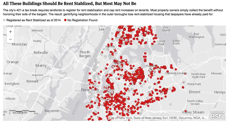
The city's 421-a program, which expired in January, provides tax breaks of up to 25 years to new residential buildings that reserve at least 20 percent of units as affordable. Proponents of the program feel it offers a much-needed incentive to build low- and moderate-income housing, but those not in favor think it gives unfair tax breaks to the wealthiest developers. The latter camp may be gaining steam, as a new report from ProPublica, outlined in Gothamist, says that nearly two thirds of the 6,400 rental buildings where landlords received tax reductions through 421-a didn't have required rent stabilization paperwork on file, meaning they could raise rents as much as they chose. ProPublica compiled this data in both an interactive map and searchable database.
Is your landlord cheating the system?

Our Mission

More than just current events, here you'll learn about the places, people, and ideas that are shaping your city.