October 26, 2016

Citee t-shirts are covered with city maps from 230 different locations

It's no secret that we're huge fans off all things map related, and that's especially true when it comes to wall decor and t-shirt design. Alex Szabo-Haslam, a designer from Sheffield, England, recently launched a campaign for "Citee," an exclusive collection that includes exactly these items. In phase one of this project, Alex printed highly detailed maps of 80 cities onto t-shirts, and now he's using Kickstarter to fund round two where he'll expand his line to include another 150 locations.
READ MORE
October 25, 2016

The arty maps of ‘Nonstop Metropolis’ show NYC the way locals experience it

When writers and artists–particularly ones who have a keen understanding of cities–venture into the world of maps, you can bet the results will be fascinating and illuminating. "Nonstop Metropolis," a new atlas by Rebecca Solnit and Joshua Jelly-Schapiro (6sqft recently discovered the “City of Women” subway map from the book) offers 26 New York City maps that “cue us into understanding who is here” according to Solnit. As Wired puts it in their review, the result is “a diverse array of deeply particular maps” that combine imaginative and fanciful imagery with the colorful cultural history beneath the city’s diverse neighborhoods and landmarks and the people who live among them.
Check out some fabulous maps
October 17, 2016

These sweet maps reveal the most popular candy by state and country

With Halloween around the corner and shelves stock full of candy, it’s hard not to be tempted to buy our favorite brand. But what is the most popular one in the entire country? According to research done by a UK website called FamilyBreakFinder, which describes itself as “the UK’s favorite site for family friendly holidays, short breaks and days […]
October 17, 2016

Oldest map of New York may become most expensive map ever sold at $10M

In 1531, Italian sailor and cartographer Vesconte Maggiolo created a "Portolan planisphere," a navigational chart of the known world, that included the first depiction of the eastern seaboard and therefore of New York harbor. Bloomberg tells us that the 6.7' x 3' map made of six goat skins is now in the possession of rare book and map dealer Daniel Crouch, who will put it up for sale for a whopping $10 million this Saturday at TEFAF art fair. If it fetches this price, it'll become the most expensive map ever publicly sold.
More on the map this way
October 13, 2016

‘City of Women’ turns the subway map into an homage to the city’s greatest females

Modern cities are filled with signs that mark history, and that history often bears men's names. In New York City, for example, we have Astor Place, Washington Square, Lincoln Center, Columbus Circle, Rockefeller Center, and Bryant Park, just to name a few. In introducing a new book that addresses this status quo, The New Yorker points out that history-making women, on the other hand, "are anonymous people who changed fathers’ names for husbands’ as they married, who lived in private and were comparatively forgot­ten, with few exceptions," and that their names are notably missing from our streets. In their forthcoming book “Nonstop Metropolis: A New York City Atlas,” Rebecca Solnit and Joshua Jelly-Schapiro offer us a New York City subway map that attempts to set the record right. “City of Women” pays homage "to some of the great and significant women of New York City" in the places they lived and made a difference.
See the full-size map here
October 7, 2016

You could squeeze the population of 8 states into NYC’s 5 boroughs

New York City is crowded, but if you needed any more proof that you're being packed into a urban sardine can, just have a look at this map from Metric Maps which ushers out the city's current inhabitants for those elsewhere in the United States. As the illustration reveals, to bring NYC's population from zero back to its mind-boggling 8.5 million, you could pull in the populace of eight different states.
more here
September 29, 2016

Interactive map shows when and where to find fall foliage at its peak

If you want to know when and where you can experience autumn in all its glory, look no further than this incredible map from SmokyMountains.com. The predictive map is the ingenious creation of Wes Melton, an engineer who developed a complex algorithm that can compute several million data points—ranging from historical temperatures to historical precipitation and forecast temperatures—to forecast exactly when fall will reach its fiery perfection in any given county across the United States.
Give the interactive map a try here
September 23, 2016

Interactive map reveals NYC buildings where affordable housing is being threatened

New York City currently maintains about 178,000 affordable housing units, a number that is getting a boost with Mayor de Blasio's plans to preserve or build 200,000 more units over ten years. However, while de Blasio has put the preservation of affordable housing at the heart of his administration's work, there's still a lot of headway to be made, and the threat for displacement remains high for a considerable number of New Yorkers. But who is at most risk? A new map (h/t DNA Info) created by the Association for Neighborhood and Housing Development (ANHD) seeks to shed some light on what areas, and even more specifically, which buildings, will likely see rent hikes in the near future.
learn more about how the map was created
September 19, 2016

MAP: More millennials live with their parents in the New York region than anywhere in the U.S.

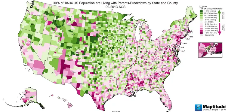
It's no one's dream to live in their parents' basement, but since the recession this has been a growing norm for young adults across the country. As Digg points out, a recent study from the Pew Research Center reports that in 2014, for the first time in 130 years, adults ages 18 to 34 were more likely to live with their parents than with a spouse or partner. They attribute it mainly to the postponement of marriage, fueled by social shifts as well as career and salary concerns. But this trend is not blanketed evenly across the country, and a new map from Metric Maps breaks down the trend by both state and county, which shows us that the Tri-State region has more millennials living at home than anywhere in the U.S.
More this way
September 1, 2016

Interactive graphic explores the diversity of Queens through its 59 endangered languages

Queens is one of the most diverse places on the planet, and it's believed that around 500 languages are spoken here. Fifty-nine of these, however, are endangered, meaning that those who speak these languages are the last people on Earth who know them. This number is staggering, considering the fact that UNESCO puts the worldwide number of "critically endangered" languages at 574, which is why artist Mariam Ghani has embarked on a mapping project that explores these disappearing tongues. First shared by Fast Co. Design, The Garden of the Forked Tongues is an online, interactive graphic and an acrylic mural in the Queens Museum, both of which plot colored polygons to represent how the languages are distributed throughout the borough.
All the info
August 26, 2016

Vacant New York: Mapping all of Manhattan’s empty storefronts

There's definitely no shortage of Duane Reades, Starbucks, and banks lining Manhattan's streets, but other than these national chains, it's hard for small business owners to afford the city's soaring commercial rents, and these mom-and-pops are currently lacking any protections from landlords. In some areas, this has created a chain store monopoly, while in others it's left stretches of otherwise popular streets with large numbers of vacant storefronts. Programmer Justin Levinson is exploring the latter through a new map called Vacant New York, which provides a startling picture of Manhattan's shuttered storefronts and its high-rent blight.
See what the map reveals
August 24, 2016

This 1927 city subway map shows early transit plans

If you're navigating the NYC subway and wishing you could start from scratch, these map outlines from 1927 might prove interesting. Found by hyperreal cartography, the maps, from the state's Transit Commission Office of Chief Engineer, outline the "plan of existing and proposed rapid transit lines" for New York City. What's shown on the map appears to be the Independent Subway System; the ISS or IND, as it was known, was first constructed in 1932 as the Eight Avenue Line. As one of the three networks that was integrated into the modern New York City subway, the IND was meant to be fully owned and operated by the city government, as opposed to the privately-funded Interborough Rapid Transit Company (IRT) and Brooklyn–Manhattan Transit Corporation (BMT) companies. The three lines merged in 1940.
Investigate the possibilities
August 23, 2016

MAP: Know where the city is spraying for mosquitoes and where there’s potential for West Nile

Thankfully, the city has found no mosquitoes carrying Zika, however, as of August 11, they've found 141 mosquito traps with the West Nile virus. If this makes you worry about every itchy bite you've gotten, this handy (albeit stomach-turning) map series may ease some anxiety. The Department of Health has created the Protecting NYC From Mosquitoes maps that show where and how many pests have been trapped on average each week, and what species they are, as well as the locations of catch basins, backpack larvaciding, helicopter and truck spraying, and standing water violations.
READ MORE
August 22, 2016

MAP: Find out what modern movies have been filmed on your street

Did you know that parts of "The Wolf of Wall Street" were shot in Fort Greene? Or that several stretches of Williamsburg appear in "Teenage Mutant Ninja Turtles"? Filmed in NYC culls three years of NYC movie filming permits and funnels them into an interactive—and quite entertaining—map that's sure to get even the most jaded New Yorker "oh huh, that's cool" at least once. Created by Metrocosm, the map highlights an impressive 17,241 filming locations and 517 movies, a mix of blockbusters and B-movies among them.
more on the map here
August 10, 2016

Mapping Subways, Buses, and Free Transfers in One Place

One MetroCard. One map. Done.This new set of maps from map obsessive Anthony Denaro shows all the ways we can use the New York City transit system's unlimited MetroCard and transfers in one convenient, color-coded place. This includes both subways and buses, and important junctions where you can transfer within and between them. Included are all NYC transit services that can be accessed with an unlimited MetroCard. As the map's creator puts it, "Millions of NYC residents live beyond a 15-minute walk to a subway station. Hundreds of thousands of people start their commute by boarding a bus and then transferring to the subway. This is a map for us. One complex transit map, for one complex transit-reliant city."
The map, and the idea behind it
August 2, 2016

New Interactive Subway Game Lets You Build the Transit System of Your Dreams

A new interactive New York City subway planning game created by electrical engineer Jason Wright gives you a chance to try your hand at building the subway system of your dreams. Though based on a similar idea to Dinosaur Polo Club's Mini Metro, the game goes further and gives players a lot more to work with. “Brand New Subway” lets players start from scratch or use current subway maps, modify historic maps dating as far back as the 1900s or use maps from the future (like the planned 2025 subway system map pictured above) (h/t DNAinfo).
Try your hand at playing god of the subways
Pitch a story icon Know of something cool happening in New York? Let us know:
July 13, 2016

Interactive Map Shows Massive ‘Subway Deserts’ in Underserved ‘Hoods

Last summer, 6sqft shared an interactive map from transit data junkie Chris Whong that laid out all NYC land ares more than 500 meters from one of the city's 470 subway stations. He's now revised his Subway Deserts Map to better take into account walkability, using a 10-minute walk from a station as the buffer zone (h/t Gothamist). The "walkshed" is styled in the same hue as water, leaving only the map portions that are subway deserts. Not surprisingly, Manhattan is pretty well set, save for Alphabet City and the far east and west sides, and the majority of the Bronx is underserved, as is much of Queens, southeast Brooklyn, and the Williamsburg waterfront.
Check out the full map here
July 7, 2016

Find Out if a Building Has Rats Using the City’s Interactive Map

From the fine folks at the city's Department of Health and Mental Hygiene comes this most informative interactive map of the five boroughs that tells you whether you'll need to keep an eye on your pizza. The Rat Information Portal (RIP) gives you the facts about rats in NYC—where they are and what you can do about them. You can search the city, building by building—handy if you're thinking of renting or buying an apartment—to get the 411 on potential pest problems of the furry kind.
Let's find some rats
July 5, 2016

Immigration Map Shows Migration Patterns for Every Country in the World

Puzzled at how many conversations about international issues turned to the subject of immigration no matter what the original context might have been, NYC-based entrepreneur and data visualization geek Max Galka created a map showing the flow of immigration to and from each of the world’s nations to better visualize where the patterns really lay. In addition to topics like terrorism, Brexit, this year’s presidential race and the refugee crisis, according to Galka, immigration was "being mentioned in connection with all sorts of topics I never would have expected.” Finding that the debates on immigration, though sometimes heated, were lacking in factual information, he hopes that his mapping efforts, brought to us via his blog Metrocosm, can provide some real-world context on questions like, "how many migrants are there? Where are they coming from? And where are they going?"
Take a look at the map to see who's coming and going
June 13, 2016

The NYC ‘Ghostbusters’ Service Map Transforms the Subway System With Film Nostalgia

If you missed the chance to visit the recent "Ghostbusters" headquarters recreation in Williamsburg, 6sqft has dug up a fun map that'll provide a dose of movie nostalgia. The New York City Ghostbusters Service Map was created by print and product designer Anthony Petrie as a witty version of the subway map, complete with notable locations from the film like Hook & Ladder 8 in Tribeca, Holy Trinity Church, the Public Library, and 55 Central Park West where Dana's apartment was. The subway lines spell out ECTO-1 and are titled as various particle beams, and stations stops are changed to names such as Destructor Drive, Clairvoyance Cove, Sanctum of Slime Street, and Who Ya Gonna Call Cul-De-Sac.
Get a look at the full-size map
June 9, 2016

MAP: Visualizing Urban Development from 3700 B.C. to 2000 A.D.

Previously, 6sqft featured an interactive map from Esri that showed how the world's population boomed over the course of 2,000 years. Now comes a new paper and visualization (h/t CityLab) from Scientific Data that takes population and archeological records from as far back as 2250 B.C. and transforms them into a fascinating map that reveals the world's first recorded urban centers, and how they've distributed themselves over 6,000 years.
the complete map here
June 6, 2016

Explore Over 10,000 Acres of NYC Parkland With This Interactive Map

Did you know that New York City has more ecological diversity than Yellowstone National Park? Take Central Park, for example, which is home to "more than 30 species of warbler, vireo, sparrow, thrush, and other songbirds" alone. Or Pelham Bay Park's eight species of owls. Then there's the 12 species of ferns at Queens' Cunningham Park. These tidbits come from a new interactive map by the Natural Areas Conservancy (h/t Untapped), who studied over 10,000 acres in 51 parklands across all five boroughs (an additional 10,800 acres are managed by the state and federal government and weren't included in the project). The organization created the map as a way to encourage people to explore the city's natural areas by showing them what they'll find -- "the types of plant and animal species, including those that are rare or threatened – and what activities are most commonly found."
Learn more
May 27, 2016

MTA Flaunts Future Subway Map With Second Avenue Line

Perhaps in an attempt to distract disgruntled riders from looming shutdowns and never-ending delays, the MTA has released a new subway map that features stations along phase one of the Second Avenue line and the reinstated W line to Astoria. The former isn't planned to open until December (which, as Gothamist notes, we'll believe when we see) and the latter November, but if you were stuck on a sweaty platform this morning, this eye candy is surely a welcome treat.
See the full map here

Our Mission

More than just current events, here you'll learn about the places, people, and ideas that are shaping your city.