Immigration Map Shows Migration Patterns for Every Country in the World

Puzzled at how many conversations about international issues turned to the subject of immigration no matter what the original context might have been, NYC-based entrepreneur and data visualization geek Max Galka created a map showing the flow of immigration to and from each of the world’s nations to better visualize where the patterns really lay.
In addition to topics like terrorism, Brexit, this year’s presidential race and the refugee crisis, according to Galka, immigration was “being mentioned in connection with all sorts of topics I never would have expected.” Finding that the debates on immigration, though sometimes heated, were lacking in factual information, he hopes that his mapping efforts, brought to us via his blog Metrocosm, can provide some real-world context on questions like, “how many migrants are there? Where are they coming from? And where are they going?”
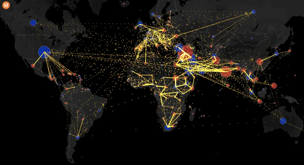
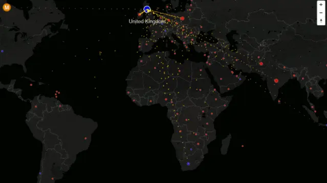
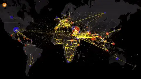
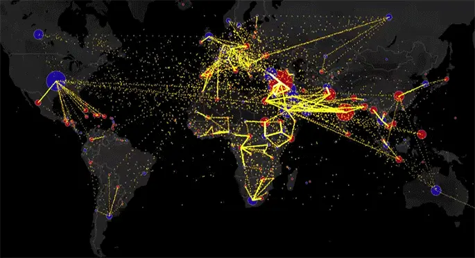
The map above shows estimated net immigration (inflow minus outflow) during the period between 2010 and 2015 by origin and destination country. Blue circles show positive net migration (more inflows). Red circles show negative net migration (more outflows). One yellow dot represents 1,000 people. You can link to the interactive version of this map here, and hover over a circle to see that country’s total net migration between 2010 and 2015. Click a circle (or tap the circle twice on a mobile device) to view only the migration flows in and out of that country.
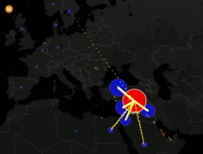
The author highlights some interesting points using sections from the larger interactive map. He points out that only small a portion of the UK’s net immigration comes from elsewhere in Europe, though in the Brexit debate immigration is the topic of many of the loudest arguments for leaving the EU (it’s worth noting that many of those arguments refer to immigration from nations outside the EU and Europe’s policies on it).
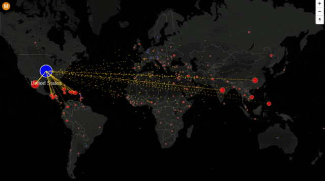
According to the estimates the author used in creating these maps, Australia is the only country to have significant positive net immigration with the U.S., meaning that more people are leaving the U.S. for that nation than vice versa.
The largest negative net immigration claimed by the U.S. is Mexico, though Galka mentions that the amount by which that country is ahead in that claim is down significantly from a decade ago, and that the real numbers regarding migration with Mexico are uncertain: “Immigration between the U.S. and Mexico is particularly complex, since it involves both legal and illegal immigration as well as temporary laborers, deportations, and a large number of people living in immigration detention facilities.” America’s true net migration with Mexico might be far lower than what is shown on the map.
By region (rather than individual country), Asia accounts for as much immigration to the U.S. as both North and South America together (including Mexico).
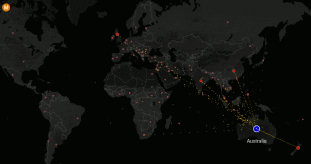
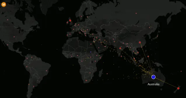
By these estimates, Australia’s net immigration is negative with every country in the world, “except for a small positive immigration balance with Sudan.” As mentioned above, Australia is the only country to have significant positive net immigration with the U.S.
Galka notes that the numbers are only estimates: The data for Galka’s map comes from the UN Population Division’s estimates for Total Migrant Stock–the number of global migrants, broken down by country of residence and country of origin. Find out more about how the map was created and more about the numbers here.
[Via Metrocosm]
RELATED: