Infographic: Here’s NYC’s Immigration Patterns over 387 Years

We often talk about specific neighborhoods’ immigration history–Little Germany in the East Village, El Barrio in East Harlem, or the capital of Jewish America on the Lower East Side. But when we look at the city as a whole, there’s been some pretty interesting immigration patterns over its nearly-400-year history. To visualize this timeline, the data gurus over at Metrocosm have put together an interactive infographic that shows the change in these immigration waves from 1626 to 2013 and how they relate to world events regarding these given countries.
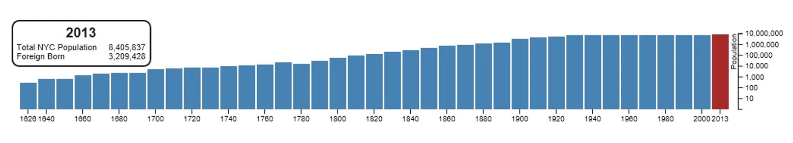
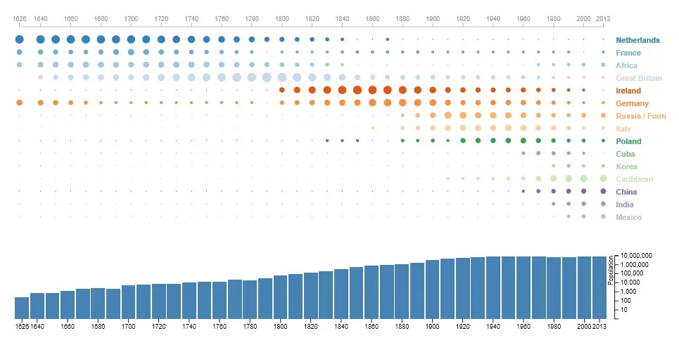
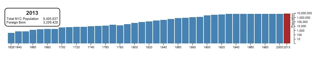
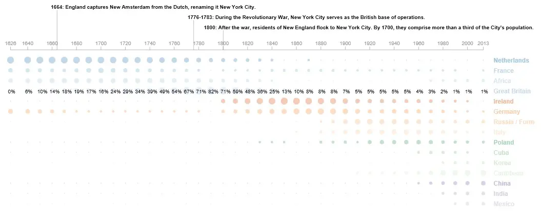
There are many layers to this handy infographic. The colored dots show the size of the immigrant groups among the city’s foreign-born population (though prior to 1776, all New York City residents are treated as foreign born), and when you roll the cursor over them you’ll get an exact percentage. You’ll also get text at the top that informs you of the national events relevant to the given immigration pattern. The bars at the bottom represent NYC’s total population each year, and when you hover over them you’ll see how the number of foreign-born residents compares.
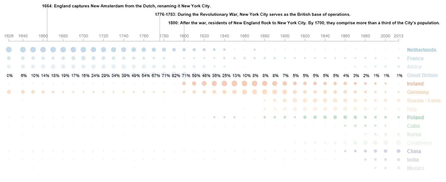
For the first 100 years, most New Yorkers were from the Netherlands, until, in 1730, the British tied for the top spot. Following the Revolutionary War, the British accounted for over a third of the city’s population. In the 19th century, New York saw a wave of Irish immigrants, which peaked in 1850 at 60 percent of the total foreign-born population. The Irish Rebellion commenced in 1798 and 1845 began the Great Irish Famine. Following that same trajectory were Germans, who took 34 percent of the population in 1850, just two years after the German Revolutions. As of 2013, when roughly 38 percent of the city was foreign-born, the largest immigrant group in the city was from the Caribbean at 28 percent, followed by China at 12 percent. Russia, India, and Mexico tie for third at 6 percent.
You can see the full interactive infographic over at Metrocosm.
[Via Metrocosm]
RELATED: