MAP: See the World’s Urban Population Grow Over 2,000 Years

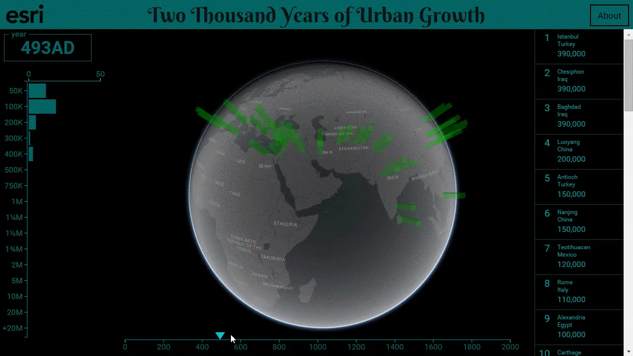
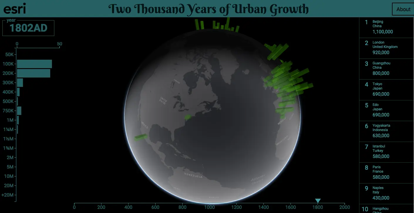
While we all like to think of New York City as the center of the universe, our little metropolis really only started to pulsate in the last couple hundred years. Way, way before this (think 1 A.D.) ancient civilizations like the Mayans experienced “urban booms” of their own. This mind-boggling interactive map made by Esri puts thousands of years of global population growth into perspective, ultimately showing us that NYC is kind of just a blip on the radar—or in this case, the 2,000-year timeline of life.
The map, aptly named Two Thousand Years of Urban Growth, is straightforward and easy to use. Simply use the slider at the bottom of your screen to choose what point in history you’d like to investigate, and the map atop will respond by charting, in 3D, the population growth at that date for various cities. If you hover over a particular bar, the map responds by both giving you some history (via Wikipedia) about that locale and showing you the city’s population change over the last 2,000 years.
According the Esri’s site, “Inspiration and data for this app was derived from Tertius Chandler‘s 1987 book entitled Four Thousand Years of Urban Growth: An Historical Census. Chandler’s work was merged and updated with data from Esri and Wikipedia.”
[Via Google Maps Mania]
RELATED: