Esri

February 15, 2018

Tired of NYC’s light pollution? Use this map to find ‘dark sky’ escapes

The omnipresence of artificial light, brilliant in its intentions, has become as much of a nuisance as a blessing in cities where we almost can’t tell night from day. Enter global light pollution. Is there any escape? The bright lights get in the way of astronomy–and affect animals and plants (who can’t just pull the shades down). Scientists are looking to “dark sky” initiatives to protect areas unscathed by light pollution; there are now dark-sky-designated areas in North America, South America and Europe. Interactive dark sky maps, courtesy of Esri, show where on Earth one might find respite from the glare–and where it’s at its most intense.
Check out the map
October 3, 2017

MAP: Watch 1 million+ NYC buildings being constructed since 1880

A walk down any block in today's New York City feels like taking a tour of a giant, noisy, scaffolded construction site. But the map mavens at Esri show us that this is definitely not the only time in history when living in the city felt like occupying a giant beaver colony. Their fascinating New York construction map brings new life to the word "built environment" with time lapse coverage of over a million buildings being built in NYC starting in 1880.
Check out the map
September 18, 2017

Map shows how many years of life a house costs, and in NYC the numbers aren’t pretty

New Yorkers know that taking on a mortgage in the city is no easy feat. But a recent map shows that, compared to the rest of the country, we'll spend many more years than most everyone else (except San Franciscans) in our attempts to pay it off. This map, which measures "mortgage magnitude," looked at the median local income and median local home value to show the relative affordability of property in each US county. The value of the average property was then expressed in the number of years salary it costs. In some counties, a house will only set you back a total of one year's pay. But as you move out toward costal cities like New York, that number gets dramatically higher.
Here's how many years New Yorkers should expect
August 16, 2017

The Manhattan Skyscraper Explorer is your building-by-building skyline map

Tall buildings—from supertalls to garden-variety skyscrapers—seem to grow like weeds in New York City: A recent boom in tall Midtown residential towers has ushered in a new focus on life in the clouds. And we're always comparing ourselves to other vertical cities. We also know there have been growth cycles and slower periods when it comes to the city's skyscrapers. Now we can survey the landscape of Manhattan's tallest buildings all at once thanks to the mapping wizards at Esri (via Maps Mania). The Manhattan Skyscraper Explorer reveals each of the city's tall towers, showing its height, when it was built, what it's used for and more.
Explore New York's tallest
August 15, 2017

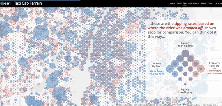
Taxi map shows where New Yorkers take cabs and how they pay for them

Looked at from any distance, New York City may appear to be a honking sea of cars and taxis, with the latter making the biggest visual impact (and probably doing the most honking). Thanks to GIS gurus Esri via Maps Mania, we have a snapshot–an aggregate vision, if you will–of a year of life in the Big Apple made up of the city's taxi journeys. The Taxi Cab Terrain map allows you to zoom in and find out about the many millions of rides that start and end in the New York City and New Jersey metro areas based on data from the NYC Taxi & Limousine Commission. Mapping yellow cab travel data covering July 2015 to June 2016, the map shows how different NYC boroughs use taxis and how they pay for their rides. Esri's John Nelson then takes a look at socioeconomic data to look for influences that might impact how different neighborhoods use and pay for cab rides.
More from the map, this way
December 13, 2016

Interactive map reveals the income gap that divides NYC’s richest and poorest

According to a 2016 Pew report, the middle class is shrinking in 90 percent of U.S. cities. It's the first time in our nation's history that the middle class doesn't make up the economic majority. Instead, the highest- and lowest-income households combined comprise over 50 percent of the population. And in New York City, the divide is startling. One in five New Yorkers live below the poverty line, while the upper five percent of Manhattan residents earned more than $860,000 in 2014. GIS software company Esri has created a series of interactive maps that visualize this wealth divide in NYC and across the country, revealing where the richest and poorest live and the new economic divisions that are forming in our major metropolitan areas.
Maps, this way
December 8, 2016

ParkServe will share park data from 13,931 cities to help planners improve recreation space locally

Next year, urban planners across the country will have a handy new tool at their disposal to help better inform them on the placement of parks and other recreation in their respective cities. Together with ESRI, the Trust for Public Land (TPL) have been developing a new website called ParkServe that has culled park data from nearly 14,000 parks across the country. As Statescoop shares, in addition assisting in park planning through open-space advocacy and research, the new site will help citizens take advantage of, and have a say in the development of, local parks.
more on the new site
December 22, 2015

MAP: See the World’s Urban Population Grow Over 2,000 Years

While we all like to think of New York City as the center of the universe, our little metropolis really only started to pulsate in the last couple hundred years. Way, way before this (think 1 A.D.) ancient civilizations like the Mayans experienced "urban booms" of their own. This mind-boggling interactive map made by Esri puts thousands of years of global population growth into perspective, ultimately showing us that NYC is kind of just a blip on the radar—or in this case, the 2,000-year timeline of life.
Access the map this way