June 21, 2017

New ArchiMaps app lets you explore cities by their important buildings

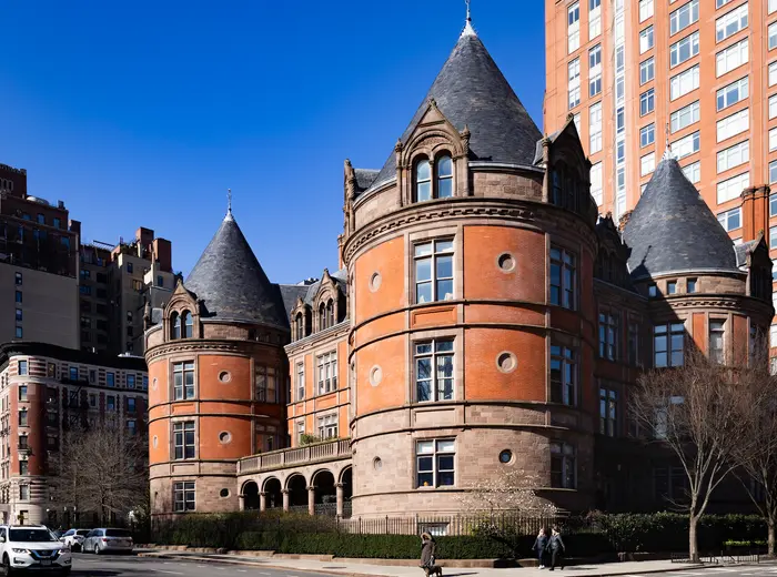
Because you can never have too many ways to explore a city, a new architecture-based travel guide map app helps make sure you don't miss any important architecture (h/t Curbed). Made by architectural historians, ArchiMaps points out a selection of important works like buildings and bridges. It's currently available for Android and iOS and in four cities–New York City, Chicago, London, and Madrid–so far with more in the works including Los Angeles, Berlin and Barcelona.
Find out more about that building
June 2, 2017

Waterfront Alliance’s ‘Harbor Scorecard’ says if your NYC neighborhood is at risk for severe flooding

This week marked the beginning of hurricane season and experts predict storms will be worse than usual, especially following President Trump’s decision to withdraw from the Paris climate accord on Thursday. To better inform New Yorkers about the risks of rising sea level and storm surges, the Waterfront Alliance, a nonprofit that works to protect waterfronts, released a Harbor Scorecard, as reported by the Brooklyn Eagle. The interactive scorecard lets users view each neighborhood by its waterfront safety and coastal resiliency. The group found that more than 400,000 New Yorkers face a 50 percent risk of a major flood by 2060.
Find out more
May 30, 2017

MAP: Battery Park City is the country’s most expensive zip code for renters

With little surprise, Manhattan comes in first for the highest apartment rents in the country, with Battery Park City leading the way for the most outrageous prices. According to data collected by RentCafe and assembled into an interactive map, the average rent in this downtown 'hood is about $6,000 per month, followed by the Upper East Side averaging $4,898 per month and the Upper West Side $4,892. Other pricey Manhattan zip codes that made the top ten include the Lower East Side, Soho and Clinton.
Find out the average rent of your zip code
May 23, 2017

The ‘map distance’ vs. the ‘geographic distance’ of the NYC subway

The NYC subway map tidily lays out over 665 miles of track and 472 stations into a simple, easy-to-read design. While the map gives the impression that our fair city's transit system is orderly and evenly spaced, as any true straphanger will tell you, that's not the reality. Indeed, those colorful lines and nodes have been placed for maximum legibility, simply showing geographical approximations that often don't even kind of match up with real life (as this man will tell you). Now, one redditor brings us an entrancing new animation that removes the MTA's distortion, giving us a look at the real distance that exists between stations and lines.
mor here
May 12, 2017

Official NYC dog name map reveals most popular pooch names by neighborhood

There’s almost no end to the amount of information you can find out about folks in your neighborhood, from two-legged to four, right down to which streets harbor the biggest poop non-scoopers. Now you can find out what name your neighbor's pet is likely to answer to (h/t Brick Underground): A newly-released official NYC dog name map shows the city's most popular dog names as well as the most common names unique to each neighborhood, based on 2016 registered dog license data.
More doggie demographics this way
May 5, 2017

This interactive map lets you find out your neighbors’ finances

Designed for the busybody in all of us, a new interactive map provides information about our neighbors' finances. Designed by student loan marketplace LendEDU, it shows the average income level, credit card and student loan debt, mortgage debt, and auto loan balances in every NYC neighborhood (h/t Brick Underground). While the Upper West Side, Tribeca, Battery Park and Lenox Hill all made the list for highest-earning areas, the highest credit ratings were all in Queens; Breezy Point, Douglaston and Clearview all had some of the best credit scores.
The 'hoods with the highest student loan debt may surprise you
May 5, 2017

1932 map illustrates a vibrant nightlife during the Harlem Renaissance

During the Harlem Renaissance, some of the greatest black jazz musicians, poets, artists and writers of all time emerged in New York City between the 1920s and 30s. Thanks to an animated map acquired by Yale's Rare Book and Manuscript Library, we can get a sense of the vibrant nightlife of Harlem during this time in history (h/t Slate). This original pen-and-brush map was drawn by Elmer Simms Campbell, one of the first commercially successful, and syndicated, African-American cartoonists in the country. The map faces southwest, bound by 110th Street, and highlights the main attractions on Lenox and Seventh Avenues.
Find out more
May 2, 2017

Mapping New York City’s 280 miles of scaffolding

Sidewalk sheds, or scaffolding, are so pervasive in New York City they almost become part of a neighborhood’s landscape. While used to protect people from falling debris, scaffolding continues to be an omnipresent eyesore that blocks sunlight and views, attracts crime and slows foot traffic. Now, thanks to a new map by the city’s Department of Buildings, residents can explore more than 7,700 sidewalk sheds, each labeled with a color-coded dot highlighting the reason for its construction, its age, and its size. As the New York Times covered, there are currently 280 miles of sidewalk scaffolding in front of 7,752 buildings in the city (way up from the 190 miles we covered just a little over a year ago), which is enough to encircle Manhattan nearly nine times.
Find out more
April 27, 2017

NYPL’s ‘digital time travel’ maps let you compare today’s New York City with the past

6sqft previously reported on the "time machine" map function that allowed users to navigate overlaid maps from 1600 to the present to see what used to occupy our favorite present-day places. Now, the New York Public Library has released the Space/Time Directory, a “digital time-travel service” that puts the library’s map collection–including more than 8,000 maps and 40,000 geo-referenced photos–to work along with geospatial tools to allow users to see the city’s development happen over more than a century, all in one convenient place. Hyperallergic reports that the project, supported by a grant from the Knight Foundation, plots 5,000 digitized street maps across the five boroughs, organized by decade from 1850 to 1950.
Find out more
April 24, 2017

‘Beerdom’ map shows 19th century Lower East Siders drank more

While today’s Lower East Side has no shortage of bars and clubs, New Yorkers of the late nineteenth century may have imbibed way more than current Big Apple dwellers. Slate shared this map drawn in 1885 and published in the Christian Union that details the number of bars per block in the neighborhood. Although the coinciding article described the social effects of LES drinking culture, overall the report found residents to be quite happy. It may have had something to do with the 346 saloons found in the area, compared to today’s mere 47 establishments. 
Find out more
April 4, 2017

Explore the homes of NYC’s notable writers with an audio-narrated tour

Some of the greatest literary giants of all time lived and wrote in New York City. In celebration of the 200th anniversary of HarperCollins, which was founded in NYC, the publishing company created an interactive walking tour map that narrates the history of each author as you walk (h/t DNAinfo). Just a few of the famed Big Apple authors include Harper Lee, Mark Twain, Zora Neale Hurston and Richard Wright.
Find out more
March 30, 2017

MAP: How old are the buildings in each Brooklyn neighborhood?

Photo via Brooklyn Historical Society One of the most exciting things about exploring Brooklyn is seeing the unique architecture of each neighborhood. Now, thanks to an interactive map from urban_calc, you can also learn the age of these structures in the borough with the oldest buildings in the city. Using the city’s OpenData project and Pluto dataset, urban_calc found the median age of buildings in each census tract. The oldest neighborhood is Ocean Hill at 1911, followed by Cypress Hill, Park Slope and Stuyvesant Heights, all with a median building year of 1920. On the other hand, the newest neighborhoods include Coney Island, West Brighton, East New York, Canarsie and Williamsburg.
Find out more here
March 29, 2017

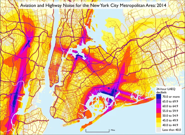
Noise pollution is worse in Jersey than NYC according to new DOT map

When comparing the perks of NYC to New Jersey, add the adjective “quieter” to the list. According to a noise map released by the U.S. Department of Transportation (DOT), noise pollution has been found to be worse in Jersey than it is in Manhattan. However, the density of highways in the city, and sounds from LaGuardia, JFK and Newark airport, do rank the New York metro area as one of the loudest areas in the entire country.
Find out more
March 28, 2017

Explore historic LGBT sites in NYC with this interactive map

To broaden people's knowledge of the lesbian, gay, bisexual and transgender community’s history in New York City, the NYC LGBT Historic Sites Project created a map-based online archive to document significant sites throughout the five boroughs. Although earlier maps highlighting LGBT history have been created, they focused solely on the history of Greenwich Village, the hub of gay activism. But the new interactive map, based on 25 years of research and advocacy, hopes to make “invisible history visible” by exploring sites across the city related to everything from theater and architecture to social activism and health.
Learn more here
March 22, 2017

On this day in 1811, the Manhattan Street Grid became official

Deemed by historians as the "single most important document in New York City’s development," the Commissioners’ Plan of 1811, which planned Manhattan's famous grid system, turns 211 years old this month. As the Village Preservation tells us, the chief surveyor of the plan, John Randel Jr., and city officials signed the final contract on March 22, 1811. The plan, completed at the end of the 19th century, produced 11 major avenues and 155 cross-town streets still used today.
Learn more here
March 13, 2017

City’s new interactive Facilities Explorer map shows you which public resources are in your neighborhood

From parks and kids' camps to food pantries, a new map–just launched in Beta mode–from the Department of City Planning lets you visually explore a database of over 35,000 records from 43 different city, state and federal agency data sources, according to DNAinfo. You can see how your community stacks up when it comes to schools, police precincts, waste dumps, free legal help, ADA facilities, resources for children and seniors and much more, and find resources when you need them. The intention of the NYC Facilities Explorer is to give community boards, council members and agencies an easy way to locate services quickly when they're considering future projects in various parts of the city.
Find out more
March 10, 2017

For $125K, you can buy the first map to credit Henry Hudson

This weekend, head over to the New York Antiquarian Book Fair, located at the Park Avenue Armory, where the first map to credit Henry Hudson with navigating his nominative river will be on display (h/t NY Times). The map, the third engraving of its kind known to exist, is being sold by Robert Augustyn, who owns Martayan Lan Fine Antique Maps, Atlases and Globes in Manhattan. The minimum asking price for the 12-by-17 inch, 280-year-old map? $125,000.
Find out more here
March 9, 2017

Civil rights map adds feminists to celebrate Women’s History Month

In honor of Women’s History Month, the Greenwich Village Society for Historic Preservation has added more notable female figures to their Civil Rights and Social Justice Map. You can now explore sites such as the now-demolished building where Hellen Keller wrote for "The Masses," learn more about Mine Okubo’s struggle to expose the cruelty of Japanese internment camps through her artwork kept in the East Village, and visit the home of Clara Lemlich, a feminist who demanded thousands of shirtwaist factory workers go on strike to demand better working conditions and higher wages.
See the interactive map here
Pitch a story icon Know of something cool happening in New York? Let us know:
March 8, 2017

Mapping America’s affordable housing shortage

Extremely low-income renters face a shortage of affordable housing in every single state and major metropolitan area in the United States, a deficiency of 3.9 million units, according to a report (h/t CityLab) by the National Low Income Housing Coalition (NLIHC). Nationwide, only about 35 affordable housing units exist per 100 extremely low-income homes, labeled as ELI households, and in the New York metro area (as defined by New York-Newark-Jersey City) the results are just as grim with only 32 units available per 100 households at or above the ELI threshold.
find out more here
February 27, 2017

Interactive 3D map of Lower Manhattan updates new developments daily

Lower Manhattan is the nation's third-largest business district and in recent years its residential building stock--both conversions of historic structures and new developments--has exploded. To track this booming urban landscape, the Alliance for Downtown New York launched an interactive 3D map to serve as a "comprehensive visualization" of the area, tracking all current and future developments within the square mile below Chambers Street. In addition to residential, office, and hotel properties, LM3D also breaks down restaurants, retailers, transit, parks and open space, landmarks, and vacant land.
Learn more about the map
February 9, 2017

Mapping where undocumented immigrants live in America

Of the estimated 11.1 million undocumented immigrants living across the U.S., 6.8 million or 61 percent live in just 20 metro areas, according to an analysis of the Census Bureau’s 2014 American Community Survey by the Pew Research Center. And as CityLab points out, this is an extremely high concentration considering just 36 percent of the country's total population lives in these areas. The highest population is, not surprisingly, right here in the New York-Newark-Jersey City area, with 1.15 unauthorized immigrants calling these cities home. We're followed by the Los Angeles area with 1 million residents, but after that it drops drastically to 575,000 immigrants in Houston.
Learn more here
February 9, 2017

Winter Storm Niko watch: Track the city’s plows live with this handy map

With close to 10 inches of snow already on the ground and more to come, Winter Storm Niko is certainly making getting around a challenge. But before taking a chance and entering that winter wonderland, check out the city's handy interactive map called PlowNYC, which tracks the progress of the Department of Sanitation's 2,300 salt spreaders and plows.
Find out more
February 7, 2017

MAP: See how demographics have shifted in every NYC neighborhood over 10 years

By now, we're all well aware that New York City is changing, becoming ever more expensive and far less friendly to its middle and low-income inhabitants. But here's a new interactive map from the Citizens Housing and Planning Council (CHPC) that offers us a snapshot view of how upper-income New Yorkers (the majority of whom are white, to be sure) have multiplied throughout the boroughs between 2000 and 2010 to alter the face of the city's demographics.
READ MORE
February 1, 2017

Map shows where New York City’s refugees have come from since 2002

In the years since the 9/11 terror attacks, somewhere in the neighborhood of 8,000 people have sought refuge in New York City. Around 8,066 refugees have entered the United States through the city according to U.S. State Department Refugee Processing Center data. This week, President Donald Trump called for restrictions on entry to the U.S. for refugees and immigrants from the predominantly Muslim nations of Iran, Iraq, Somalia, Yemen, Sudan, Libya and Syria. A map of the world's nations, courtesy of DNAinfo, shows the 59 countries from which New York City's refugees have come each year since 2002.
Find out how many refugees have actually come to NYC from those countries

Our Mission

More than just current events, here you'll learn about the places, people, and ideas that are shaping your city.