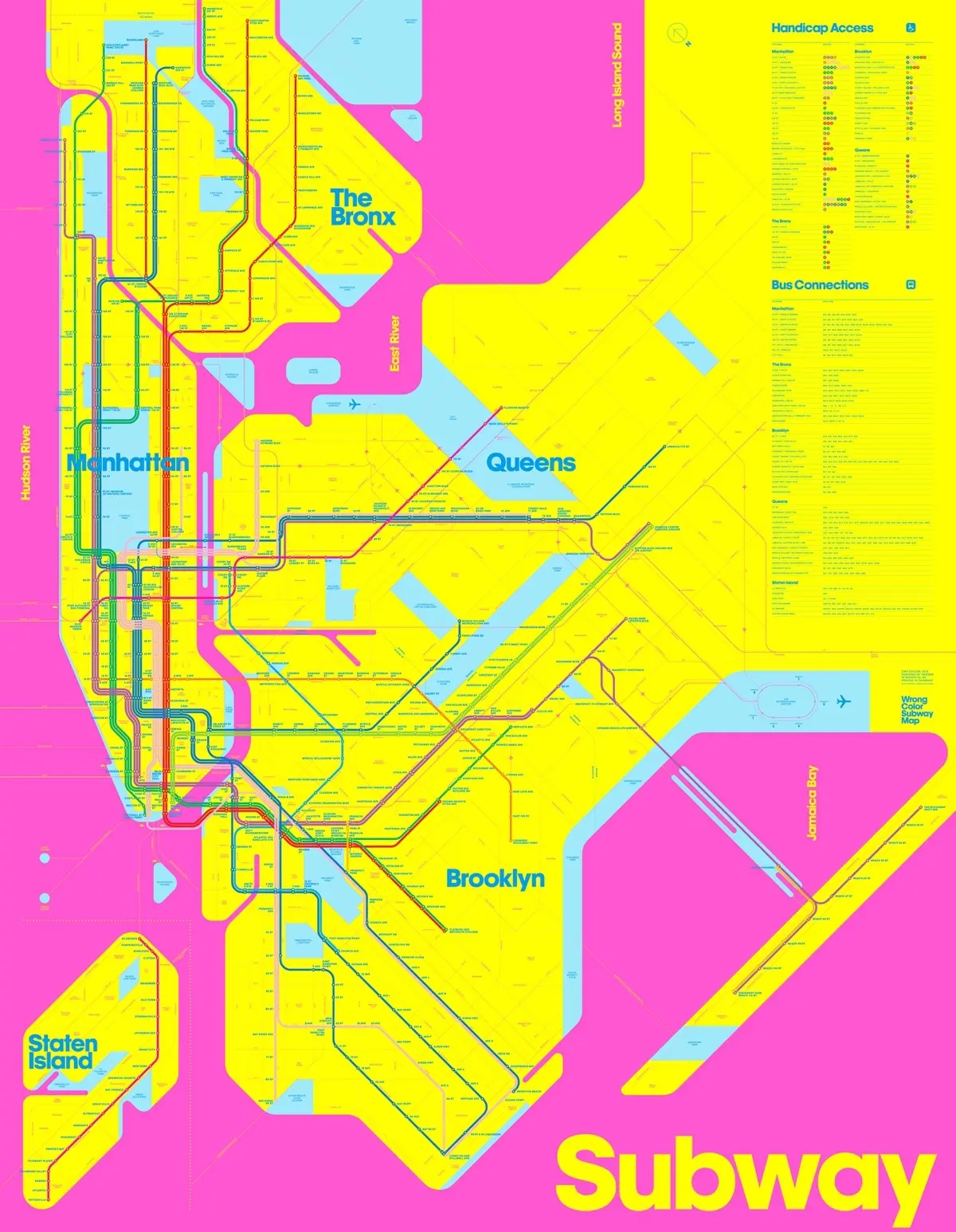
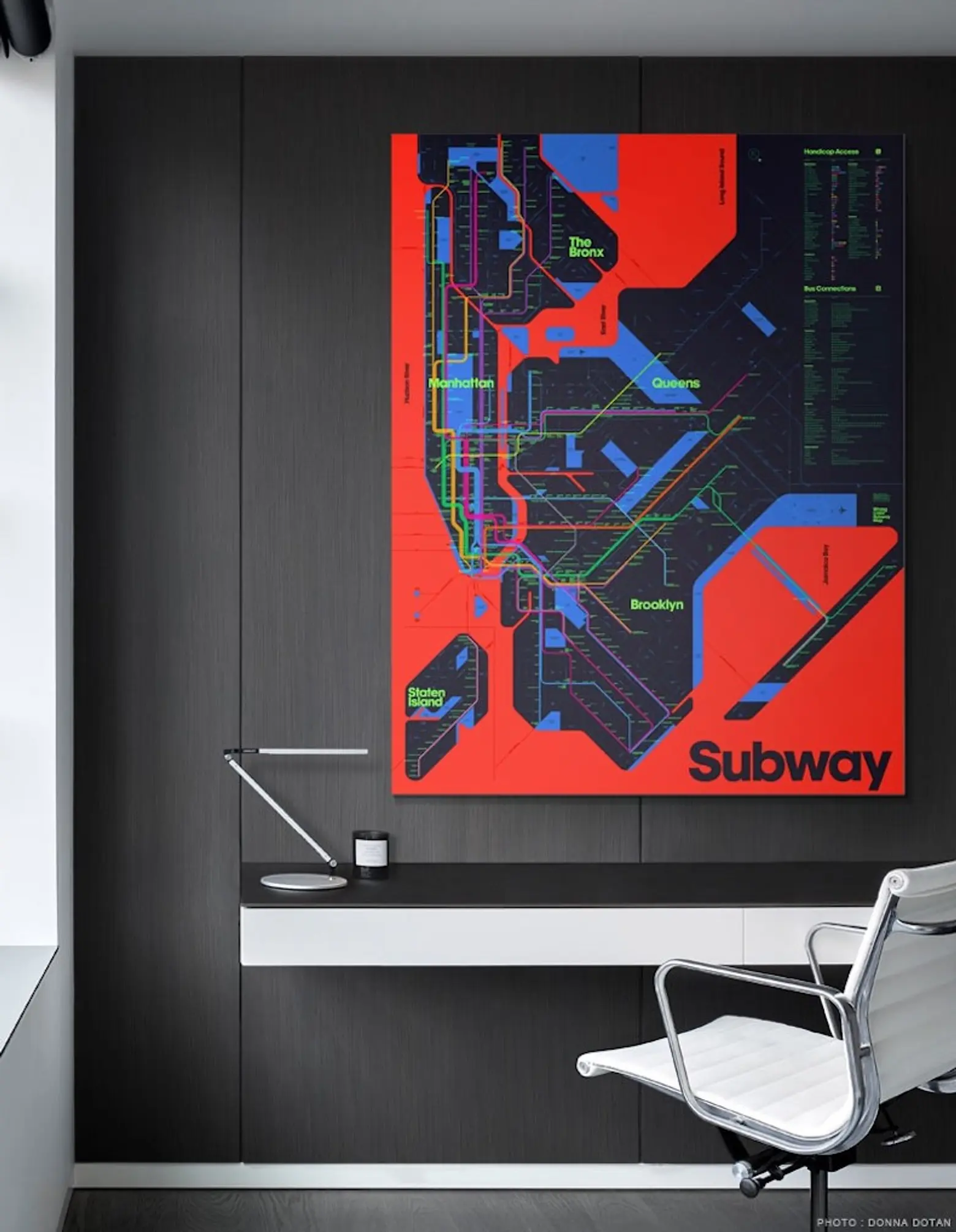
Triboro’s ‘Wrong Color Subway Map’ uses art as an antidote for subway confusion

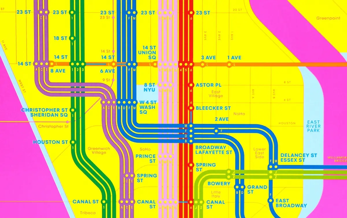
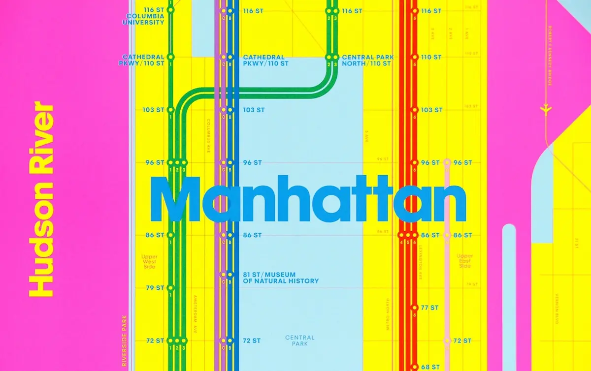
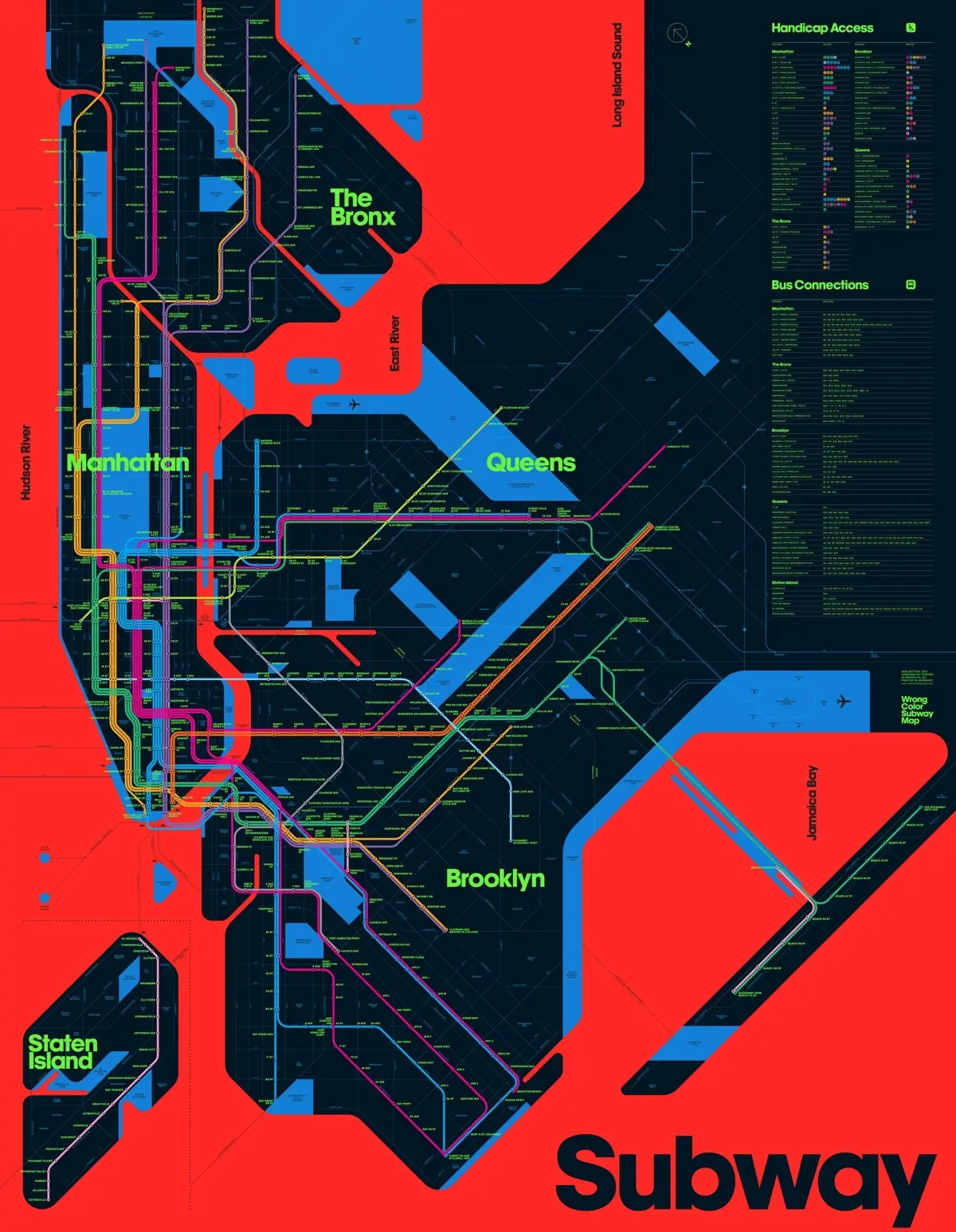
David Heasty and Stefanie Weigler, the husband-and-wife team behind Brooklyn’s Triboro design firm, want you to spend more time looking at the New York City subway map. To that end, they’ve created versions of the familiar underground map in vibrant colors that definitely aren’t part of the official MTA version. Intended as less of a subway map replacement and more of a “beautiful memento of the city,” Triboro introduced their Wrong Color Subway Map this fall, citing Massimo Vignelli’s iconic 1972 design as inspiration (h/t Wall Street Journal).

Upon moving to NYC in the early 2000s, the pair found their design sensibilities offended by the dull colors of the city’s subway maps–especially when compared with those of cities like London, where underground transit maps were so aesthetically pleasing they could double as wall art. Heasty and Weigler found the MTA subway map to be not only unattractive but confusing, without enough visual hierarchy for visitors to quickly orient themselves.
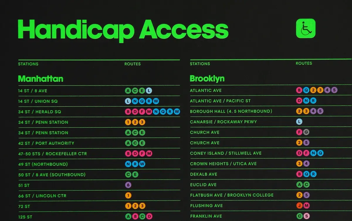
The wall-worthy map follows an earlier map effort, the One Color Subway Map, a fluorescent red poster whose vibrant simplicity made it a sellout hit at the Noho design store/gallery The Future Perfect.
The maps are the same size as official subway platform versions (45 inches by 58 inches), which made it easier for the designers to sneak some of them onto subway station walls and observe visitors’ reactions–mostly “pleasant confusion.”
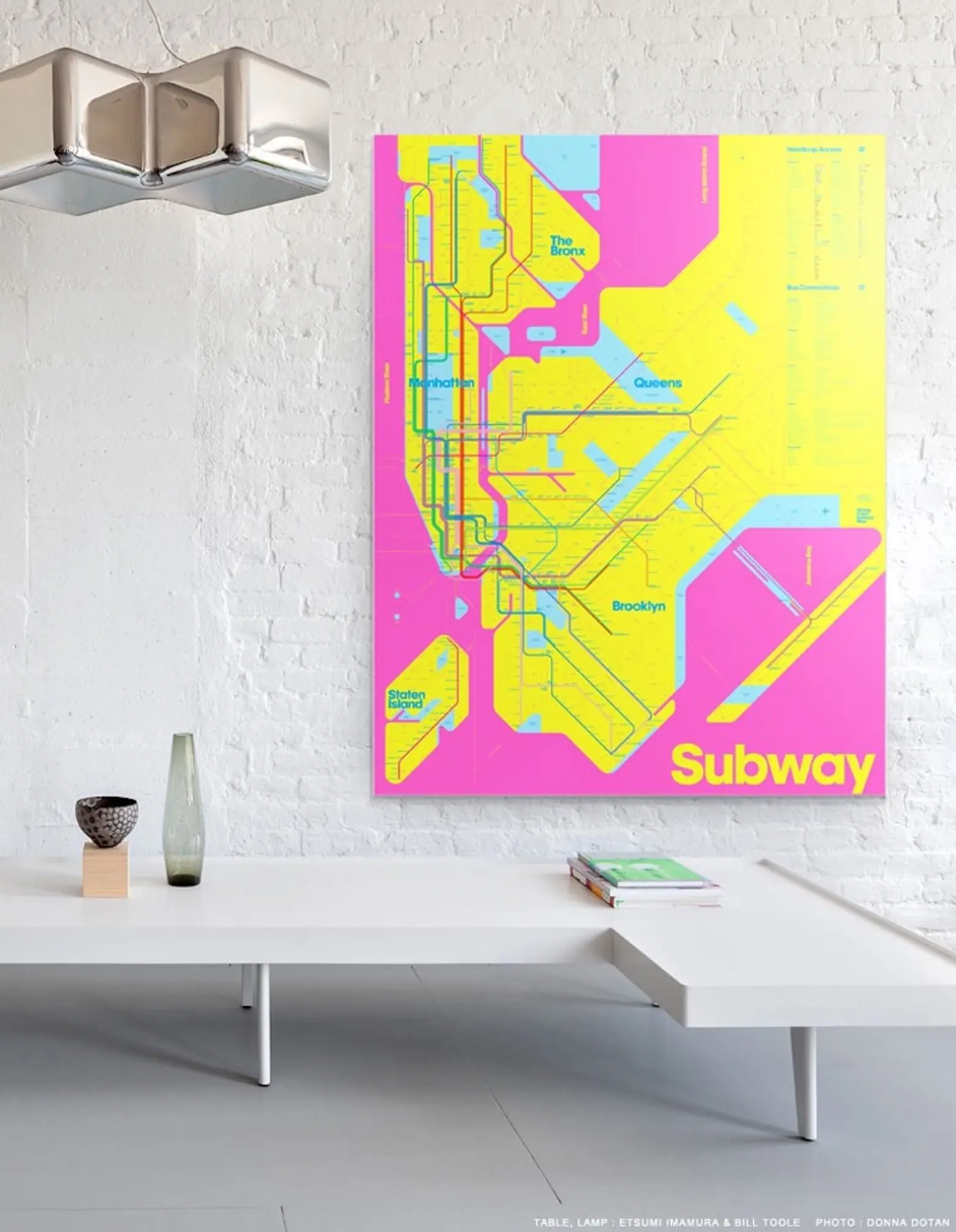
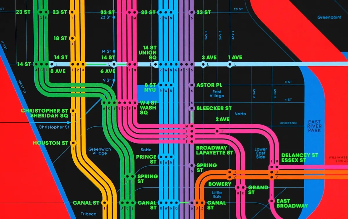
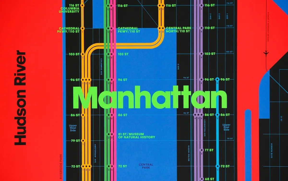
Six years on, Triboro’s Wrong Color Map adds more colors and a custom typeface. The pair test drove hundreds of different color options before choosing two versions based on the RGB (red, green blue) and CMY (cyan, magenta, yellow) color systems used in art and design. “We chose the most inappropriate colors we could think of,” they said. They attempted to keep the map accurate as well, distorting and reshaping the area’s geography to “fit everything in.” They even future-proofed the map by including the coming-soon 2nd Avenue Subway line.
Heasty describes frustration with the actual subway as no small inspiration, citing the way lines seem to quit service almost at random, though he continues to find it “a fascinating place where people intermingle and squish together, and it’s awesome and infuriating at the same time. As designers, we know we can’t solve the larger issues, but instead we can give commentary on the subway and the idea of confusion in an art piece.”
Check out the maps and more at Triboro.
[Via WSJ]
RELATED:
- ‘City of Women’ turns the subway map into an homage to the city’s greatest females
- Map Enthusiast Creates a More Geographically Correct Version of Vignelli’s Old Subway Map
- New Interactive Subway Game Lets You Build the Transit System of Your Dreams
- Map Mashup: The NYC Subway System Gets Re-Stylized as The London Tube