Map Enthusiast Creates a More Geographically Correct Version of Vignelli’s Old Subway Map

For anyone in the world who’s ridden the New York City subway, they’ve undoubtedly taken a curious gander at the system map, full of its rainbow-colored, crisscrossing lines. But what many riders may not know is that in 1972, a man named Massimo Vignelli was commissioned by the city to create a very different version of this map, immediately sparking controversy for its geometric simplicity and geographical inaccuracy. In 1979, Vignelli’s map was replaced with a more organic, curving version like we see underground today.
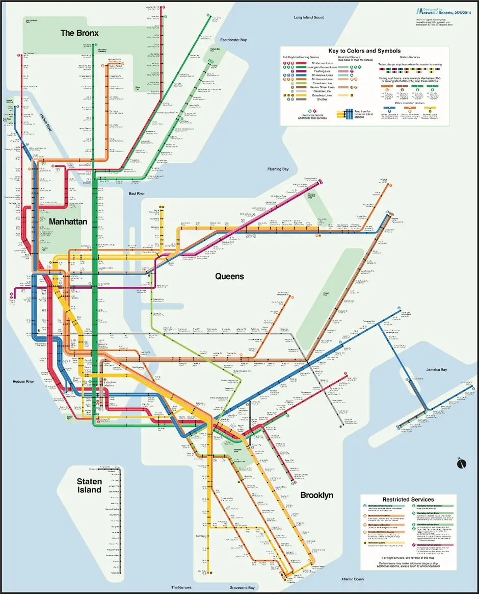
In 2008, the MTA commissioned Vignelli’s firm to update their map, and a new version was put online to serve as the Weekender, highlighting weekend service changes. But now, underground map enthusiast Max Roberts has gone one step further, and claims he’s come up with a perfect compromise between the Vignelli work and the MTA’s signature map.
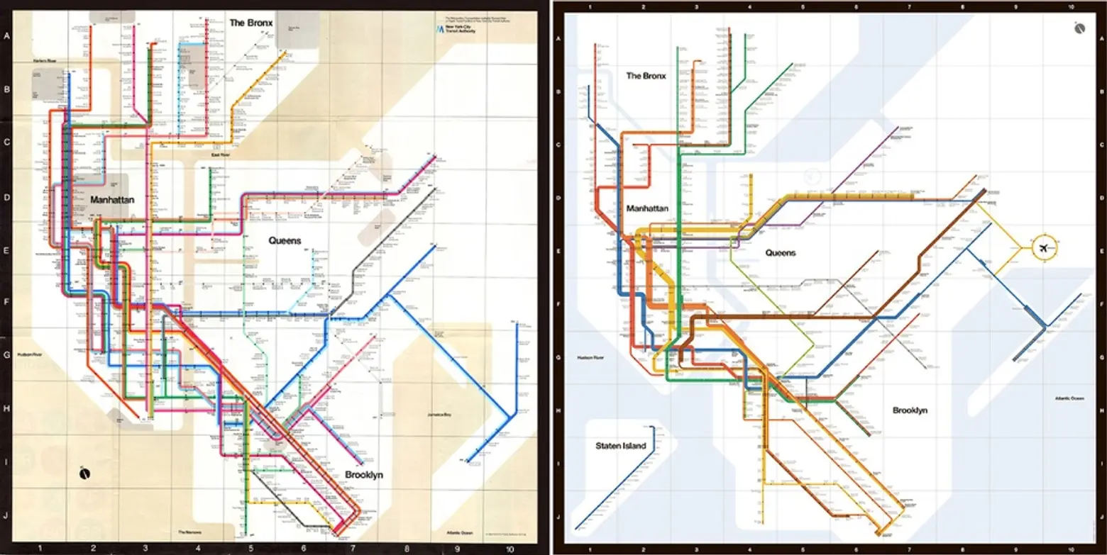
Images courtesy of MTA: Left- Vignelli’s 1972 map; Right- 2008 Vignelli redesign
Roberts, who has designed nearly a dozen unofficial MTA maps, incorporated into his most recent creation many of Vignelli’s signature elements, including geometrically shaped boroughs, tightly kerned Helvetic font, and side-by-side straight lines. But, Roberts feels his version more accurately represents the subway routes and surrounding landscape. It also displays water as blue and outdoor space as green, not previously done by Vignelli. He also thinks it’s a better compromise than that which the MTA undertook in 2008, asserting that version overcomplicated the original work.
The biggest gripe with Vignelli’s 1972 map was that station locations and line trajectories were not aligned with reality. Roberts utilized city street maps to accurately locate stations. He also veered from Vignelli’s 45-degree angles, citing that in New York the paths are typically steeper or shallower, and incorporated 30- and 60-degree angles.
What do you think about Max Roberts’ redesign? At the very least, we’ll never stare at that subway map the same again on our commute to work!
[Via City Lab]
Lead Image: Roberts’ redesign; courtesy of Max Roberts