‘X-ray’ subway station maps help navigate NYC’s complex underground paths
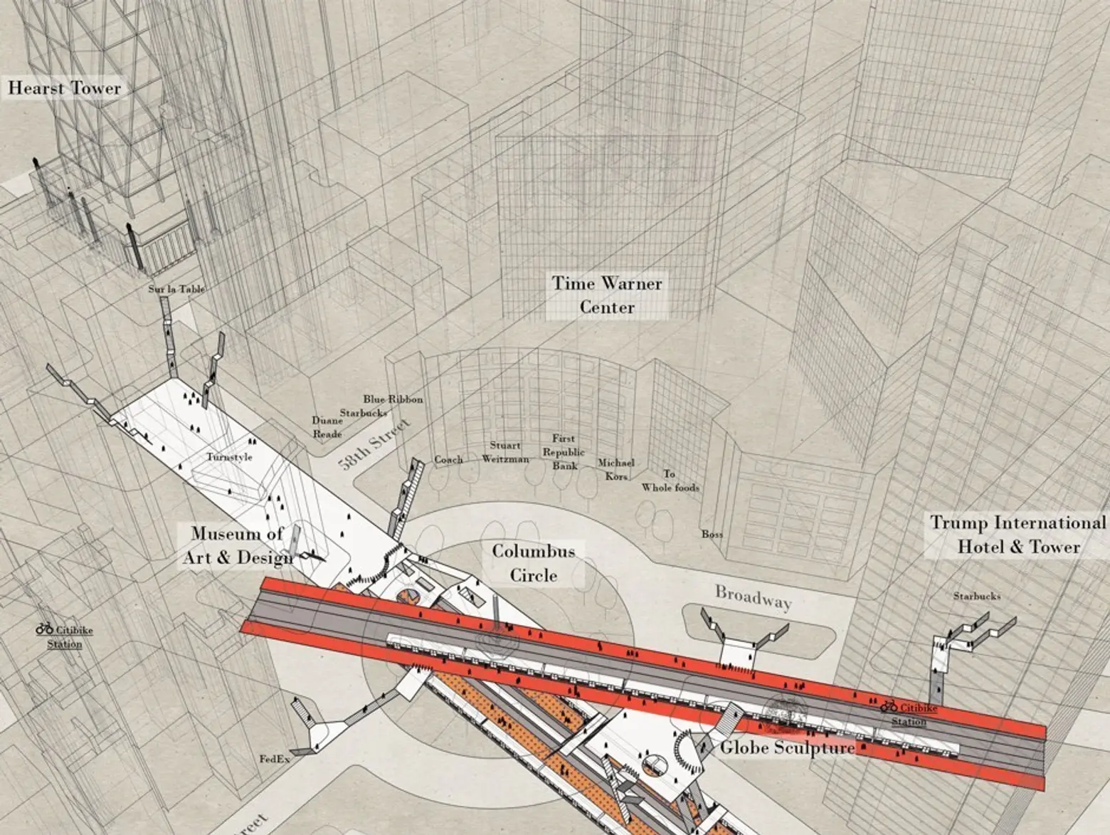
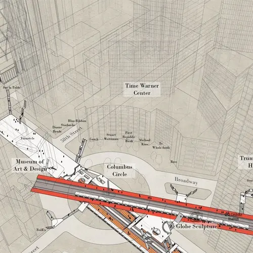
Sketch of 59th Street-Columbus Circle via Candy Chan
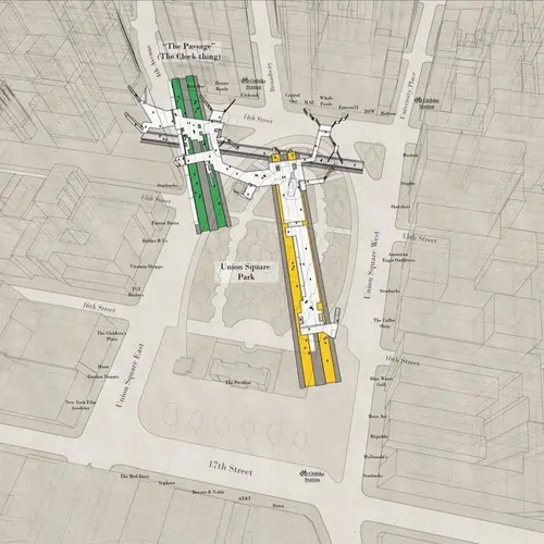
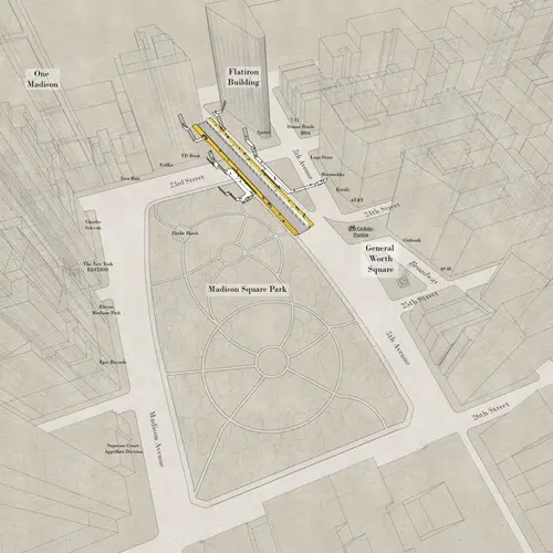
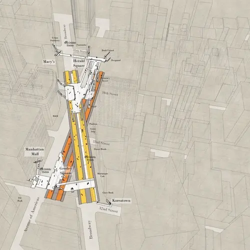
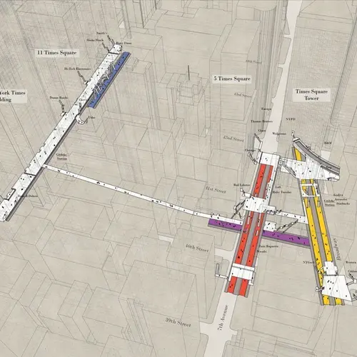
While the official map of the New York City subway clearly labels which station comes next, it’s not very good at showing the actual geographic distance between stations or what the paths and tunnels look like in order to take the right exit. Like many New Yorkers, architect Candy Chan developed a love-hate relationship with the subway. As CityLab shares, after feeling constantly lost when trying to navigate the city underground, Chan created Project NYC Subway, which includes photographs, architectural drawings, and a series of three-dimensional sketches that display what the complex stations really look like.
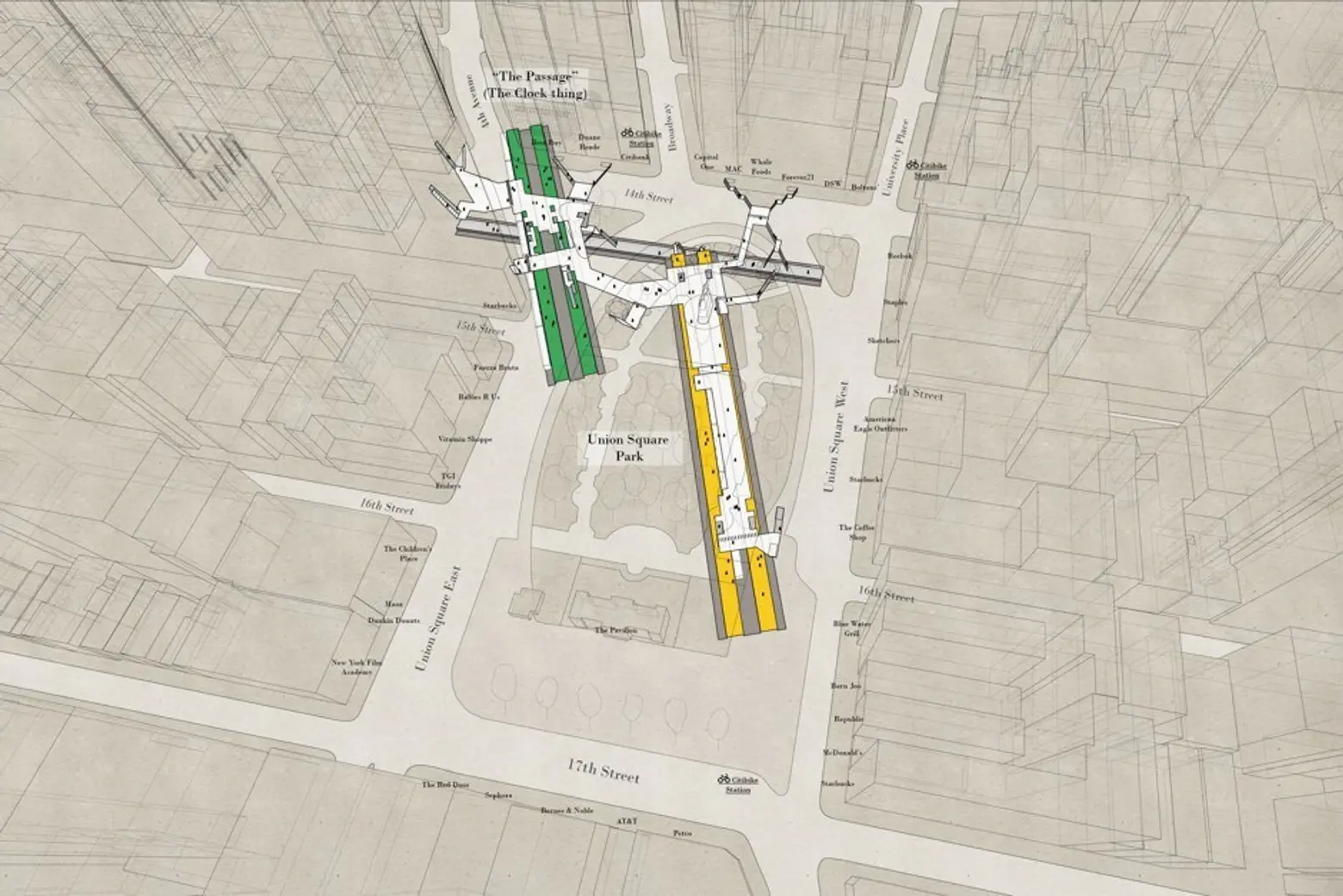
Sketch of 14th Street-Union Square via Candy Chan
Chan was inspired by subway stations in Hong Kong, where she’s originally from, as each exit there is labeled with both a letter and a number. She then began visualizing subway stations for her project in 2015. Now, adding to her work, the architect added additional drawings of people and buildings for scale, sculptures, and parks.
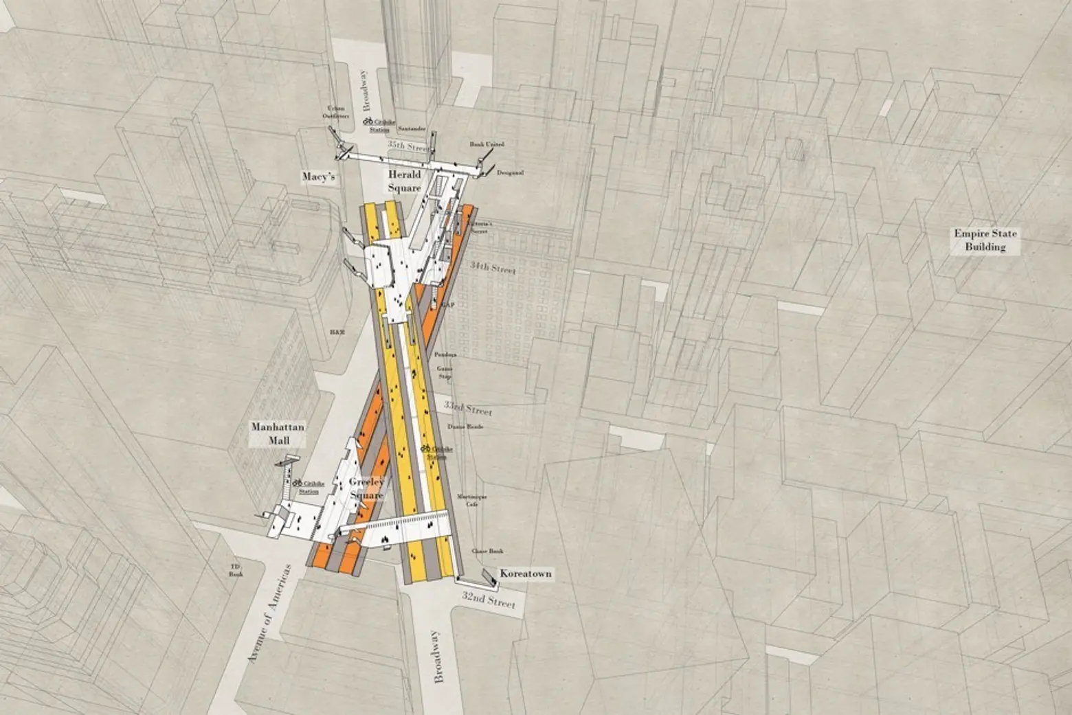
Sketch of 34th Street-Herald Square via Candy Chan
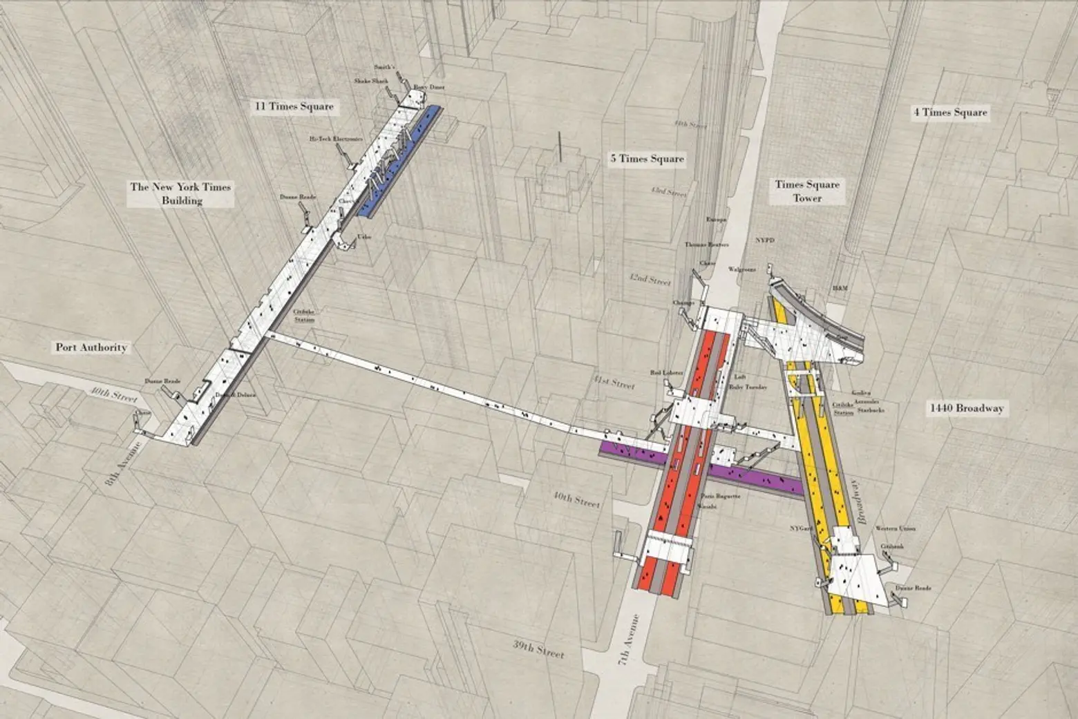
Sketch of 42nd Street-Times Square via Candy Chan
Chan told CityLab: “At the beginning, my focus was on the station themselves, because I find it very disorienting to be in one of the bigger ones. Once I had about 20-something stations done, I started to look at how they relate to the city.”
The maps are aimed to help visitors and long-time New Yorkers navigate the system more efficiently, while also providing city agencies with more information about how people use urban spaces. Chan hopes to expand her maps into Brooklyn soon, and perhaps in the future, create an app of her diagrams to make them more accessible.
Chan’s drawings can be purchased through the Project Subway NYC website found here.
[Via CityLab]
RELATED:
- The ‘map distance’ vs. the ‘geographic distance’ of the NYC subway
- Crowd-sourced maps show where tourists and hipsters land in every big city
- Interactive map reveals how your daily commute time compares with the nation’s worst
All sketches courtesy of Candy Chan’s Project Subway NYC
Interested in similar content?
Leave a reply
Your email address will not be published.









This would make a nice iOS app