Vintage maps reflect the population distribution of Americans in 1930

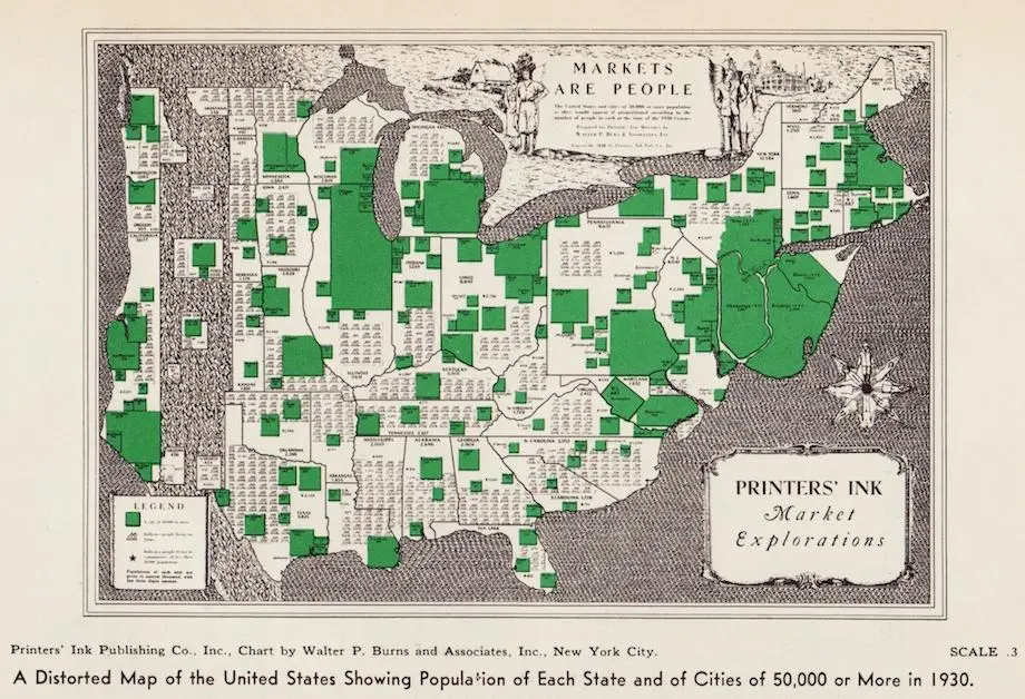
Map of U.S. with population of each state and of cities of 50,000+(Printers’ Ink Publishing Co., Inc., Chart by Walter P. Burns and Associates, Inc., New York City)
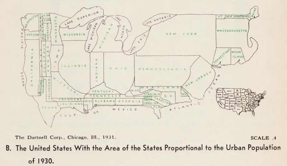
Using the 1930 census for their data, two distorted maps show where residents in the United States lived during this period of time. Both vintage cartogram maps exhibit how bunched Americans were in the north and the east coast, clustered in urban areas, despite the westward expansion of the previous century. As the Making Maps blog first featured and as Slate discovered, the size of New York and New Jersey grows in proportion to its expanding populations, moving further east into the ocean.
U.S. with the area of the states proportional to the urban population of 1930 (The Dartnell Corp., Chicago, Ill., 1931)
Map A, “Markets Are People,” is a distorted map of the U.S. which shows the population of every state and marks cities with more than 50,000 residents a bright green color. Map B changes the size and shape of each state to reflect its urban population proportionally.
Designed before the post wartime population boom, both maps exhibit a relatively small California, Texas and other states out West. Plus, the southern states on the second map are barely visible, reflecting their small urban populations at the time.
The maps originally helped businesses and advertisers tailor their efforts to their target consumers. The publishers of a New York journal which catered to marketers, Printers’ Ink, commissioned the first map. The second map was first produced by the Dartnell Corporation, a Chicago-based firm that published handbooks for marketing departments.
[Via Slate]
RELATED: