The Real MTA map shows only the subway lines that are currently functioning

Screenshot from realmta.info at approximately 3pm on Wednesday, March 7th (during the impending nor’easter)
There’s been a lot of recent attention about the deterioration of the New York City subway, both in ridership and service. And, in the past, the subway map has done little more than inspire some cool art. Real-time information that could be very useful to riders, like a major delay or line shutdown, is only accessible “live” once you have already swiped your card and arrived on the subway platform. What good is it then? Now, thanks to web developer Eric Markfield, from Unfounded Labs, the Real MTA map, “a realistic subway map,” provides an up-to-the-minute, visual representation of any delays, service changes or planned work (h/t Curbed).
Any line that is experiencing delays disappears from the map. A clickable side panel links to an official MTA status report that details the problem.
Speaking to his inspiration, Markfield said, “As a New Yorker, I experienced the usual subway frustrations mounting in the recent years. I figured, I’m a web developer and the MTA publishes this open data and although there are good apps out there, I wanted to do something simple, playful and instantly understandable to give an idea what would the subway would look like if it would really working.”
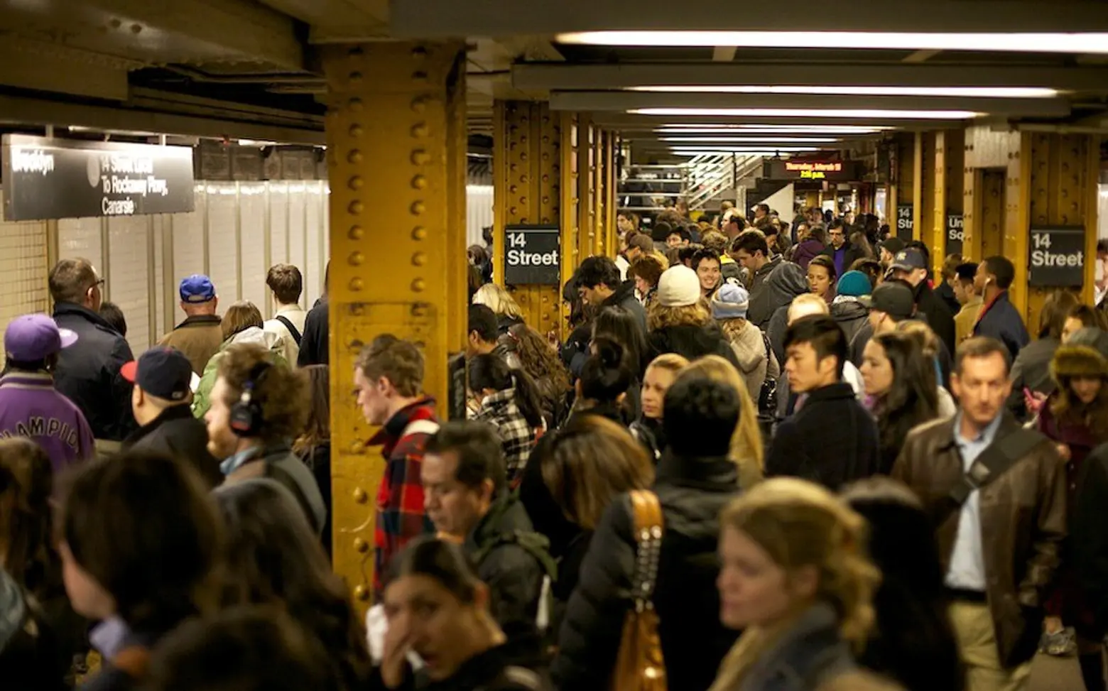
Markfield points out that there are often many ways from point A to point B in NYC. He believes many others would follow his lead and be happier to find an alternate route if it makes for an easier commute. “I’m happy to go out of my way to have a more pleasant subway experience. I don’t mind adding 10 minutes to my ride, walking a little more, or riding a Citibike to another stop, to avoid being so crammed.”
There is also a Twitter account, although it only updates twice a day so that sort of takes the “real” out of “real time.” But Markfield acknowledges that not everyone has the time to check multiple sites, “so if they’re already on Twitter, I have it update at top commuter times to give them a snapshot.”
Only live a few days, Markfield says the response has been great. “It really validates people’s frustrations. It’s part commentary and part tool.”
When asked, Markfield was open to the suggestion to expand the map encouraging rider input, a la Waze, and report other subway issues like stops with good live music or flooded stations.