This map of NYC’s subway distorts geography to give commuters more realistic arrival times

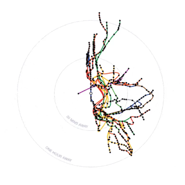
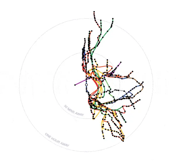
While the standard map of New York City’s subway from the MTA might be easier to read, it distorts the geographic distance between stops making it tough to really know how far apart they are from one another. Many designers and architects have taken a stab at creating more accurate maps to ease the struggle of subway straphangers. And now designer Nate Parrott has released his own interactive subway map that shows how many minutes it takes between point A and point B, as Co.Design reported. Click on a station and the whole map changes to show the travel time to reach every stop.
After a specific stop is selected, the map reorients itself to other stops on the map. Users can filter by weekday rush hour, weekday late night or weekend afternoon. Parrot told Co.Design in an email: “I love the idea of distorting maps to reflect what’s important—in most cases, and especially in New York, geographical distance isn’t.”
What makes Parrot’s map unique is its ability to tailor its map to each individual user. Instead of one standard version, this subway map distorts its geography in a way that’s actually beneficial for each rider. “I like the idea of having a ‘personal map’ based on where you live–in the digital age, there’s no reason everyone’s map should look the same,” Parrott said.
However, the map is based on the schedules and information from the MTA, which as too many New Yorkers know, has not been the most accurate as of late. But anything that aims to help get around the city a little bit easier is worth a try. Test out the interactive map here.
[Via Co.Design]
RELATED: