Artist uses the classic Vignelli design to reimagine the NYC subway map in concentric circles

Map via Max Roberts
Map via Max Roberts
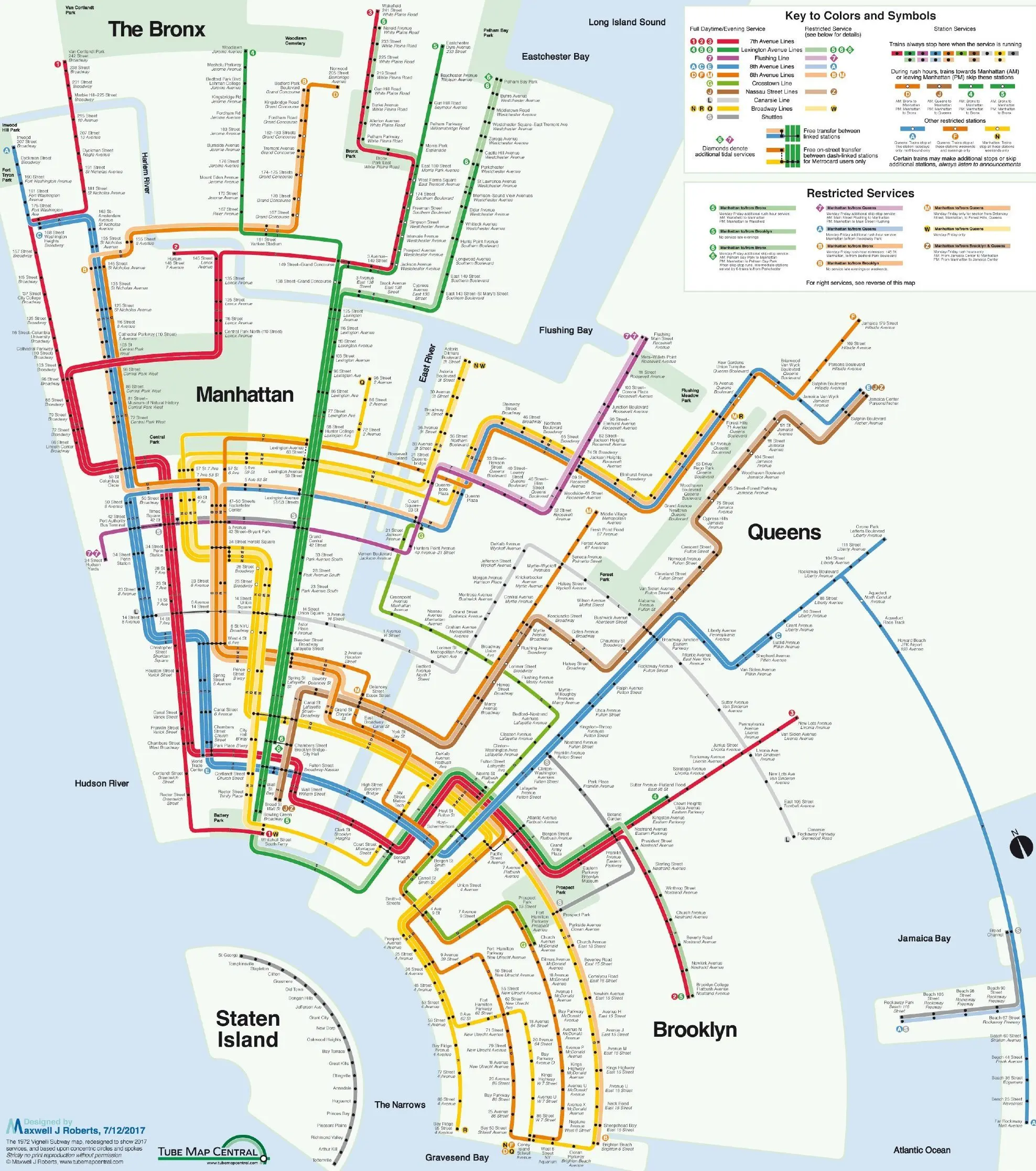
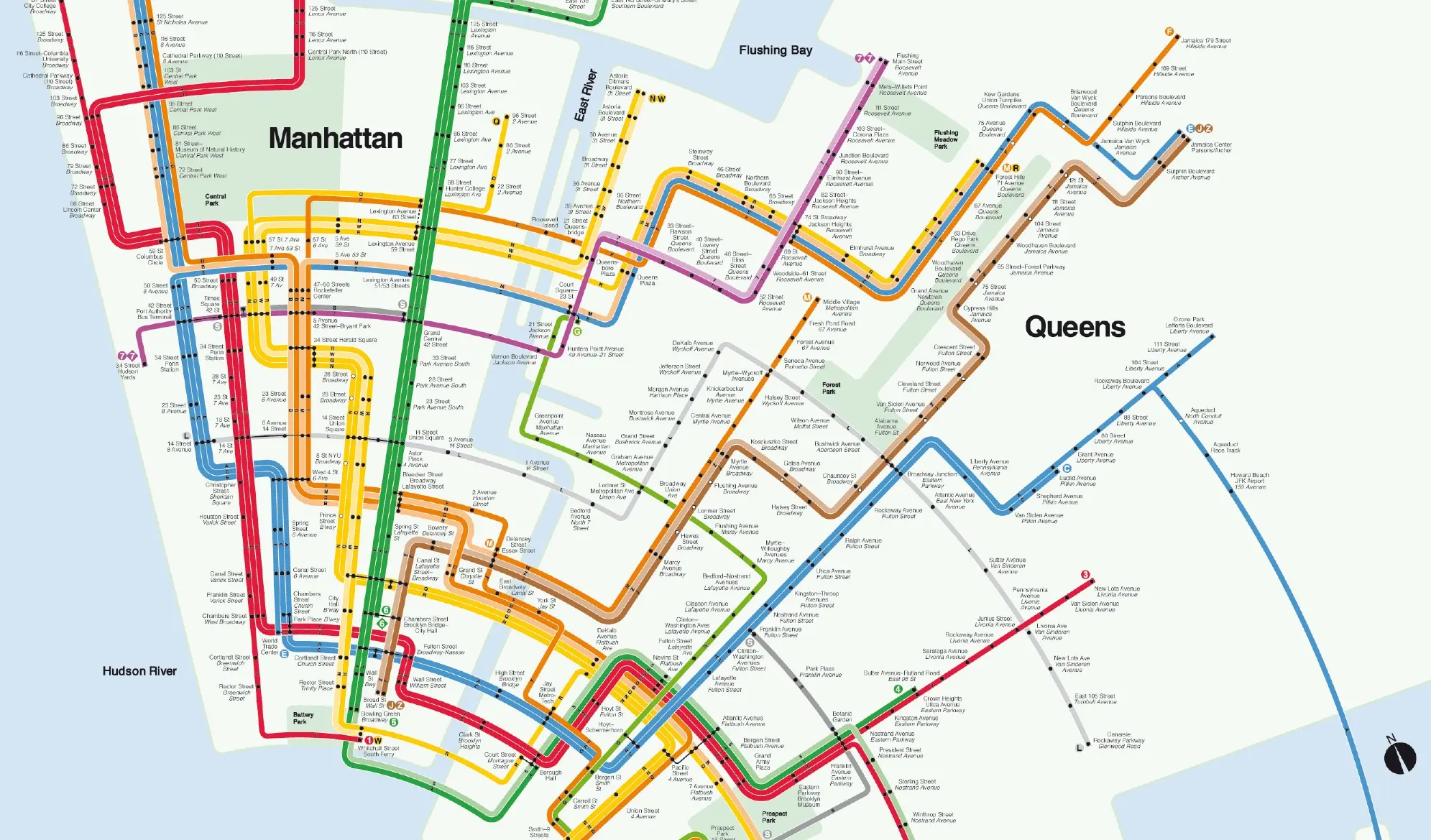
The classic NYC subway map is instantly recognizable–but what if you were to turn the design on its head? That was the thinking behind mapmaker and subway enthusiast Max Roberts, who wanted to visualize the city’s cohesiveness in a map that focused on aesthetics, rather than the angles and geographic accuracy New Yorkers are more familiar with. According to Untapped Cities, this isn’t the first time Roberts has experimented with a concentric design. A few years back, he released a map that re-imagined the tradition map in concentric circles. This latest version uses Massimo Vignelli‘s design, a distinctive map released in the 1970s in which each subway route is represented.
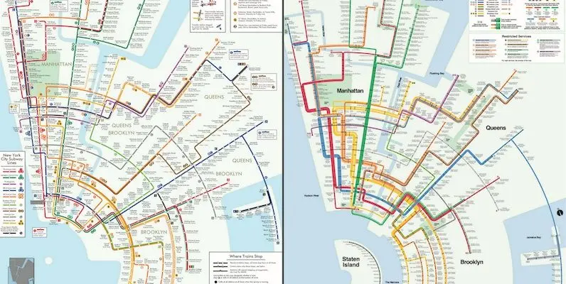
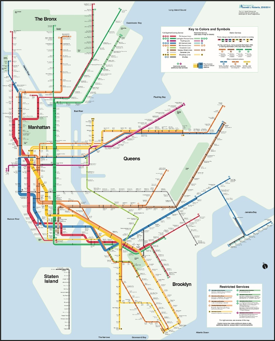
 Roberts’ original concentric circle map (left), compared to the Vignelli design (right), courtesy of Max Roberts
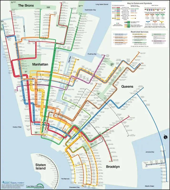
Back in 1972, Massimo Vignelli was commissioned by the city to create a different version of the subway map, and it immediately sparked controversy for its geometric simplicity and geographical inaccuracy. Vignelli’s map gives a line to each route–so, for example, when the 4/5/6 are on the same path before diverging, there’s a thick band of green to represent it.

According to Untapped Cities, the thickness of these bands made it difficult for Roberts to plot everything–he actually had to design Manhattan’s routes five times before he was satisfied. In both his early and more recent map, the layout starts in the southwest corner with Staten Island, working up through Lower Manhattan and going out toward the Bronx, Queens, and Brooklyn. All the station dots and information listed on all NYC subway maps are replicated here, except that the routes have been laid out in circular arcs.
Roberts was particularly drawn to Vignelli’s distinctive early map design. “The almost other-worldly power and marvelous precision of Vignelli’s original translate well to these design rules,” the artist said. “A good geographical map shows where the network is, a good schematic map shows how the network fits together.”
 Vignelli meets the MTA, courtesy Max Roberts
This isn’t the first time Roberts has tinkered with the subway map. A few years ago, he released what he thought was a perfect compromise between Vignelli’s work and the MTA’s signature map. It’s pictured above.
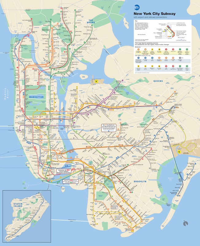 Classic MTA subway map, via the MTA
[Via Untapped Cities]
RELATED: