My 600sqft: Writer and food artist Emma Orlow fills her Bed-Stuy pad with JELL-O prints and ’70s kitsch

Our ongoing series “My sqft” checks out the homes of New Yorkers across all the boroughs. Our latest interior adventure brings us to writer, artist, and event producer Emma Orlow’s Bed-Stuy apartment. Want to see your home featured here? Get in touch!
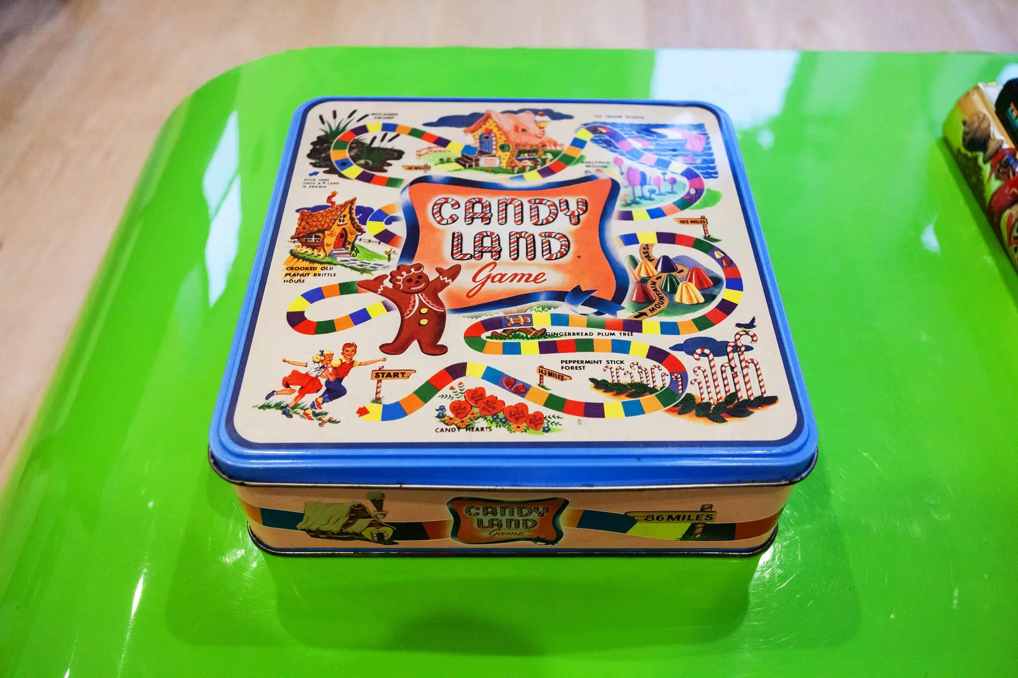
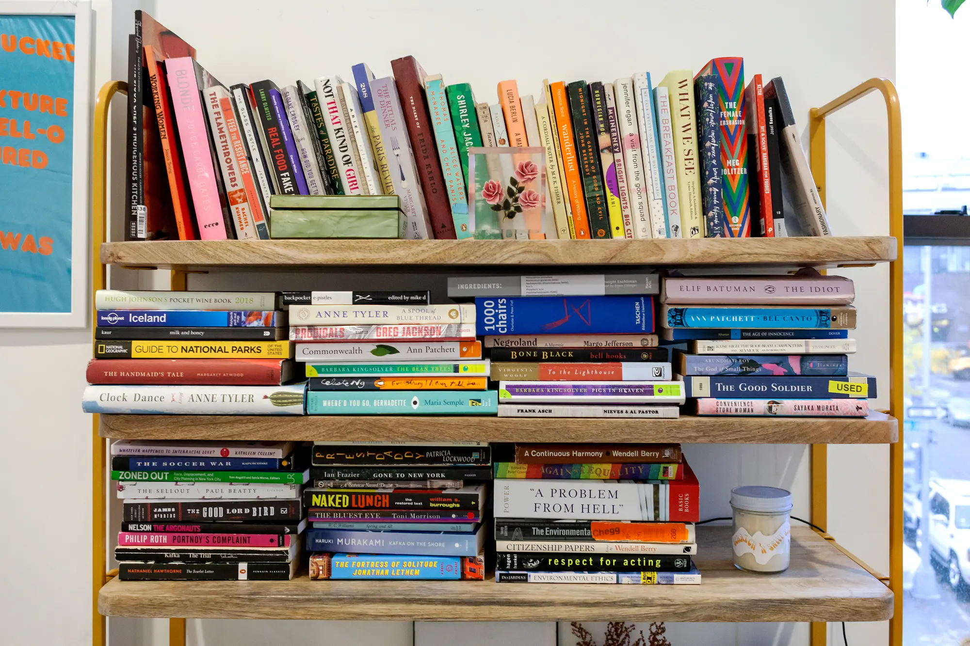
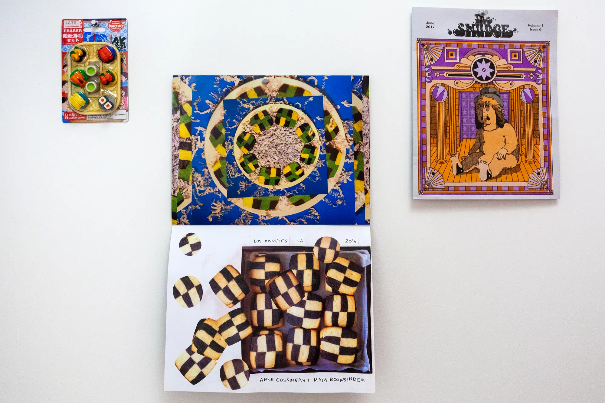
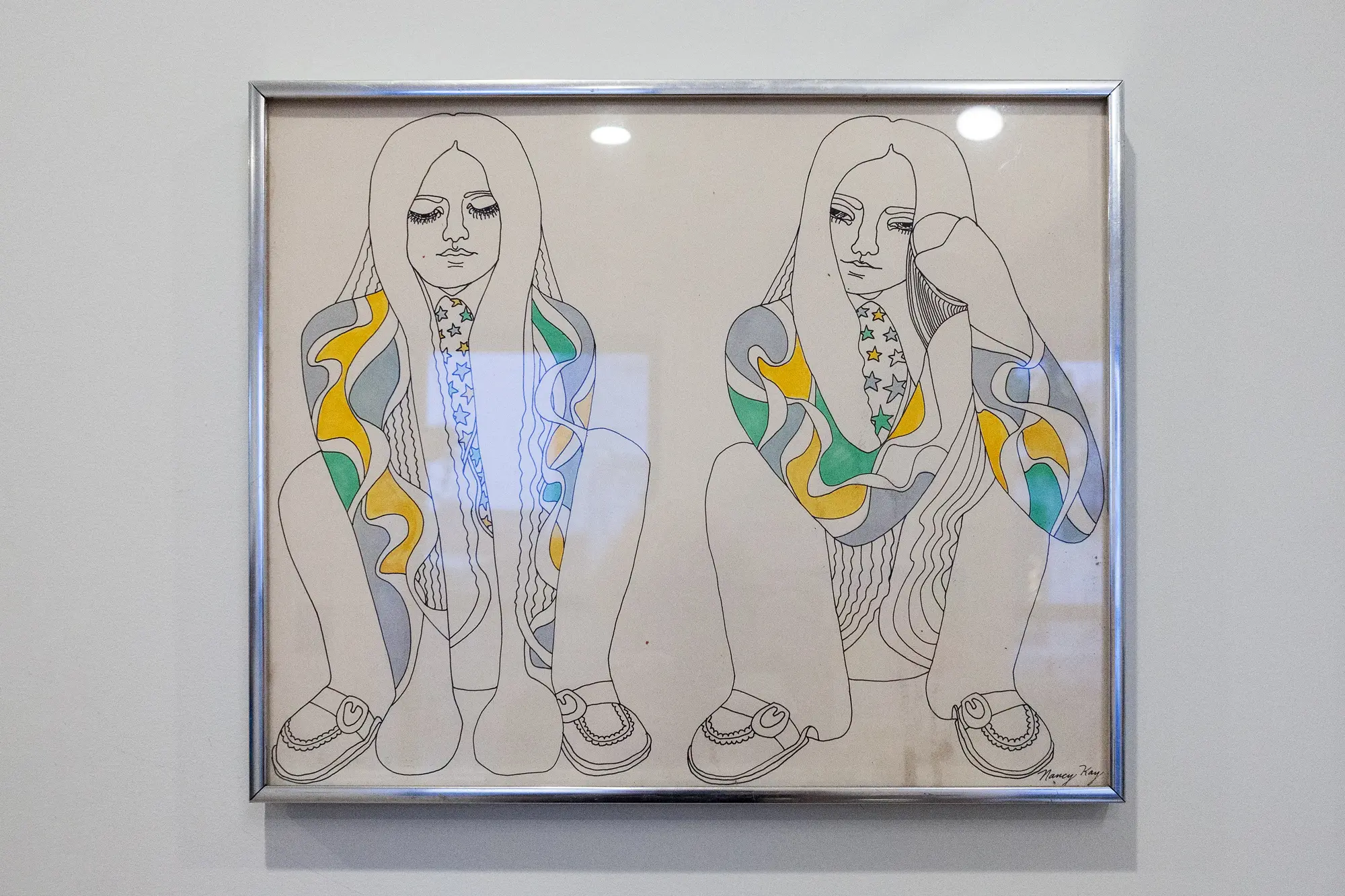
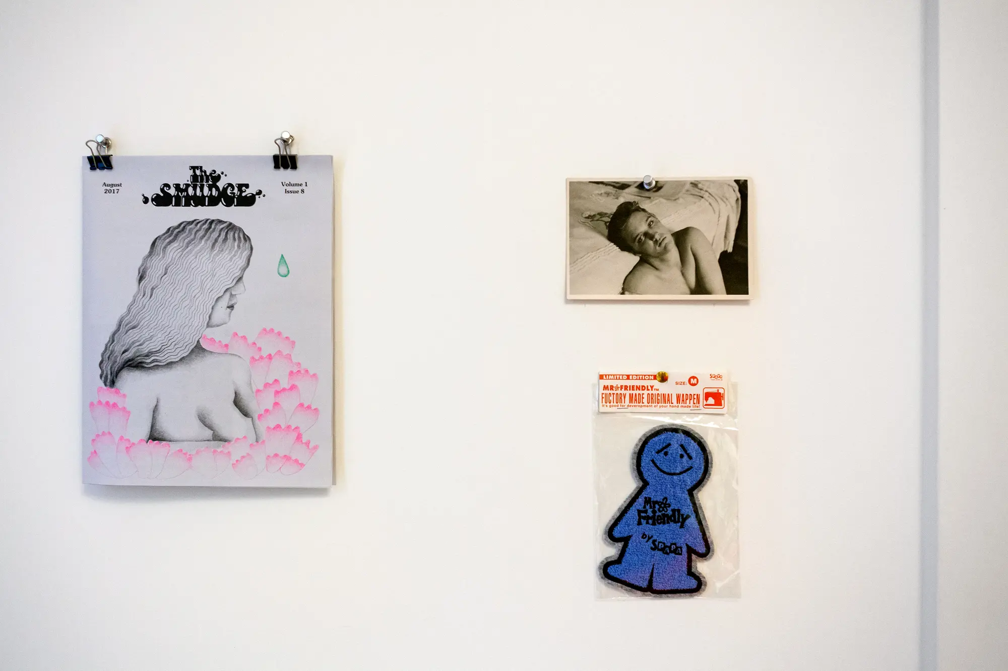
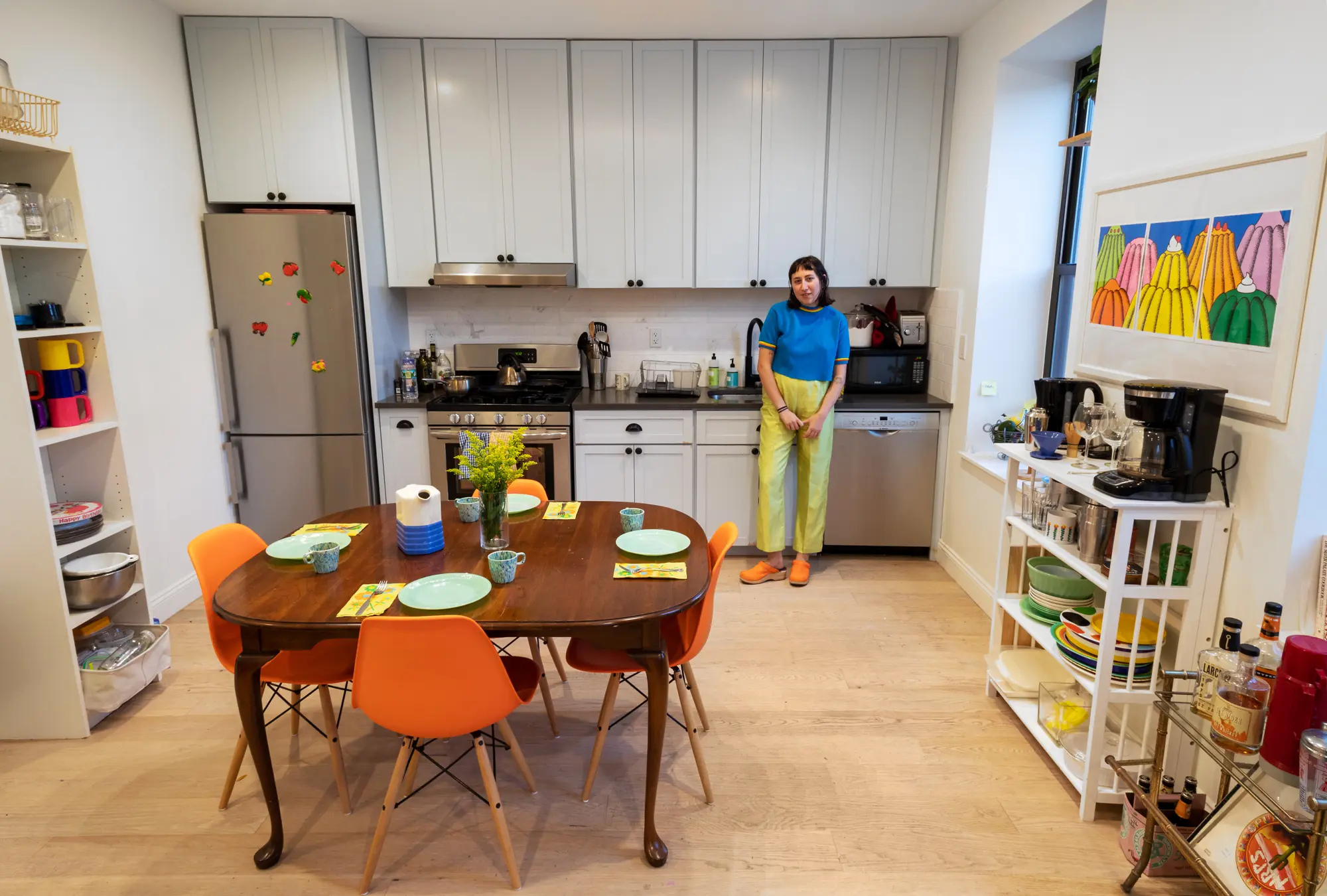
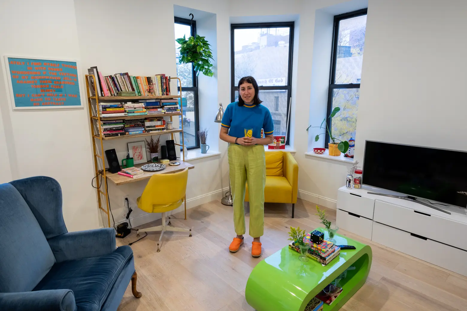
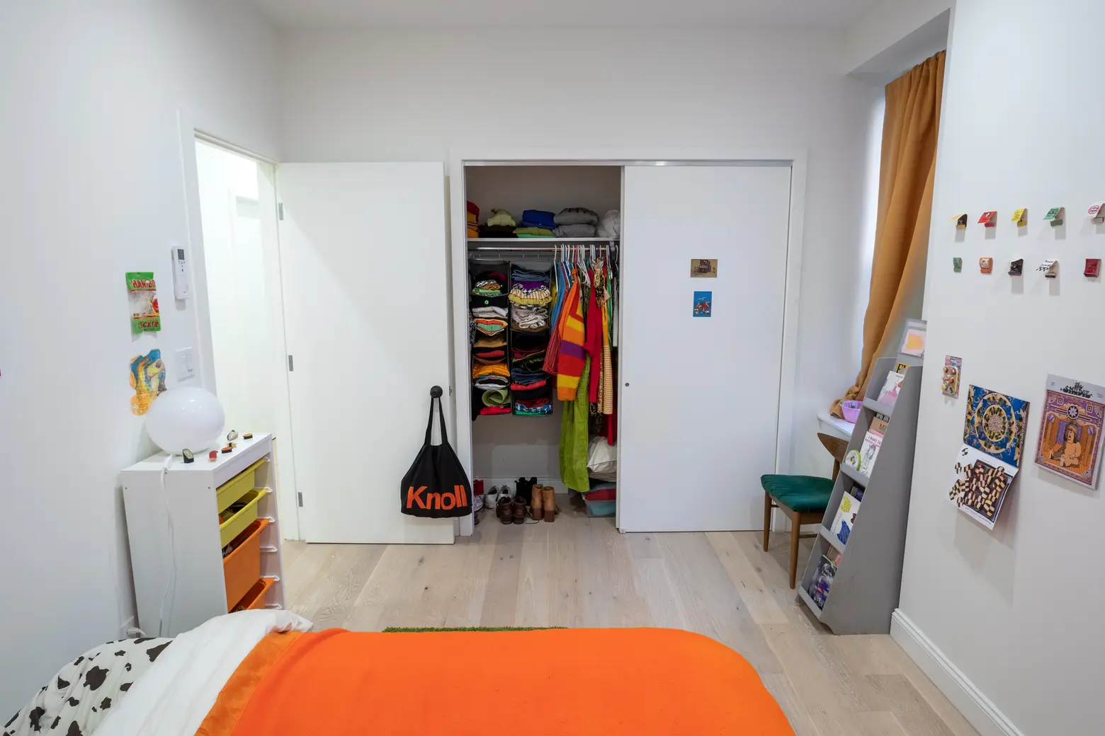
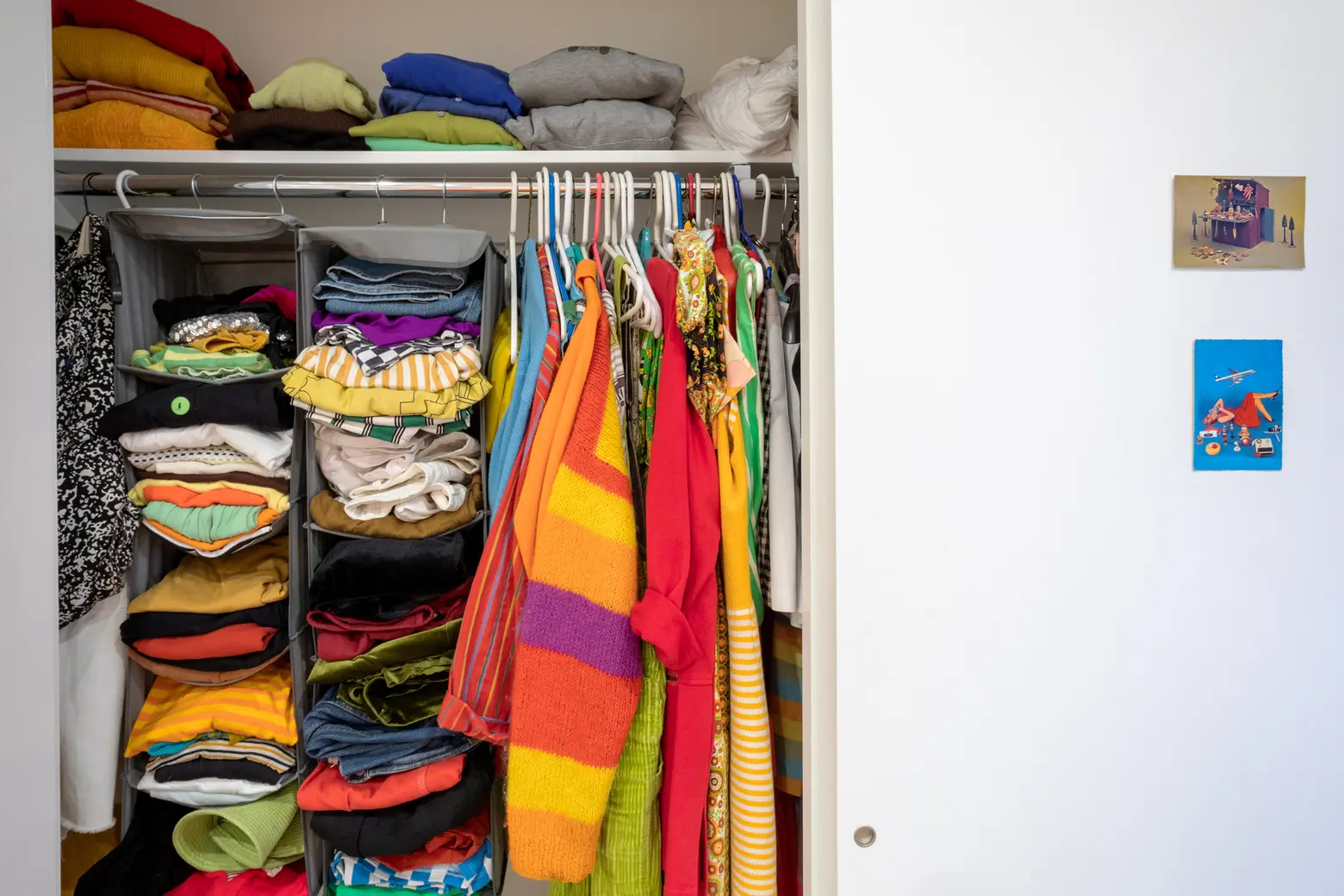
For most of us, our homes represent our personality generally, but for NYC native Emma Orlow, her Bed-Stuy apartment is a decorative translation of everything she loves and does. Part events producer, Emma has curated her space with yellow, bright orange, and lime green furniture and accessories, along with a mix of vintage mementos (her mom’s old NYC matchbook collection adorns one wall), stylish accessories (she counts among her favorite things a set of rainbow Massimo Vignelli mugs), and kitschy ’70s-era objects (see her retro Candy Land game). Emma also works as a food writer and artist working with food, another passion that can be seen throughout her home, from the JELL-O risographs to her beloved Japanese miniature food erasers.
6sqft recently paid Emma a visit and learned that you can’t help but smile when you walk into her space–or when you chat with her, for that matter. Ahead, take her apartment tour and learn what influences her creativity, where her fun decor comes from, and what simply she simply couldn’t live without.
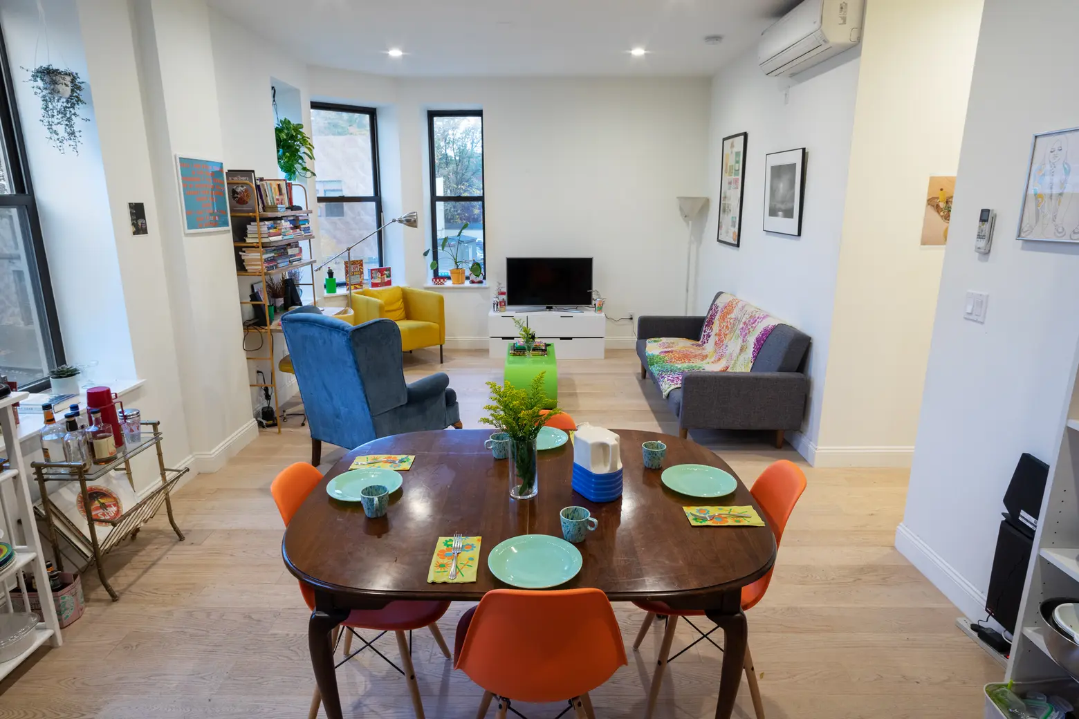
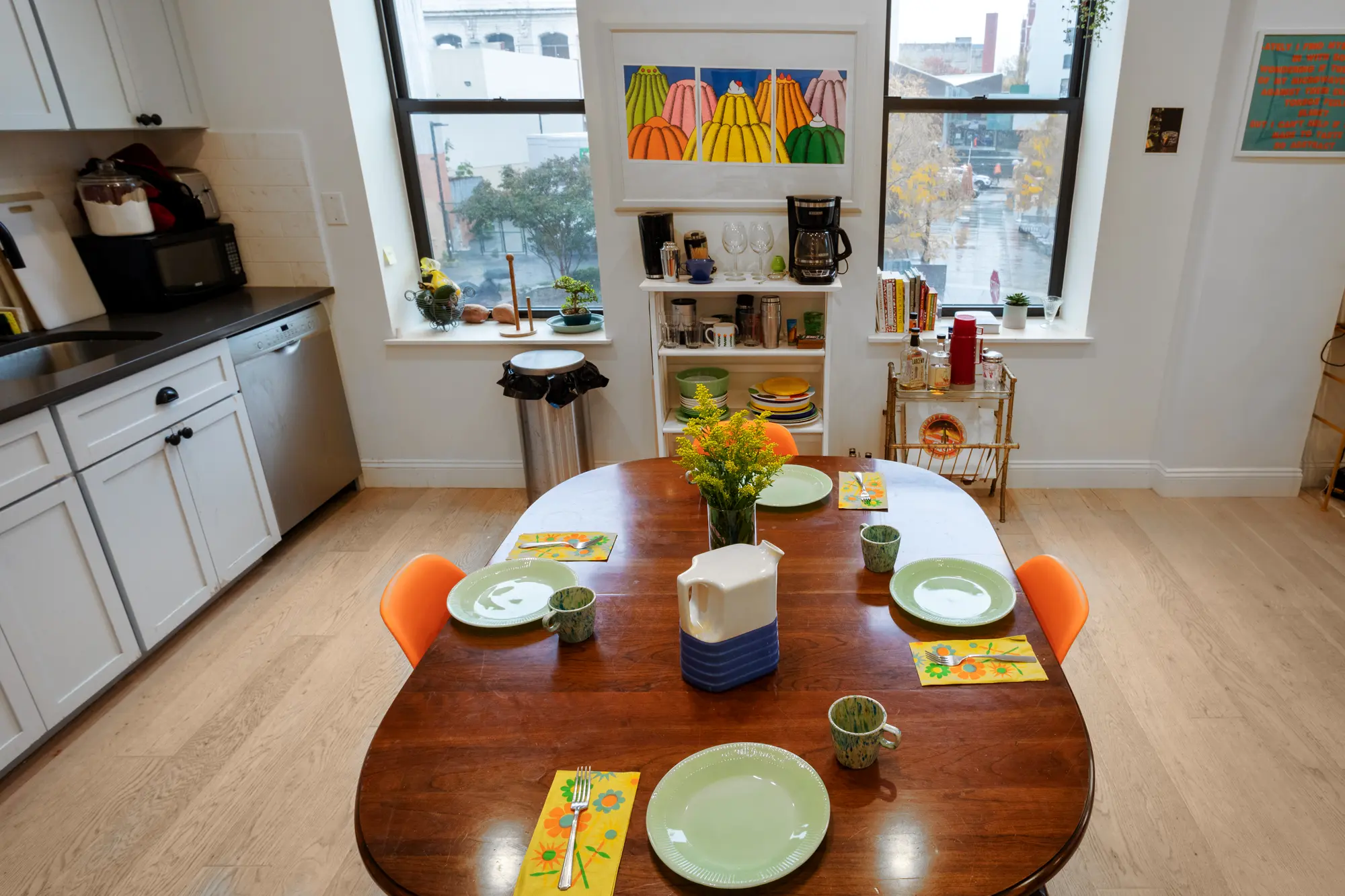
 The plates were Emma’s grandmother’s Kosher-for-Passover set. The dining chairs are from Overstock.
You mentioned that you grew up on the Upper East Side. Do you think having a Manhattan childhood sparked your creativity?
I feel really privileged to have grown up just a subway ride away from cultural happenings Downtown or in Brooklyn. My classmates growing up rarely left the Upper East Side, never took the subway, and rarely, if ever, went to Brooklyn. It was wild. I definitely feel a certain part of my creative interests developed from feeling so different from them and being disgusted by the displays of wealth. Both my parents grew up not at all wealthy in Flatbush/Boro Park, Brooklyn and Long Island City, Queens respectively. Growing up, my parents always encouraged me to travel to different neighborhoods, trying all the different specialty markets like Kaluystan’s in Little India or Kam Man in Chinatown and experimenting with new flavors, which really influenced my interest in food.
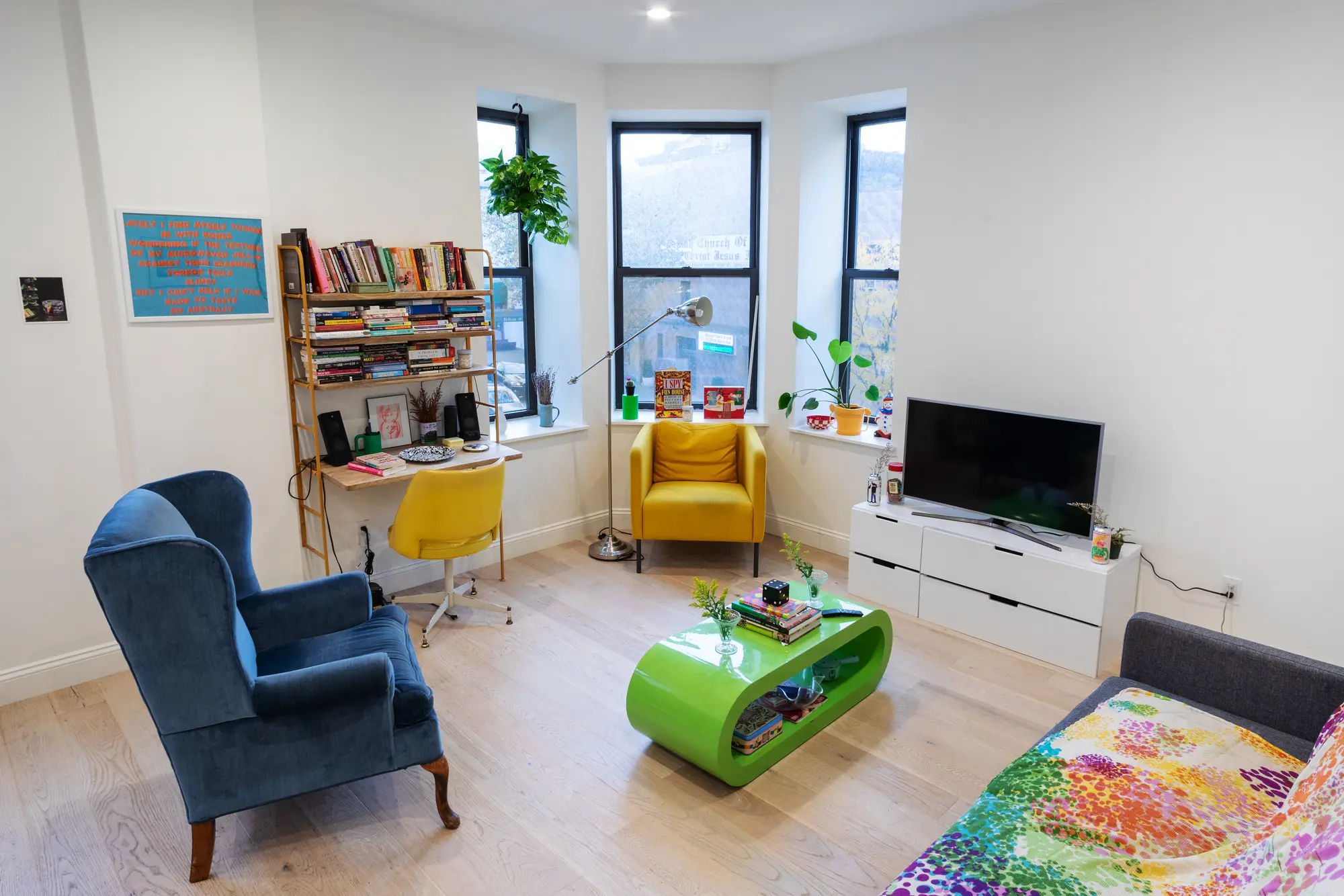
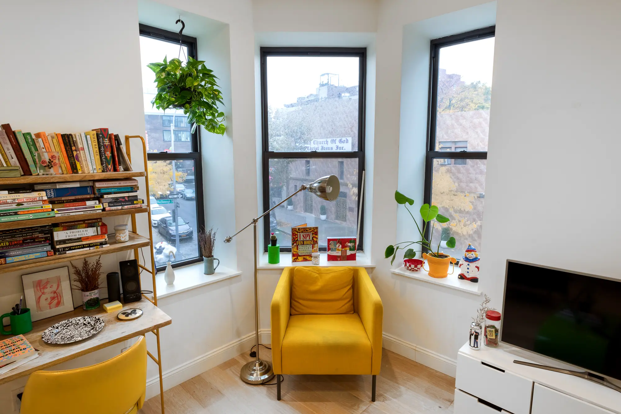
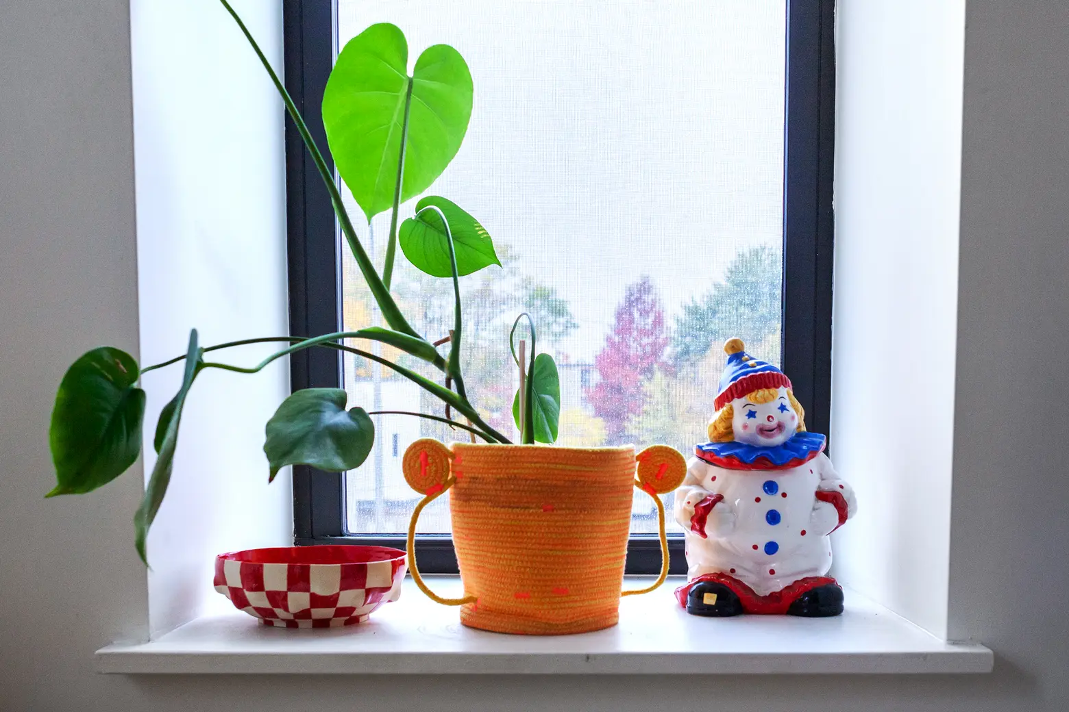 Emma found the blue armchair and the desk chair on the street. Above, the clown is a cookie jar.
Tell us a bit about your background and how you got into writing, food art, and event production?
My parents instilled in me from an early age a desire to support small local businesses and how fun it can be to just walk and walk for hours discovering new places. That’s sort of the core tenet of my writing–whether it’s about food or design, I am interested in using my platform to higher creative, hardworking people who don’t typically have a voice in the media, especially in a rapidly gentrifying city like New York where one day your favorite diner is there and the next it’s a Soul Cycle. I feel it’s especially important to write as a way to archive the city.
I write for publications like Grub Street, Vice MUNCHIES, and Architectural Digest, usually about food people with an artistic approach to their practice. At NYU, I went to a school where you sort of build your own major. Mine was a combination of food and museum studies (I called my capstone dissertation “Food Art as Body Politics”), which at the time really felt like peak existential crisis. I was like, I know I love the ridiculous subject of food art but how the hell could that turn into a job that both makes money and doesn’t feel frivolous? My interest in food as it interacts with design has led me to work in museums, kitchens, a children’s cooking school, creating edible installations for the Museum of Food and Drink and North Brooklyn Farms, combined with the writing that I do full-time.
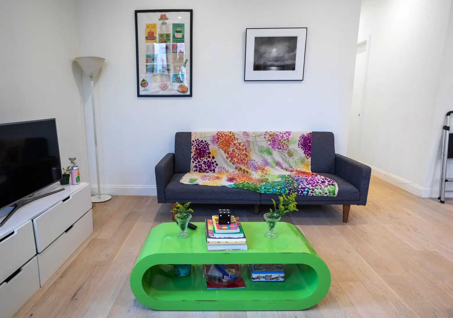


 The green coffee table is from Craigslist.
Any recent, cool projects you can tell us about?
I recently worked on an Art Basel event in the abandoned site of the former Burdines-Macy’s mall that tells the history of indoor shopping, through a multi-sensorial edible art experience. The mall where the dinner was has a really interesting history: Its president, Alfred Daniels, announced it would no longer refuse service to black patrons, in a time in 1960s Florida where Jim Crow laws were still in full force.
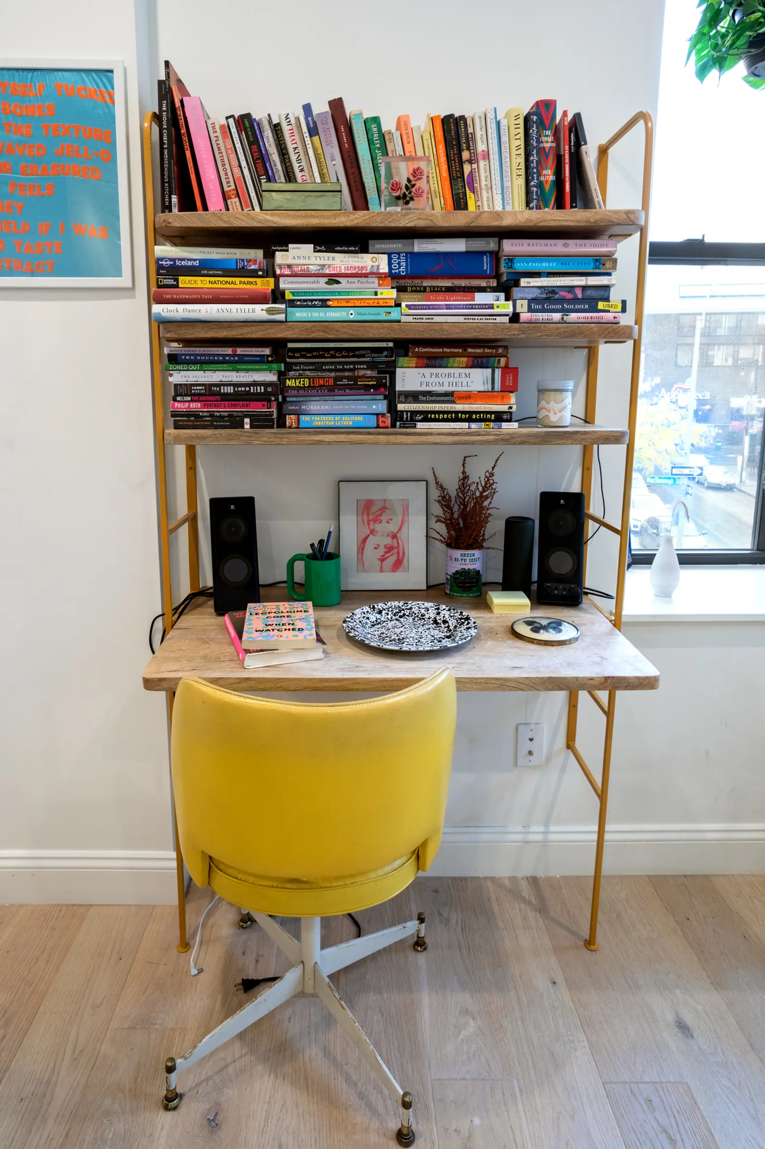
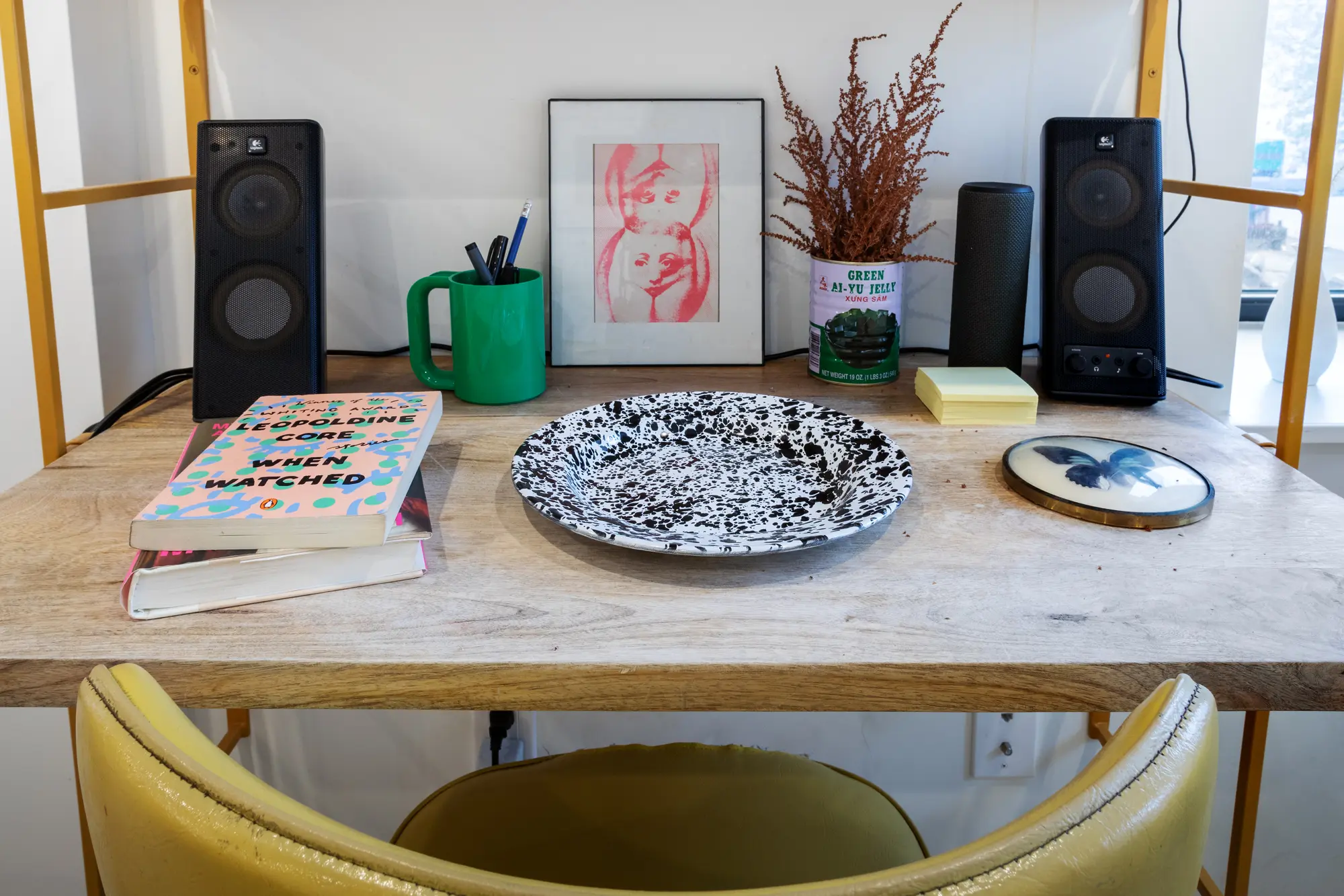
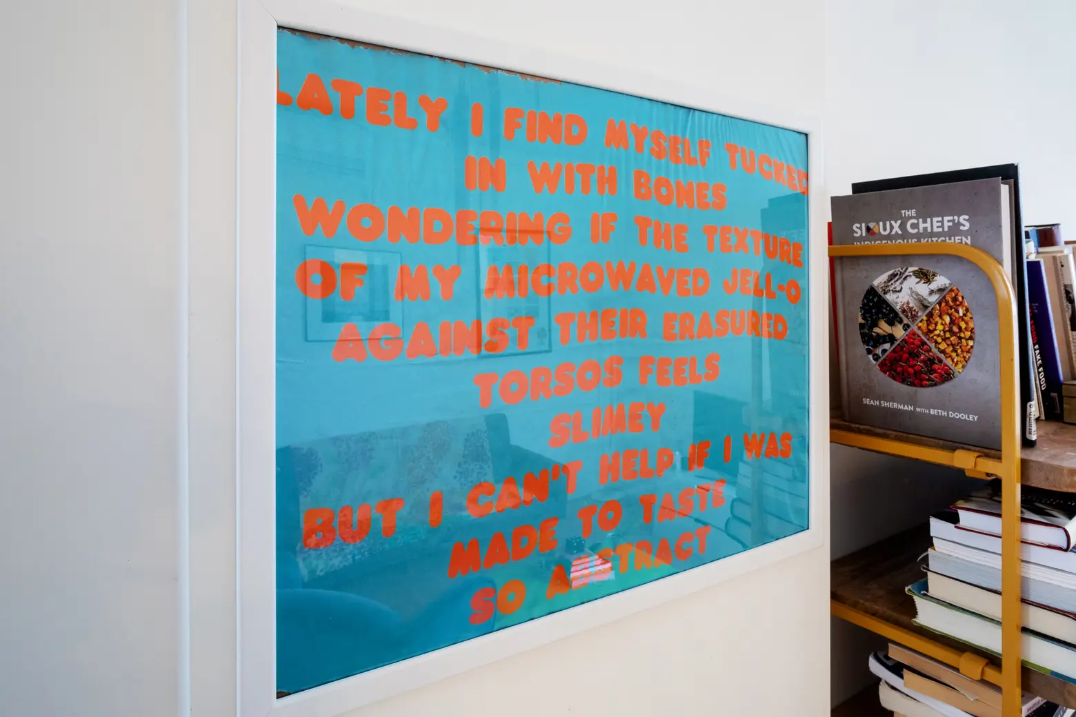 Emma made the text-on-silk art piece. She used to write a lot of poetry in relation to food.
What brought you Bed-Stuy?
I love Bed-Stuy for its history, warm community that’s been here for generations, beautiful architecture, and slower pace than Manhattan.
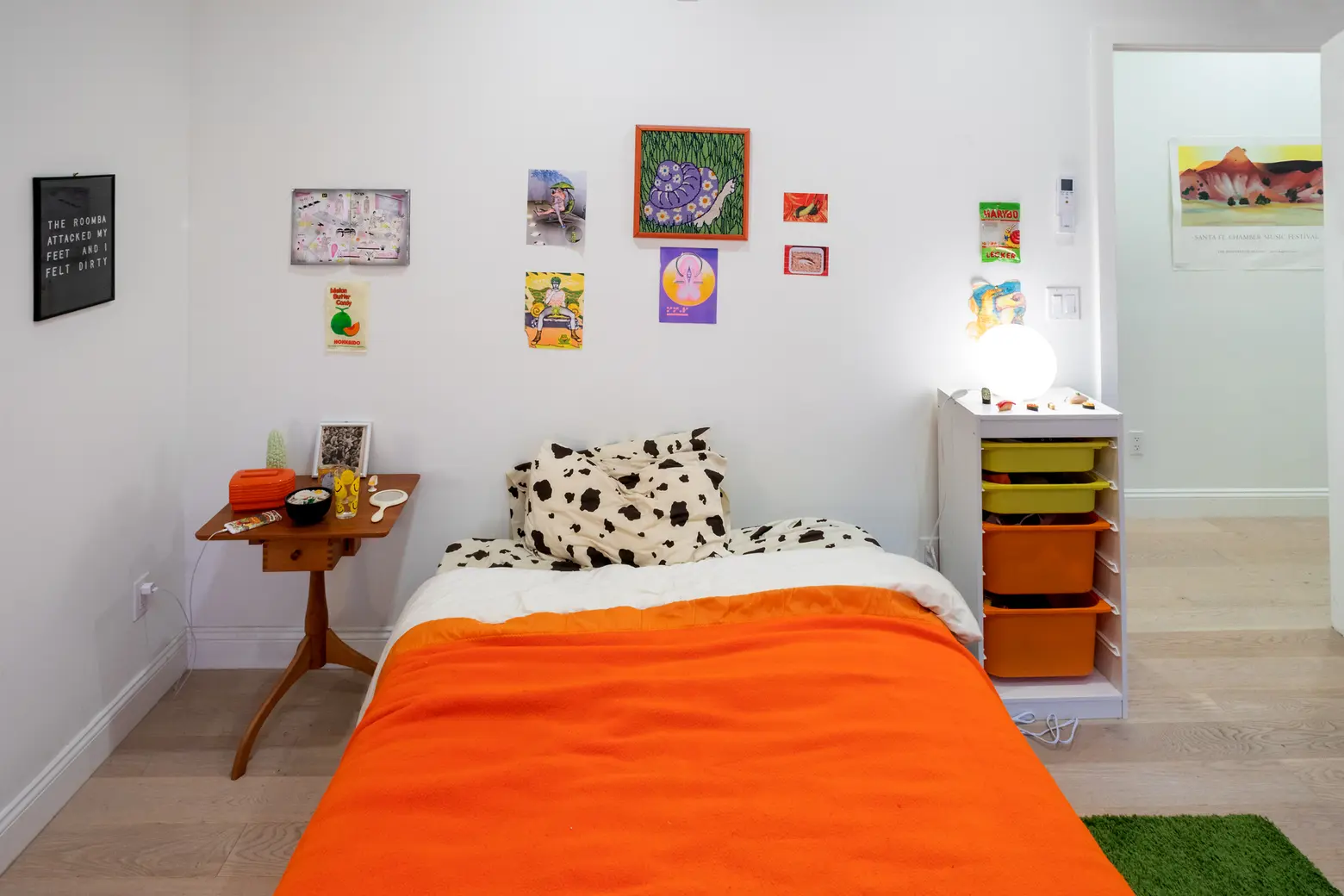
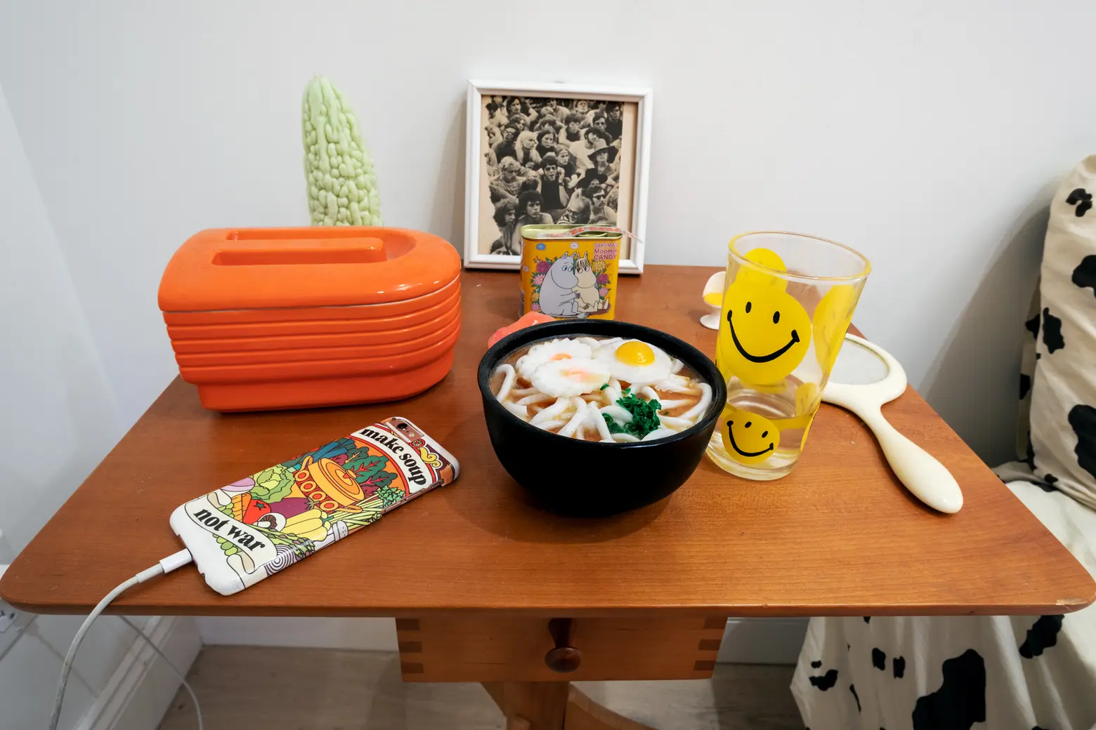
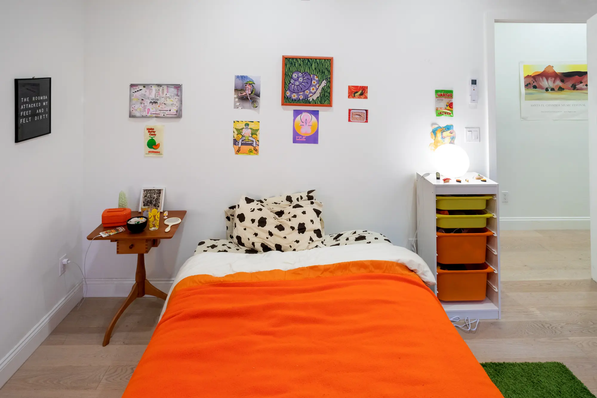
 The bedroom nightstand was in Emma’s house growing up. It’s from Hancock Shaker Village. The smiley face glasses were her grandmother’s; Emma remembers drinking lemonade from them as a kid. The udon bowl is a piggie bank.
Favorite spots in the neighborhood?
I love Doctor’s Cave Cafe (one of the most caring and wonderful business owners in the neighborhood. I love it for baked goods or to-go food) Bar Lunatico (jazz + drinks), Bed-Stuy Provisions (the new menu is really, really good!) and Lover’s Rock (the best place to hang out on early summer nights).

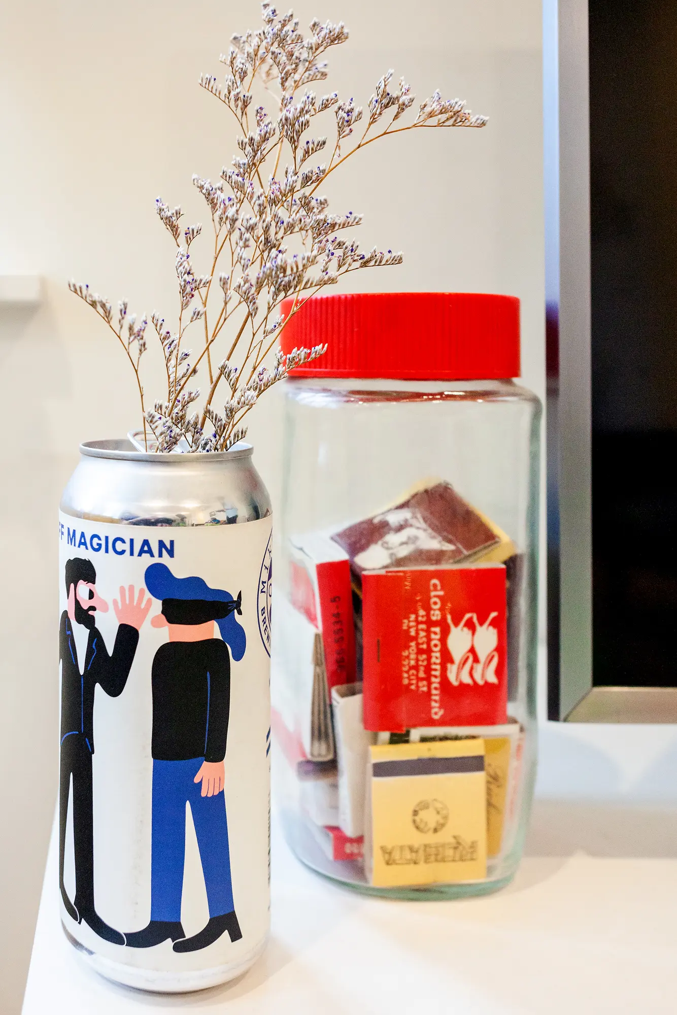
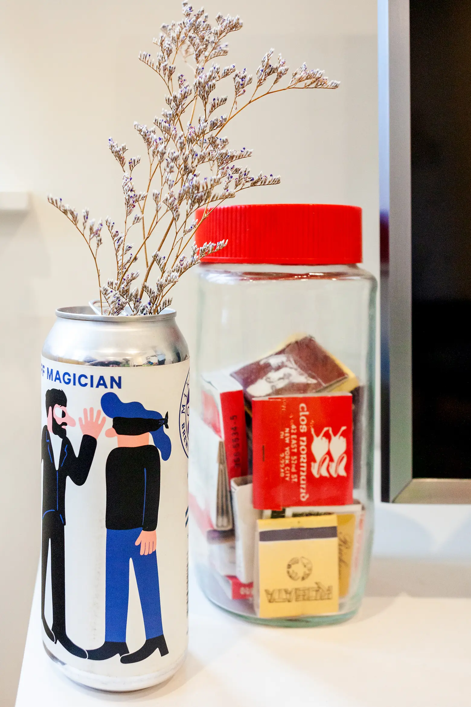
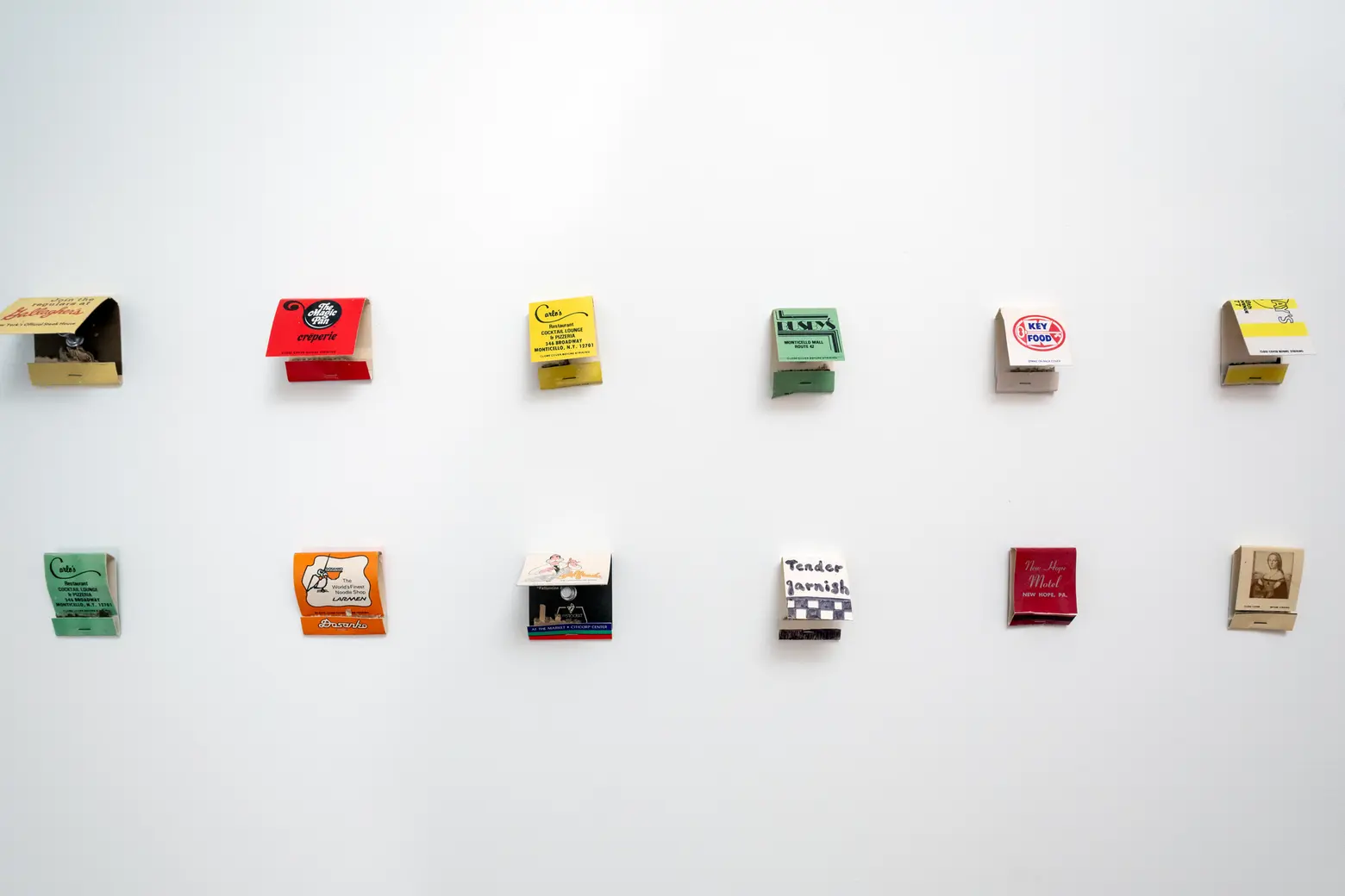 Emma’s mom used to write notes about each place on the matchbooks. None of the locations exist anymore.
Have you always loved bold colors and prints?
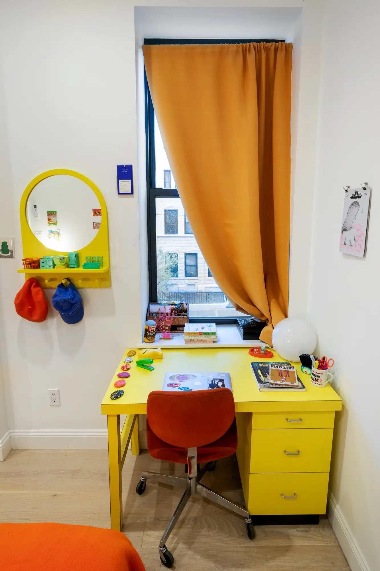
I grew up with parents who don’t necessarily have “creative” careers but really value the power of art and culture. From a young age, my favorite family activity was going to this flea market in Chelsea or on Avenue A in the East Village and finding cheap, weird ephemera. Pretty much everything in my house is second hand. On my wall I put up all these old matchbooks my mom used to collect from businesses, most of which are no longer around. My orange blanket was my mom’s camp blanket, the yellow desk is from Craigslist, and a lot of the furniture I found on the street.
What were your best finds in the apartment?
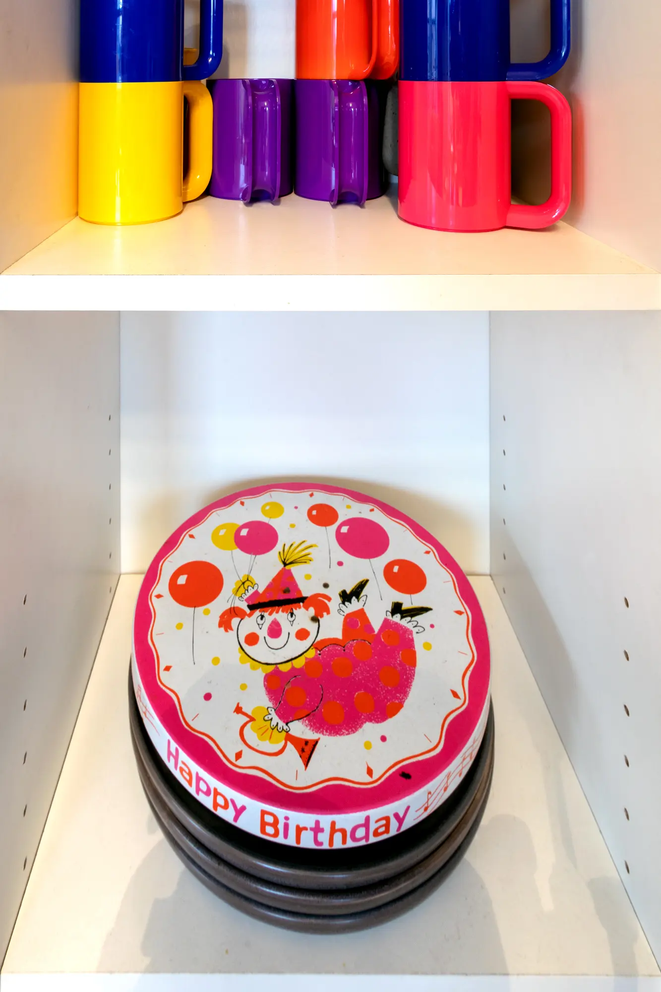
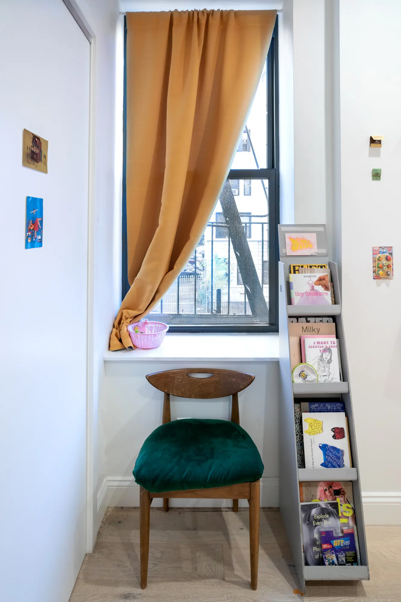
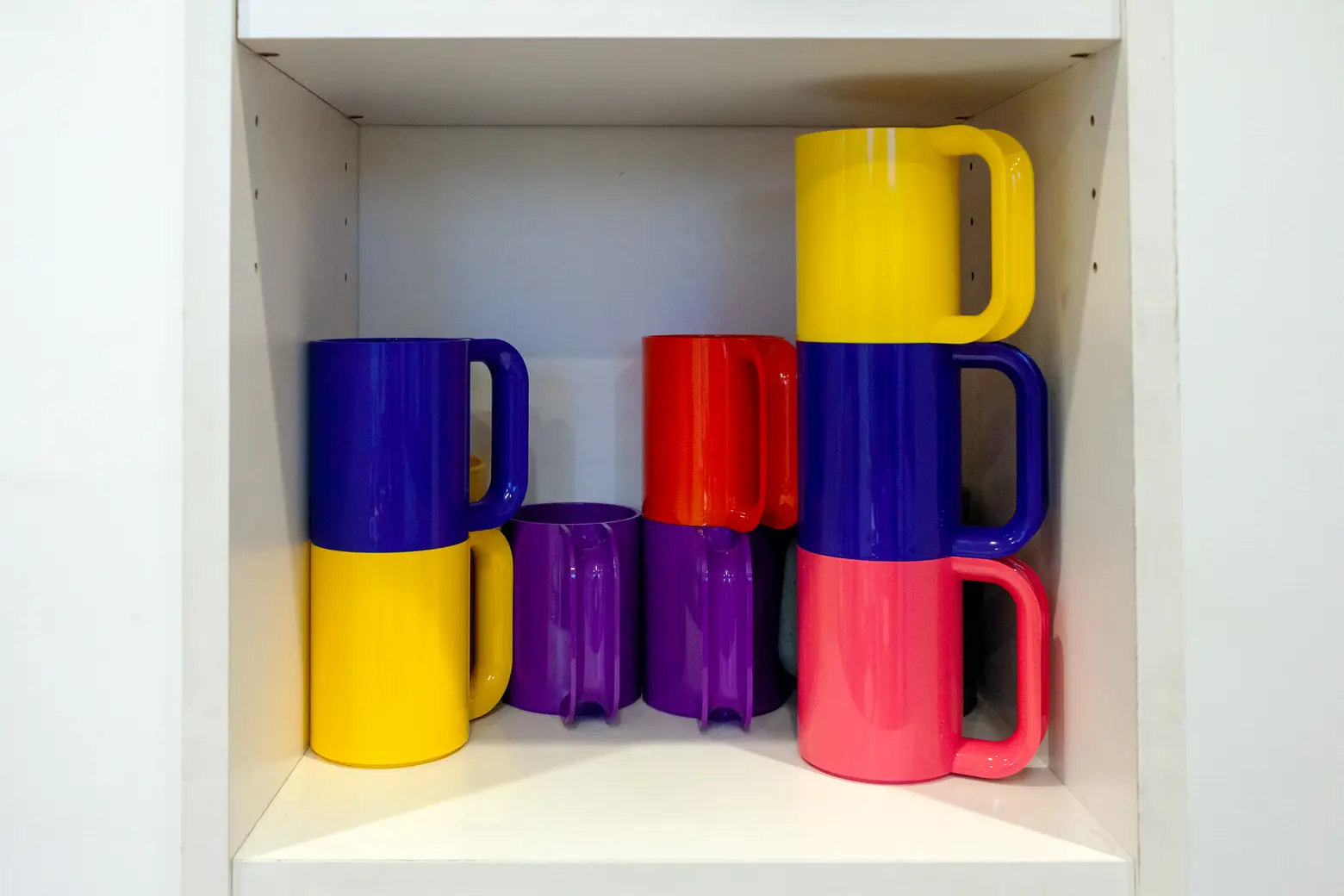
By complete chance, I have a whole bunch of rainbow Massimo Vignelli mugs because, without knowing, two separate people in my life gifted them to me for my birthday last year. Vignelli designed the MTA subway maps, which I see a similarity too in the curvature of the handles. I really love them. In my bedroom, I have this gray magazine rack, which my parents found on the street that a bodega was throwing away. Also, there are these Mikkeller beer cans I use as vases. I really love Keith Shore’s graphic design for them, so much so that when I went to an outdoor concert in Prospect Park that didn’t permit outside beverages, I hid the cans in the bushes so that I could save them on my way out.


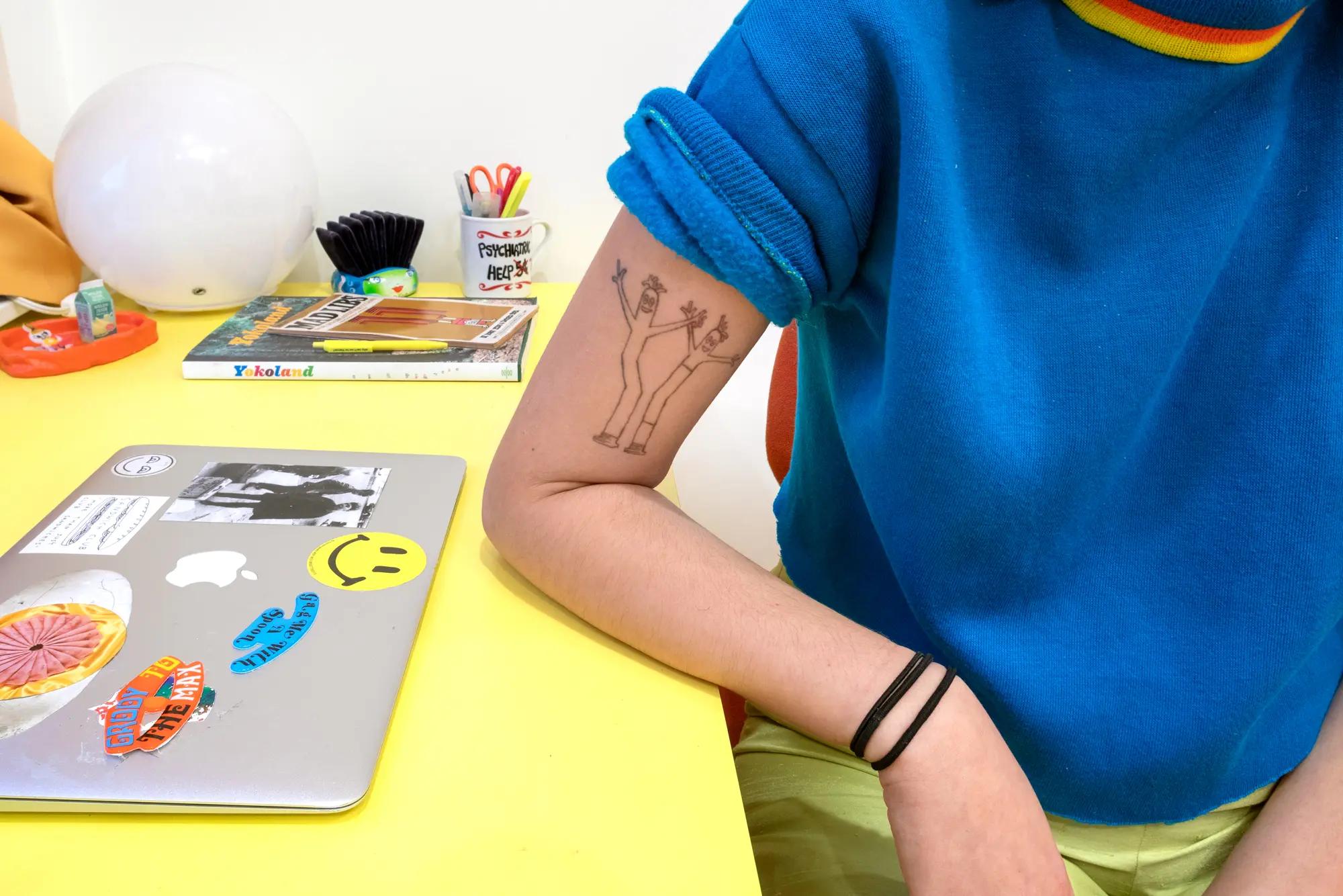
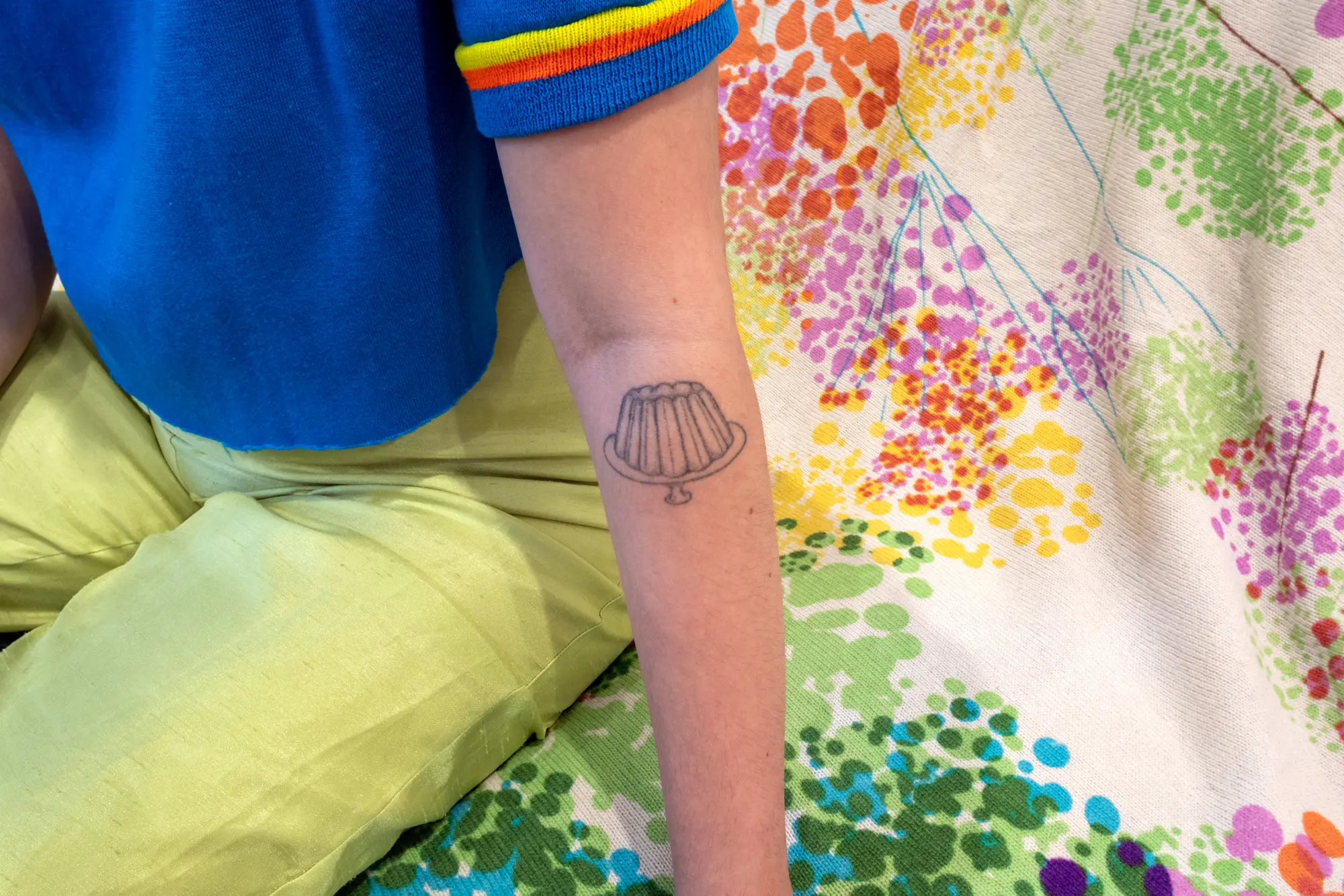
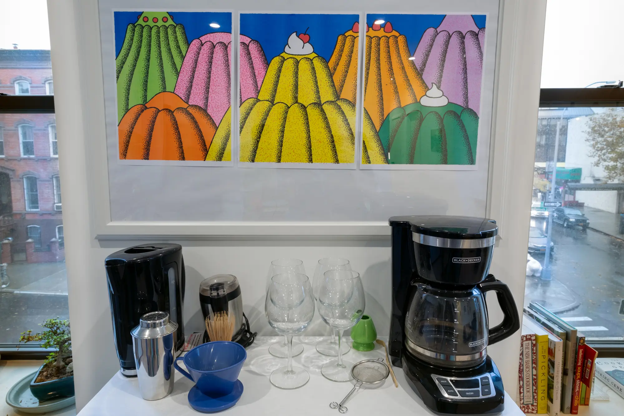
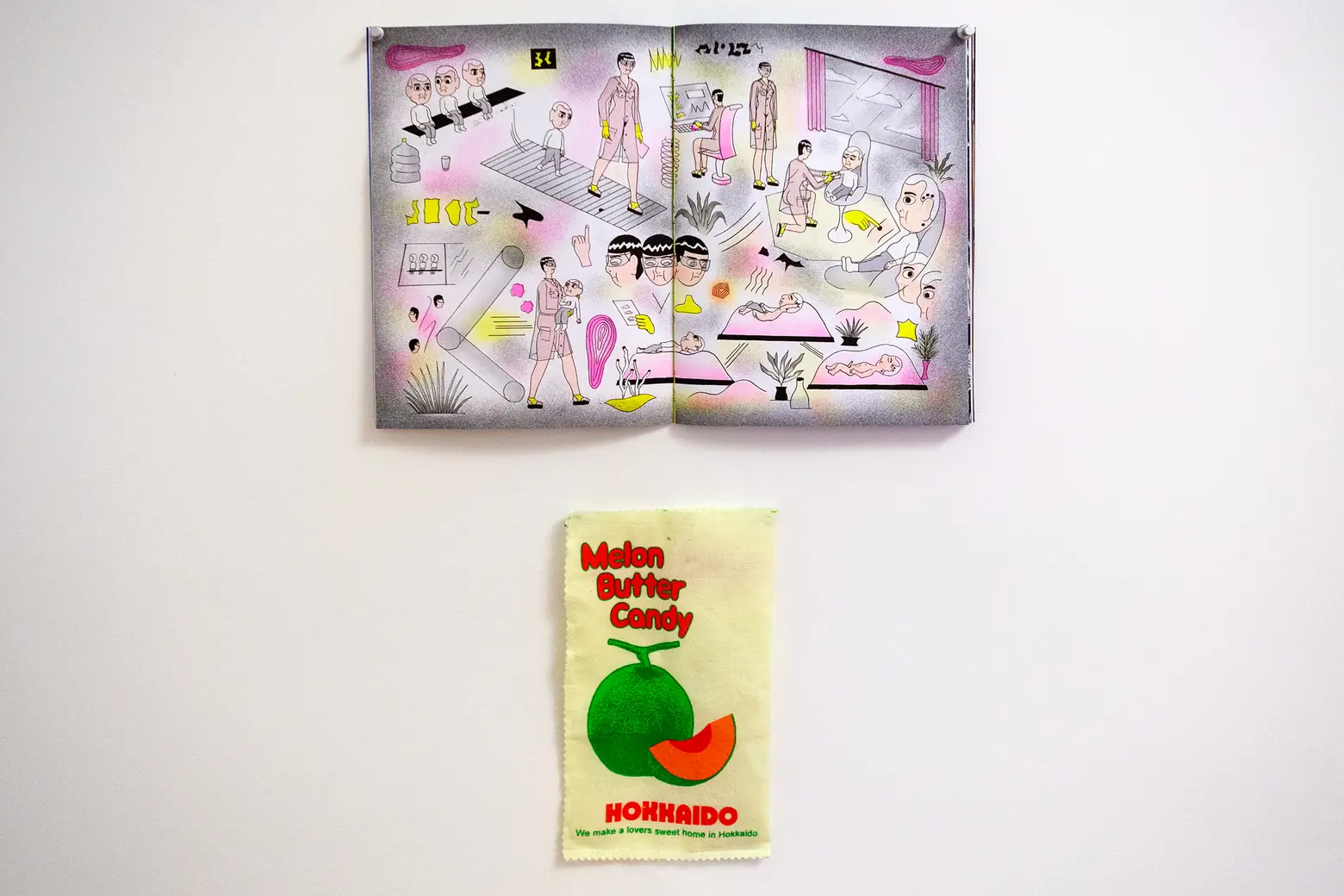
Your Jell-O tattoo is great! And we noticed all your Jell-O risographs. Where did this interest come from?
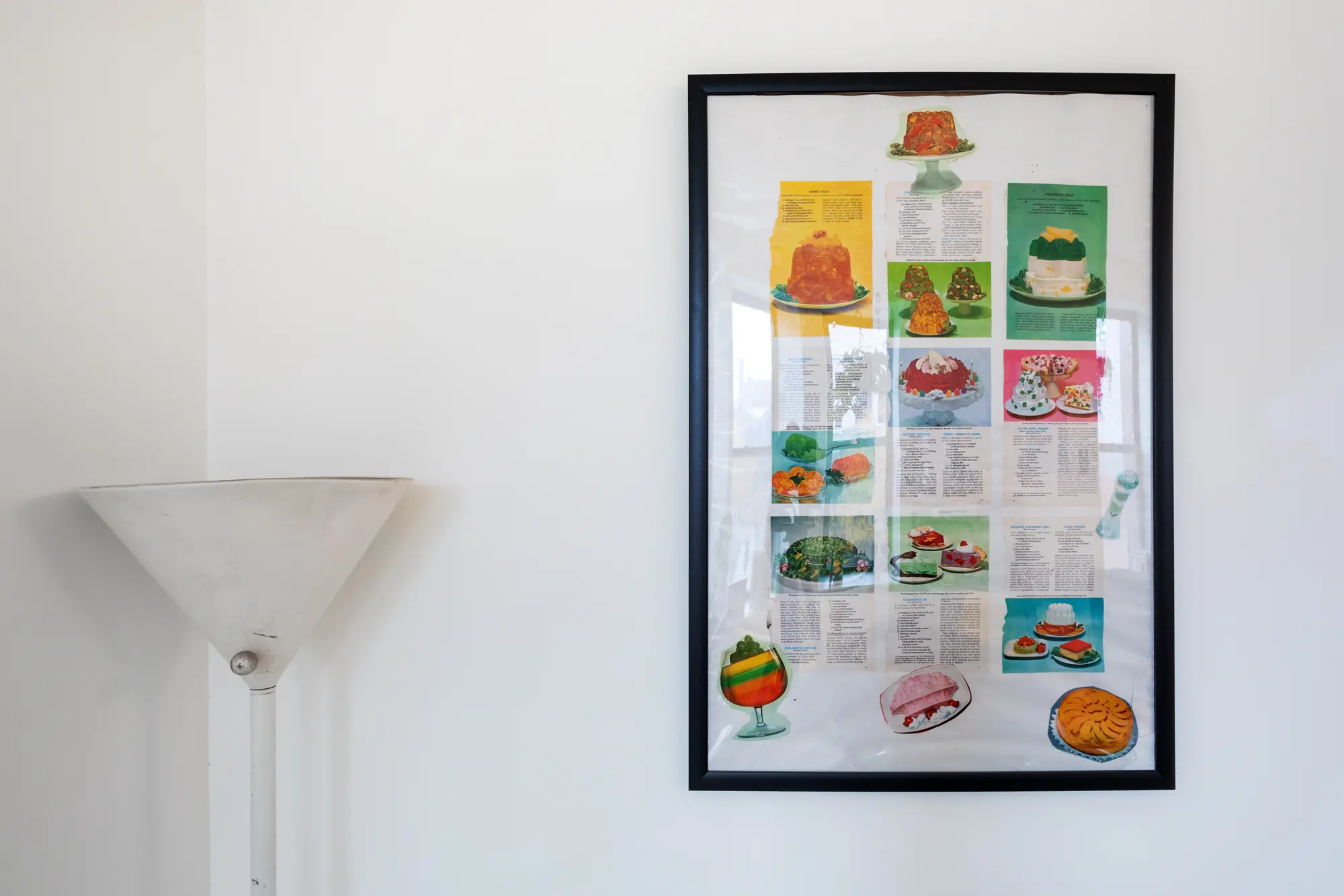
I really love 70s cookbook editorial shoots and graphic design and how it’s a food trend that’s very aesthetically pleasing but is actually a pretty sinister food (both in it being made from gelatin and the proven carcinogens in the food dye) while nevertheless being given to patients in hospitals. I have at least five different JELL-O moments in my house including a silk tapestry I made of a food poem I wrote and a triptych risograph by Lan Truong. The history of JELL-O kind of tracks the changing ways women have been marketed to–at first JELL-O was this invention for stay-at-home moms and then in the ’70s as the feminist movement gained success it was advertised as this grab-n-go snack for empowered working women.
Your personal style seems to match the style of your home. How would you describe it?
My style is a little bit ’70s Bert and Ernie from “Sesame Street,” a dash of “Lizzie McGuire,” and a spritz of “Romy and Michele’s High School Reunion.” For some reason, green, orange, and yellow has always been a really satisfying combination of colors to me.


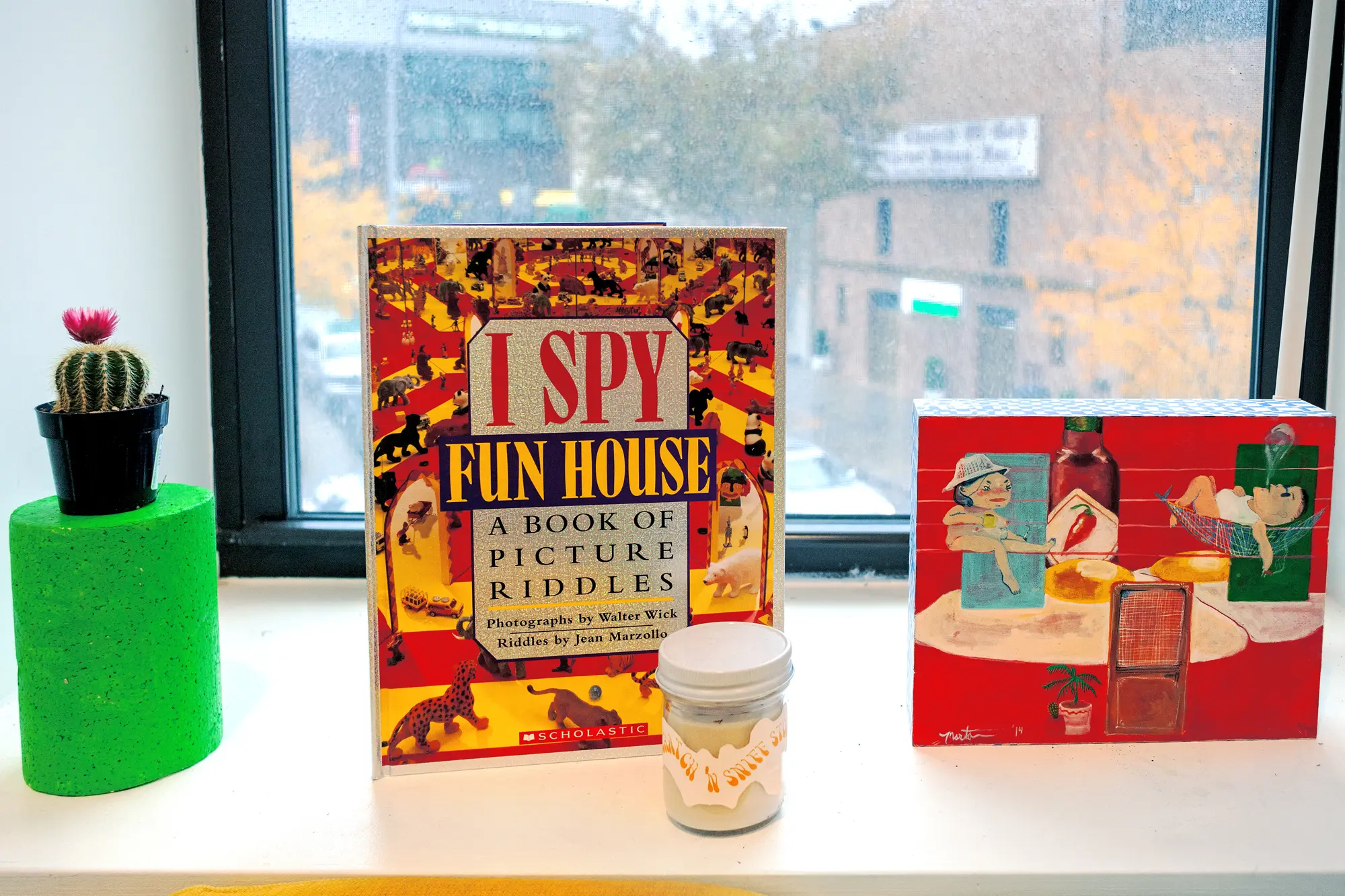
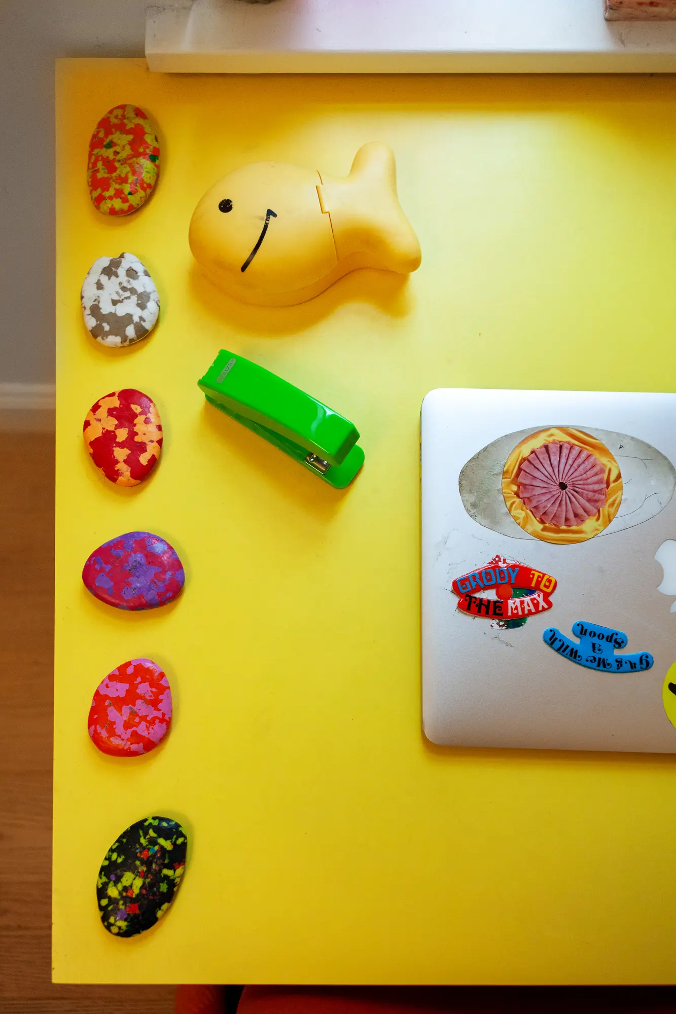
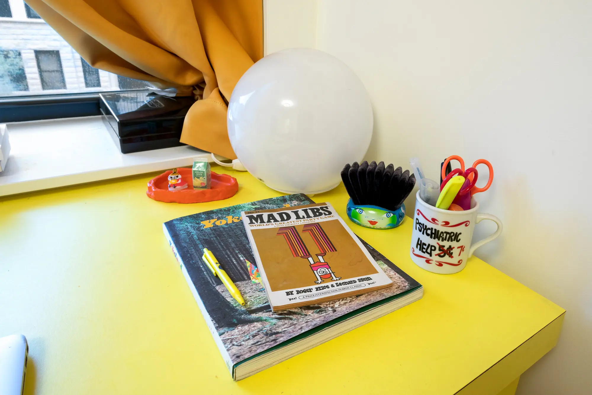
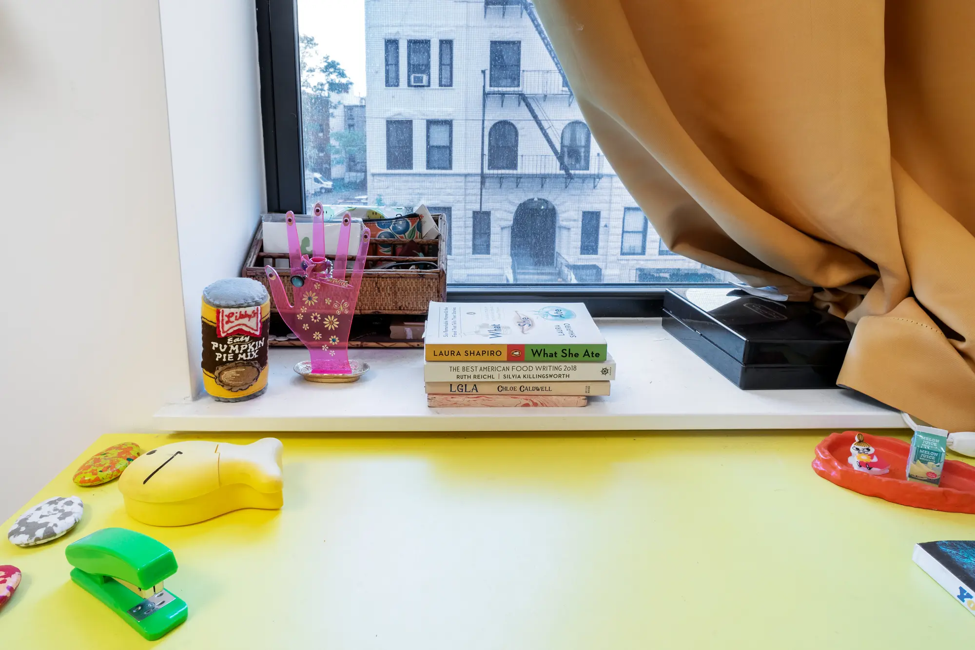
 The Mad Libs book is from the ’70s. Emma is really into graphic design from that decade. The goldfish was a send-away offer from a cereal box; Emma used to bring snacks in it as a kid.
You have three roommates; how do they like how you’ve decorated the place?
My aesthetic can certainly and understandably be a lot, so it’s about balancing my desire to have everything be bright, lurid colors with neutrals that make the space look more refined and, I guess, “adult,” whatever that means. If it was up to me, my apartment would probably have a corduroy slime green couch, squiggly lamps, and a lifesize yellow pencil in it, but living with roommates is all about compromise, which in the end feels way better because we worked on it altogether.
You can only take three items from the apartment. What are they?
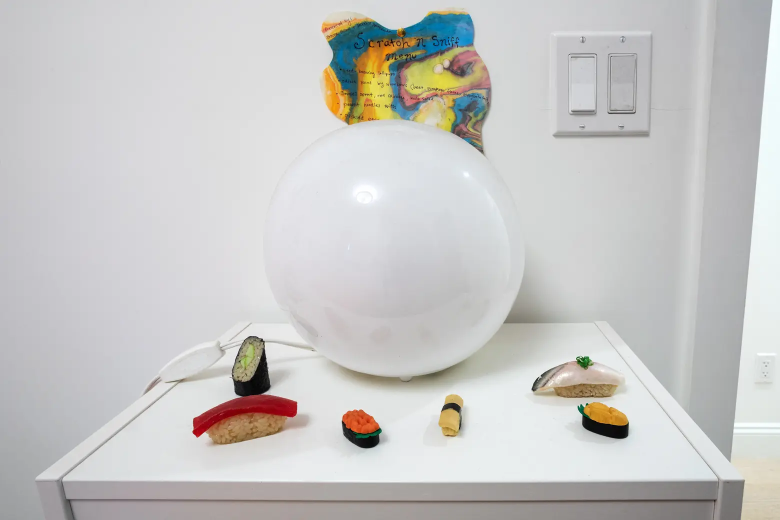
My three most sacred items in the apartment are my Japanese miniature food erasers, my ramen piggy bank, and my clown cookie jar.
RELATED:
- My 730sqft: It’s a retro pink party at fashion designer Stella Rose’s Bushwick pad
- Our 900sqft: Native New Yorkers Aria and John open up their retro, colorful Harlem home
- My 720sqft: A food and wine specialist serves up her retro, girly Jersey City studio
All photos taken by James and Karla Murray exclusively for 6sqft. Photos are not to be reproduced without written permission from 6sqft.