Inside New York’s little-known graphic design gem, The Herb Lubalin Study Center

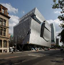
Icy, metallic, and unabashedly serious is how one might describe The Cooper Union for the Advancement of Science and Art building in the East Village. But deep within its mash of raw concrete, steel beams, and metal screens is an unlikely 800-square-foot treasure chest filled with tens of thousands of design and typographical ephemera spanning multiple decades.
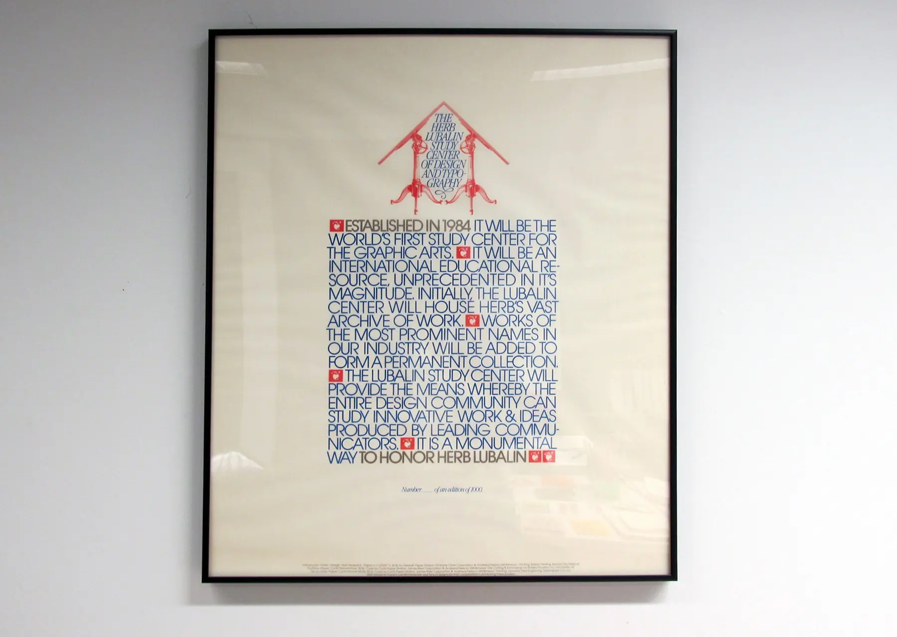
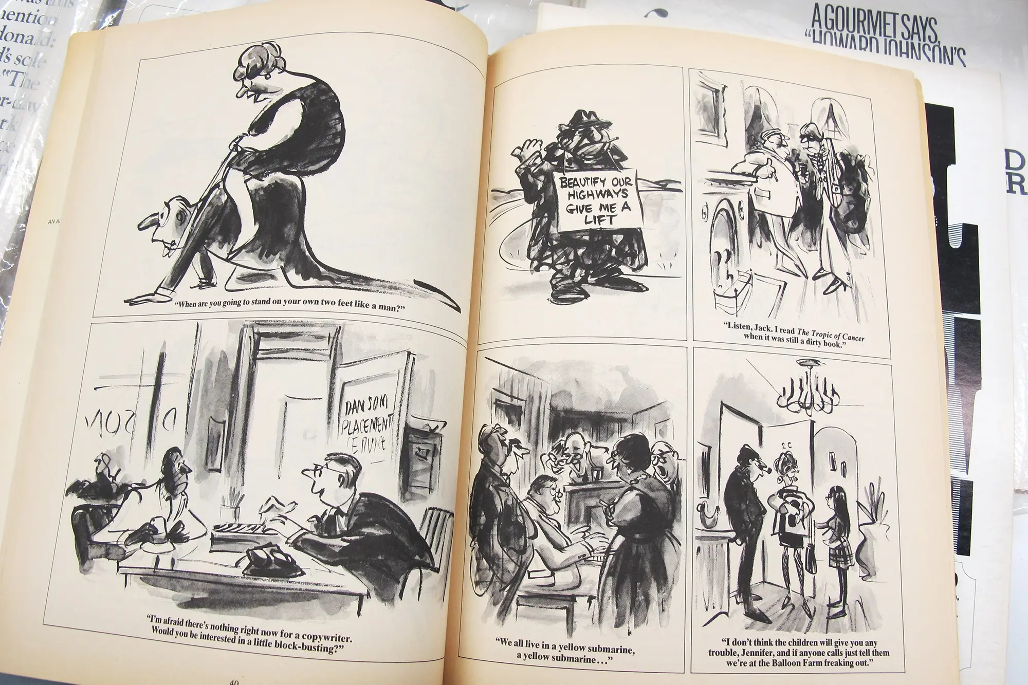
Known as The Herb Lubalin Study Center of Design and Typography, the quaint and cozy space opened in 1985 as an archive dedicated to the work of Herb Lubalin, an American graphic designer best known for his playful art direction at Avant Garde, Eros and Fact magazines, as well as his groundbreaking design work completed between 1950 and 1980 (including the original World Trade Center logo). As one would expect, the center is filled with one-of-a-kind Lubalin works that range from posters, journals, magazines, sketches, and packaging, most of which came from his studio, his employees, or via donation by Lubalin enthusiasts.
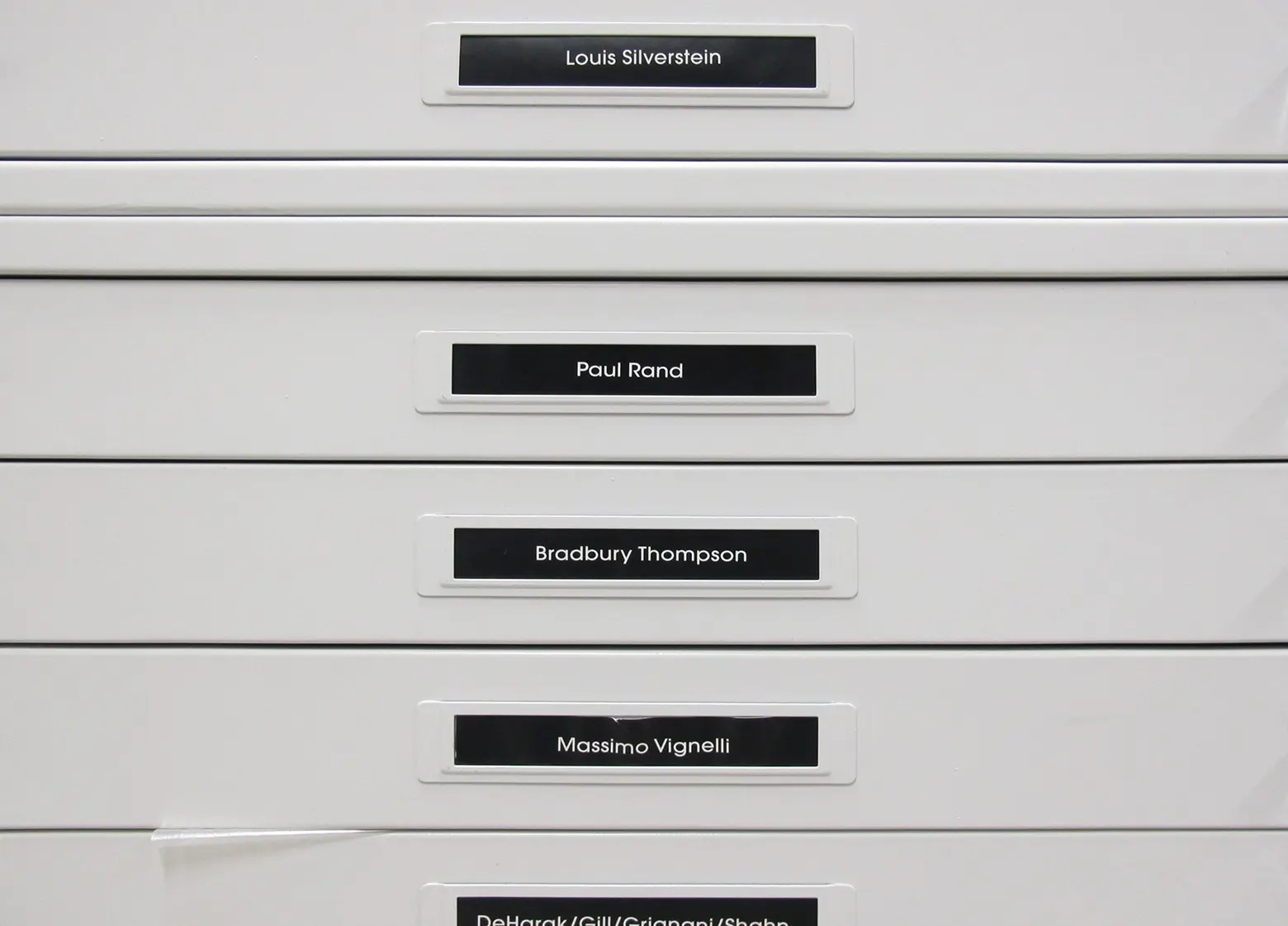
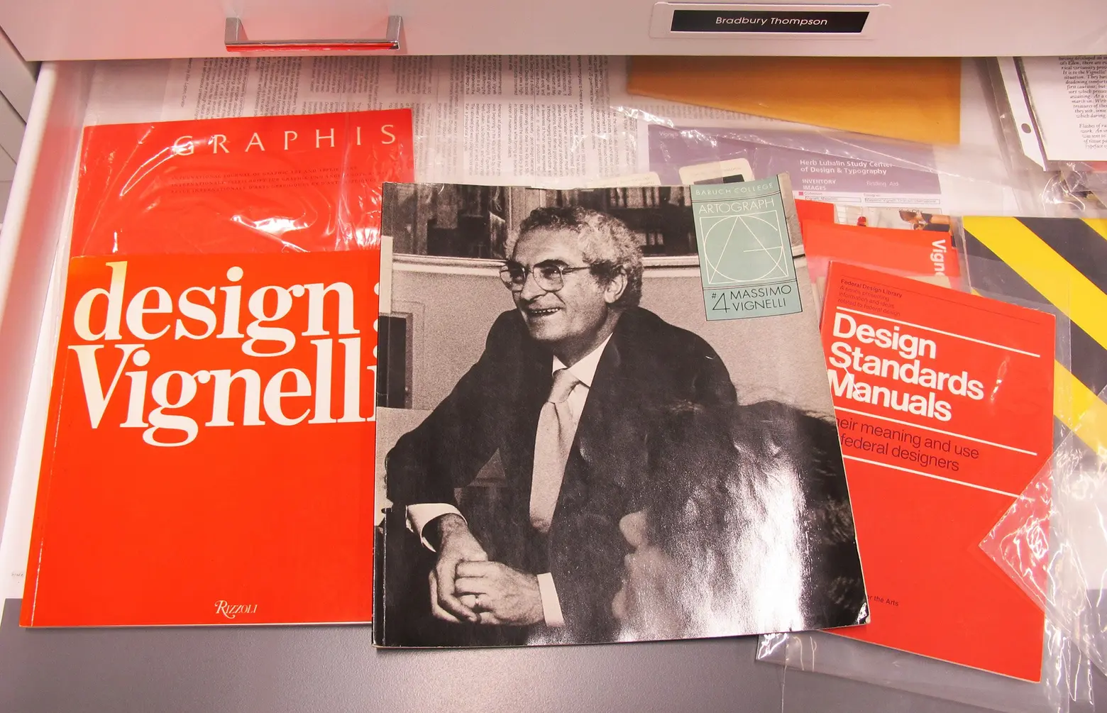
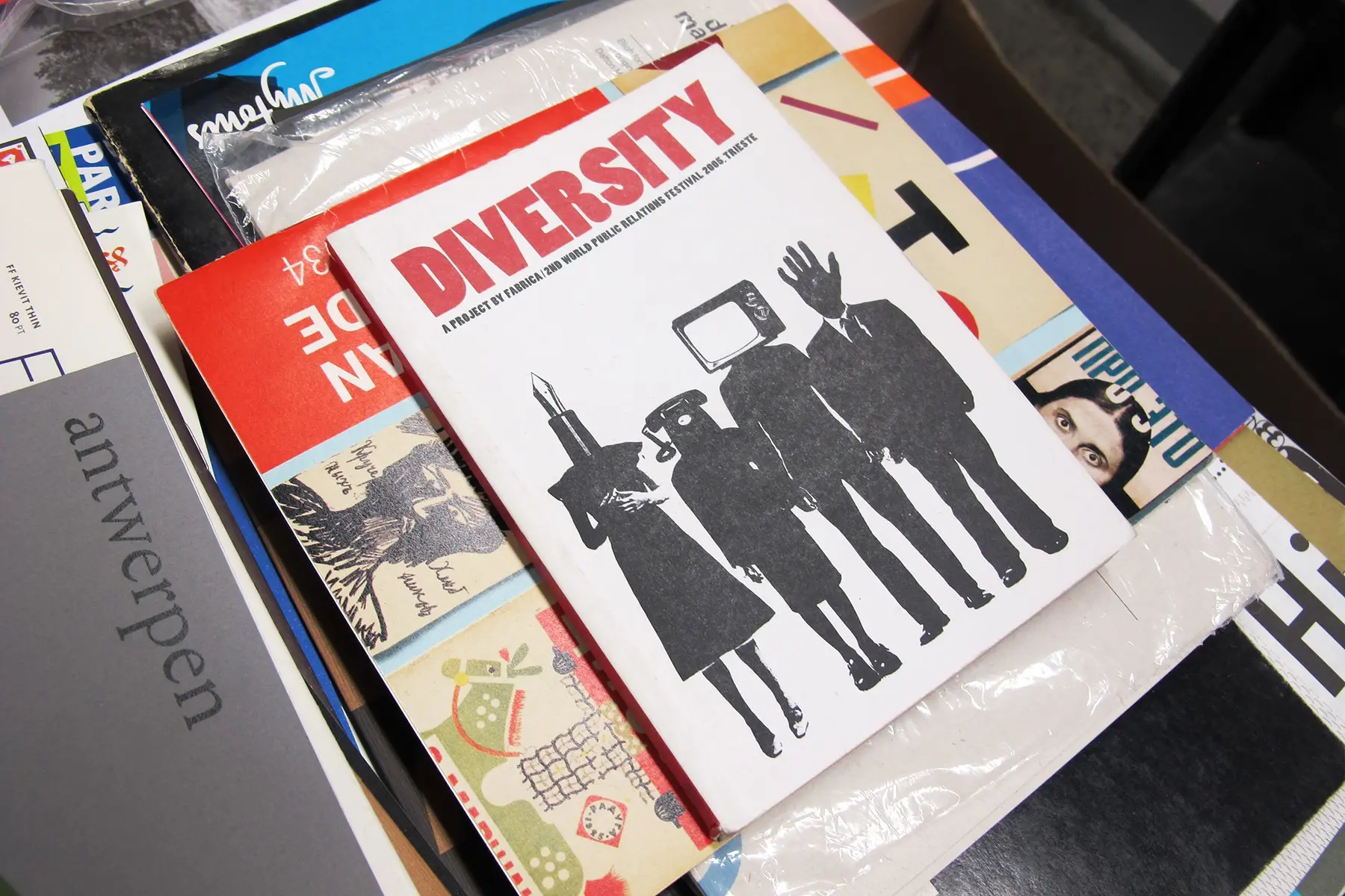
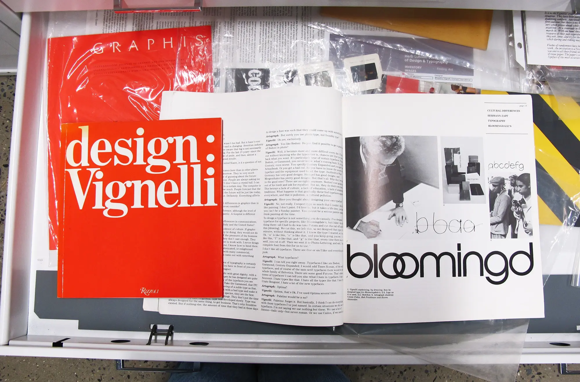
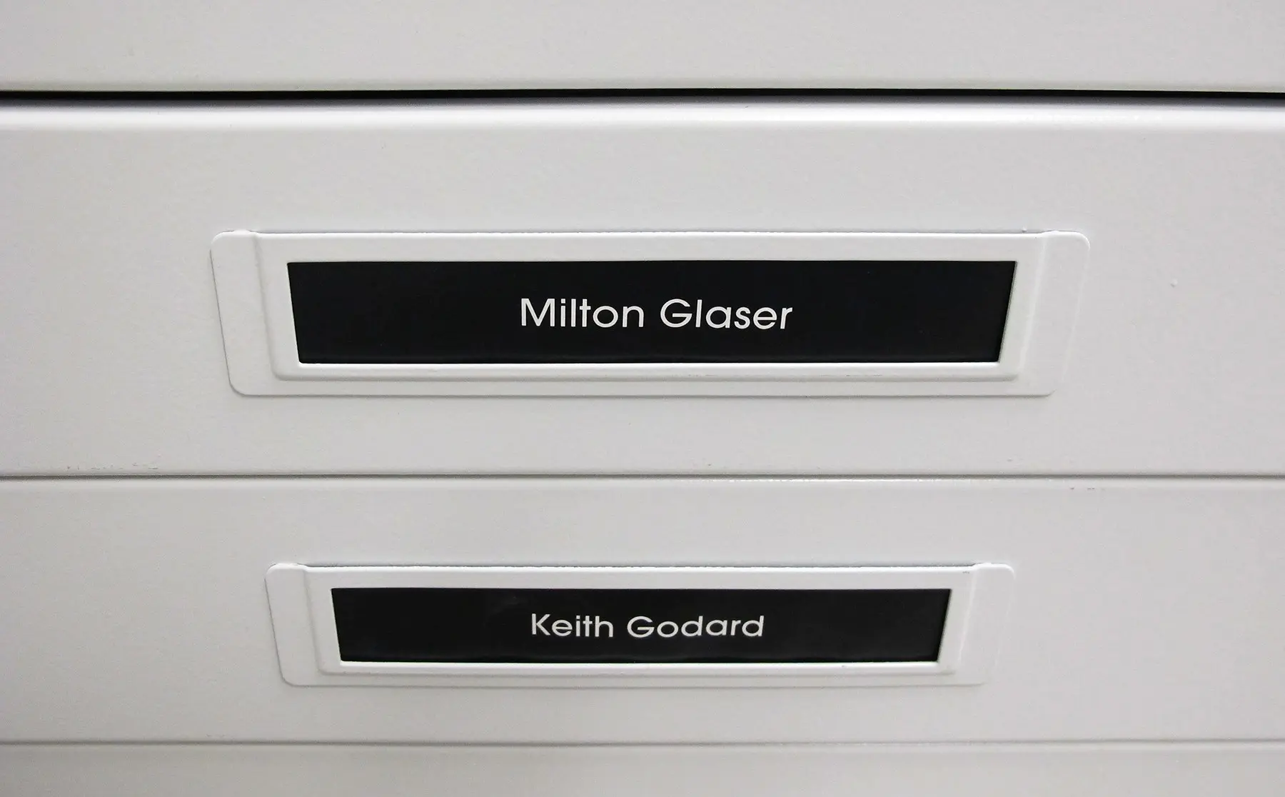
However, what many will be surprised to know is that Lubalin’s materials make up just 20 percent of the center’s entire collection. Indeed, about 80 percent of what’s tucked away comes from other influential designers. And those flat files not dedicated to Lubalin are filled with rare works from icons that include Push Pin Studios, Seymour Chwast, Milton Glaser, Lou Dorfsman, and Massimo Vignelli.

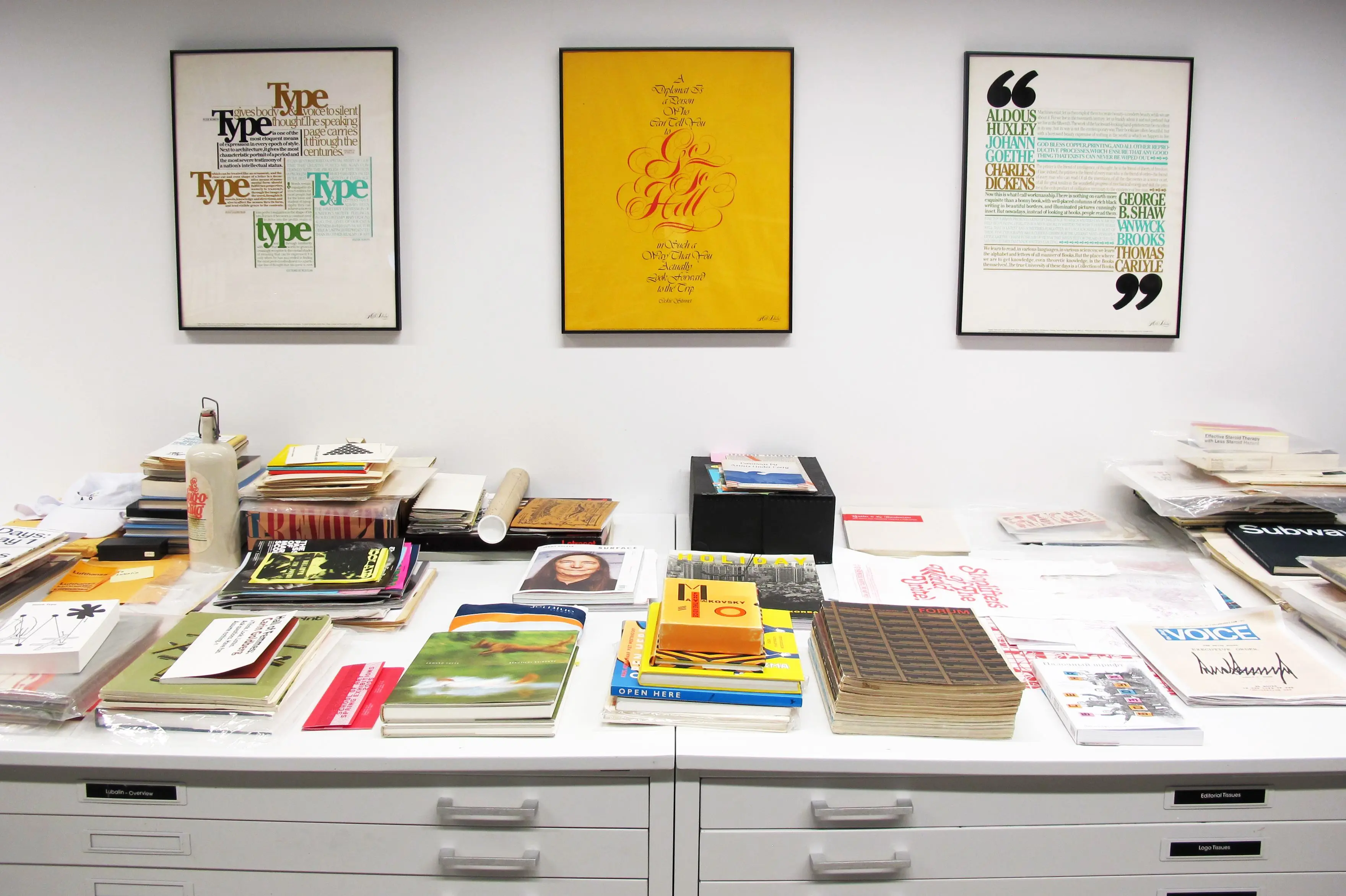
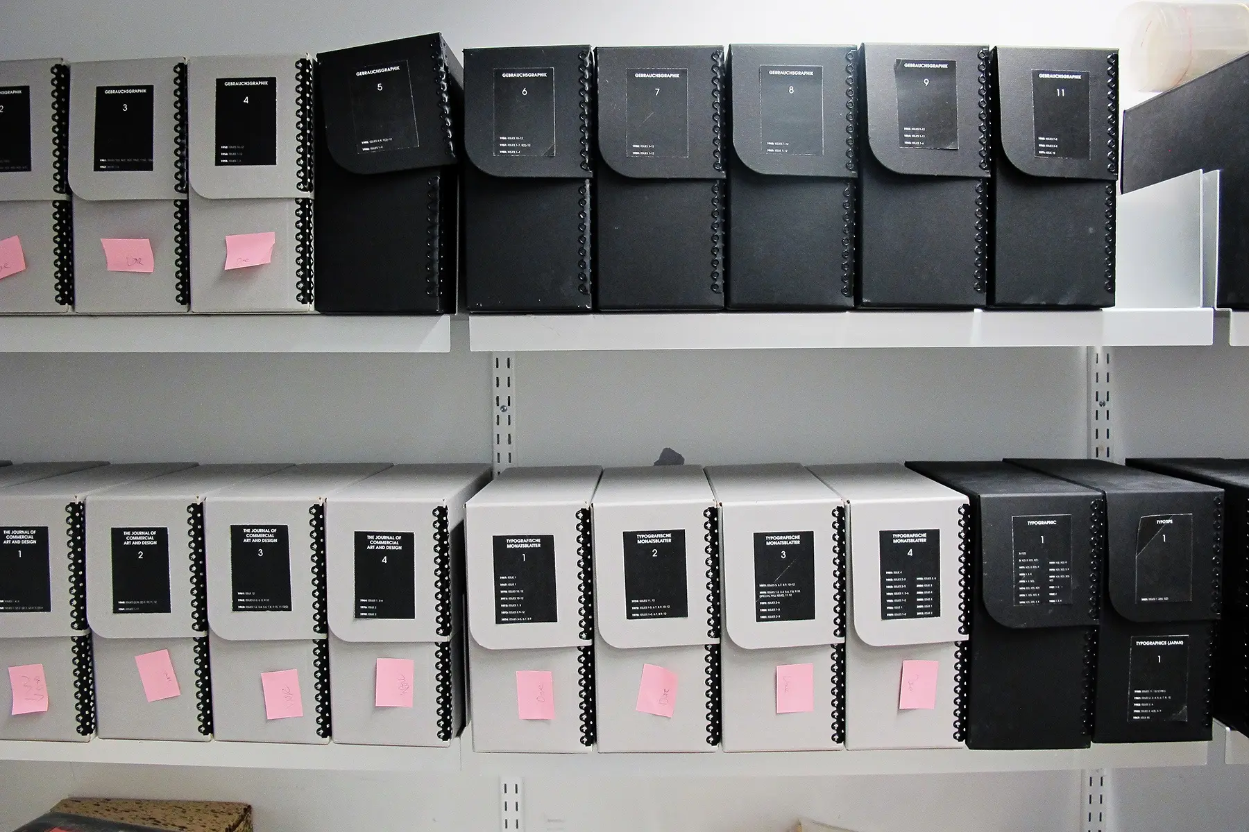
 Typographic materials sit on the right shelves while design journals are on the left (top)
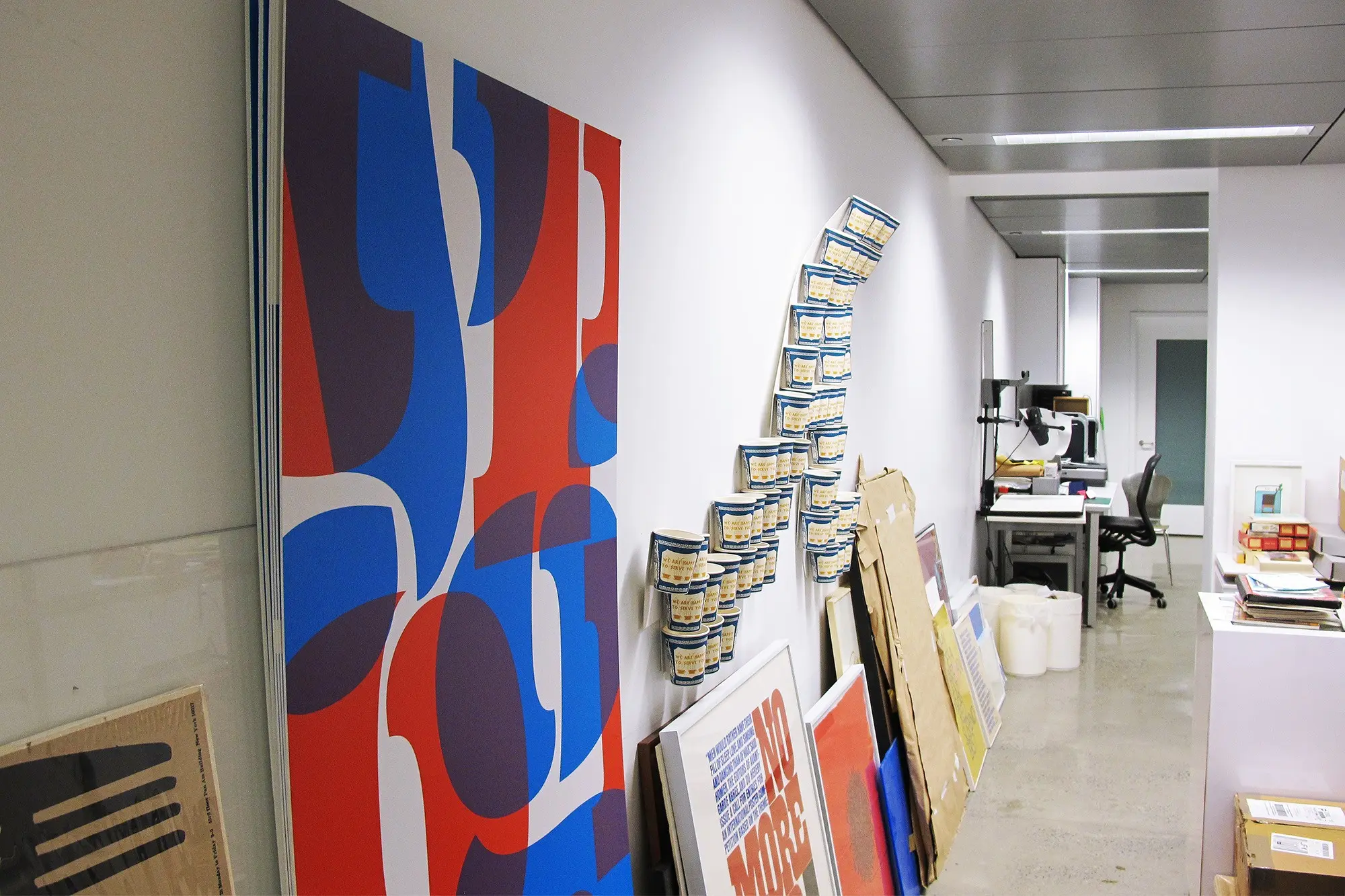
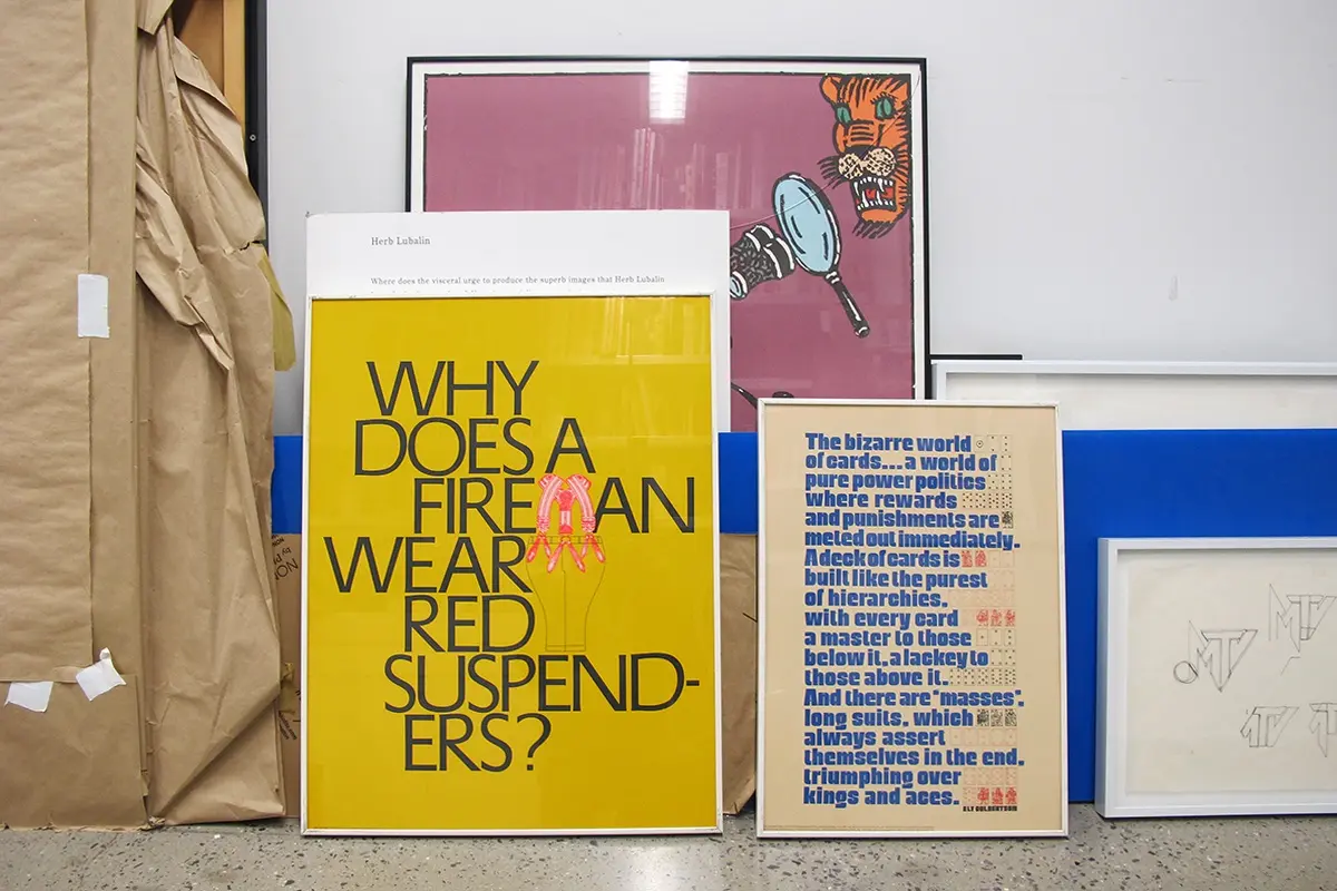
While the center does not loan items out, visitors are, by appointment, given free reign of the materials. Items can be taken out of their plastic slip covers, handled (with care), and guests are encouraged to explore every page and piece of ephemera at their disposal.
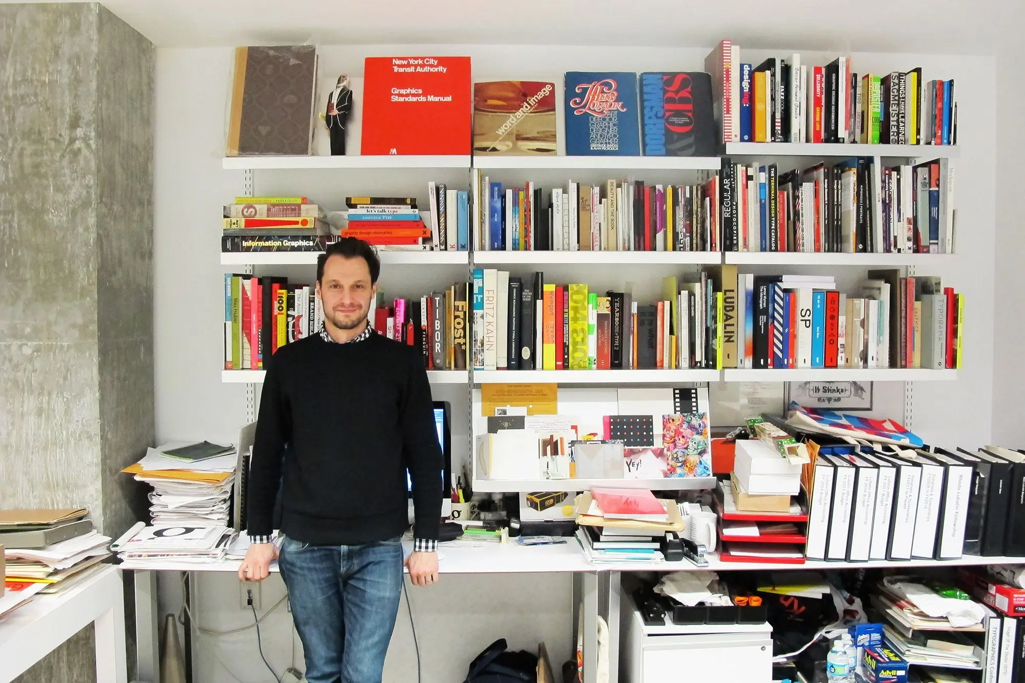
But with so many drawers to pull and so many boxes to thumb through, where does one start? We asked curator Alexander Tochilovsky to give us a tour of The Lubalin Center to offer some insight into how the archive is structured. Ahead also he shares why the collection is so much more than fonts and flourishes, and he points out some of the must-see gems hidden within the vast collection.
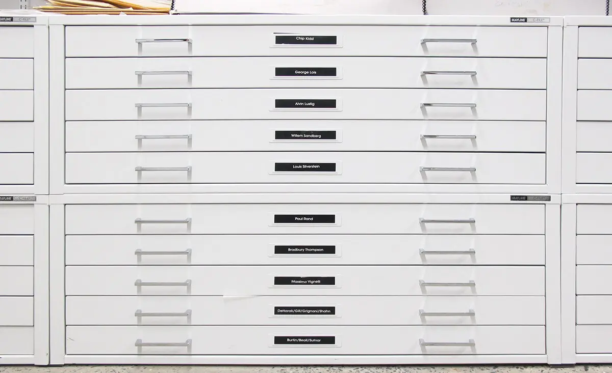
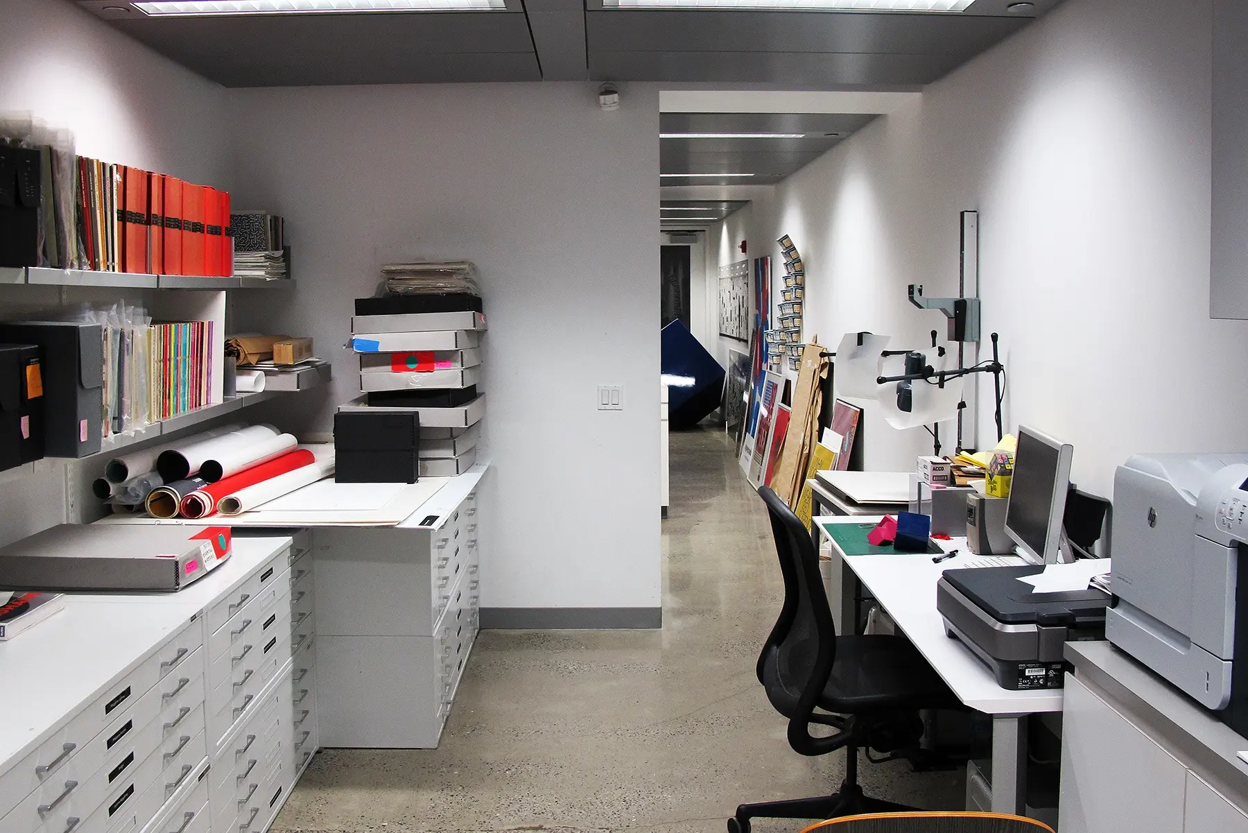
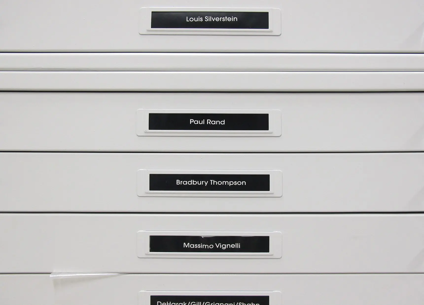
 Flat files are organized thematically or by designer
First, who visits the center?
We mostly get designers here—I would say 90 percent are graphic designers. We had about 1500 people come through here last year, and it keeps growing every year. Designers are always looking for inspiration, and this is a great resource.
How has the center acquired most of its work?
Most of the items here have been donated to the center, and most of the items in the collection are typographic in nature because Lubalin made a name in typography. But a lot comes from designers, particularly older graphic designers, who have collected materials for reference over the years and are retiring, so they don’t really need them anymore. It’s a shame to throw such material away, so people seek us out and they like our mission. They appreciate that people actually use what’s here and it doesn’t just sit in a box.


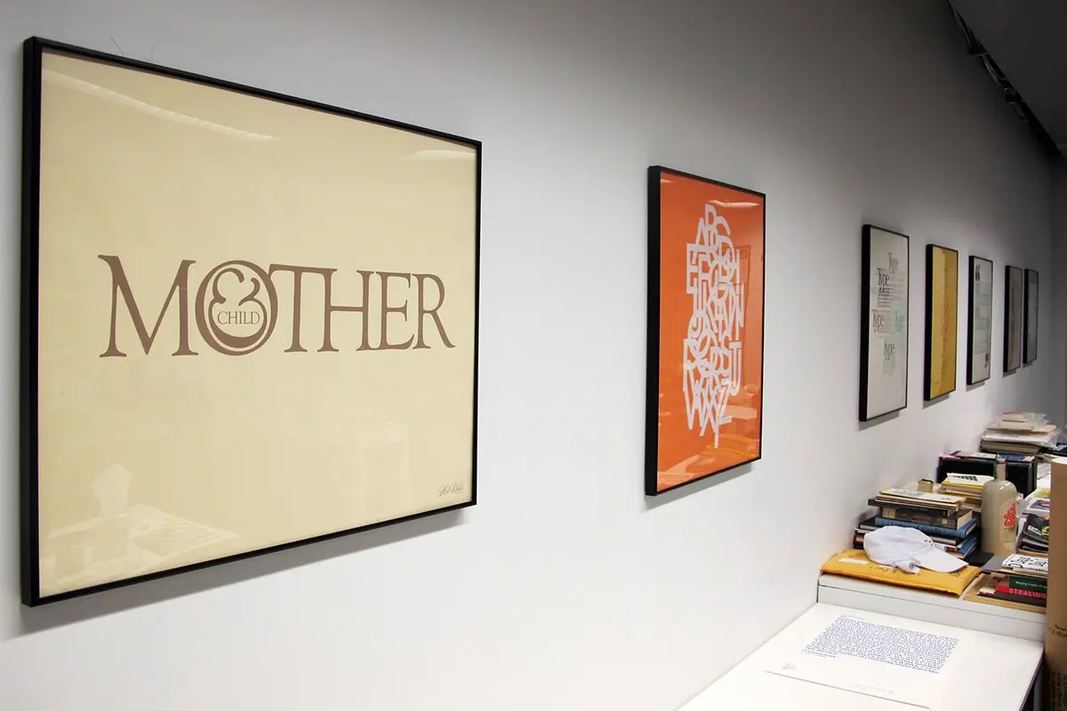
The original “Mother & Child” logo created by Lubalin, and to the right “ABCDEFG” type set in Avant Garde Gothic, which was designed by Herb Lubalin with Tom Carnase (top)
How do you judge what’s appropriate for inclusion?
Fortunately, on some level, I don’t need to decide what needs to be cut or kept. I’ve been here going on seven years, and while we’ve had a number of donations, I haven’t turned anything away because everything has fit thematically or filled a hole or niche. And most ephemera is relatively small, so even though we don’t have a ton of space, we can always be smarter about the space we do have.
We’re kind of a living and breathing archive and we’re constantly able to adjust—we’re not just a box where everything just goes into storage. When we have visitors, we do it by appointment, but we give them full access to everything, and I think we’re unique in that sense. We try not to hide things. But it’s also the nature of the space. We could ask people to sit and we could gently bring them stuff, but I think there’s something really magical about being able to open the drawers and “go behind the curtain.” We definitely encourage browsing because you may open a drawer and you may not recognize a name, but you’re like wow, I have this newfound passion for this particular person or particular aesthetic.
![]() Preliminary sketches of the PARADE magazine logo by Herb Lubalin
Preliminary sketches of the PARADE magazine logo by Herb Lubalin
Given there are a lot of rare items here, has the value of any of the works been assessed?
Some material, yes, but it’s really difficult to put a value to some things, especially those that are one-of-a-kind. There are very few appraisers that can appraise graphic design.
For example, we have a number of some of Lubalin’s sketches. As pieces of paper or documentation they may not have value, but something like the PARADE piece (above) is incredibly invaluable in a cultural and graphic design sense. But financially it may not be worth much at all.
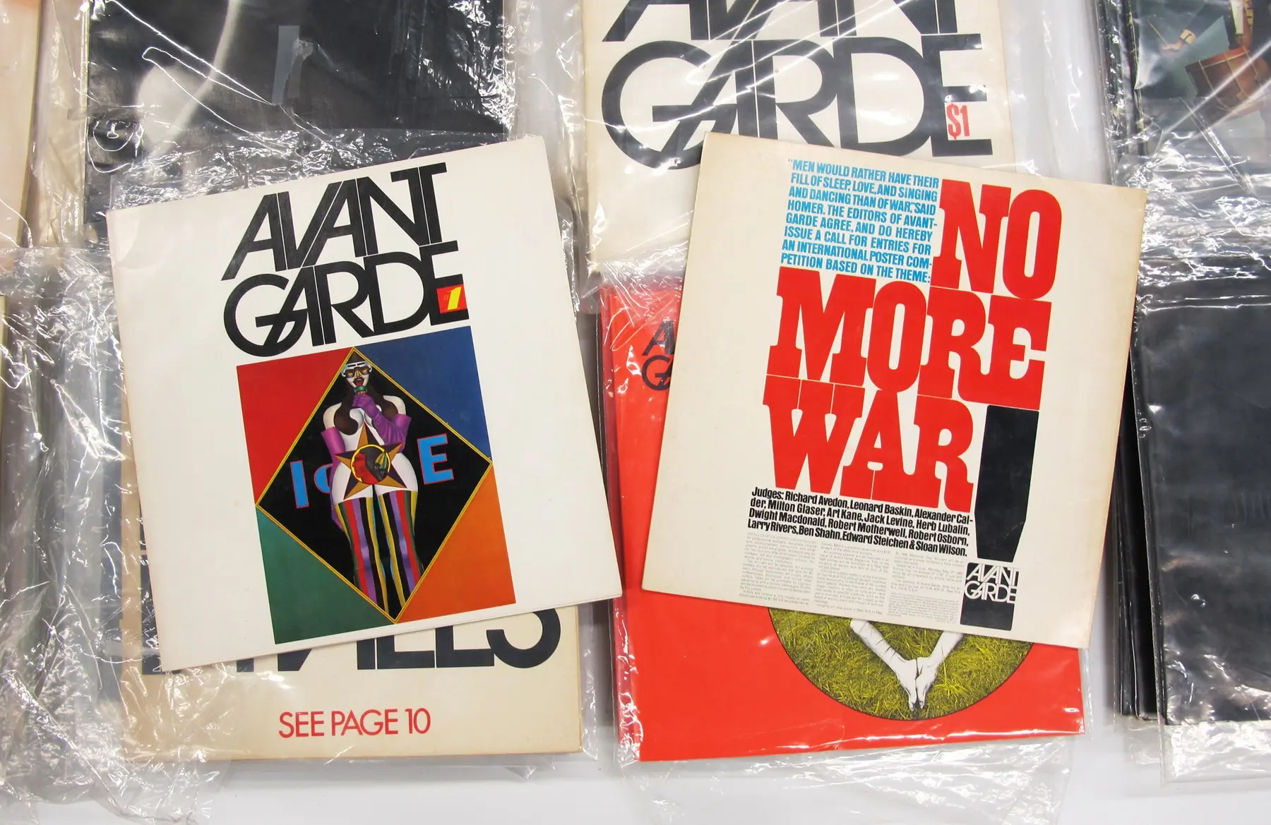
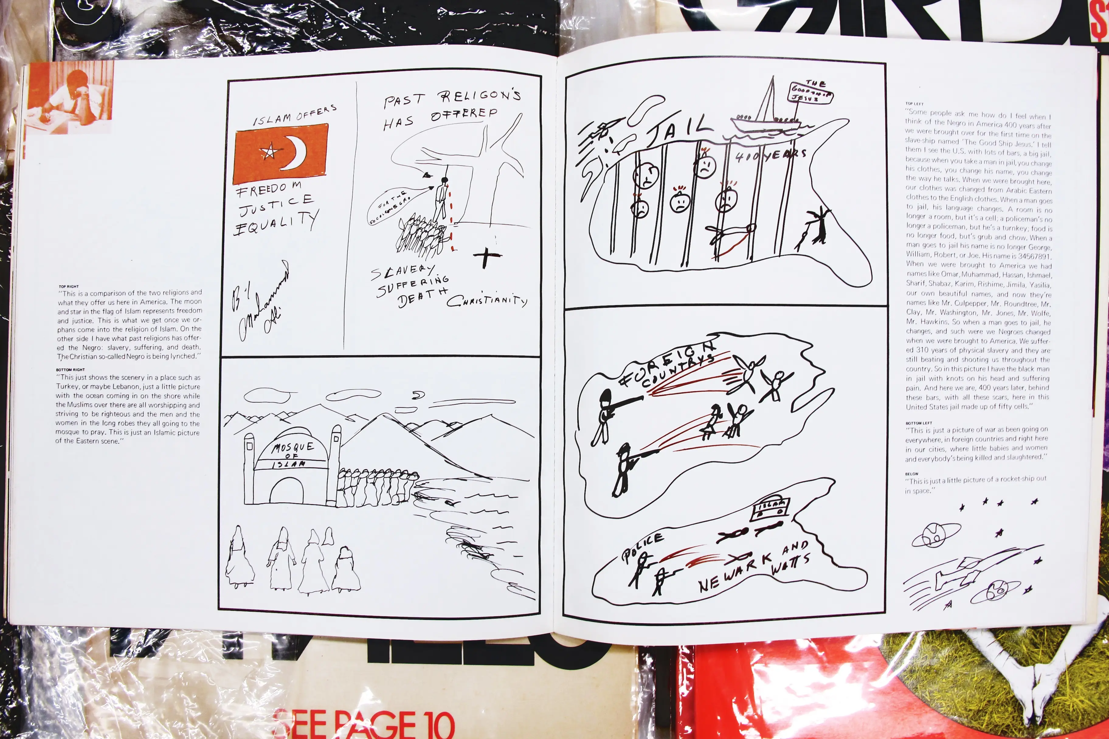
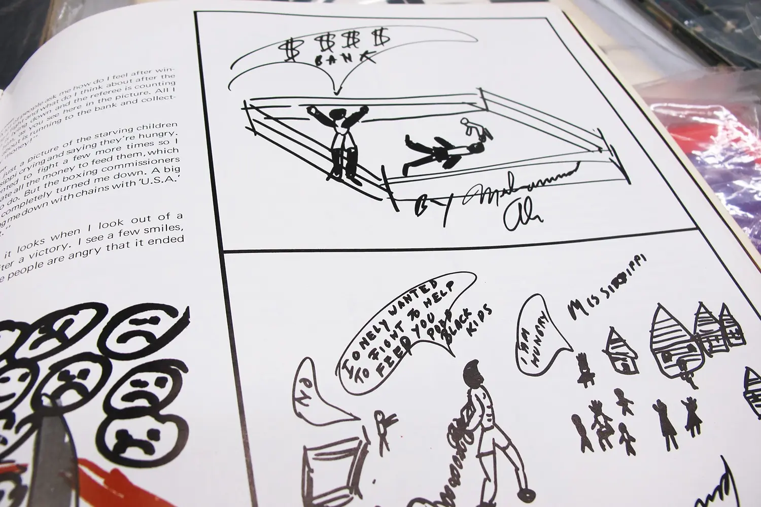
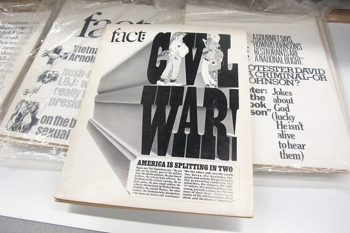
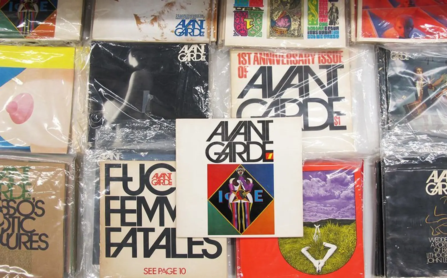 The first issue of Avant Garde magazine (amongst every issue published), which contains drawing done exclusively for the publication by boxer Muhammad Ali
We also have every issue of Avant Garde magazine, which Herb Lubalin art directed. There is a market value for them (you can get them on eBay for between $100-200) but the articles inside are so much more valuable that the physical magazine itself.
In the first issue of Avant Garde there is an article that really no one is familiar with called “Drawings by Muhammad Ali” which shows a completely obscure side of Ali that very few people know about. Some people know he liked to draw, but what they’re familiar with are the very neutral drawings, mostly of boxing scenes. But the drawings in this issue involve very deep social issues he’s contending with such as Islam, race, lynching—it’s the side of Ali you would never really see. There’s even one image of him in the courtroom when he was convicted of dodging the draft.
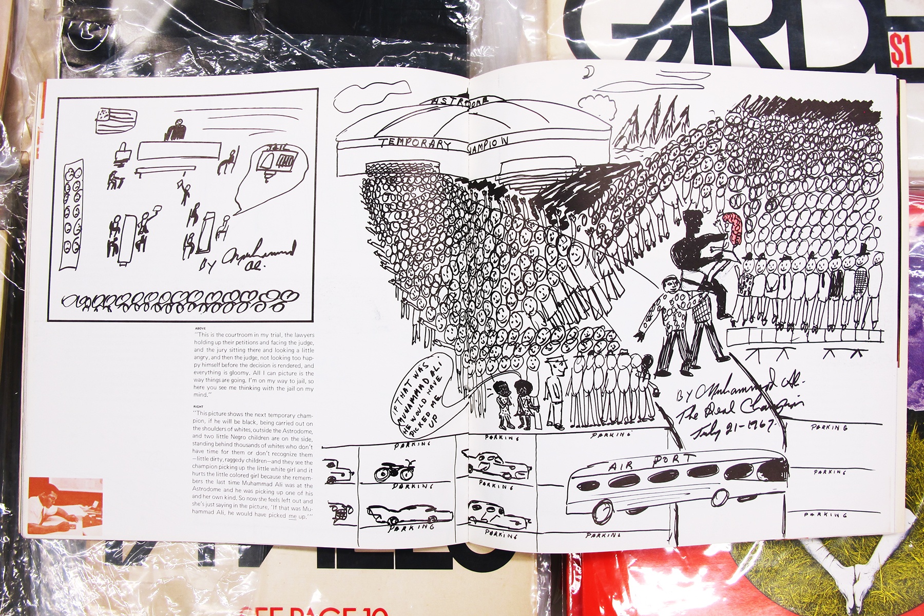
 Several of the rare, politically-charged drawings Muhammad Ali within the first issue of Avant Garde
And the sad part about these drawings is that they were made just for the magazine. It’s very likely the original drawings didn’t survive. So this is the only place you would ever encounter them. So, sure, there’s maybe a $100 value to this magazine, but the cultural significance is astoundingly bigger.
How does digital design play into the museum? Do you take documentation from working studios on important projects?
Not yet. Our mission has always been to protect what we have and to maintain that for as long as we can and digitize that—and that itself has become a new mission for us. But part of my interest is to salvage some of the older materials that might disappear. For example, I’ll buy some old paperbacks that may not be from a very famous designer, but it’s important for me to add them to the collection because they augment the notion of what graphic design really looked like.
So the design might not be considered “high end” for the same period, like with really beautiful modernist works, but if we only keep modernist works it makes it seem like modernism was the only style when that is far from the truth. Modernism existed and there was a counterpoint to it. I want there to be a true testament of how things were.
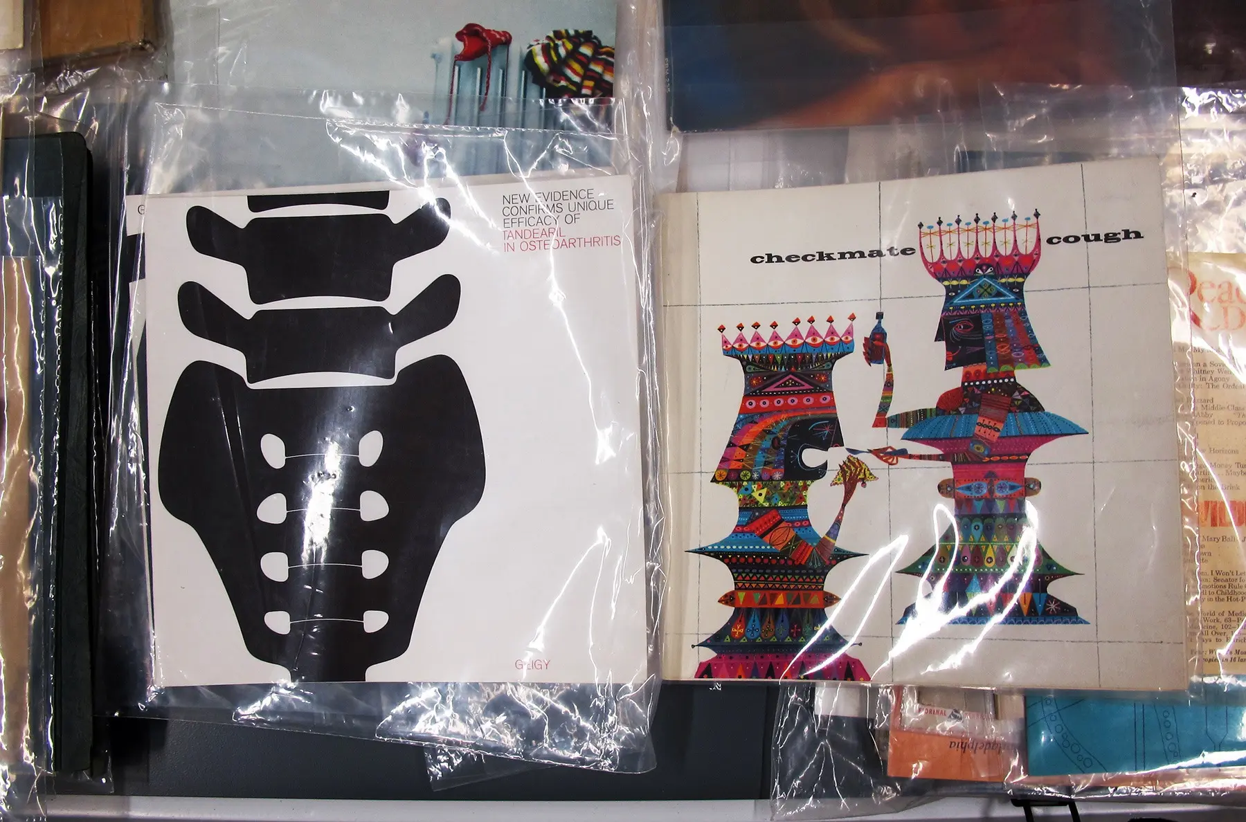
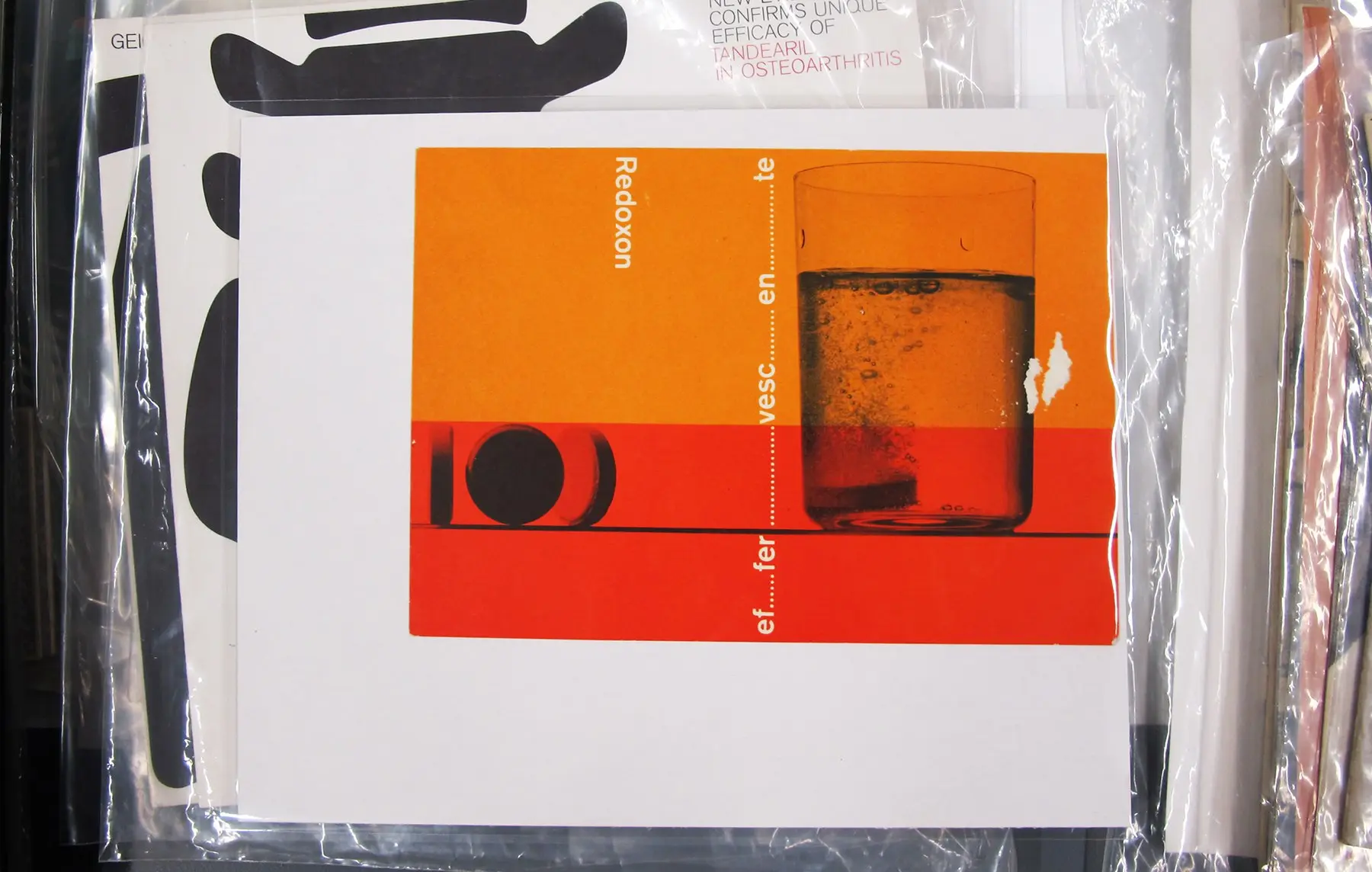
 Wild, very psychedelic designs that graced pharmaceutical pamphlets in the early 1950s. The public never saw these materials, as they were provided exclusively to doctors
What are a few of your favorite pieces from the collection?
We have some pharmaceutical design pieces that I love that are really illustration heavy. Like this one from Jerome Snyder, which is from 1952 and pretty out there for the time. These are mailers and pharmaceutical designs like this were mostly sent to doctors only. So this is material very few people would see or keep.
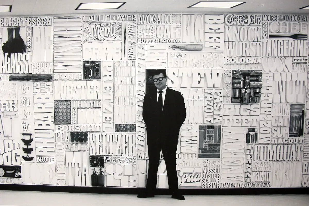
Another one of my favorites is this work by done by Louis Silverstein. Silverstein spent his entire career at the New York Times and was responsible for the redesign of the paper and its grid structure. We have a lot of his studies on how a contemporary newspaper should be constructed. We also have a number of tear sheets that designers would get for their portfolio for anything that would run in the paper.
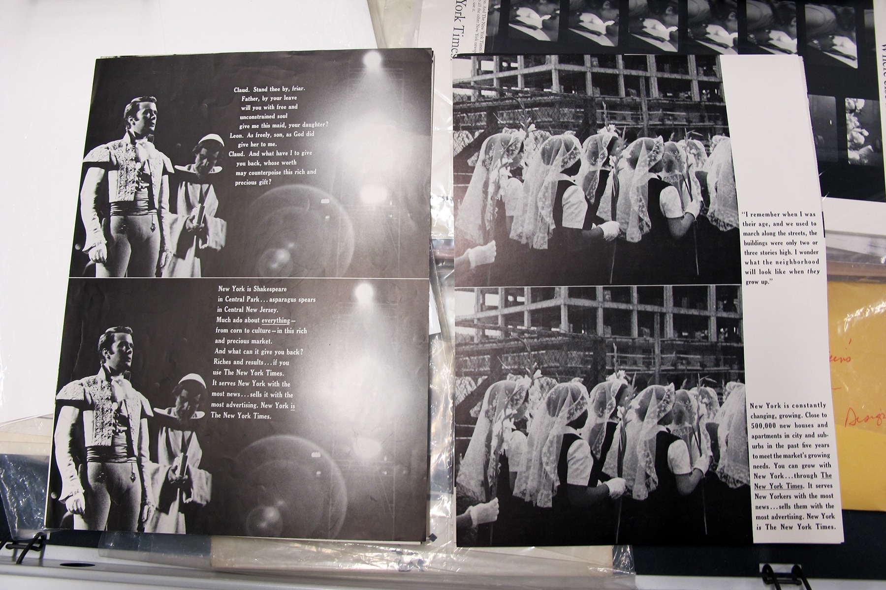
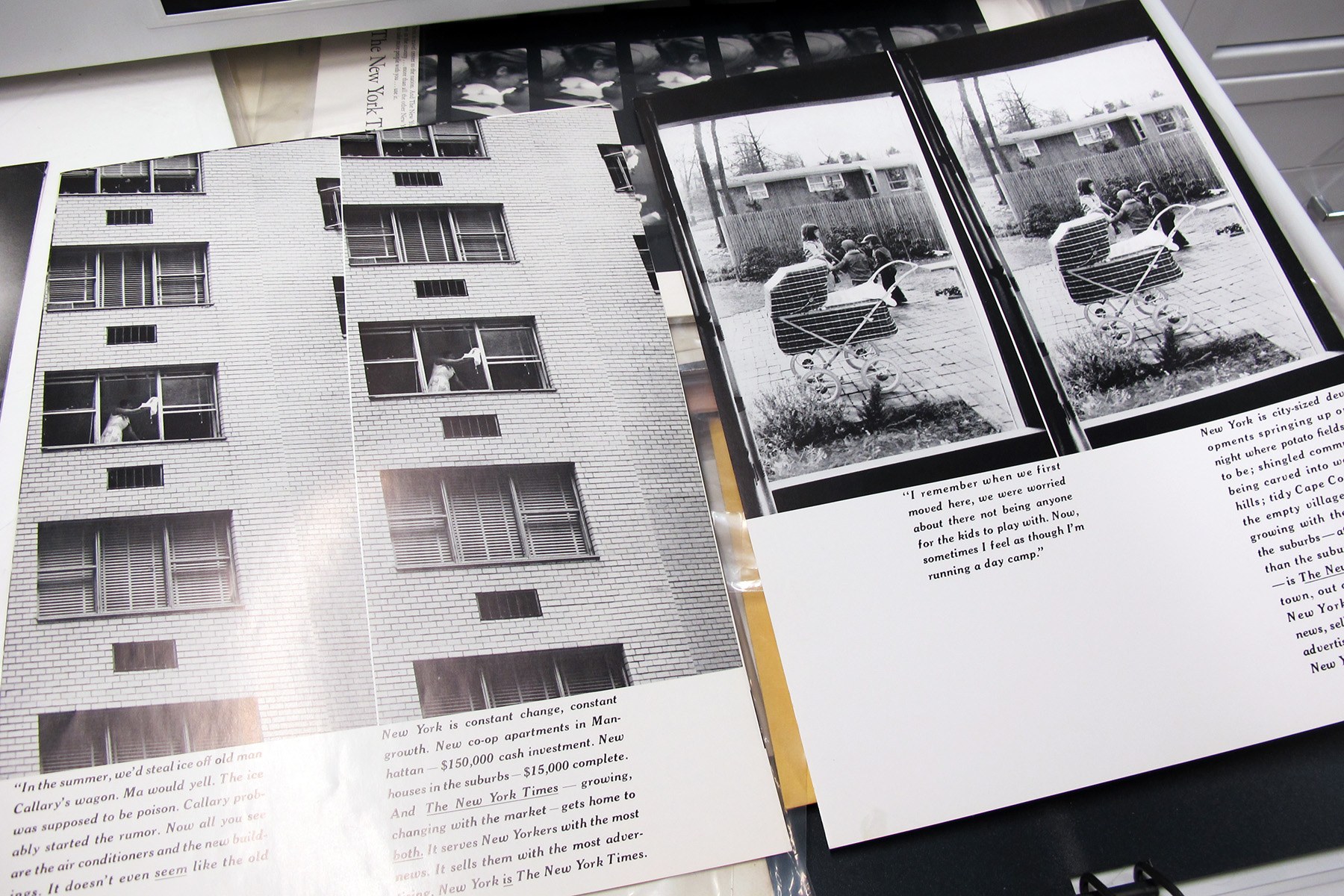 Original tear sheets from the New York Times of images taken by famed photographer Robert Frank. These are the only set in existence and were images produced early in Frank’s career when he was a freelance photographer just starting out.
The tears would be printed on nicer stock so the creator would have a nice copy for their files. So this (seen above) is a set that probably exists in just one copy, and it’s a campaign that the Times did that uses photography from Robert Frank.
It was work for hire, so the New York Times owns this work, not Frank, so you’ll never see it published in his books. So the people who might have seen them are the people in 1959 who picked up the newspaper where this ran. The audience is infinitesimal. And here we have the original set of these photographs. They are very beautiful, very Frank photography, in his style and in his hand. And this was done while he was still a freelance photographer trying to make a living.
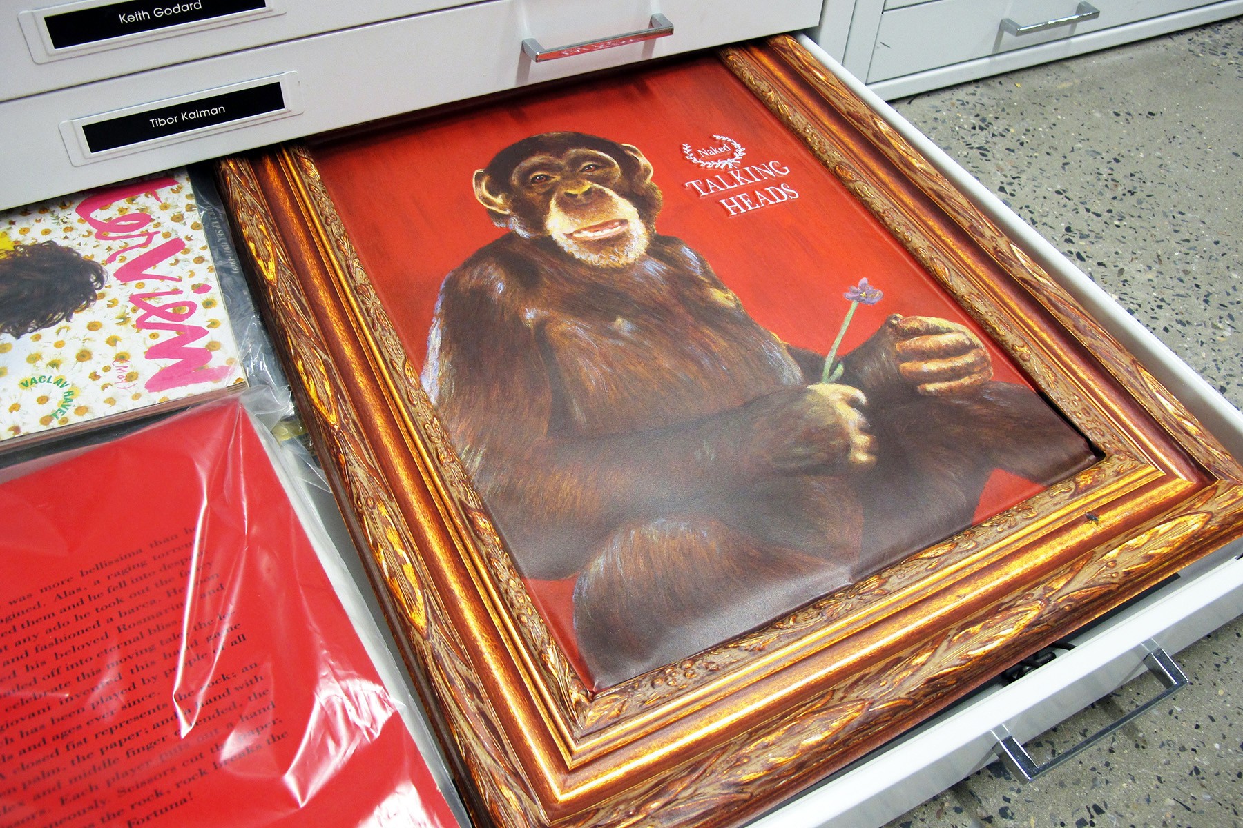 In-store promo developed by designer Tibor Kalman for the Talking Heads
Tibor Kalman and his company designed most of the packaging and sleeves for the Talking Heads. We have some the in-store promo for the “Naked” album, and this (above) is a piece they commissioned an animal painter to paint.
In an era where an inexhaustible amount of information exists online, where does a place like this fit in?
Very little of what’s here—80 percent I’d say—is not available online, and very few people have seen it. What I say to students and other designers is that if you’re doing visual research online, you’re probably typing the same string of text into Google that someone else is typing, and the way the algorithm works, you’re basically going to see the same thing everyone else is seeing.
So if you want to see something different, you have to do a little bit of legwork and come to places like this because what we have is not online. For example, you might see the cover of a Fortune magazine from the 1930s online, but at the Lubalin Center we have the whole issue. And you never know what you’ll find inside.
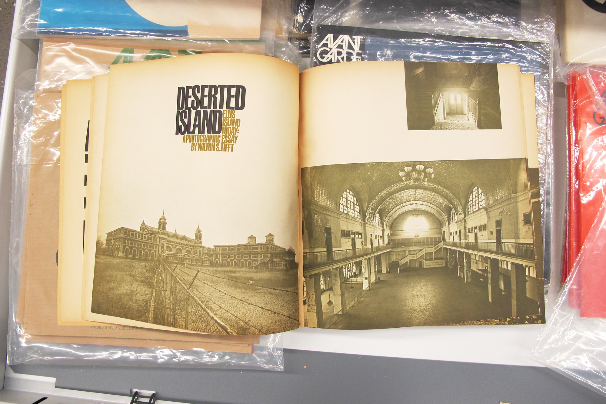
 An article on Ellis Island in Avant Garde (top); Milton Glaser book cover illustrations (bottom)
+++
Admission to The Lubalin Center is free, but access is granted by appointment only. Some of the contents in the archives are also featured online at Flat File, a newly launched design resource. With Flat File, curator Alexander Tochilovsky and designer Anton Herasymenko pull individual works from the center’s collection and dissect them to reveal their context and history.
The Lubalin Center
41 Cooper Square
New York, NY 10003
[email protected]
212.353.4021
This interview has been edited and condensed. All images © Diane Pham / 6sqft
RELATED:
- Own the incredible Arts and Crafts home where Milton Glaser designed the ‘I ♥ NY’ logo
- This Poster Displays All 468 Subway Station Signs
- A History of New York in 101 Objects: 6sqft Edition

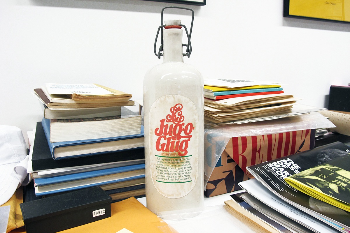


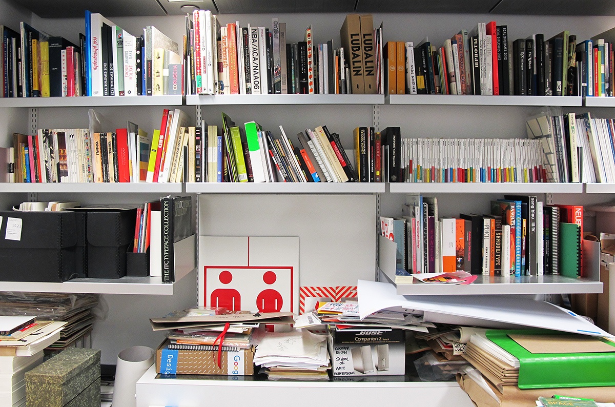
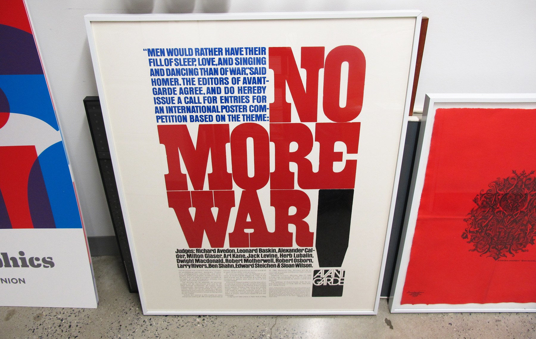


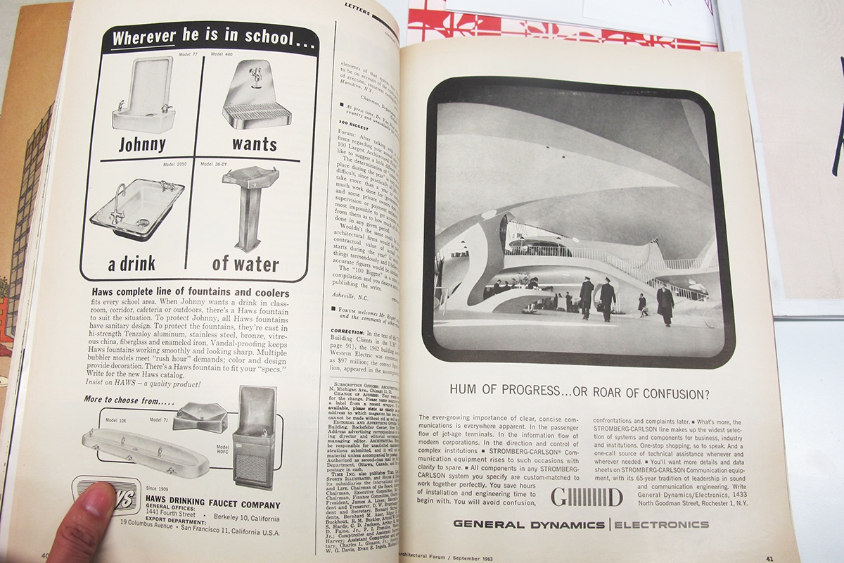


Image © 6sqft


Explore NYC Virtually
Leave a reply
Your email address will not be published.


Wow! Il’ll have to visit this graphic designer’s paradise next time I go to NYC!
thank you…must visit….