Infographic: Here’s How Much Every State Contributes to the U.S. Economy

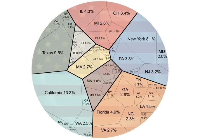
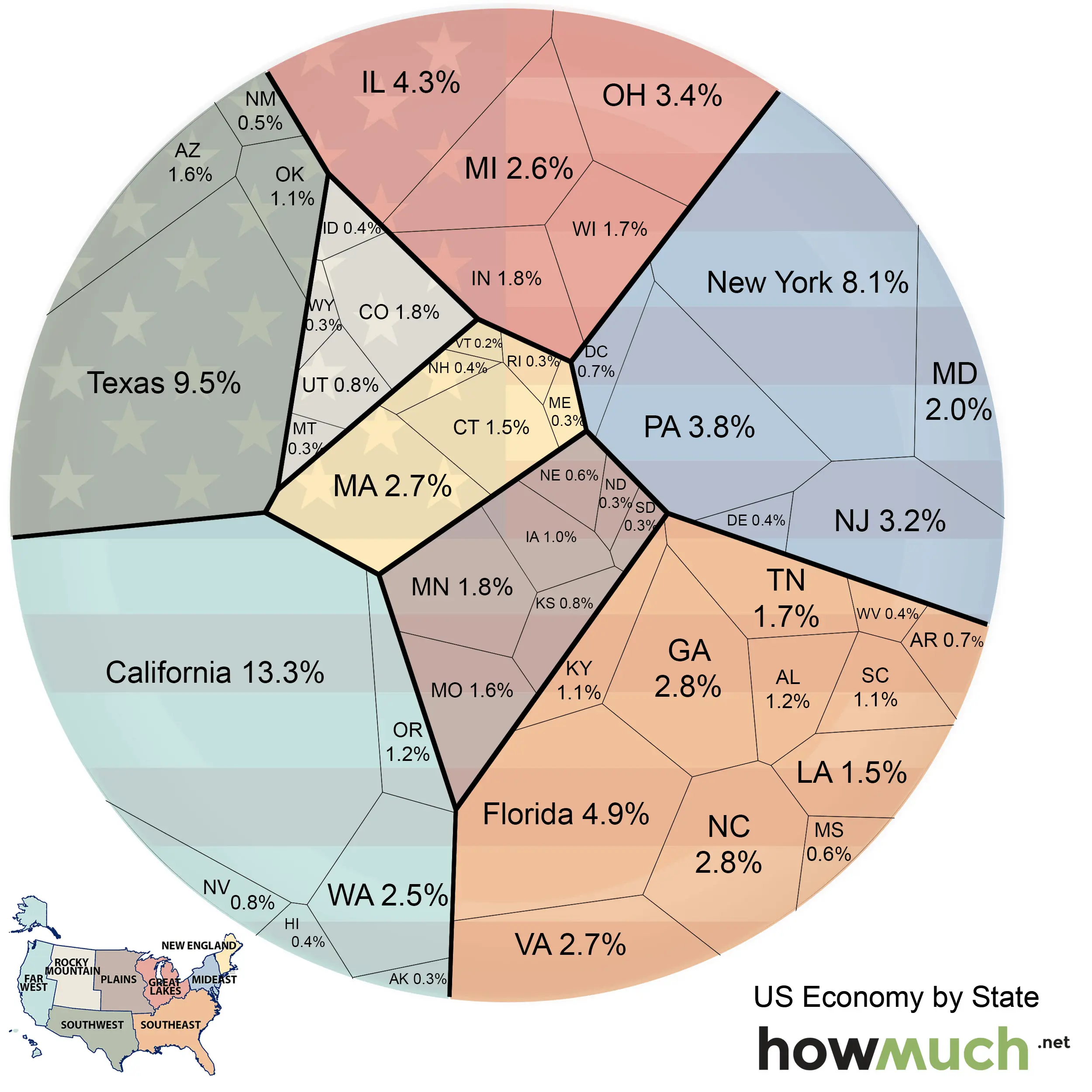
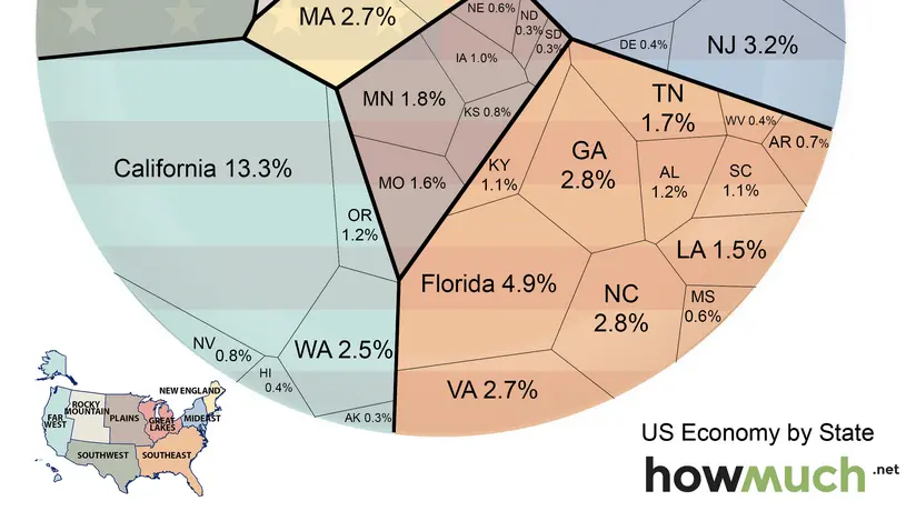
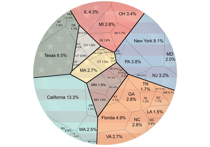
Would you guess that Texas has a bigger or smaller economy than New York? Which state would you say is the smallest contributor to our nation’s $17.3 trillion GDP? This fascinating chart created by HowMuch.net breaks down the relative economic value of each state (in 2014 dollars) into one digestible diagram that’s sure to start a conversation—if not offer a whole new respect for states like Florida and New Jersey.

It’s no surprise that California and New York rank among the highest with 13.3 percent and 8.1 percent contributions, respectively. Although, as we previously alluded, Texas bests New York at 9.5 percent. The smallest economies include those in the Rocky Mountain region with most states accounting for less than 1 percent. But if we’re to talk the tiniest, Vermont sits at the very bottom with just .2 percent.
You’ll also notice that the states are also grouped by color according to their region. As HowMuch notes on their site, most of the economy is concentrated in three regions: the Far West (18.6 percent), Southeast (21.3 percent), and Mideast (18.2 percent). In these regions you’ll find most of the major U.S. states and cities, a fact that accounts for their larger contributions.
[Via Business Insider]
RELATED:


