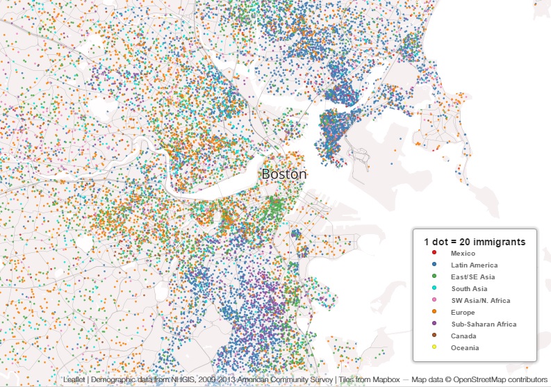
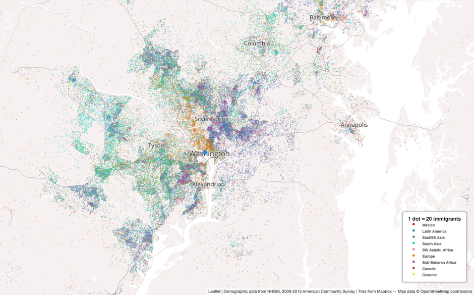
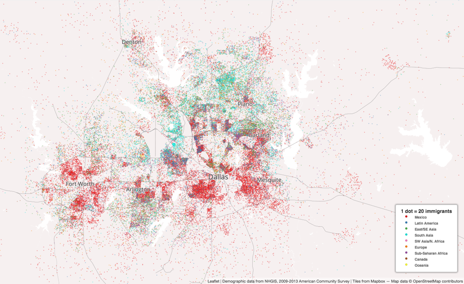
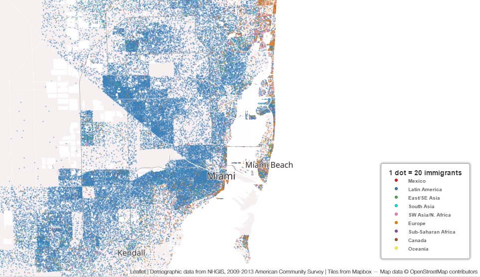
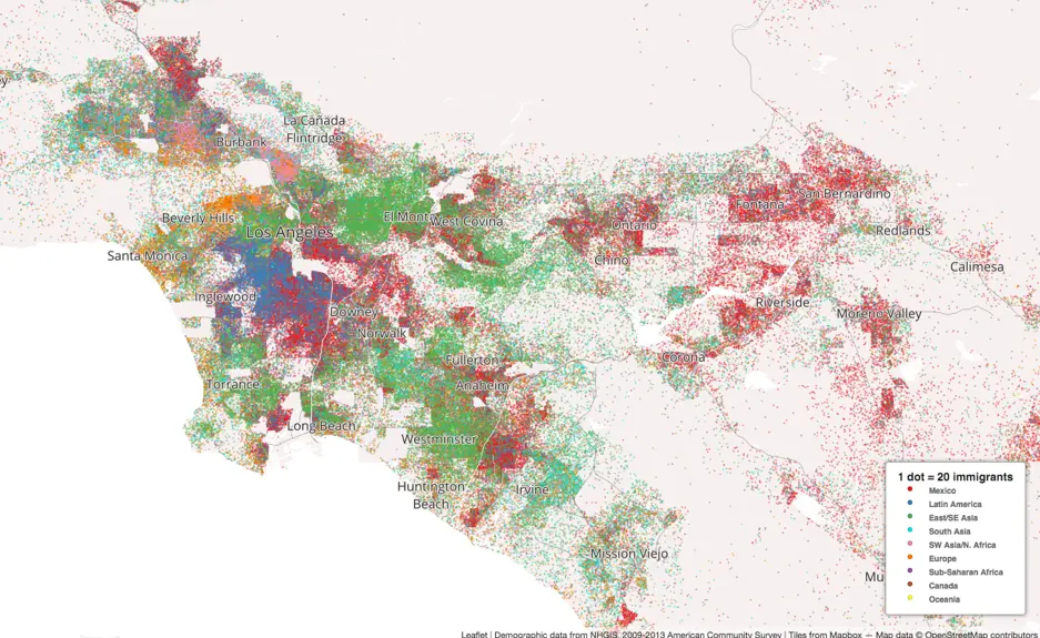
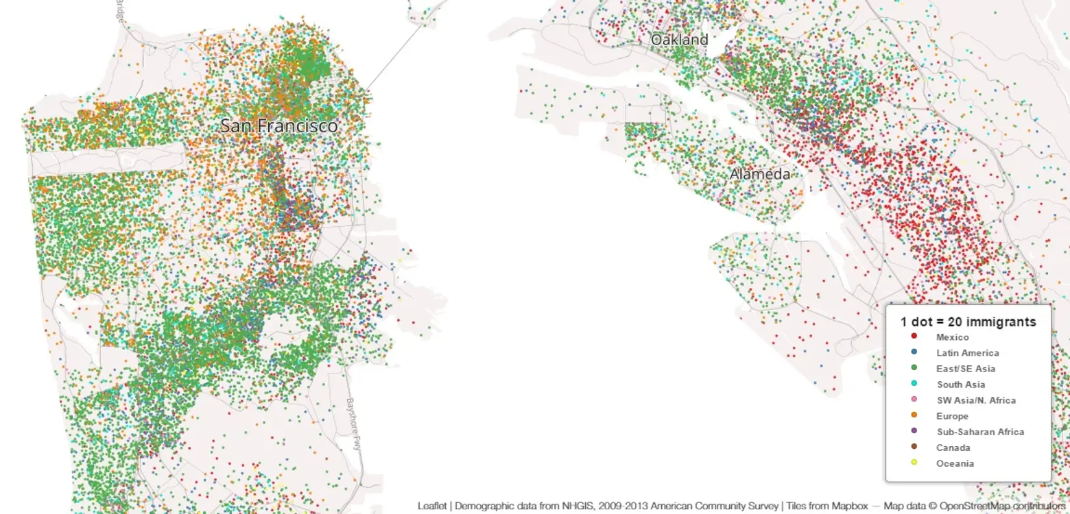
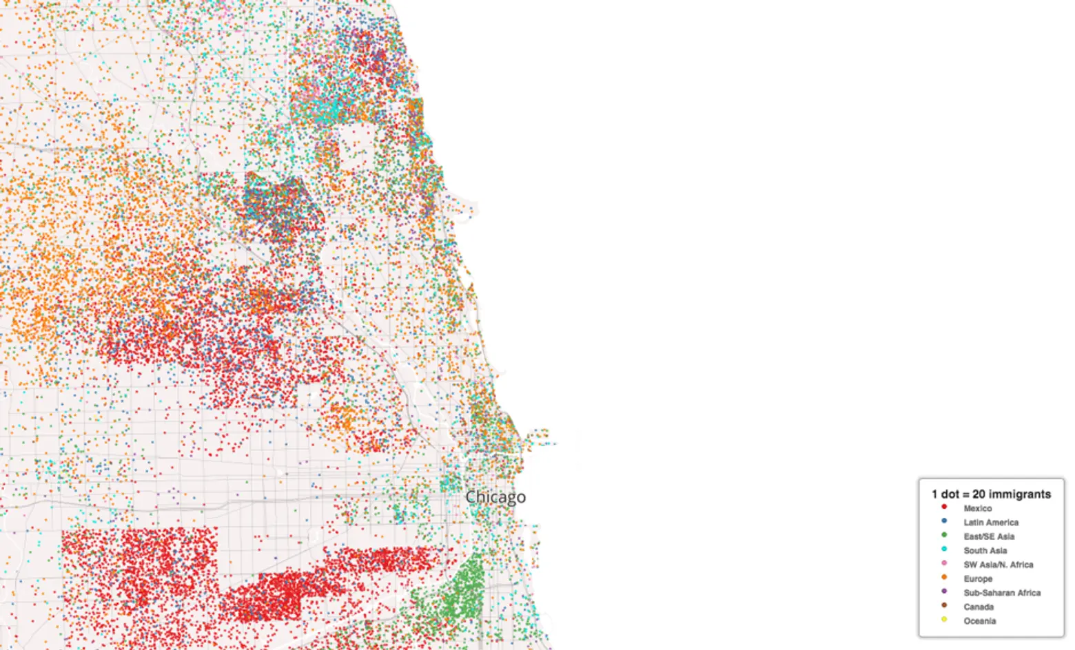
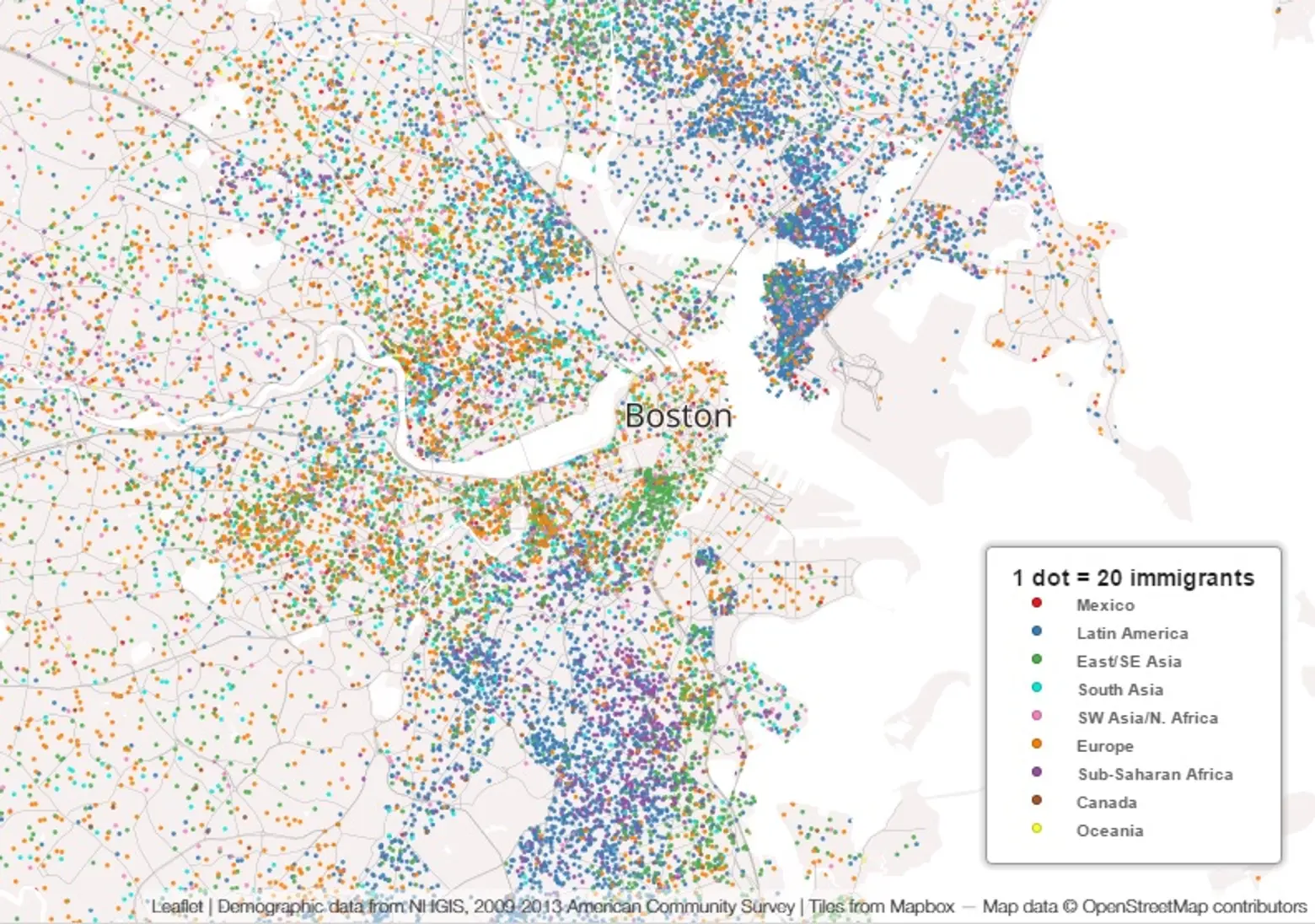
Colorful Dot Maps Paint a Picture of Immigration in the U.S.

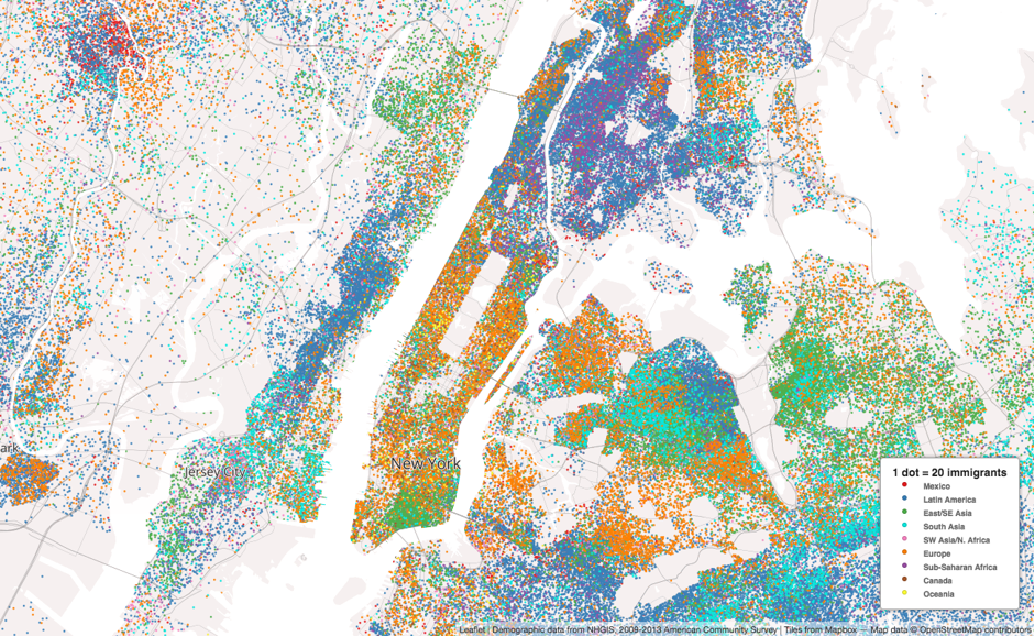
First spotted by CityLab, these dot maps called Mapping Immigrant America are colorful in two senses of the word. Kyle Walker, assistant professor of geography at Texas Christian University, used census tract data to map America’s immigrant population. The nine countries of origin (Mexico, Latin America and the Caribbean, East and Southeast Asia, South Asia, Sub-Saharan Africa, North Africa and Southwest Asia, Europe, Oceania, and Canada) are represented with a different hued dot, creating a picture of diversity and ethnic enclaves. With each dot standing in for 20 immigrants, a quick look at a city’s color palette tells a lot about its cultural makeup.
In New York, we see that the the majority of Manhattan’s immigrants are European, save for the East/Southeast Asian cluster on the Lower East Side and the Latin American population above Central Park. Nearly all of the Bronx is dotted dark blue for Latin America, as is northeastern Brooklyn. Northwestern Brooklyn, Northwestern Queens, and Southeastern Queens are predominantly European, while Northeastern Queens is a mix of South Asian and Latin American.
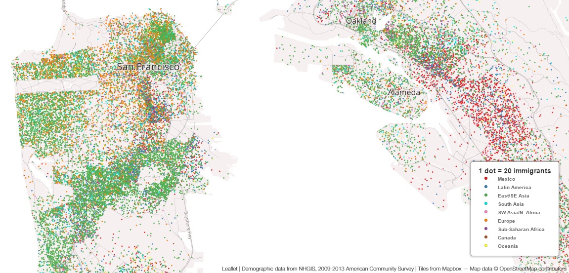
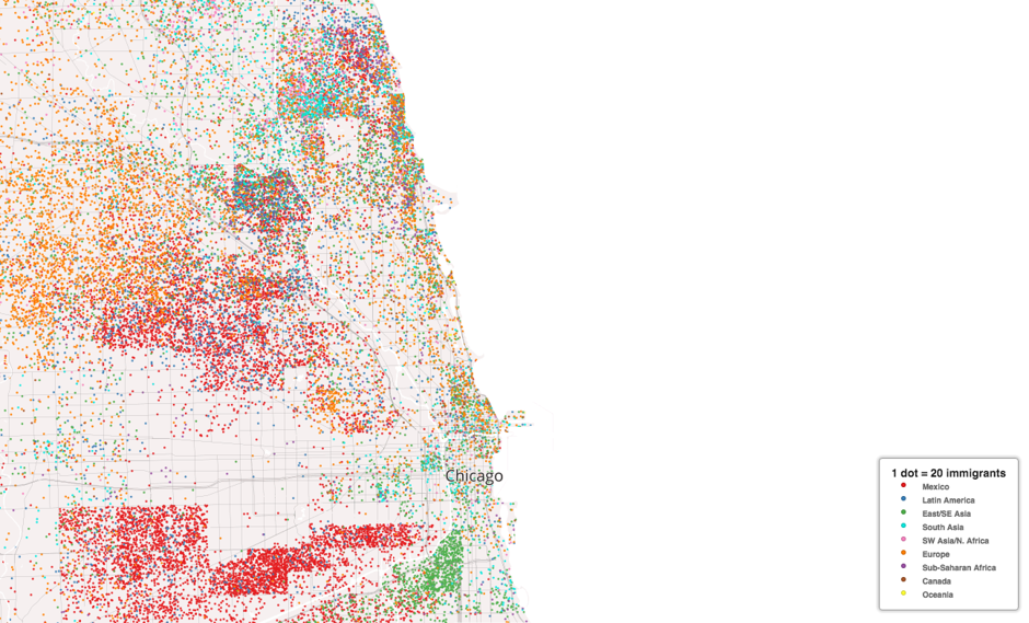
See how other major U.S. cities compare here and in our gallery below:

[Via CityLab]
RELATED:
- Map Shows the Countries Other Than Mexico That Have the Most Immigrants in Each U.S. State
- Infographic: Here’s NYC’s Immigration Patterns over 387 Years
- NYC aka New Netherland: Mapping the 11 Different Cultural ‘Nations’ Within the U.S.
All maps via Kyle Walker