‘True Size Map’ Will Change Everything You Think About World Geography

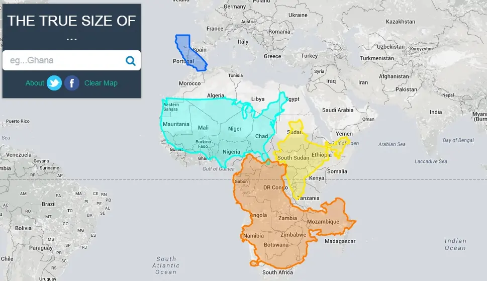
“Did you know that California is more than four times the size of Portugal? Or that you could fit China, the U.S. and India into the continent of Africa, with room to spare?” The Huffington Post shares these mind-blowing facts in a reveal of the “True Size Map,” which shows countries in their true, relative sizes and lets users move them (along with states) around to compare sizes. This layout is as opposed to the Mercator projection, our typical map, which, because it’s translating a spherical planet into a flat 2D representation, distorts many countries. For example, nations near the poles appear larger than they actually are while those close to the equator are smaller.
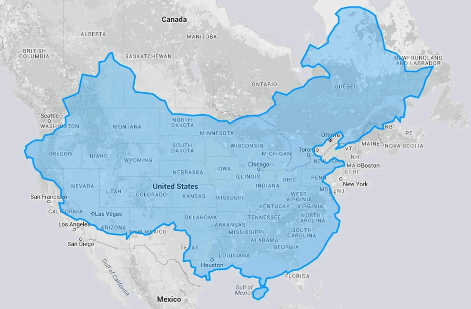
China laid over the United States
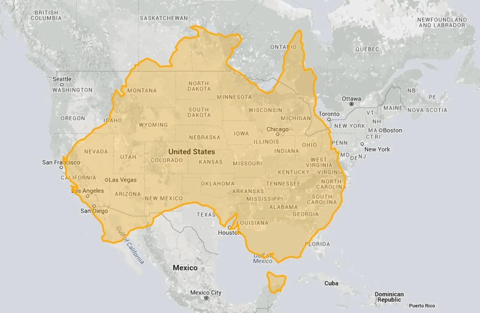
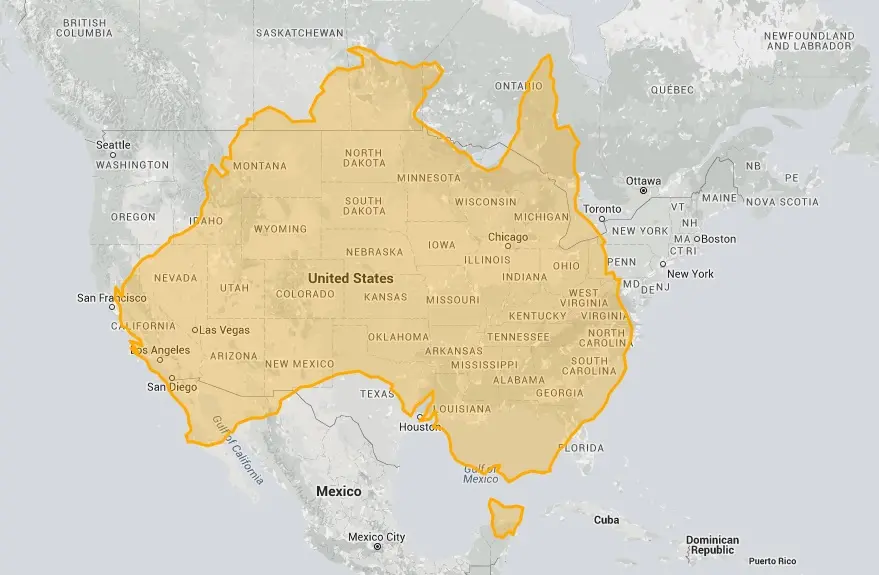
Australia laid over the United States
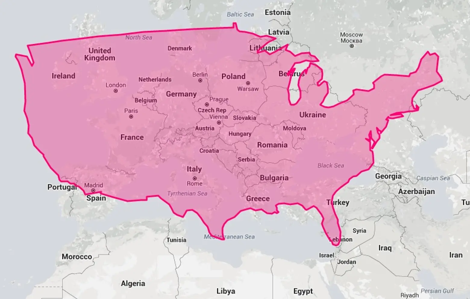
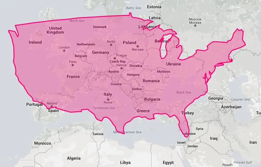
The United States laid over Europe
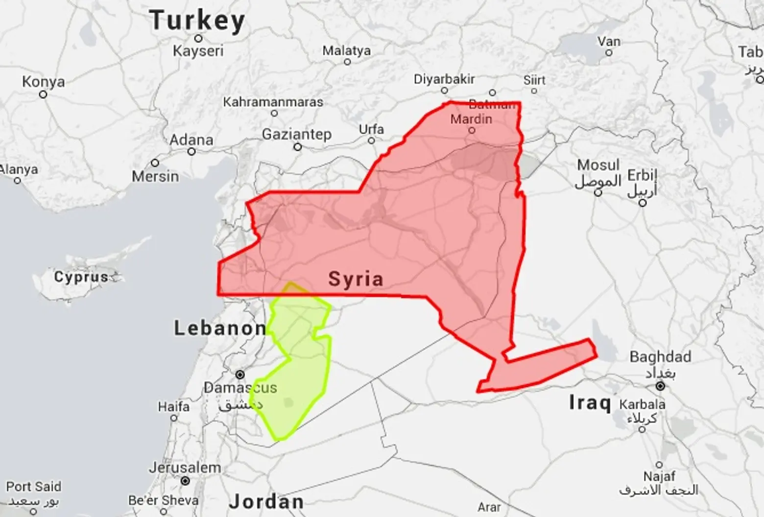
New York and New Jersey are about the same size as Syria
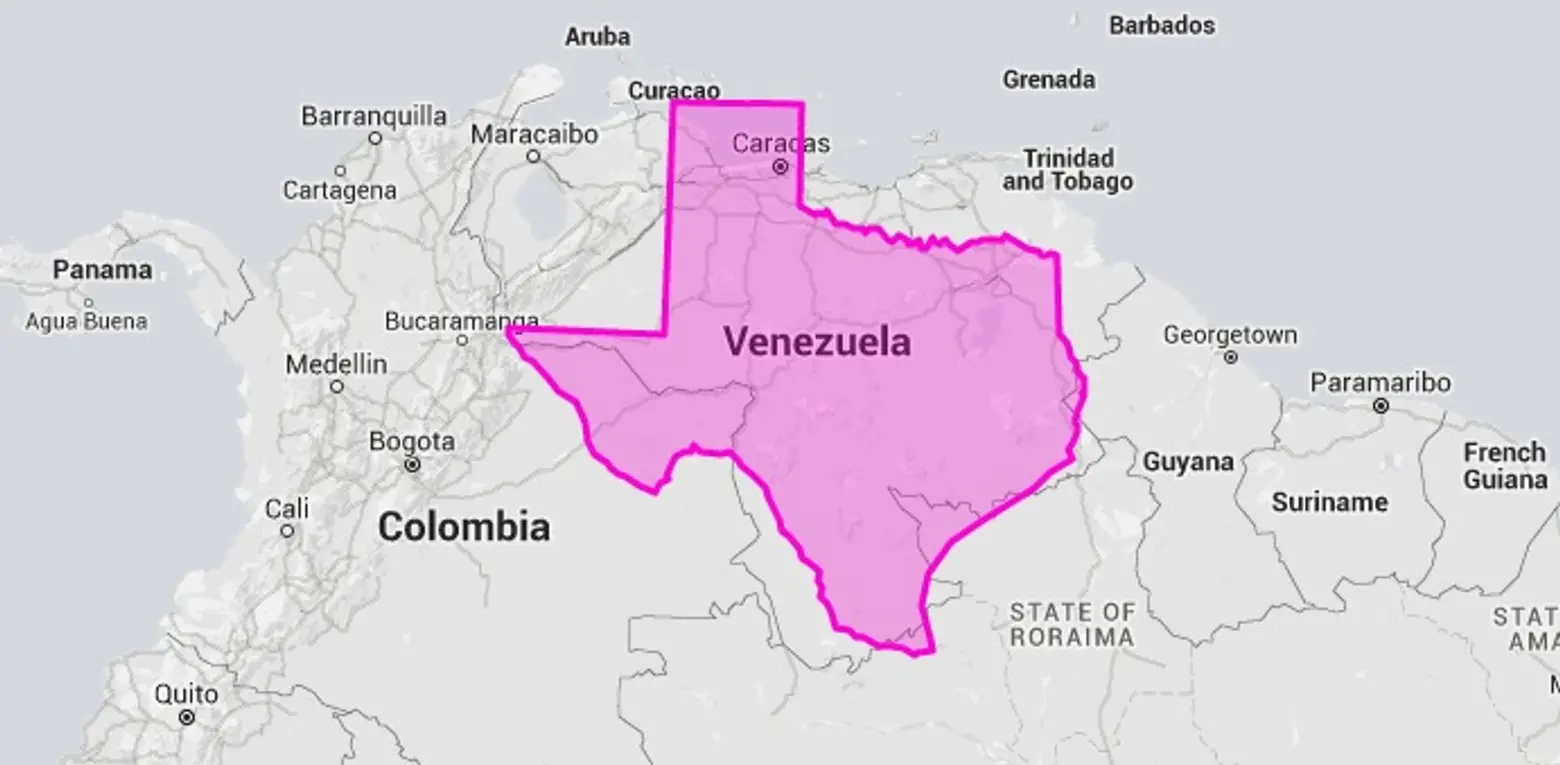
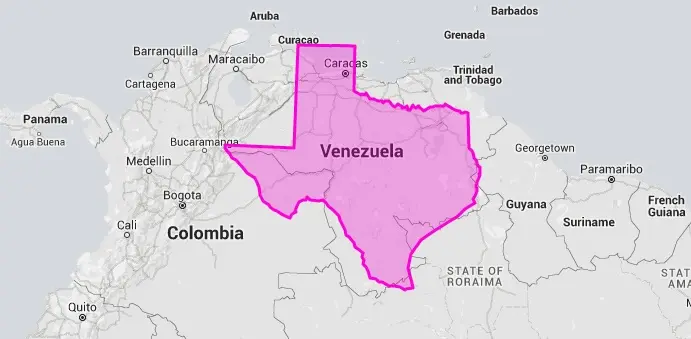
Texas is about the same size as Venezuela
True Size Map was created by technologists James Talmage Damon Maneice. They were inspired by an episode of “The West Wing” and an infographic called The True Size of Africa.
Explore True Size Map this way >>
[Via Huffington Post]
RELATED:
- Maps Compare NYC’s Footprint to Other Cities Around the World
- Money Mapped: New York Has the Same GDP as Spain
- Here’s a Map of Where the World’s Insanely Rich Live
All maps via True Size Map


Explore NYC Virtually
Leave a reply
Your email address will not be published.


This is more accurate site: https://guesswhereyouare.com/guide/maps/true-country-size.html
TrueSizeMap has some calculations issues from wrong projection