Maps Compare NYC’s Footprint to Other Cities Around the World

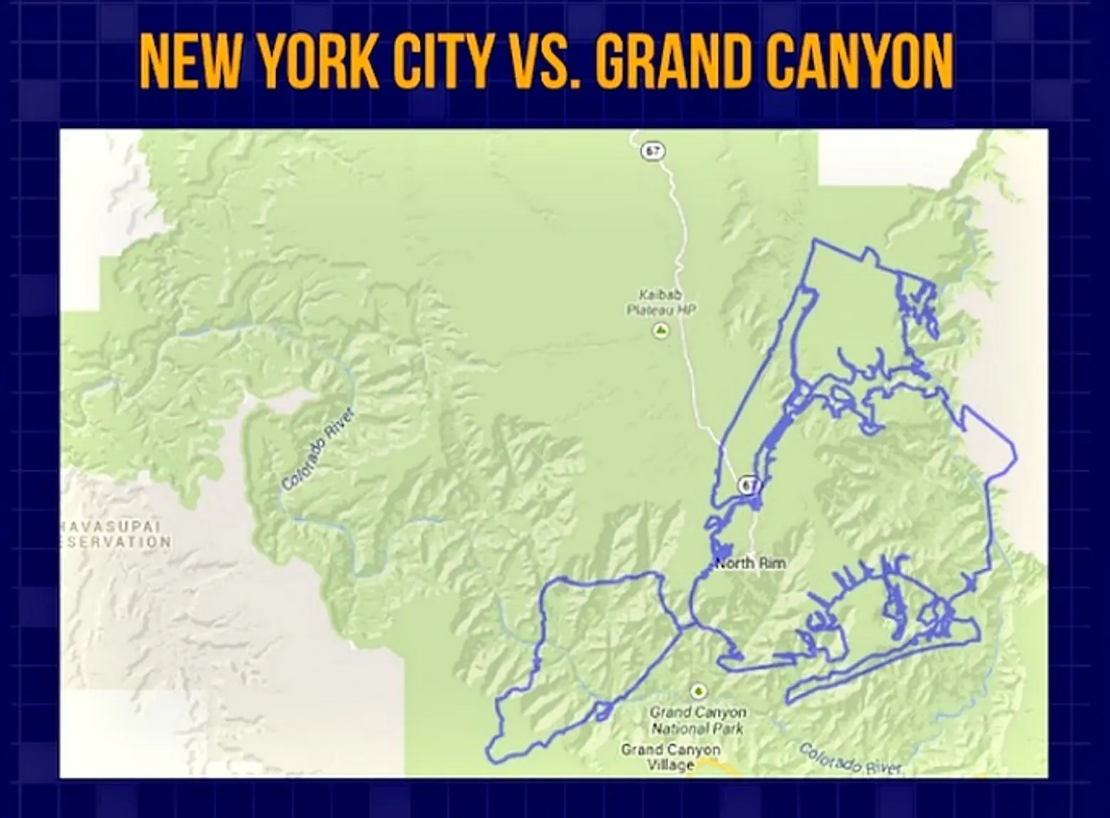
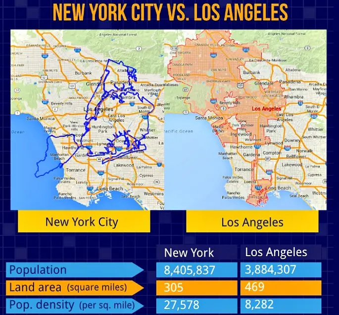
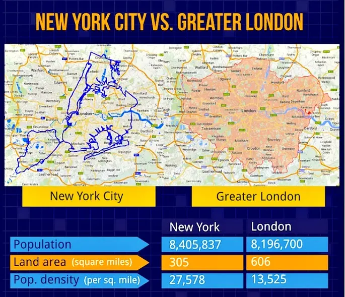
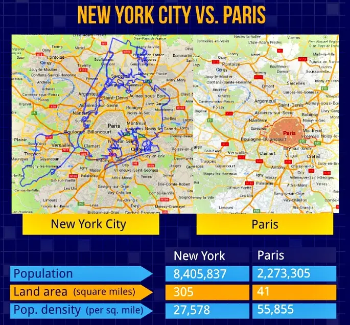
Considering that the world’s population can fit inside New York City, it’s easy to believe that our great metropolis is the biggest city around. But is that actually true? A fun new mapping series from storage site SpareFoot takes an overlay of NYC’s footprint and places it over other major cities, countries, and landmarks from the around the world. The visuals are helpful in seeing how easily we can misrepresent size in our heads. For example, as SpareFoot notes, “New York’s 8.4 million residents make it the 21st most populous city in the world (when measuring within the city limits) and of course first in the United States. By area, the 305 square miles of land delineated by its city limits make it the 24th largest city in the US by land area.” And internationally, it doesn’t even make the list of top 250 largest cities by land, reports Gothamist. Just look at London–it’s nearly twice the size of New York. Yet Boston and San Francisco are about 1/6 the size of NYC.
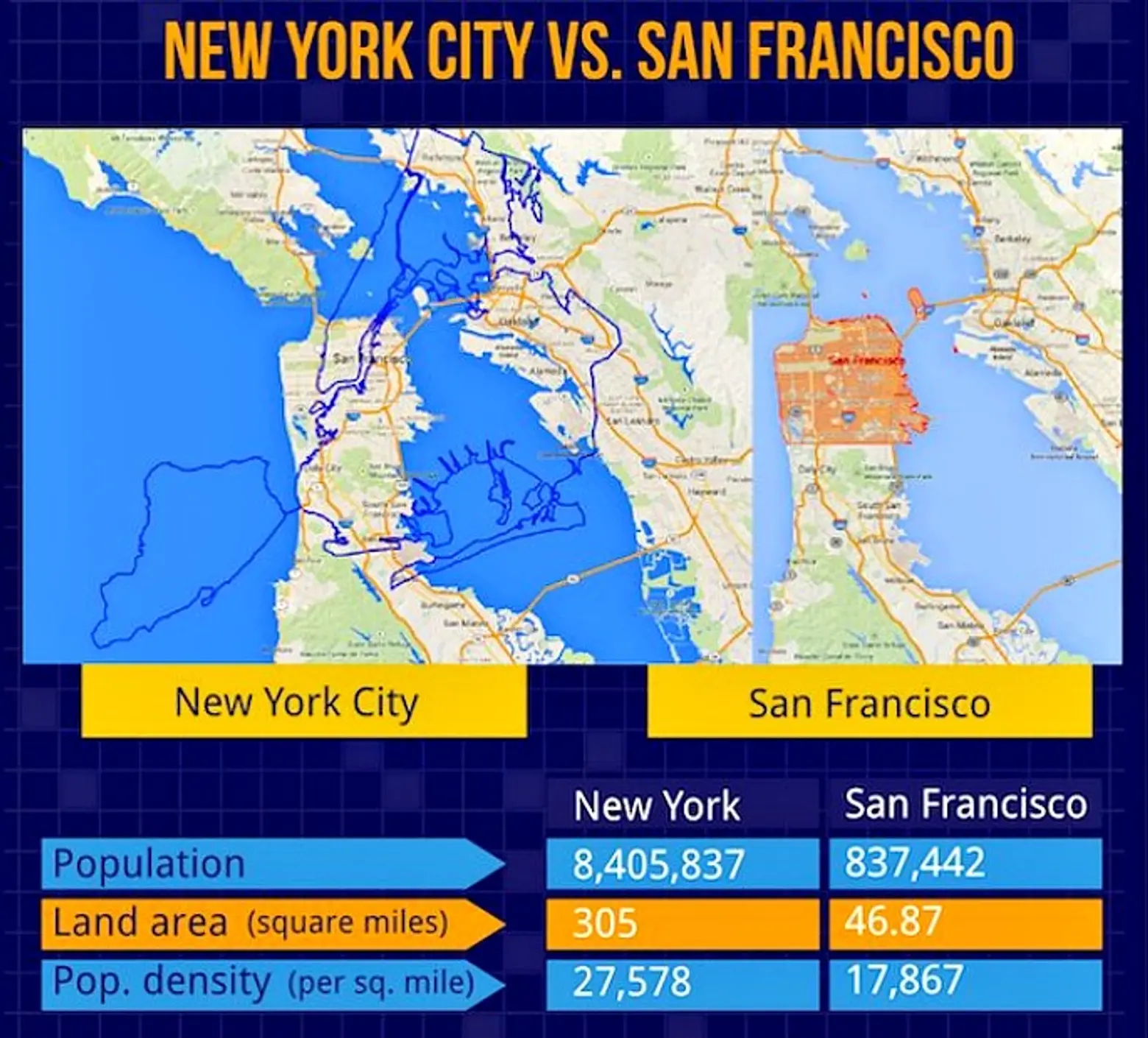
To create the overlays, SpareFoot used a mapping tool called MAPfrappe, which allowed them to draw an outline of NYC’s city limits and move it across Google Maps, “readjusting the shape and scale of the outline to compensate for Mercator projection distortions, in effect allowing for 2D comparisons on a 3D globe.” In addition to looking at land footprints, the site also provides data for population, population density, and land area.
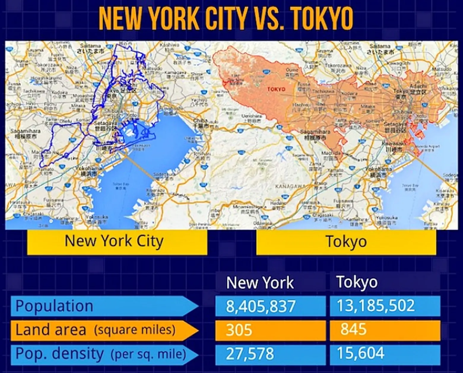

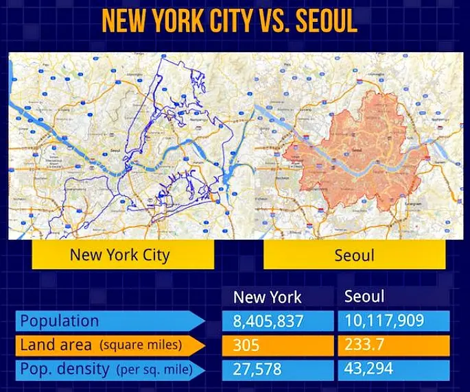
Tokyo is much larger than New York and it also is the most populated city in the world. But because it’s so large, its population density is only 15,604 people per square mile, whereas NYC’s is 27,578. Seoul has rougly two million more people than New York, but is 75 square miles smaller. It’s population density is a whopping 43,294 people per square mile.
See more maps in our gallery below, and check them all out on SpareFoot.
All maps via SpareFoot
RELATED:


Get Insider Updates with Our Newsletter!
Leave a reply
Your email address will not be published.


This is a terrible misrepresentation of reality utterly lacking in cartographic integrity, for which the authors would do well to be ashamed of and take down. The geographic areas being compared to one another are quite simply not comparable. For instance, NYC proper is compared not to Tokoyo proper but to the entire prefecture of Tokoyo. They have effectively compared part of a city to an entire state; small wonder their density calculations are well off the mark.