The MetLife Building’s letters are getting a makeover

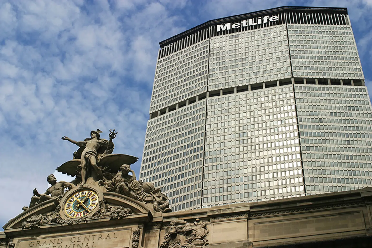
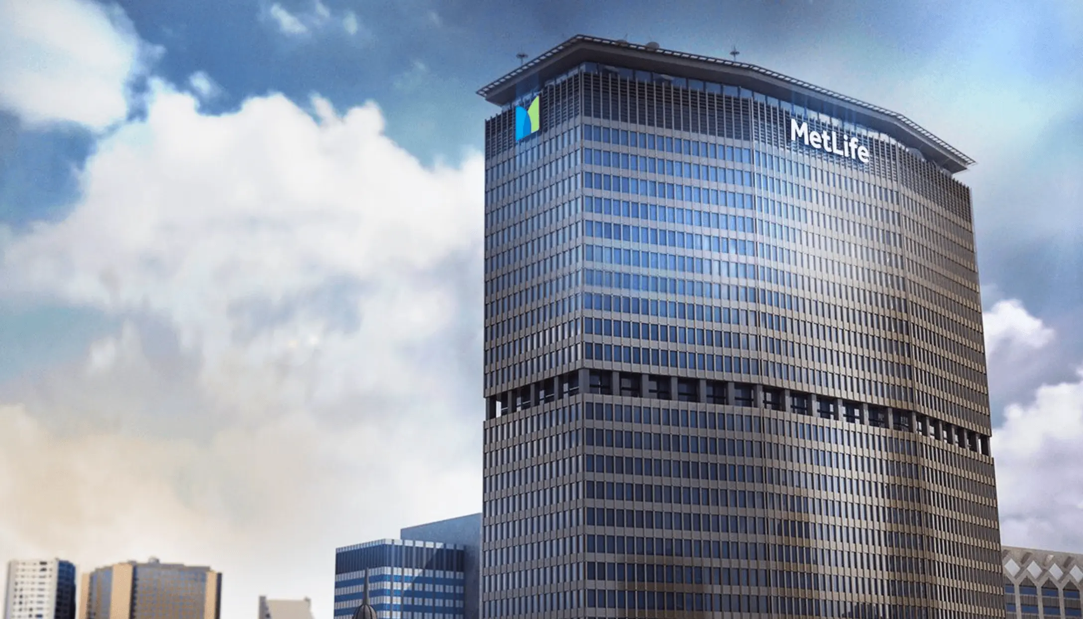
While the Brutalist architecture of the MetLife Building, formerly the Pan Am Building, makes this 59-story skyscraper stand out among Midtown’s many tall towers, its large sign touting its namesake makes it easy for all to identify. Beginning this week, the insurance company will replace the massive letters with a brand new typeface, as Crain’s reported. The installation of the new, more modern logo will be the first time the building’s sign has changed since 1993 when 15- and 18-foot-long letters spelling out MetLife replaced Pan Am’s sign. Additionally, the firm’s new corporate logo–made more colorful in an attempt to shift their marketing strategy along with a new tagline “Navigating life together”–is being installed on the tower’s east side.
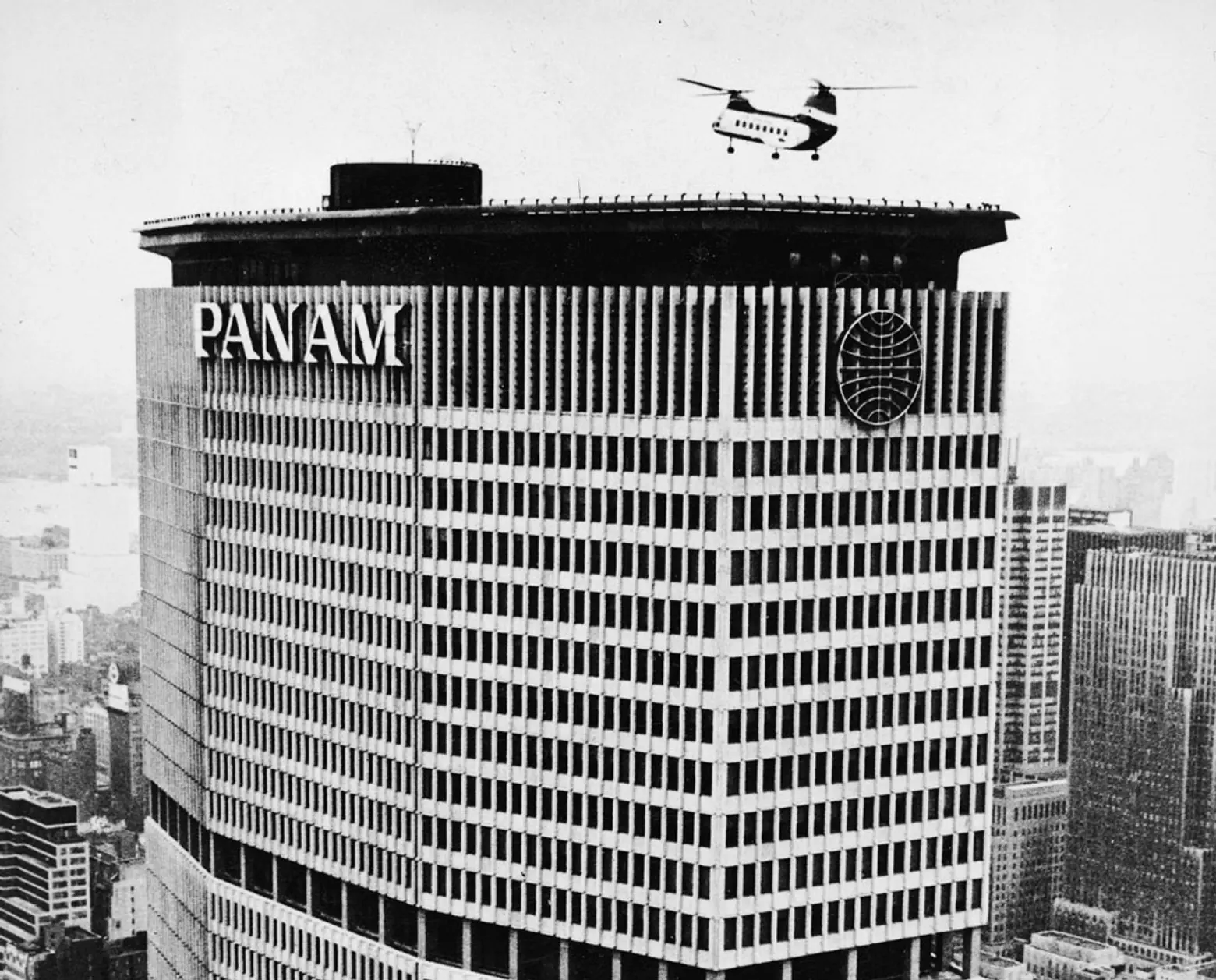
In 1963, the Park Avenue tower was the last skyscraper built before city laws prevented corporate logos and names on top of buildings. Before the company went bankrupt, Pan Am featured its own logo with 15-foot-tall letters on the building’s north and south faces. The Metropolitan Life Insurance Company bought the building in 1981 and then, in 1992, MetLife announced the Pan Am sign would be removed.
But despite its prominence, the MetLife Building has long been criticized for its bulky exterior and supertall height, which overshadows Grand Central Terminal and partially obstructs views of the Chrysler Building from 30 Rockefeller Plaza. Architecture critic Ada Louise Huxtable described the tower as “a colossal collection of minimums.”
The project to replace the insurance company’s massive letters has begun on the tower’s east side and is expected to take the rest of the year to complete. MetLife has yet to say how much the project costs, but the company’s senior vice president for customer experience and design, Howard Pyle, said the redesign “reflects who MetLife is today as we transform to be a more modern, consumer-facing and purposeful company.”
[Via Crain’s]
RELATED:
Get Inspired by NYC.
Leave a reply
Your email address will not be published.


Change the lettering all you want, it’s still the Pan Am Building.