Mapping the Individual Economies of NYC Neighborhoods

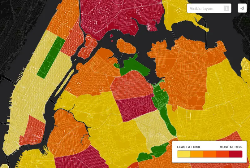
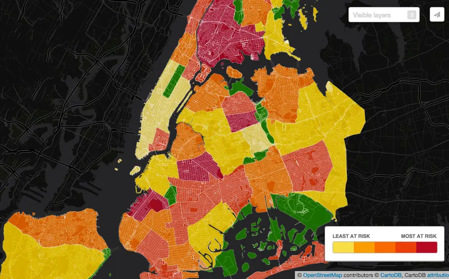
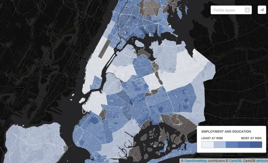
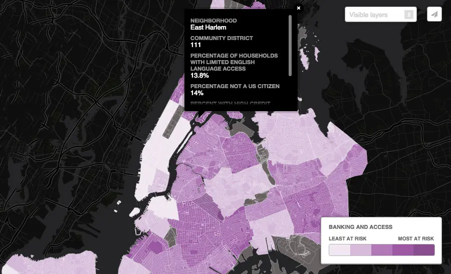
What does your neighborhood economy look like? That’s the title of this smart new interactive map that shows economic development opportunities at the local level. Created by the Association for Neighborhood and Housing Development, the map has five layers–total risk (shown above), community and infrastructure, employment and education, banking and access, and income and benefits. They’re all color-coded and range from least at risk to most at risk. As we can see, the most at risk neighborhoods are in northern Manhattan, the Lower East Side, the Bronx, Sunset Park, Bushwick, Bed-Stuy, and Elmhurst in Queens. The least at risk is the majority of Manhattan and Rego Park/Forest Hills.
To determine overall risk, 19 economic factors were analyzed, including poverty rates, graduation rates, and development dollars spent.
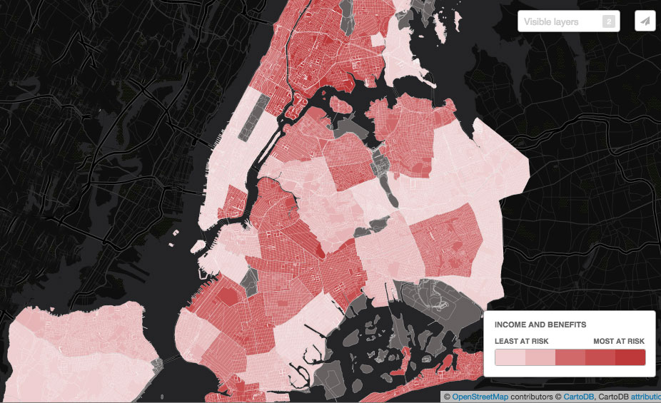
The trends stay pretty consistent through the categories, though employment and education has a higher number of at risk areas.
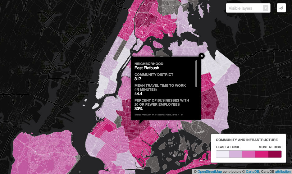

The map also allows users to click on neighborhoods to get more information about their local statistics related to a given layer.
[Via Google Maps Mania]
RELATED: