Mapping Every County in America by Its Natural Beauty Ranking

New York has come a long way in recent years in terms of improving its “natural beauty.” We added the High Line and Brooklyn Bridge Park. We increased ferry service and are sprucing up the East River esplanade. But apparently this is not enough to make our fine city a “desirable” place to live.
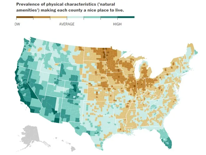
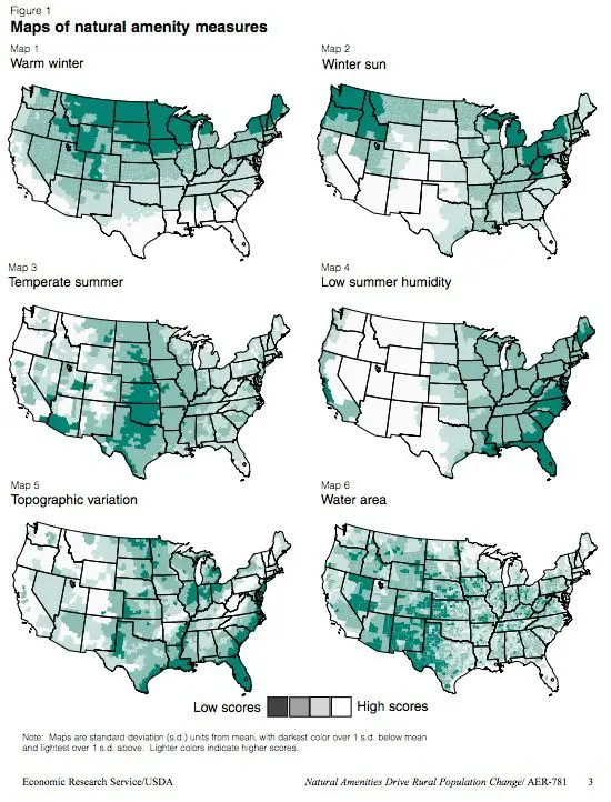
A new mapping series from the Washington Post takes data from the USDA’s Natural Amenities Scale–a measure of the physical characteristics of a county area that enhance the location as a place to live–and color codes from low to average to high just how naturally beautiful and pleasant a given county is. The scale takes into account “six measures of climate, topography, and water area that reflect environmental qualities most people prefer,” which includes “warm winter, winter sun, temperate summer, low summer humidity, topographic variation, and water area.” And judging by today’s stickiness and last winter’s polar vortex, maybe it’s our extreme seasons that are putting our counties in the “low” category.
When you scroll over the map (which you can do here), you can get the ranking for all 3,111 counties in the lower 48 states. Queens county has “low natural amenities” and ranks 1,430th in the nation. Kings county is even worse, ranking 1,572nd. The Bronx is “average” and isn’t so bad at a 734 ranking. Unfortunately, New York (Manhattan) and Richmond (Staten Island) counties don’t appear.
Though we hate to bruise our East Coast pride, all of the ten highest-ranked counties are in California; Ventura County is the most desirable place to live in the country. Alternately, the worst places to live are near the Great Lakes on the Minnesota/North Dakota border; the absolute worst is Red Lake County in Minnesota, which, as the Post notes, is “the only landlocked county in the United States that is surrounded by just two neighboring counties.”
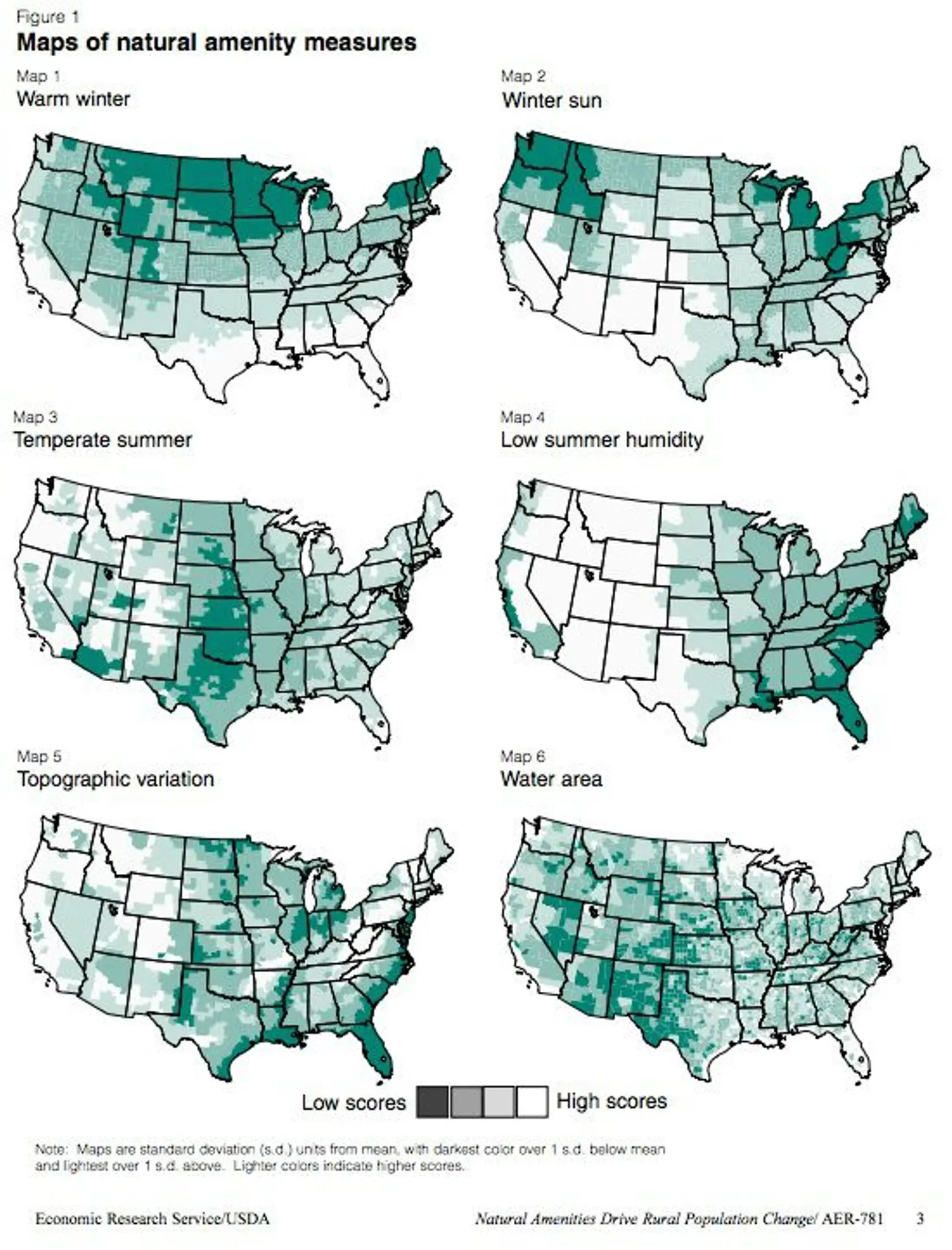
The maps above break down the ranking by each of the six natural amenity measures. As the Post calls out, however, some of this data is slightly skewed and is perhaps a matter of personal preference. For example, the author wonders how “Maricopa County, AZ– home to Phoenix, a place that feels like the inside of a hot car for half the year– ranks higher than Iowa’s stunningly beautiful and criminally underappreciated Loess Hills region? Or that Washington D.C. –home of sweltering summers, miserable winters, swampy humidity and little natural beauty to speak of–ranks higher than any place at all?” Data from the USDA, though, shows that between 1970 and 1996, the counties with the highest rankings saw the sharpest growth in population, while those with low rankings saw a decline.
[Via WP]
RELATED: