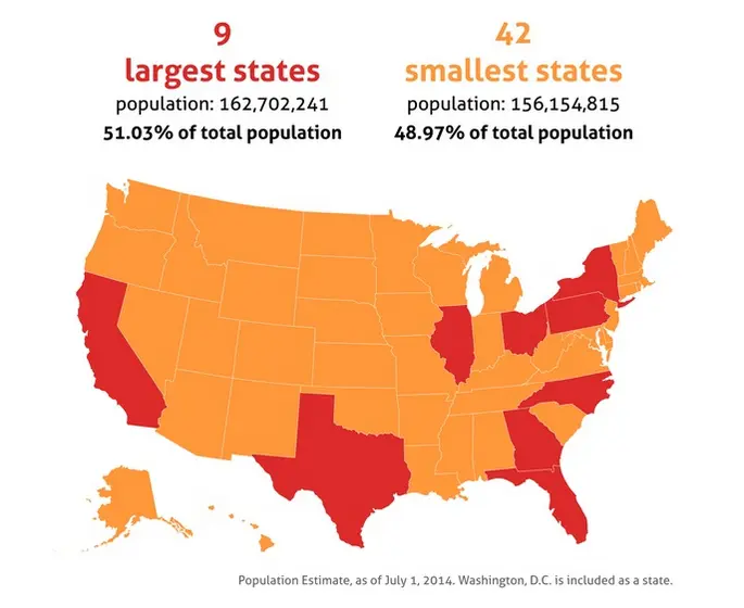
51 Percent of Americans Live in the Country’s Nine Largest States

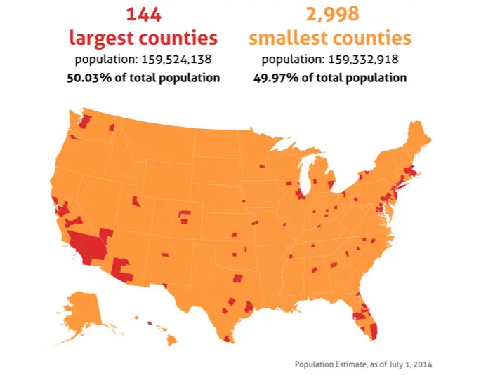
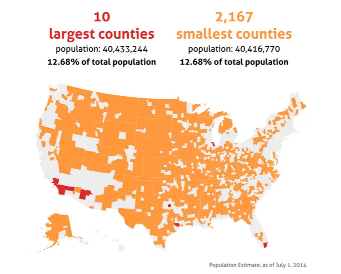
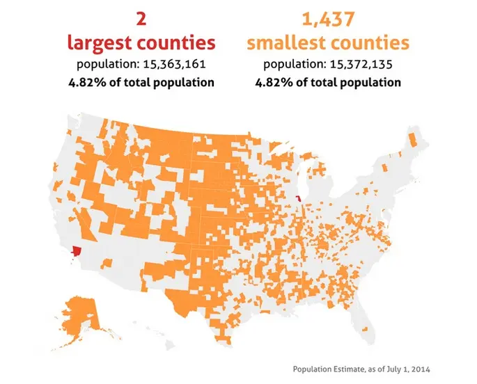
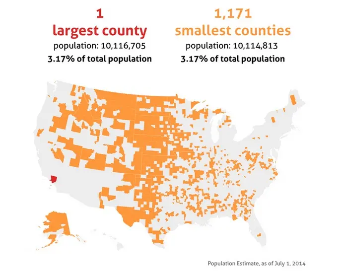
Being face-to-armpit on our morning subway commute and sharing an apartment with five other people can cause us New Yorkers to forget that outside of our five-borough bubble there are places where homes are spaced out and one may need to drive several miles just to get to the grocery store. This mapping series by Dadaviz user Jishai illustrates just how disproportionate the country’s population is. As Mental Floss first noted, “For each visualization, the red and orange regions have equal populations.”
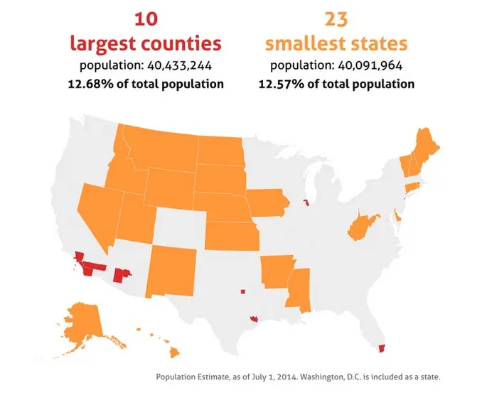
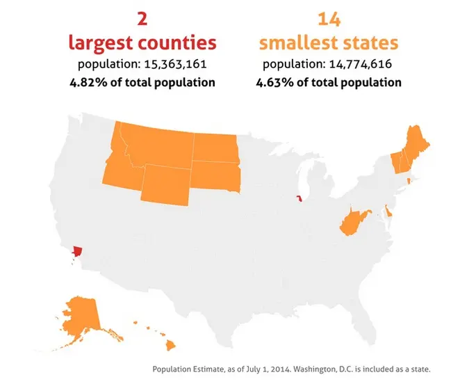
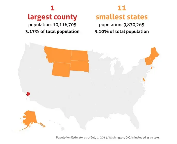
For example, in the map above, we see that 51 percent of the population lives in the country’s nine largest states. Other statistics visualized on the maps show that 50 percent of the population live in the 144 largest counties in the nation, and that the country’s largest county, located in southern California, has roughly the same population as the 11 smallest states.


[Via Mental Floss]
RELATED:
- NYC Makes Up 5 Percent of the Nation’s Property Value
- NYC aka New Netherland: Mapping the 11 Different Cultural ‘Nations’ Within the U.S.
- New Map Reveals the Loudest and Quietest Places in the USA, As Suspected NYC Is Noisy
- New Maps Show How Much You Need to Work in Order to Own a Home in NYC and Other Major Metros