Interactive Graph Compares L Train Commute Times and Rents With Other NYC Neighborhoods

We’re hearing lots of anguish and anxiety over the possibility of an L subway shutdown for repairs for as long as a year or more, and we’ve taken a look at some possible solutions. Now, we’ve asked the real estate data geeks at NeighborhoodX to go a little deeper beneath the grumbling to find out just how much convenience can be had along that thin grey line, and how it stacks up against other neighborhoods in Manhattan, Brooklyn and Queens.
So which other neighborhoods offer commute times similar to the L train stops—and—just as important when choosing a neighborhood–how do their rents compare? And if you’re living along the L, in light of the shutdown, what neighborhood alternatives do you have in the city that provide a similar commute?
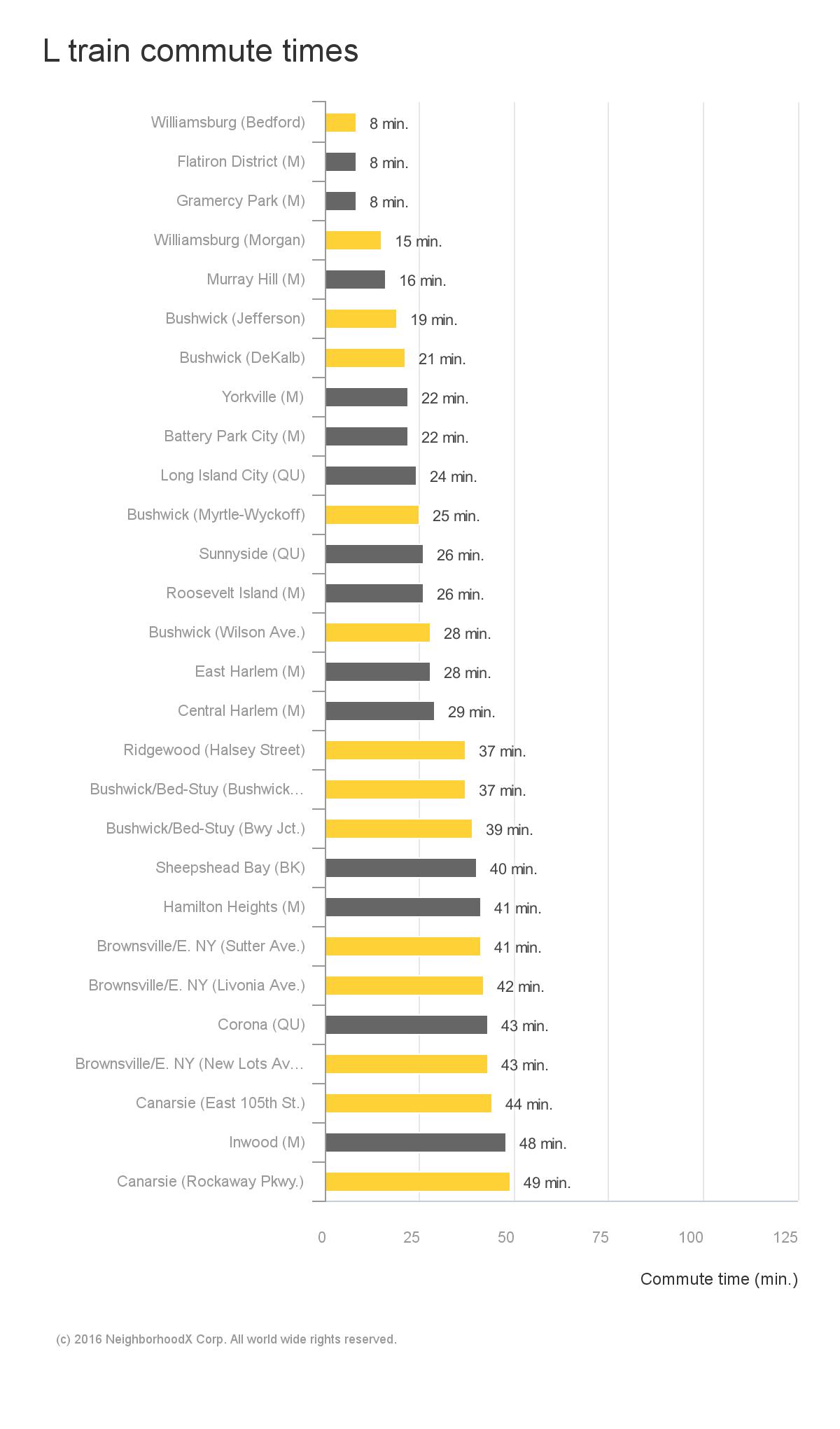
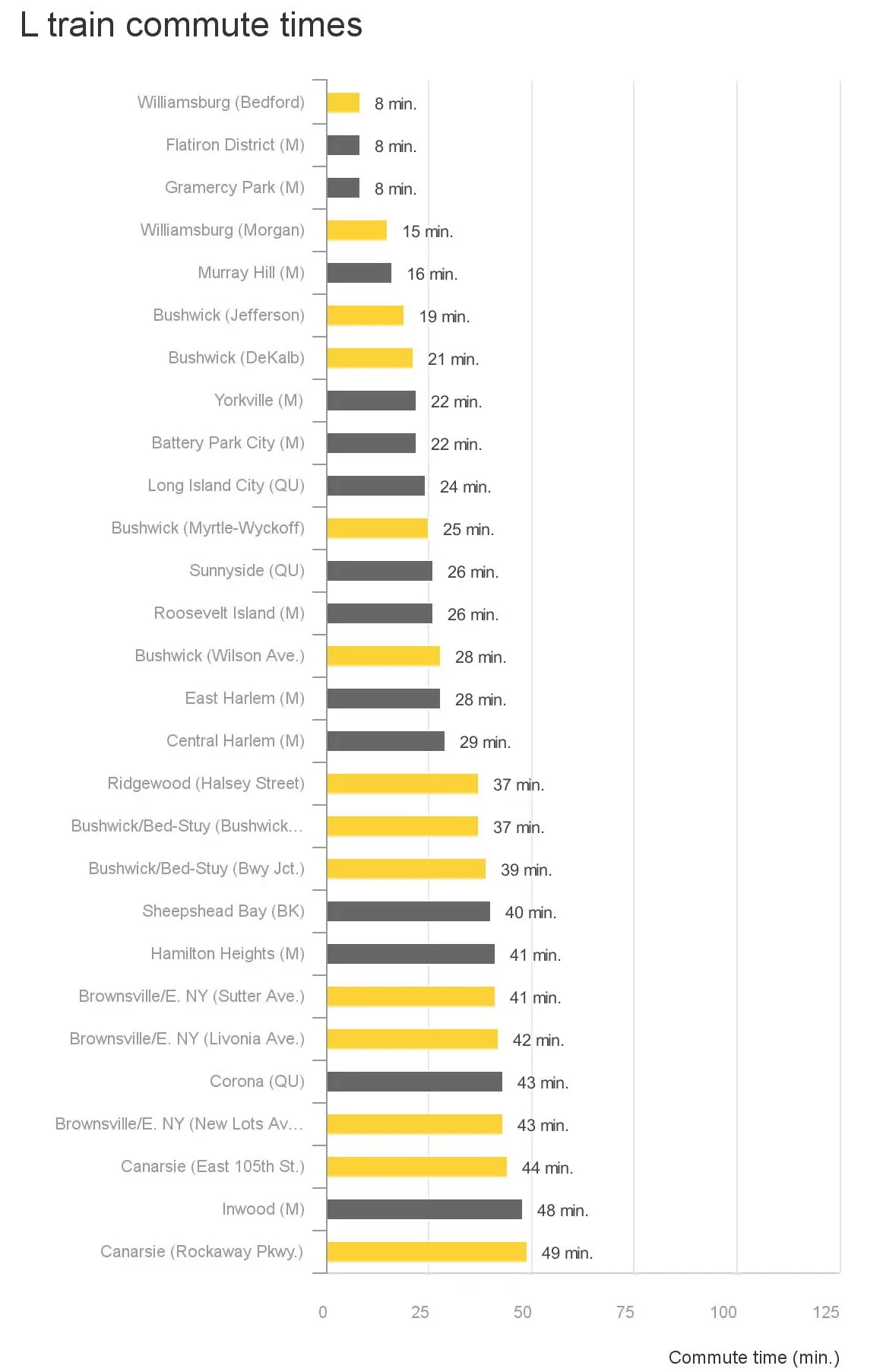
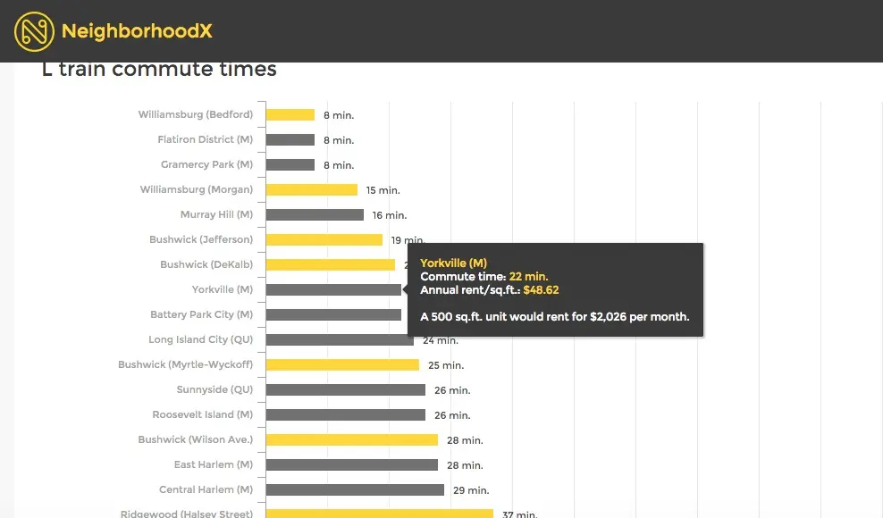
The graph above compares the commute time to Union Square across various neighborhoods and stations throughout the borough. As NeighborhoodX co-founder Constantine Valhouli told 6sqft, “We wanted to offer a way for people to see what other neighborhoods had comparable commute times—and naturally, how rents factor into that.” On the interactive graph at NeighborhoodX’s site, you can place your cursor over each neighborhood to find out what the average rent is for a sample 500-square-foot apartment.
It turns out that some Manhattan neighborhoods (Murray Hill and Yorkville, for example), popular with professionals for their convenience, are about as commuter-friendly as some of the L-train ‘hoods that used to be considered way out there. Case in point: The commute time from the Morgan stop in East Williamsburg (about 16 minutes) is basically identical to the commute time from Murray Hill. Rents are somewhat comparable too, at a (per month) price per square foot of $49 and $56, respectively. However, you can probably get to Union Square from Murray hill in less than 16 minutes if you walk. Not so much from the Morgan stop…
Given speedier commutes than some might have guessed, prime Williamsburg starts to seem more affordable: Gramercy and Flatiron clocked travel times on par with the Bedford Avenue stop, but rents rung in at $71/square foot compared to Williamsburg’s $49. The DeKalb stop in Bushwick compares to Yorkville on the Upper East Side commute-wise, but rents are higher at $49 per square foot compared to DeKalb’s $33.
In other neighborhoods along the L train, rents ranged from below $19 (Canarsie) to $49 (Williamsburg) per square foot. As you reach the end of the L line, Brownsville, Canarsie and East New York show very low rent numbers, though commute time is the longest of all, bringing up a topic vital to any discussion of cities, and quality of life–we’ve previously covered the correlation between income and access to NYC public transportation.
According to Valhouli, “we’ve always believed that rents reflect the current conditions of a neighborhood and property…because rents reflect the amenities (or hassles) that will be experienced in the next 12 months of the lease…” But as yesterday’s town hall meeting on the shutdown showed, the MTA is providing little information on what’s actually in store for the train line, so it’s quite unclear how, if at all, service changes will affect real estate prices.
Check out the L Train infographic and more illuminating neighborhood charts and maps at NeighborhoodX.
RELATED:
- Are Shuttle Buses a Viable Alternative to the L Train During a Shutdown?
- Chart Compares Suburb and City Commute Times–and How Much Extra We Pay for Convenience
- NeighborhoodX’s 3D Map Reveals the Blocks Where Real Estate Prices Are Soaring
- Subway Rent Map Shows Manhattan Rental Prices Along Each Train Line