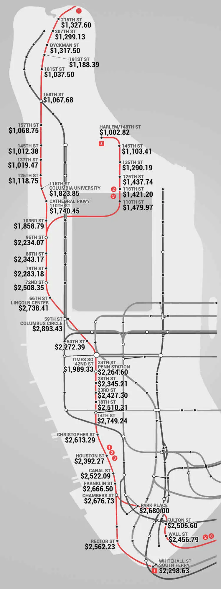
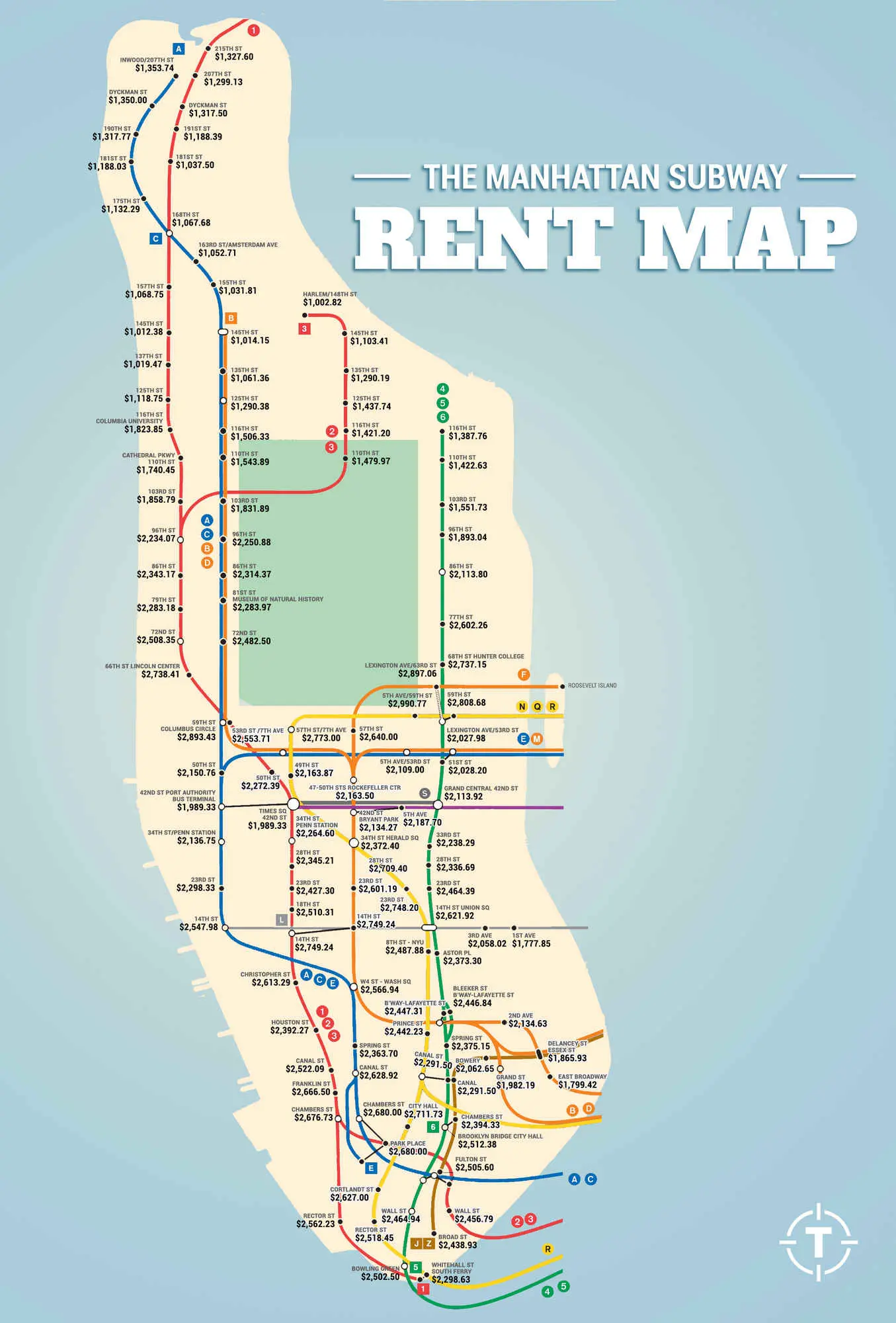
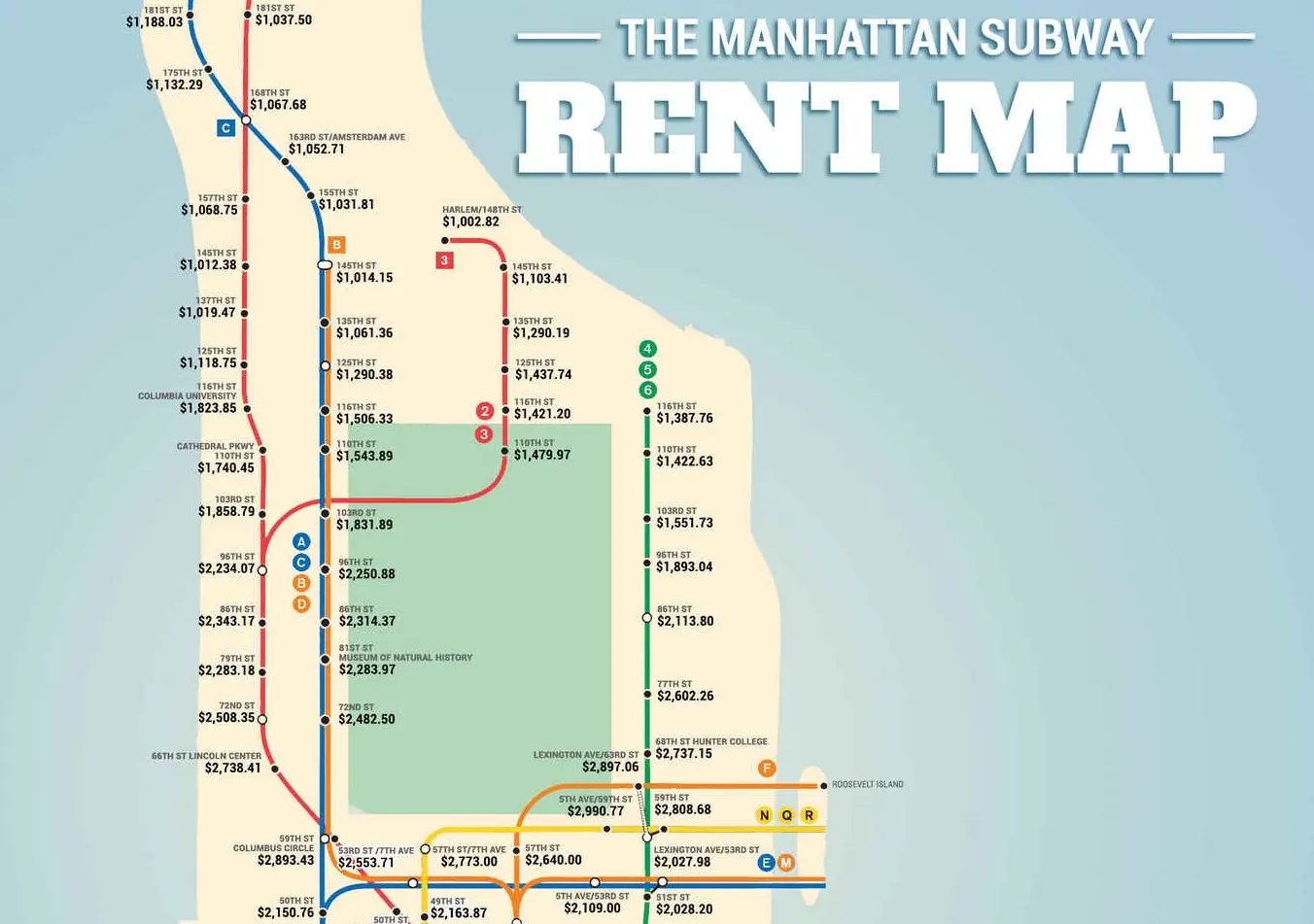
Subway Rent Map Shows Manhattan Rental Prices Along Each Train Line

Map © Thrillist
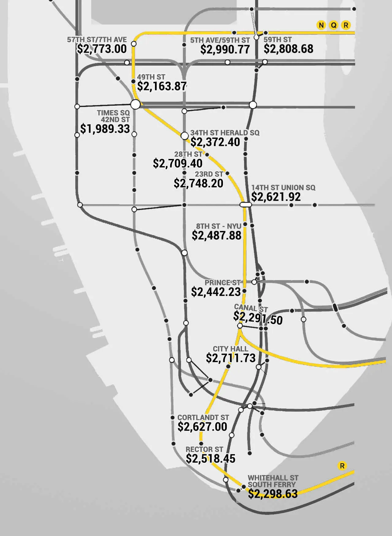
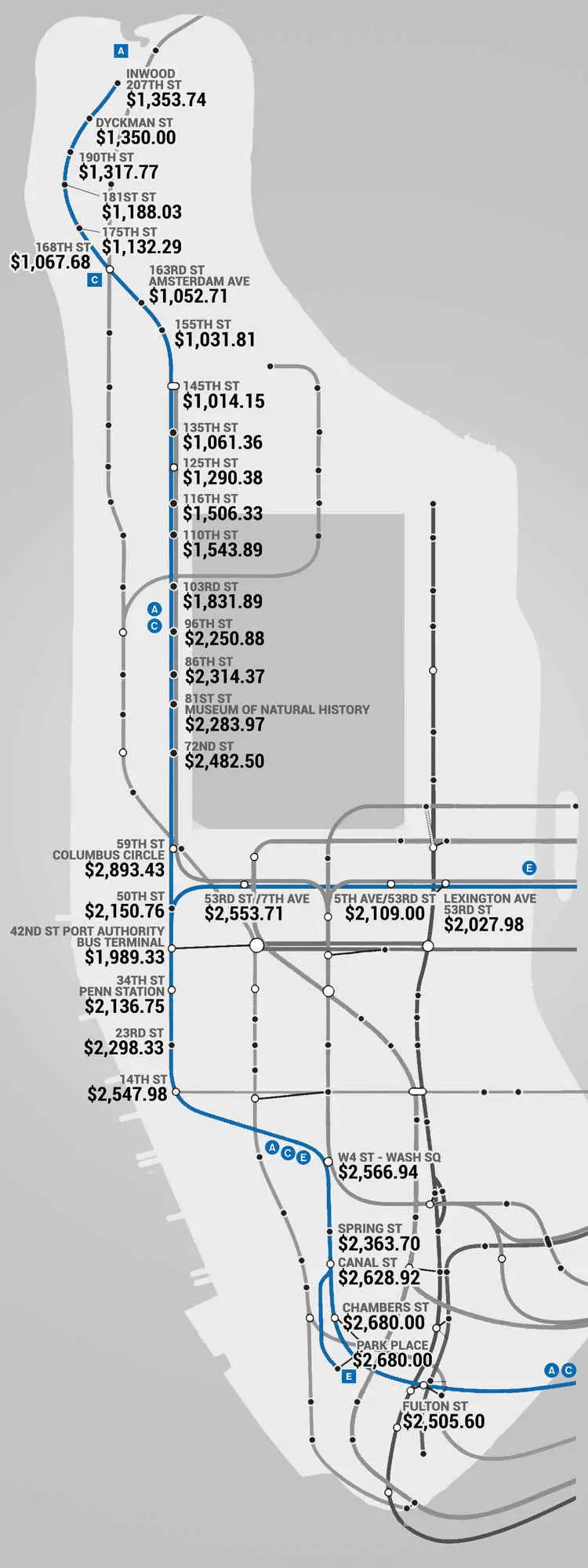
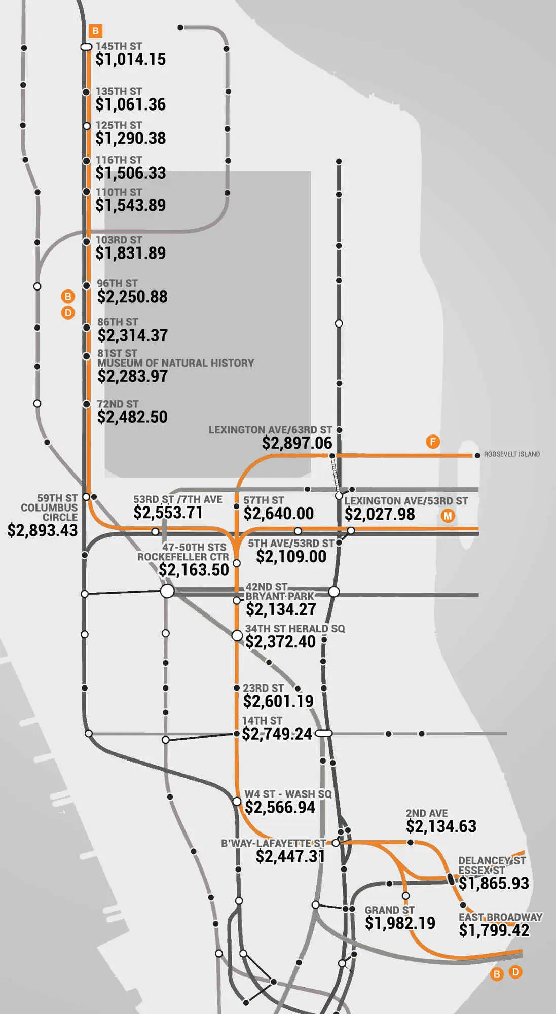
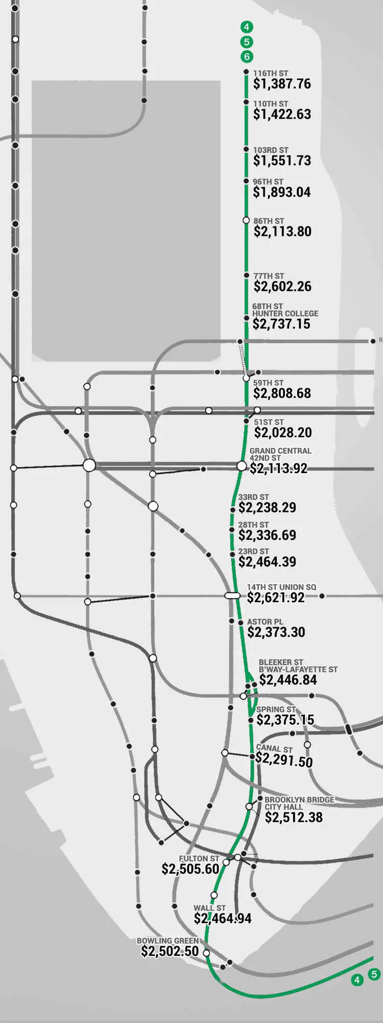
The folks over at Thrillist have put together the fun new Manhattan Subway Rent Map, which shows “where you can’t afford to live, by stop.” The figures come from the median rent per bedroom near every Manhattan subway stop. For the most part, the trends are what you’d expect — prices along the 4, 5, 6 line get incredibly lower above 96th Street; living near a 14th Street train station will cost you; and the A, C, E train carries pretty steep prices throughout Manhattan until you reach 125th Street. But what’s interesting is that the 59th Street corridor reigns supreme, with prices across the board coming in around $2,800.
Click on full map to expand
Thrillist used census blocks and data to arrive at their findings, looking at those rentals located within a quarter-mile of a given station.
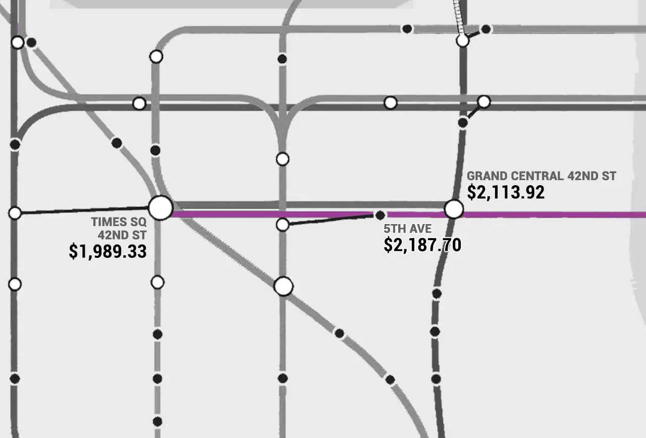
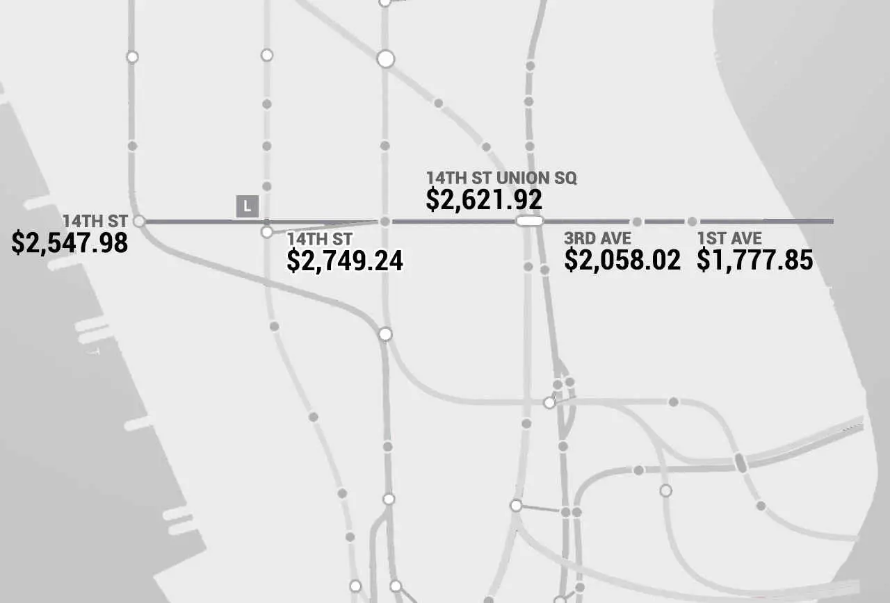
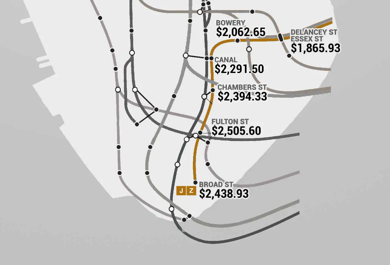
In addition to their large, expandable map of all Manhattan train lines, they’ve segmented out each individual line. You can see all of these maps here.
[Via Thrillist]
All maps © Thrillist
RELATED:
- Musical Data Project is the Soundtrack to Income Inequality Along the Subway
- Animated GIF Shows How NYC’s Subway Has Evolved over the Last 100 Years
- The Subway That Could Have Been: Mapping Never-Built Train Lines and Abandoned Stations
- Do You Really Know Your Neighborhood? Interactive Map Helps You Find Out More on Who’s Around