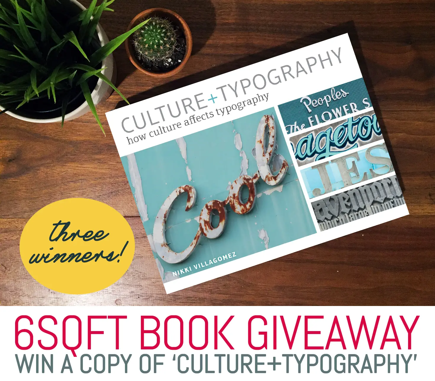
LAST DAY: Three Chances to Win a Copy of ‘Culture+Typography’ by Nikki Villagomez!

Whether you’ve been a long-time typography enthusiast or just recently jumped on the bandwagon of Helvetica fans and Comic Sans haters, you’ll love this new book from South Carolina-based graphic designer Nikki Villagomez. Titled “Culture+Typography How Culture Affects Typography,” her book investigates how design choices from type selection, color usage and more can be informed by the language of the cultural surroundings. If you’re looking for a new great design for your brand or you’re just a font fanatic, this book will be a great addition to your collection or your coffee table. We’ve teamed up with Nikki and are giving away THREE of her books to three lucky readers!
To enter, all you need to do is:
1. Subscribe to our newsletter (if you haven’t already)
2. Comment below answering this question: “What is your favorite font and why?”
And that’s it! You have three chances to win, so be sure to invite your friends to enter. The deadline to enter is TODAY Friday, November 6th. Find out more about the book and why typography is so important from the author herself ahead.
What inspired you to write the book?
Nikki: I never set out to write a book; actually it never even crossed my mind as something I would do. I started my blog four-and-a-half years ago as a way to keep my love of typography alive as I work as an in-house designer with a limited color palette (15 colors) and typefaces (two!). I find my job as the Creative Studio Manager at DHG to be incredibly challenging and rewarding, but I needed that creative outlet.
I set a goal for myself that I’d post five days a week comparing pictures side by side from different parts of the world. It was never about how many hits my site got or what comments came in, it was done out of pure joy.
After about a year of posting, my blog started getting a following and traction within the design community. I started speaking to AIGA chapters with my talk How Culture Affects Typography. These talks were catered to each city I visited. I asked local creatives to send me pictures of their typographic landscape that made their city unique and send them to me one month prior to my talk. I used these pictures to create a custom driven presentation.
To date, I have spoken to 19 AIGA chapters across the country. AIGA has afforded me a wonderful platform to share my passion for typography. These talks led to me speaking at the How Design Live conference which put me in front of a much bigger audience. The talk was well attended and received so HOW Books approached me about writing a book. It seemed like the logical next step and was without a doubt the hardest thing I have ever done.

Why is typography so important to you?
Nikki: For me, typography has a way of evoking a feeling, a sense of place and a sense of belonging based on the style and placement of the letterforms. It is very easy to become immune to our typographic landscape which is why traveling is so enjoyable.
When we travel, we are dropped into a new environment and all of our senses are heightened. We become keenly aware of the sights and sounds that make a place unique. Typography plays a vital role in this discovery process. The goal with my talks, my blog and my book is to bring that sense of awareness to people’s day to day life and look at their city through the eyes of a visitor.

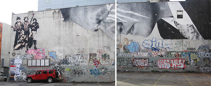
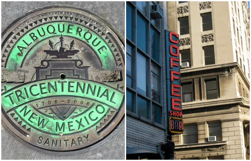
I get a lot of joy when I hear someone say, “I drive past that sign everyday but never really saw it!” or “I had no idea the history behind that sign!” or, my personal favorite, “The typography on that manhole cover IS really beautiful!” There are always new things to discover no matter where you are.
Massimo Vignelli sums it up perfectly for me: “We think typography’s black and white; typography’s really white, you know, it’s not even black. It is the space between the blacks that really makes it. In a sense, it’s like music; it’s not the notes, it’s the space you put between the notes that makes the music.”
You can pick up Nikki’s book online at My Design Shop for $24.
Excerpted from “Culture + Typography: How Culture Affects Typography” Copyright © 2015 by Nikki Villagomez and published by F+W/HOW Books. Used by permission of the publisher. All rights reserved. Photos courtesy of Nikki Villagomez.


Get Insider Updates with Our Newsletter!
Leave a reply
Your email address will not be published.


Meta is my favorite typeface. It is extremely versatile but yet has character that softens it and makes it a bit human.
Helvetica, of course. Modern and classic at the same time.
Gill Sans. Mostly because I really like that lowercase hourglassy “g”
Futura will make anything look sophisticated.
What is so great about Verdana 8?! It’s my go to font for any and all Excel reports. It’s crisp and readable without serifs, and allows more to be seen in less space. It may not be decorative or creative but it gets the job done!
FF Karbid by Verena Gerlach, this woman did a fantastic job of rescuing the vernacular of old Berlin. You can tell a lot of love and attention has been poured into the crafting of this font. It’s one of my favourites because I’m a big nerd when it comes to cultural hand painted signage.
http://ilovetypography.com/2011/12/14/an-interview-with-font-designer-verena-gerlach/
Century Gothic– adds a touch of class to e-mail correspondence. Especially useful when trying to convince the rubes of the world to use HTML settings. Plain Text and Rich Text are devoid of any personality whatsoever.
Bodoni – every letter form is elegant. It ads importance to any word.
I love Times New Roman – it’s a classic
Matthew Carter’s Big Caslon – with beautiful wide bowls, a gorgeous tail on the Q, so strong and yet romantic and fascinating, like someone you might admire from afar but never be brave enough to approach…its enough just to be able to look at these letterforms, you feel in awe of them.
My fave is Trade Gothic. It’s versatile and timeless.