My 850sqft: Graphic designer Ksenya turned a raw Williamsburg loft into an industrial-chic oasis

6sqft’s series “My sqft” checks out the homes of New Yorkers across all the boroughs. Our latest interior adventure brings us to graphic designer Ksenya Samarskaya’s industrial-chic Williamsburg loft. Want to see your home featured here? Get in touch!
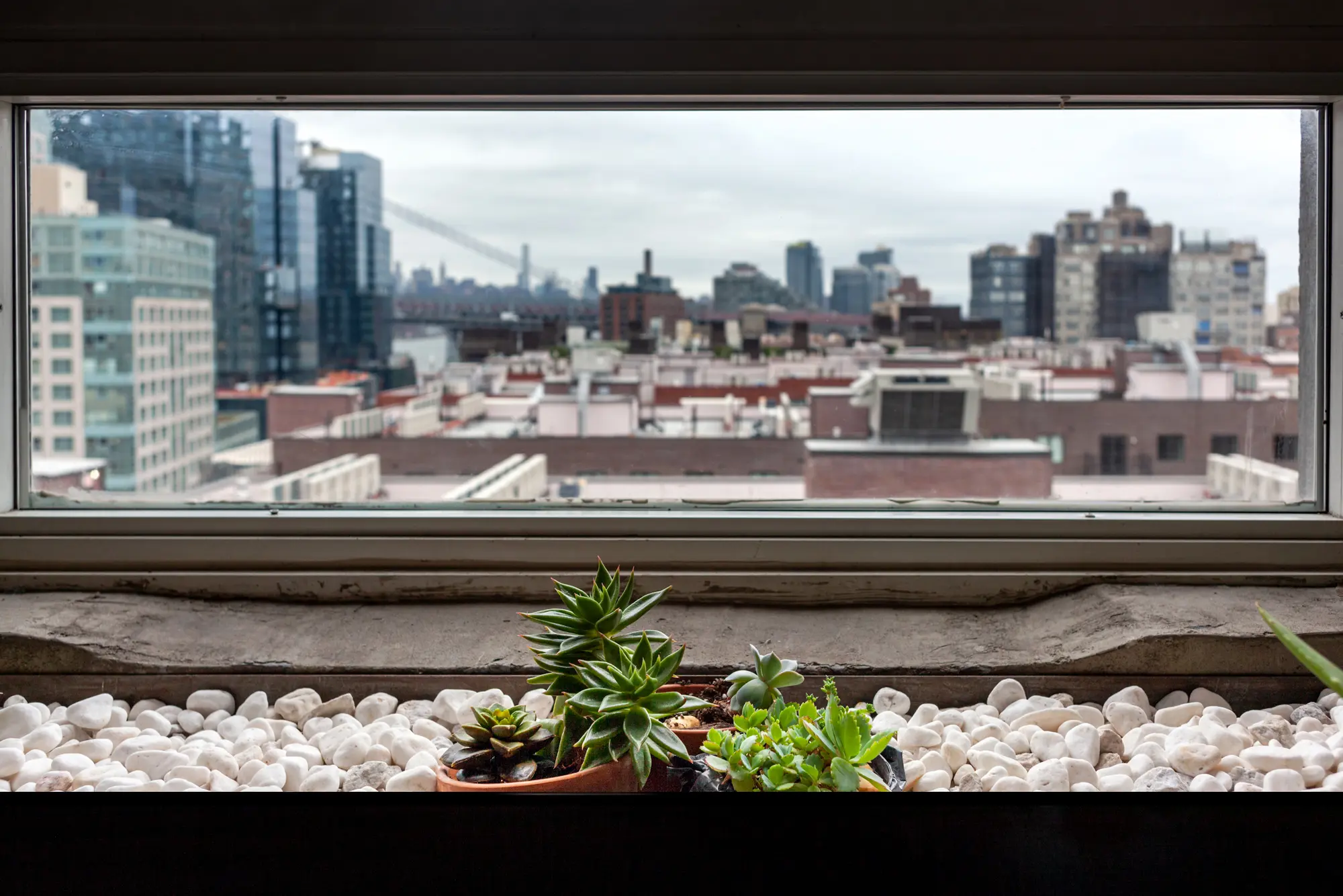
Ten years ago when graphic designer and typographer Ksenya Samarskaya moved into Williamsburg’s famous artist loft 475 Kent, the building and neighborhood were much different. Her view of the Williamsburg Bridge remains, but it’s now obscured by the slew of glassy towers rising along the waterfront, a literal representation of how the area has lost some of its creativity to corporate entities. And though the building has seen its share of controversy, Ksenya’s loft feels like stepping back to Brooklyn’s Millenium-era artist boom.
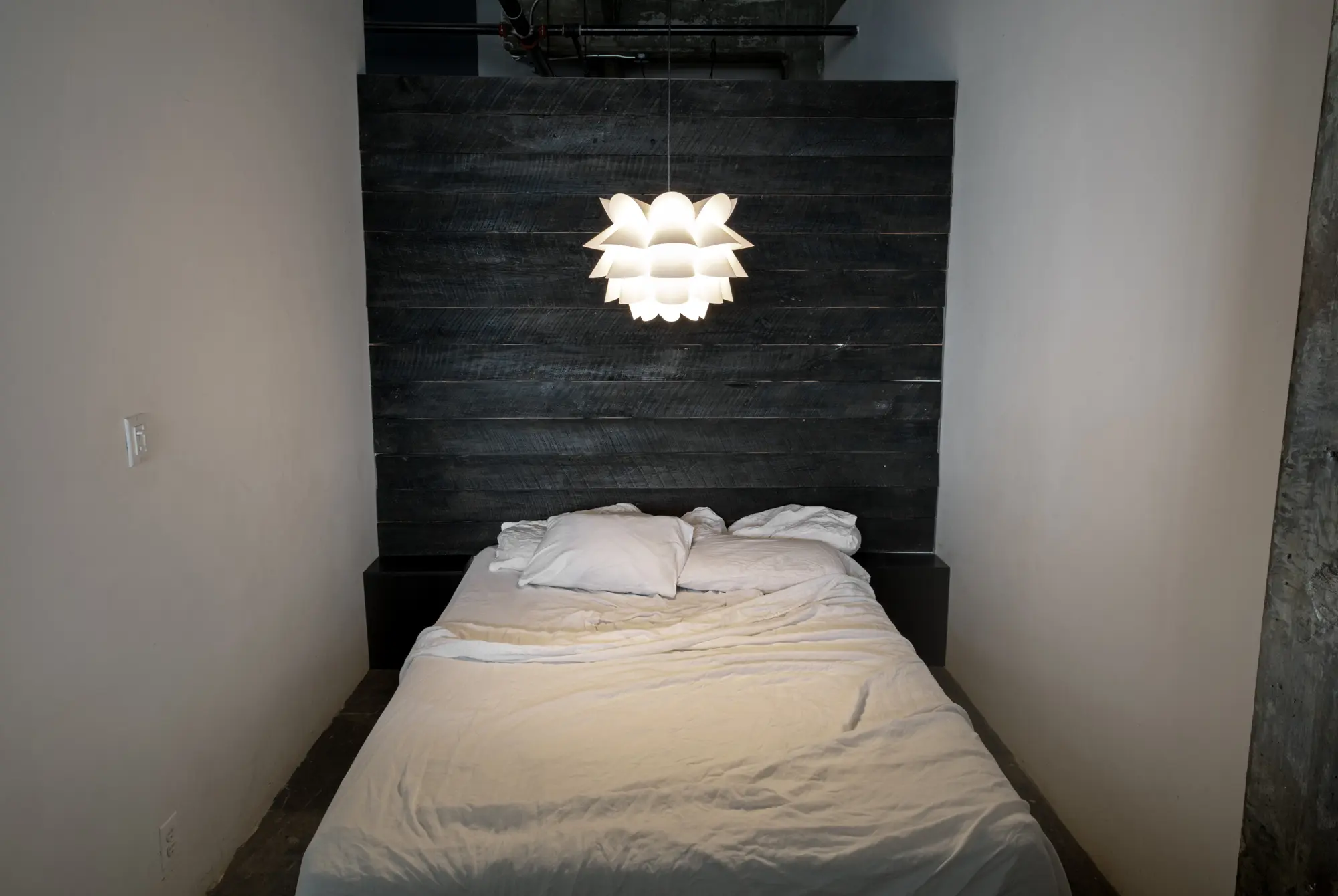
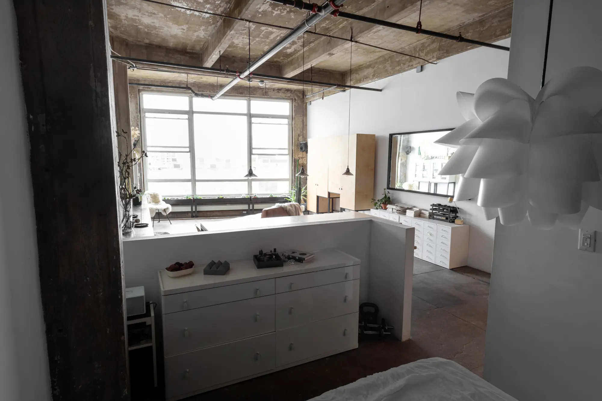
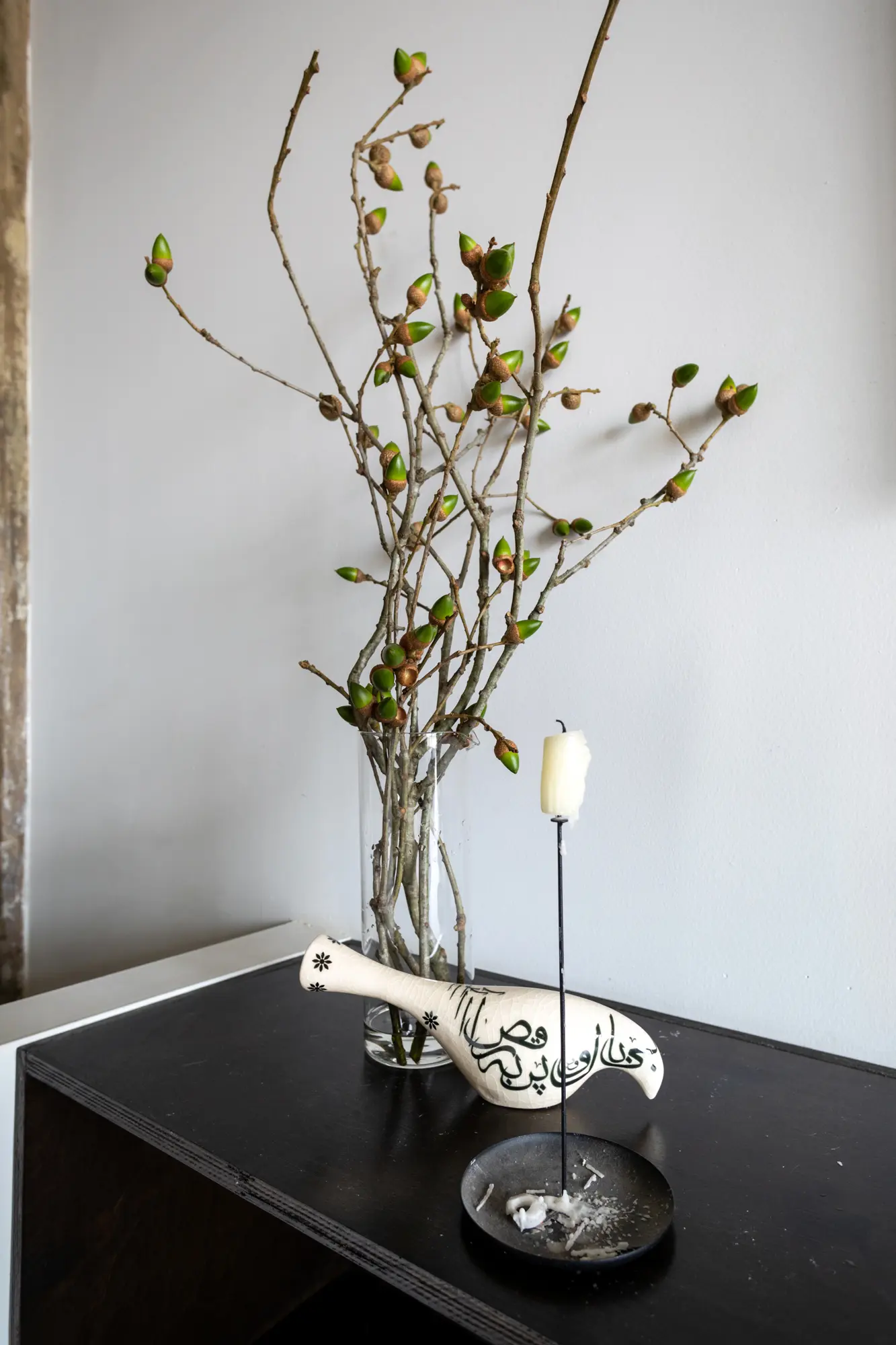
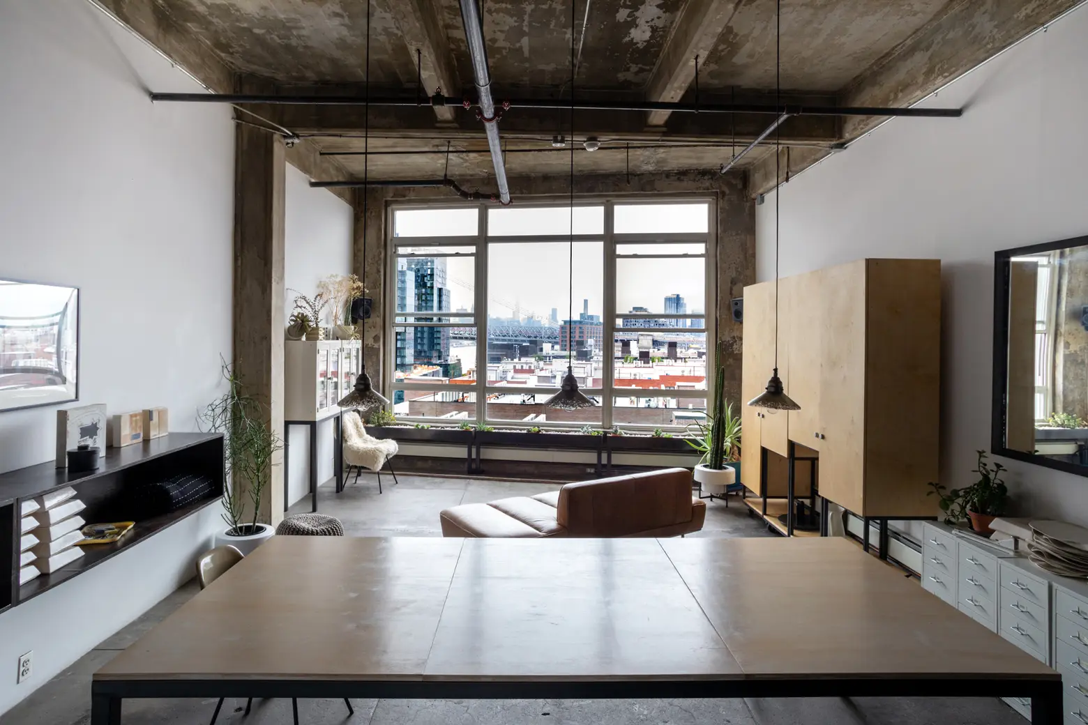
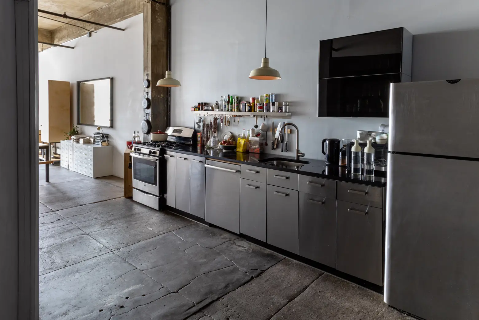
In true artist loft fashion, the space was completely raw when Ksenya moved in. With a little help from her friends and neighbors, she achieved the perfect balance of industrial charm and chic, minimalism. From staining the concrete ceiling and retaining the original floor and wooden beams to having custom multi-use furniture pieces designed, Ksenya created her own little oasis.

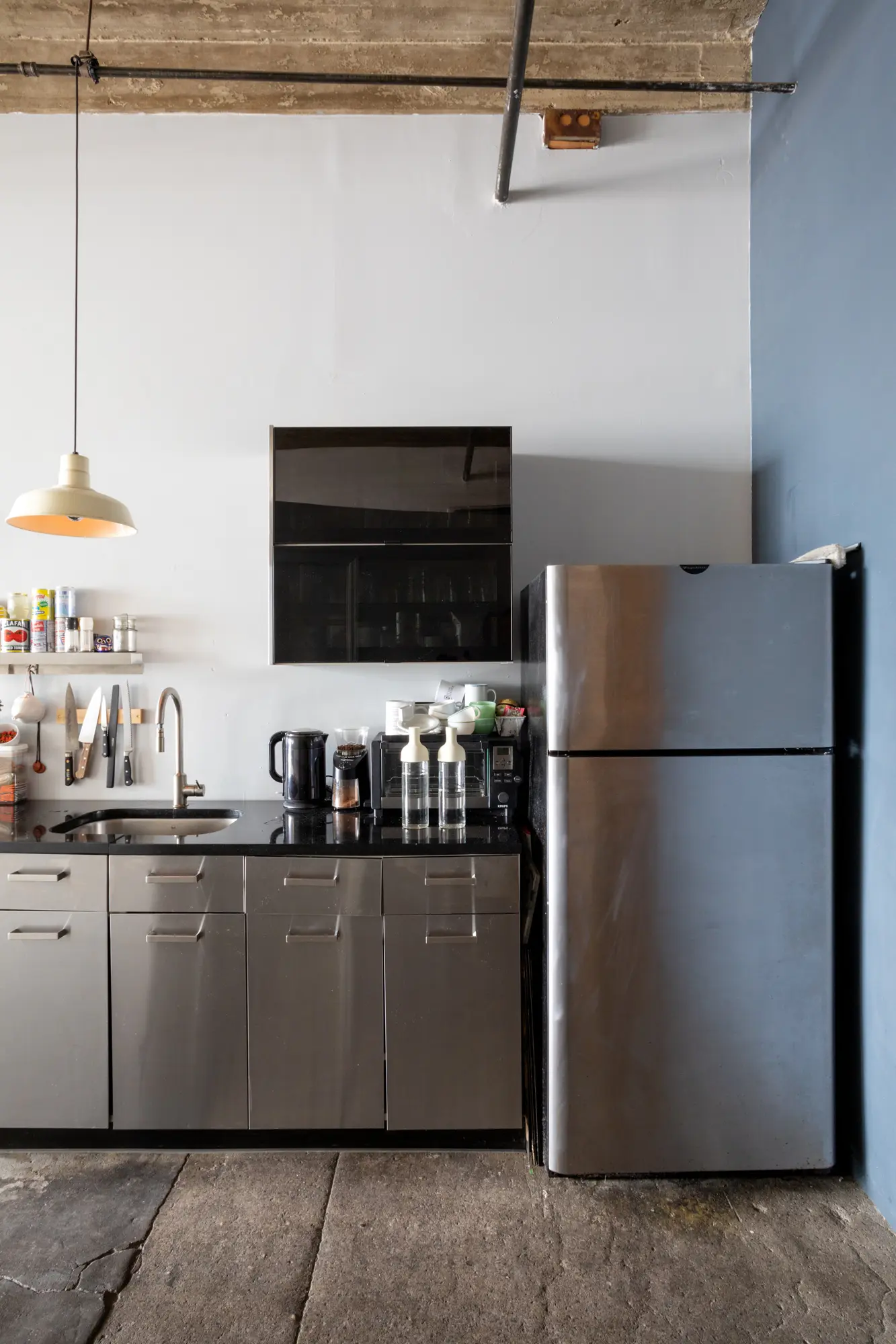
Originally, the ceiling was white and water-damaged. Since concrete stain is toxic, Ksenya used a wood stain, and since the concrete is porous, it absorbed the stain and the texture came through. She also wired the whole apartment herself.
You mentioned that you studied installation art–do you think this plays into your design aesthetic?
It serves as a freeing agent, a great primer for ways to think about space in possibly unexpected ways. Within installation art, there’s an openness to using unconventional materials, whether that be buckets of gravel or random found objects. It’s looking at materials for how they feel before thinking about them in terms of what they’re traditionally used for. That’s an amazing ledge to start from when thinking about even functional space. A lot of the assumptions fall away and we’re left with basics of light and texture and materiality, conflating ease and difficulty. I’m less likely to get hung up on what the Joneses are doing, and instead align things to the bigger questions of how I want the space to feel or what I want the primary movements in it to be.
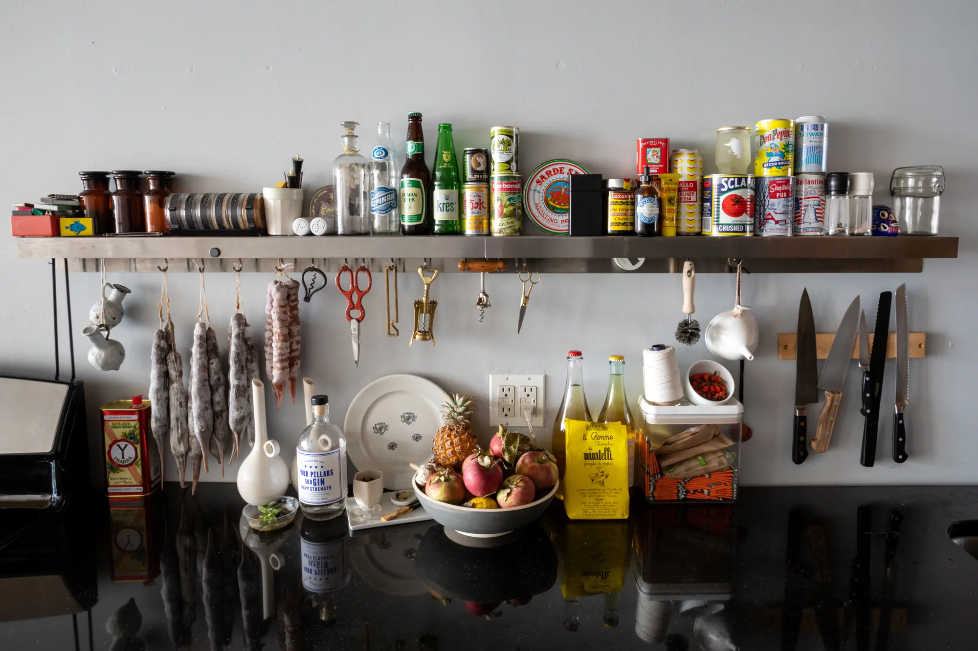
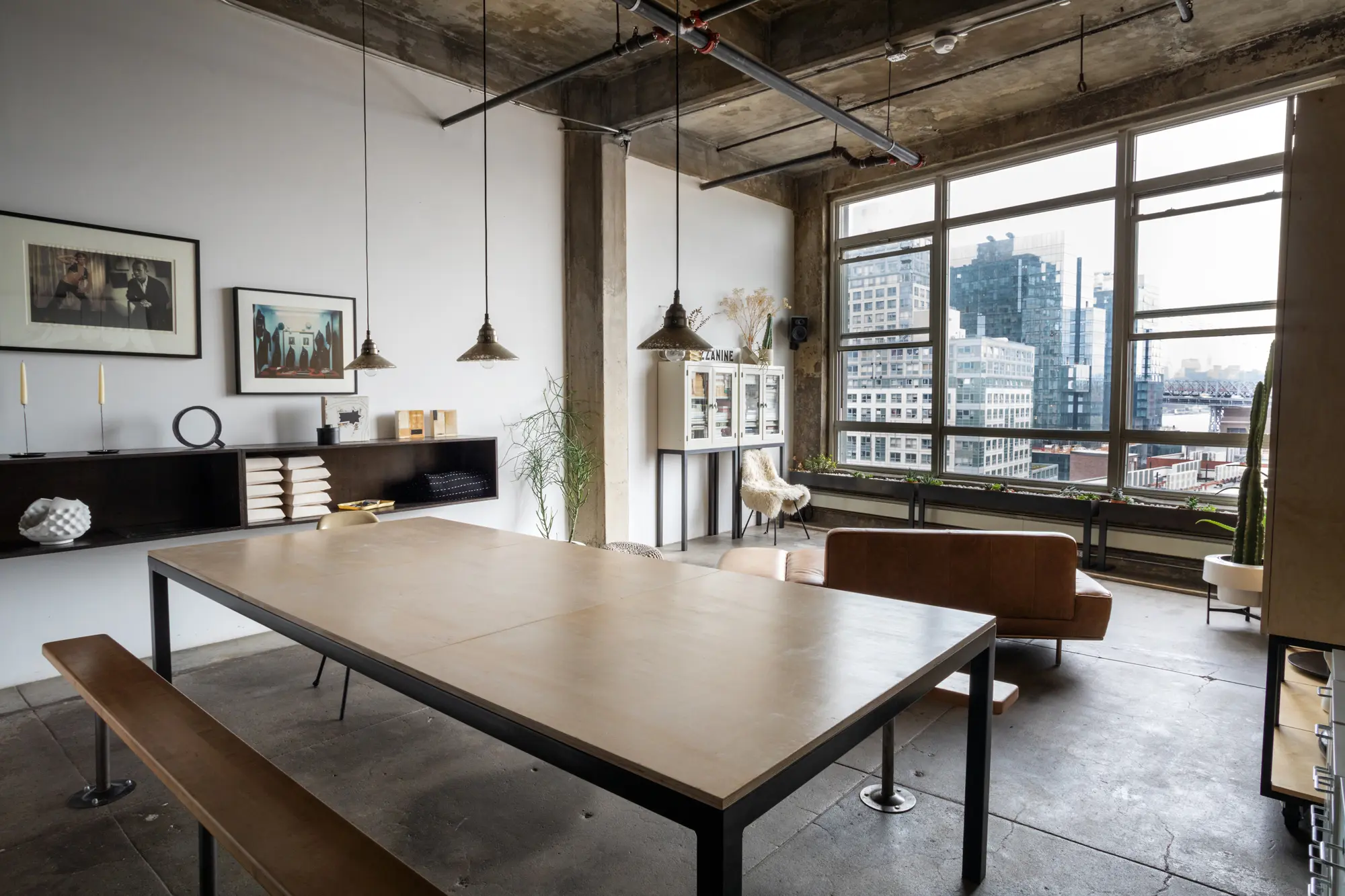
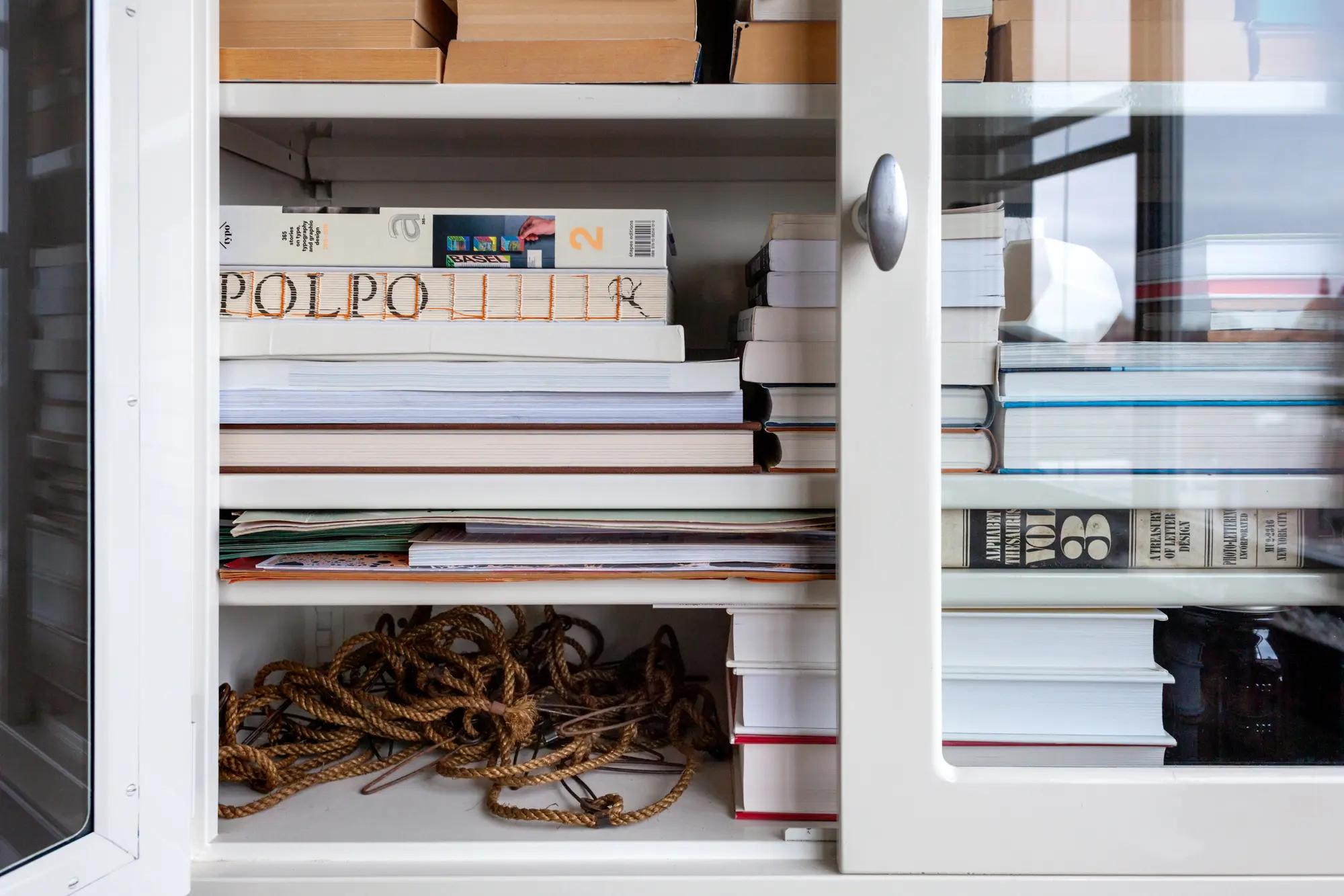
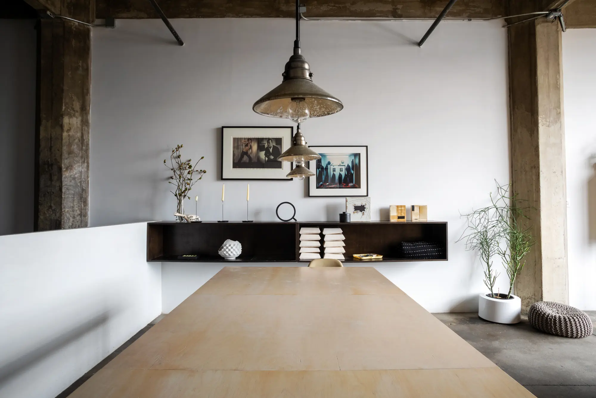
The book storage is actually old medical cabinets that Ksenya sand-blasted and attached legs to.
You now work as a typography designer and brand strategist. How did you get into this?
With brand strategy, (and similar comprehensive, conceptual design-work), there’s very much a conflation with art thinking. Everything possible is available to manipulate towards a certain multi-layered communication. A communication that’s at once clear and direct while simultaneously emotional, speaking to our instincts and deeper desires. There’s an investigative process of finding out what a company or a product is, or dreams to be, and translating that into text, web, and logotype. That’s incredibly challenging and rewarding work. And typography, including creating my own typefaces, allows me to harness the control all the way through. Akin to a mason firing their own bricks; a chef with a backyard farm or a penchant for mixing their own ketchup.

You’re getting a graduate degree in design criticism. What can we expect to see from you in the future?
As I hit mid-career, there’s a decisive desire to pivot. To not just be making the work, but thinking about how to help others make the work, how to influence the greater culture to appreciate all that effort and sensitivity, and to be more actively working in creating a paragon for what the world could be. To not take how it is now for granted as much. Speaking, writing, and teaching are all powerful ways help accomplish that.

When you moved into this unit, it was completely raw. Take us through the process of visualizing the layout and building it out.
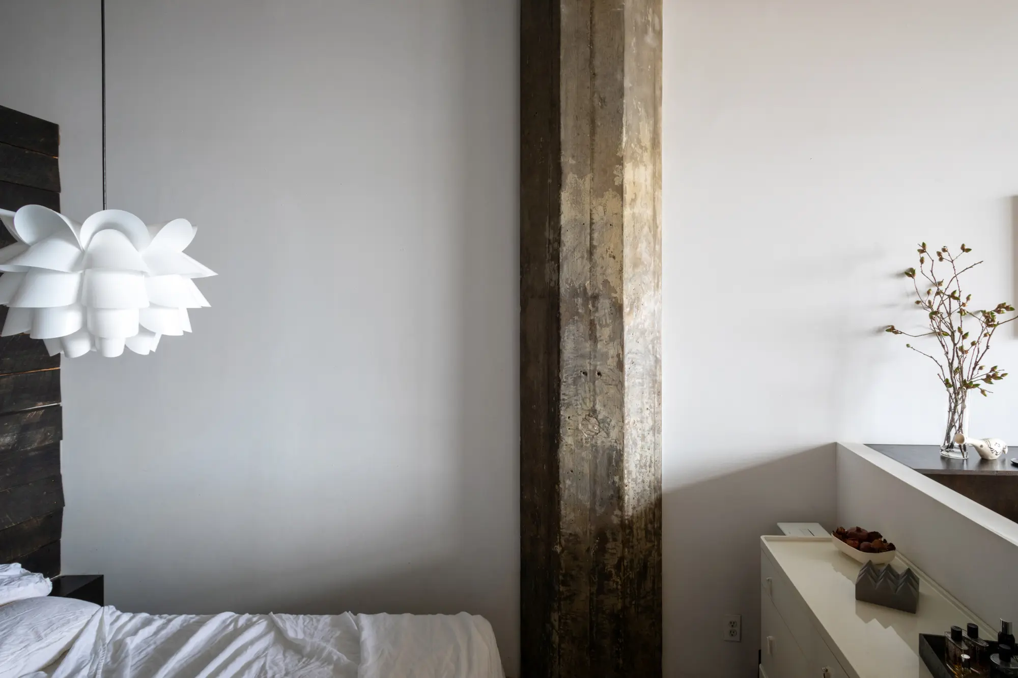
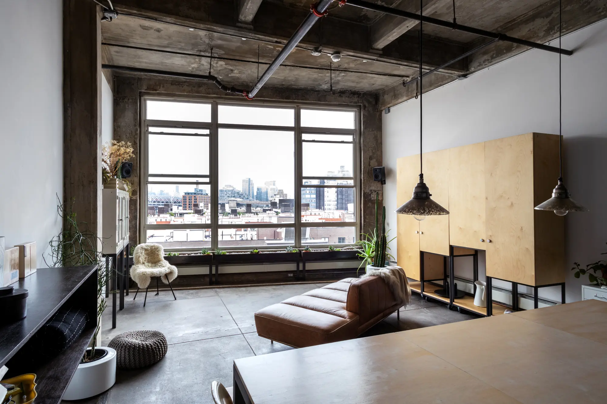
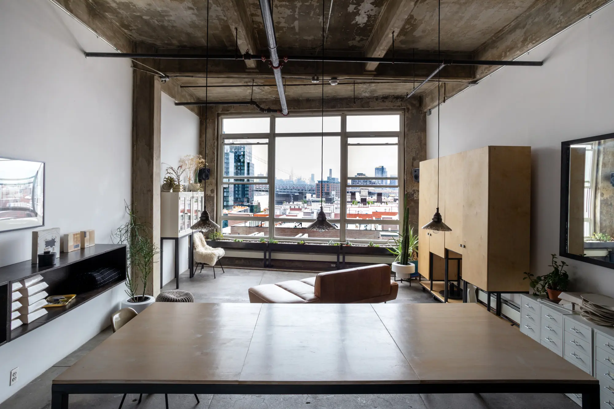
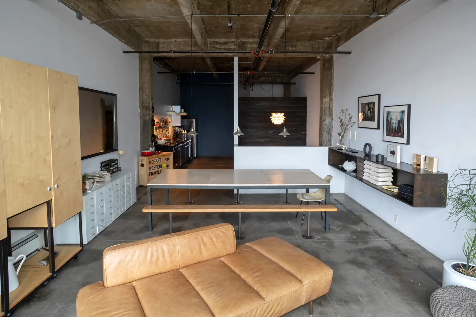
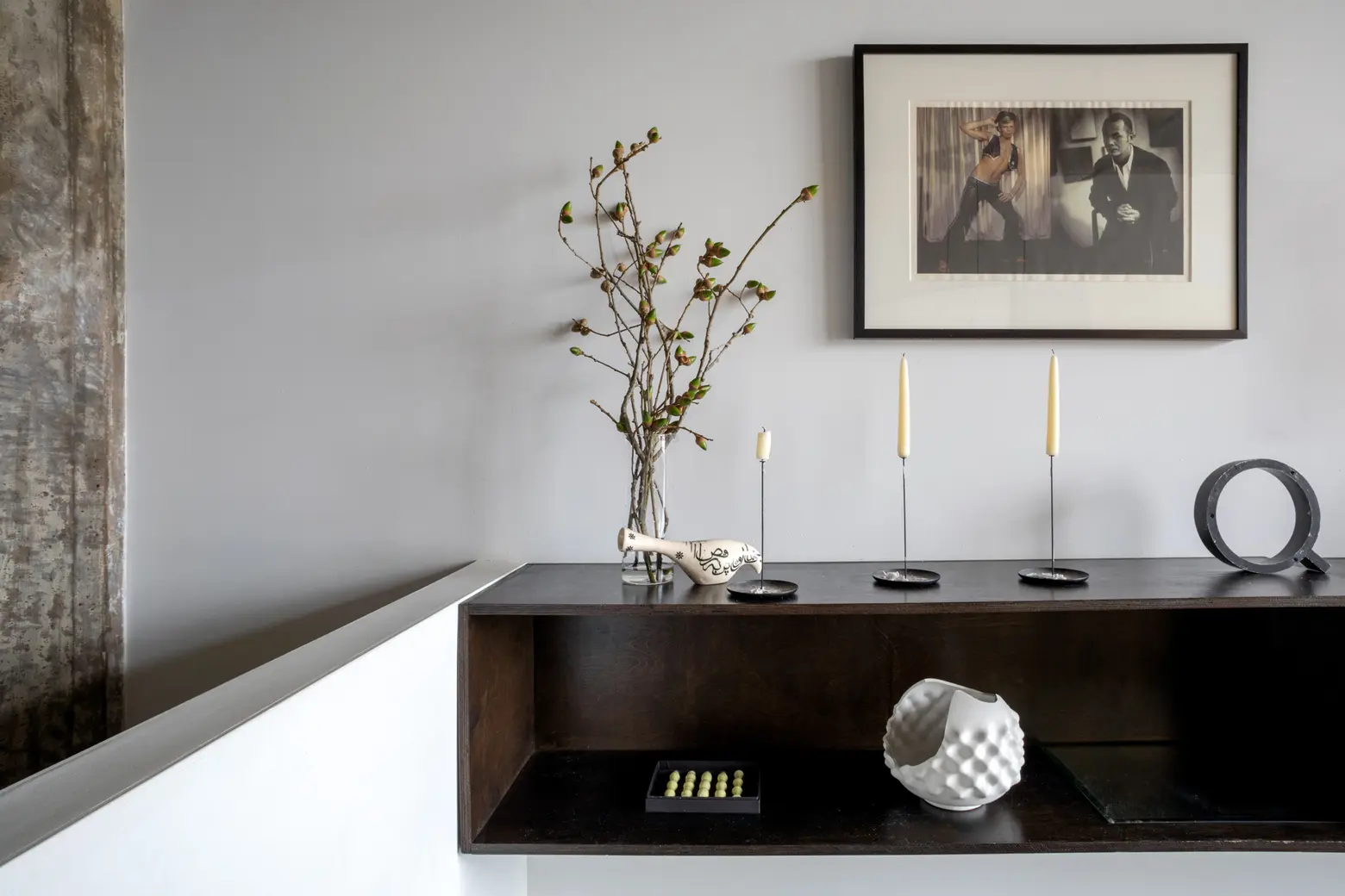
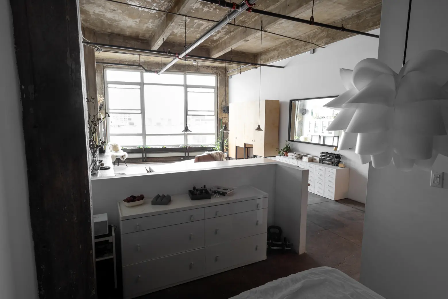
There were a few primary guiding principles. One was the window, making sure there was a direct line of sight to the views from where time was primarily spent, and organizing the hierarchy of spaces in respect to their light-proximity. The second was how to keep the openness and vastness that a loft offers, while differentiating “rooms” with varying spacial feel. That way there’s no caged effect from spending too long in the loft, because one could always shift for a different perception. These were accomplished via a combination of tonal color-blocked walls, varying lighting styles placed at different heights, half-walls, and custom furniture pieces.
You have a great setup for entertaining. Do you like to host?
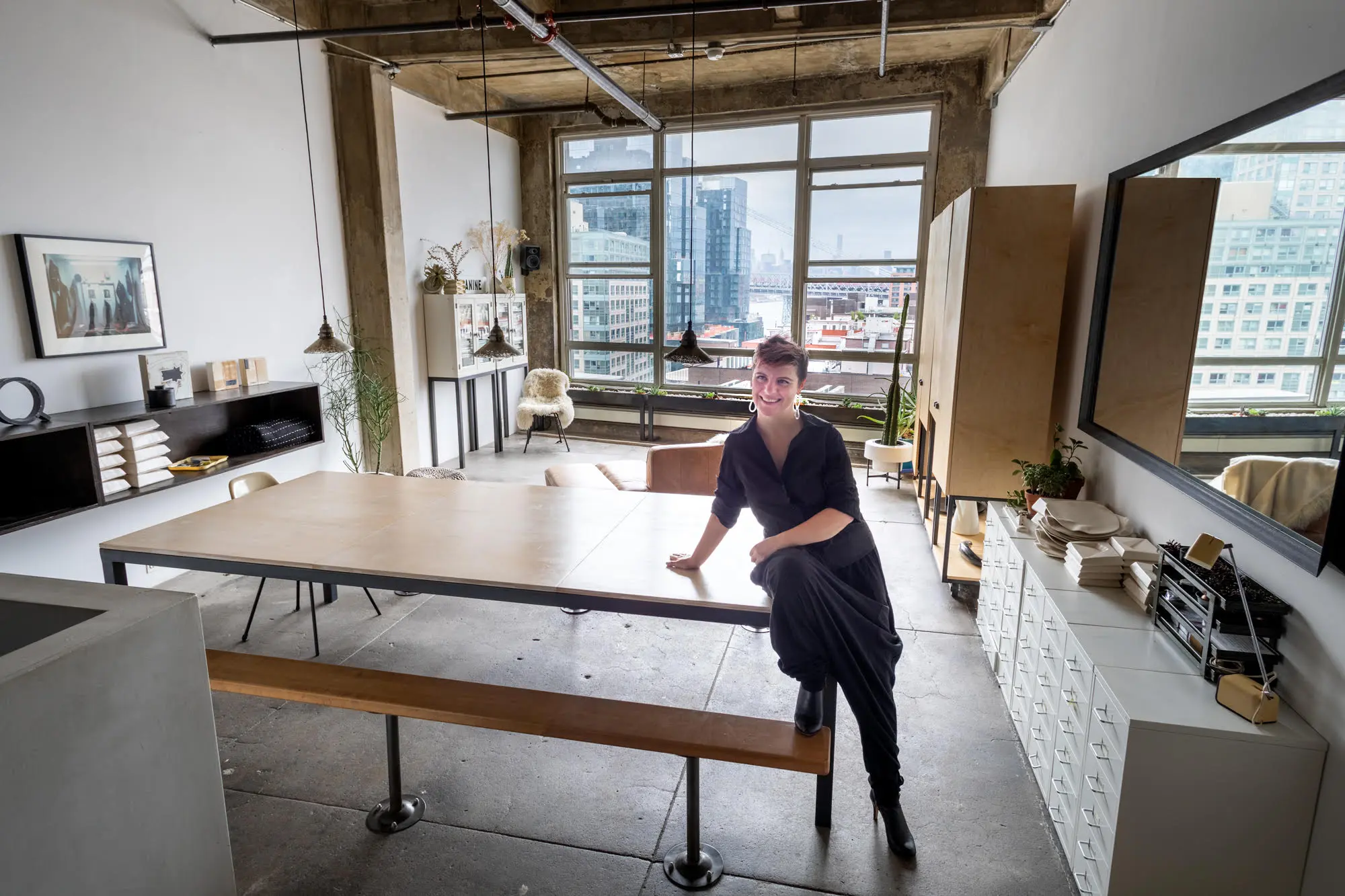
That was definitely one of the considerations when I was designing the space. I absolutely love the openness and connotations of the large table. It’s a wonderful location and metaphor for thought, connection, and creation; whether it’s dinner parties or work stations. I’ll joke about it being an Alice in Wonderland situation, where if I’ve a project open or something left over on one side, I just throw my hands up in the air and rotate over a smidgen to a free spot. Over the last several years, I was also collaborating on a pop-up supper club called Traffic–Tide.

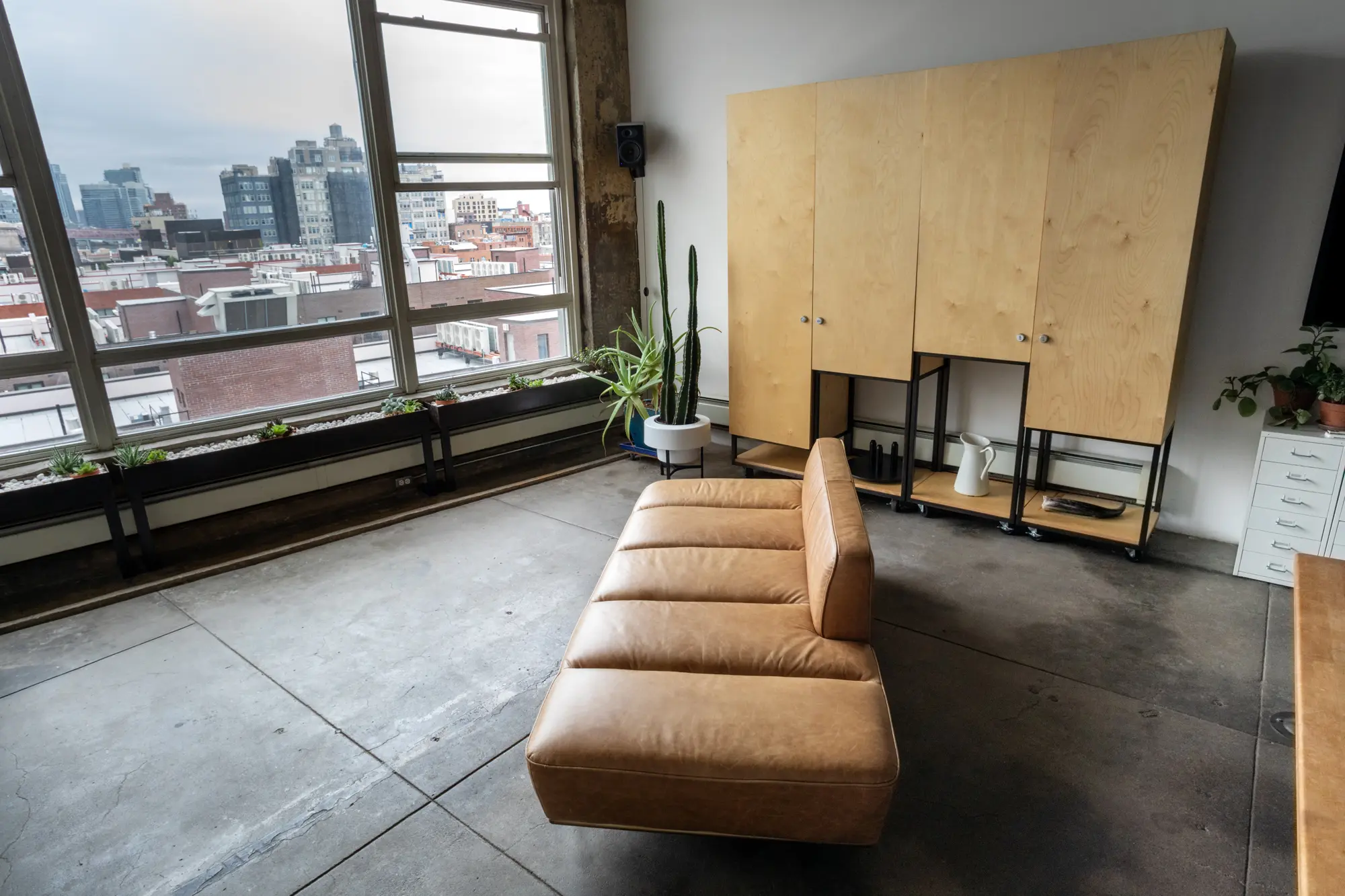
The couch is from CB2, which Ksenya says is “her Ikea.”
Tell us about your furniture—you said a lot of it was custom and the storage piece has some secrets that help with photo shoots?
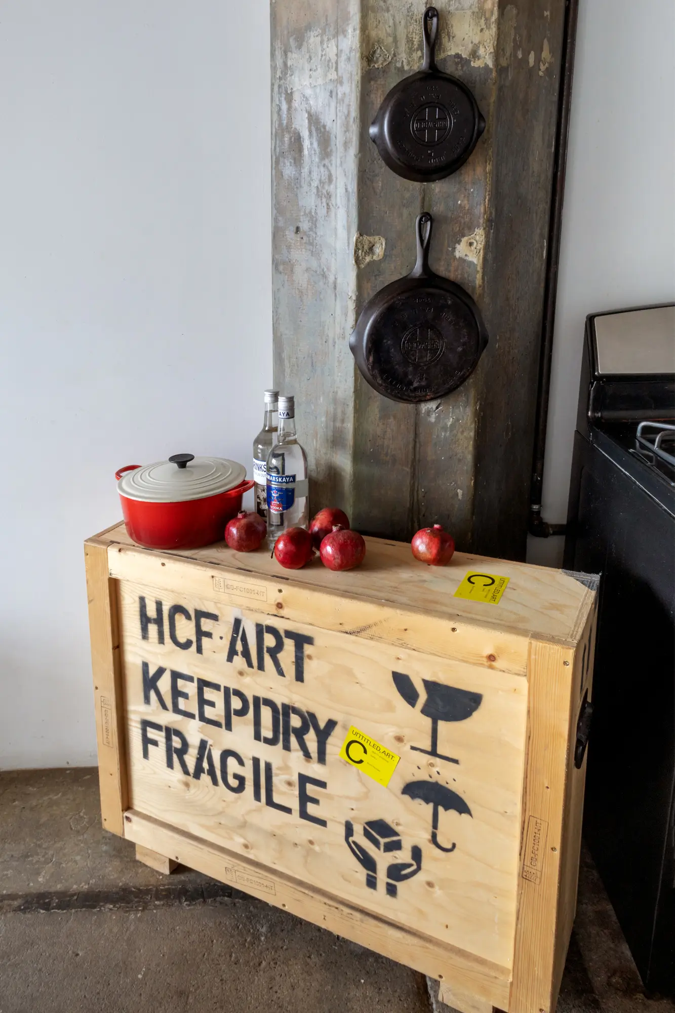
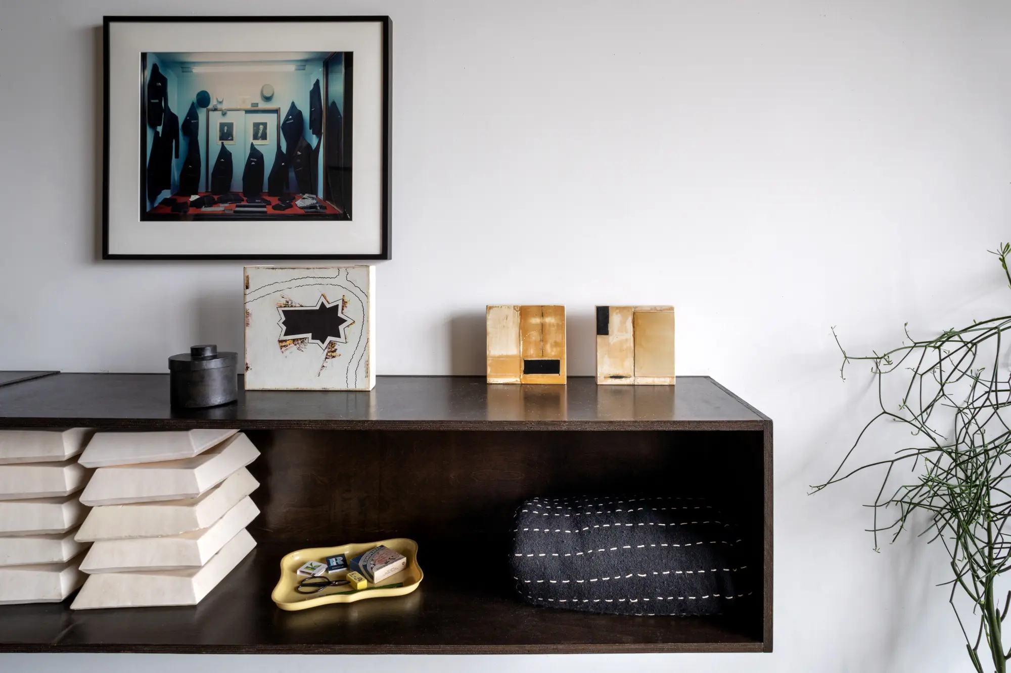
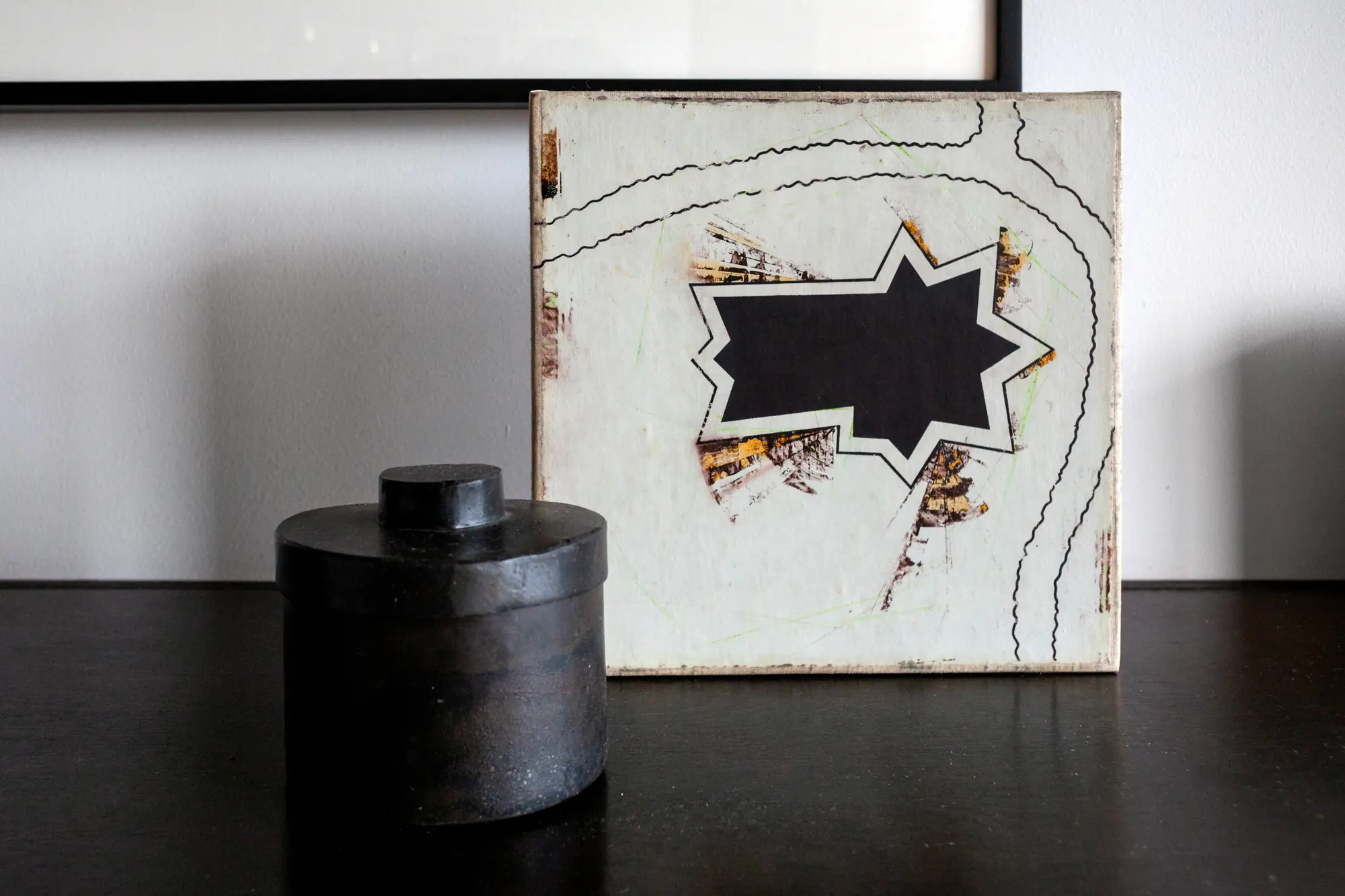
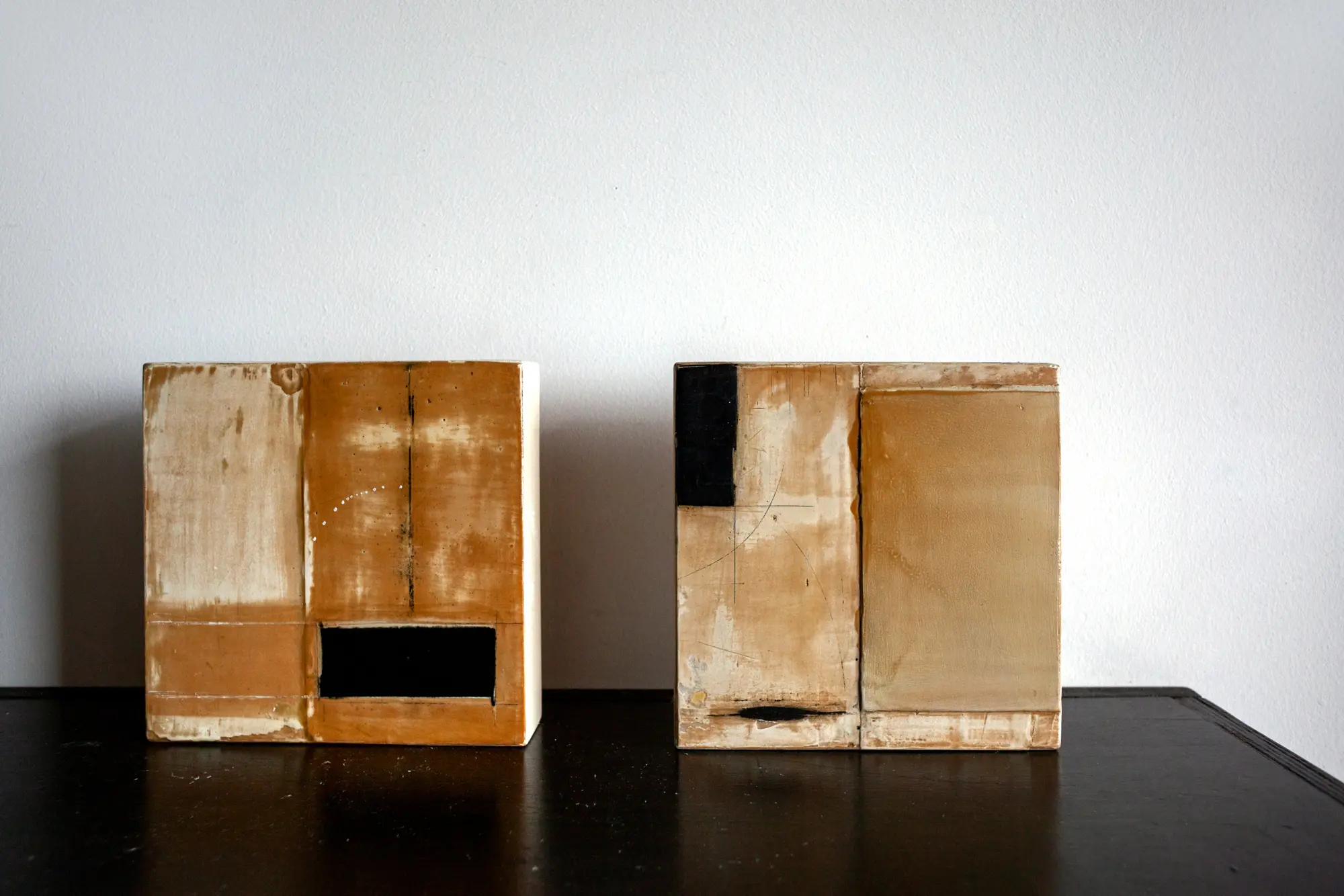
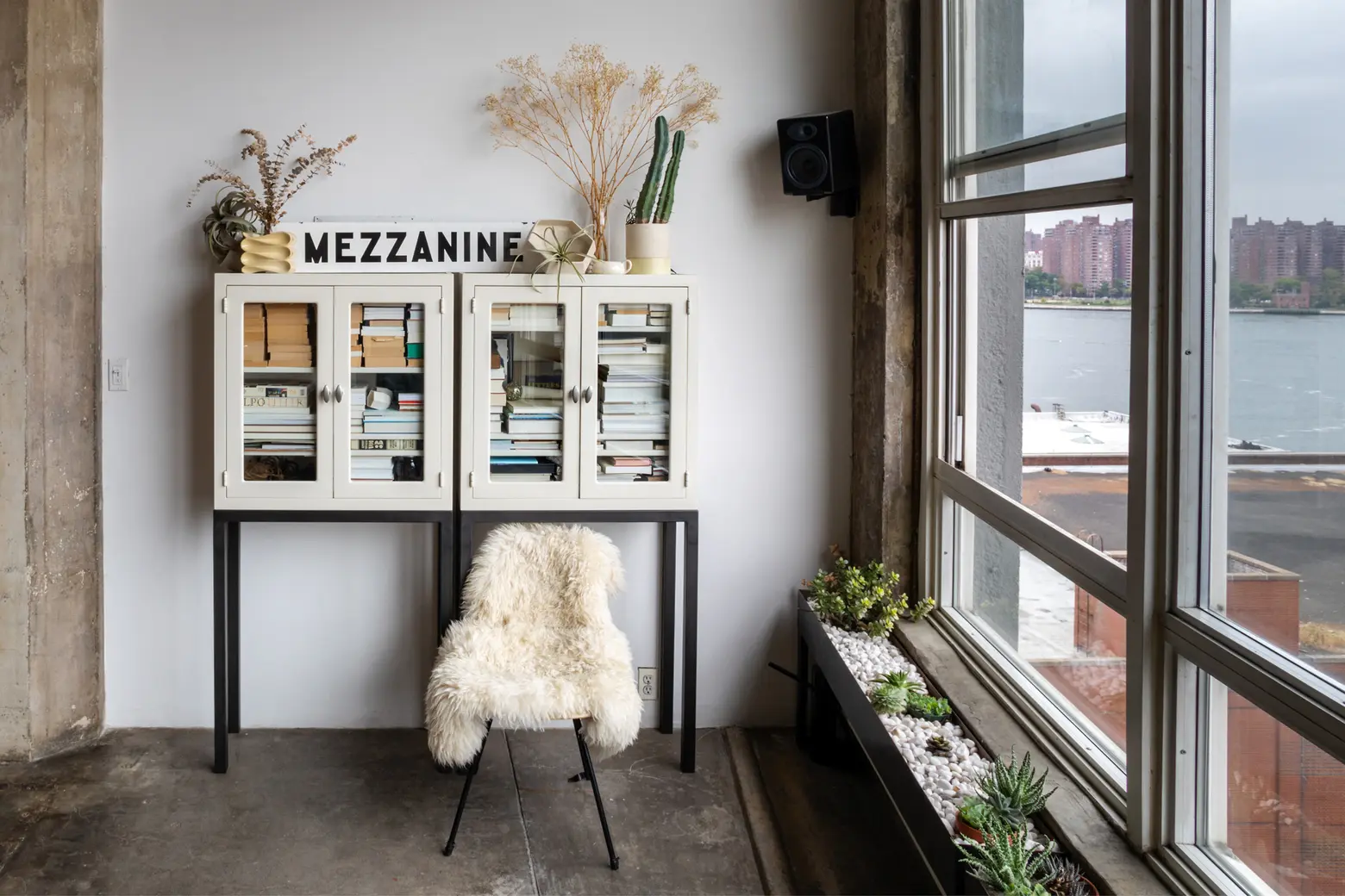
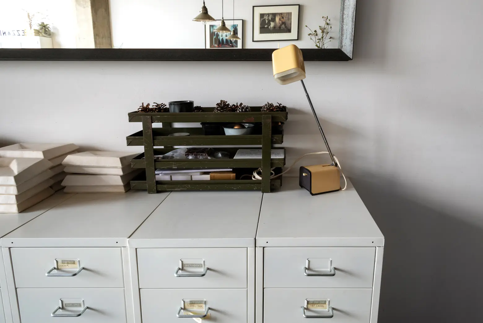
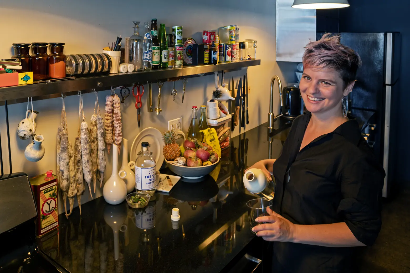
A lot of the pieces in the space were created either by or in collaboration with friends, which is wonderful to be surrounded by. The mirror is by Made in Chinatown. The planters I designed with Farrah Sit. There’s a sensor box that sits in the corner and transmits light, noise, and other data out to the internet, which was created with help from Luke R. Dubois. What isn’t from friends, I’ve been consciously purchasing from other local designers, with a recent favorite being a Simone Bodmer-Turner vase. The cabinets were inspired by storage pieces from VIDIVIXI, who are now in Mexico so I wasn’t able to do a direct collaboration. They were designed for flexible storage and are individual units that can be aligned to form a temporary wall or scattered throughout the space. One is hiding a front-facing clothing rod, another a tall vertical shelf for backdrops, and on the back are slots for a rod to go, so they can be positioned and twirled as needed without having to bring out extra stands and then shifted back into place without any visual detritus left over.

You can only take 3 items from your apartment–what would they be?
In a fire? The laptop, the box of documents, and probably something completely random as I’ll be panicking and not thinking clearly. In a move? Those first two, add the art objects. Probably not much more. Though my designs often arrive at similar conclusions, there’s a beauty in starting fresh and considering designs for the layout and circumstances of the new space rather than re-masking remnants of the past.
Sum up your design style in a few words.
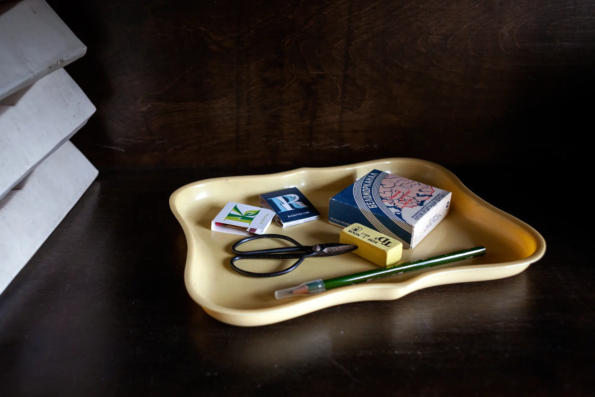
Spacious, textured, inquisitive.
What about the South Williamsburg neighborhood. Obviously there’s a lot of construction along the waterfront–do you feel a difference in the area?
My view is definitely a partial landscape from what it first was when I moved here. 475 Kent started being occupied for art studios and residencies in the late 1990s. Shaefer Landing, which is visible to the left, went up in 2005, a little before I moved in, but it still left the view of the bridge, abundant water, and the Empire State building. Eliot Spitzer’s project went up over the past year and a half, so like any vista, permanence is not guaranteed. There’ve been a lot of changes in other ways, too– demographics, retail, businesses. It’s probably too much to get into here, but for anyone that’s interested, Jeremiah Moss memorializes a lot of what’s shifting in his blog and other writings.

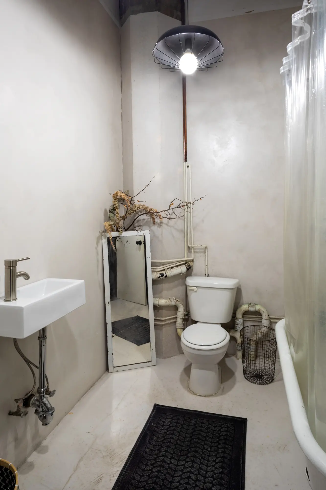
Ksenya found the clawfoot tub as someone was bringing it into a vintage store to sell.
Favorite spots in the neighborhood?
The King Luke Empire, which is the tax name behind the conglomeration of Diner, Marlow & Sons, Marlow & Daughters, and Bonita (which has closed since). Their spaces seem to nail just the right ambiance that can accommodate a range of times and moods equally well, and I respect that plurality. They’ve been regular haunts of a lot of the building-folk since Diner first opened in 1999, and a nice place to run into friends. I worked on the branding for Sweethaus, owned by a really lovely couple and procurers of my favorite pistachio waffles, and I’m currently working on a logo refinement for Depanneur, which is a highly curated bodega with fantastic turkey sandwiches just around that same corner.

Any advice for someone who is embarking on a minimalist design for the first time?
Prioritize. A space can’t do it all, but it can do two or three things very well. Figure out what those are for you, and base every decision around that. There’re also some frugality tricks: one exceptional item can often make a stronger impact than multiple decent ones and often gets preserved better. So spending money on nice things has often ended up a way that I save money in the long run.
RELATED:
- My 865sqft: A treehouse bedroom grows inside the Williamsburg loft of two creatives
- My 900sqft: Artist Ehren Shorday adorns his Bushwick loft with ‘trash’ and treasures
- My 1400sqft: Inside creative couple Molly Young and Teddy Blanks’ perfectly outfitted Williamsburg loft
All photos taken by James and Karla Murray exclusively for 6sqft. Photos are not to be reproduced without written permission from 6sqft.