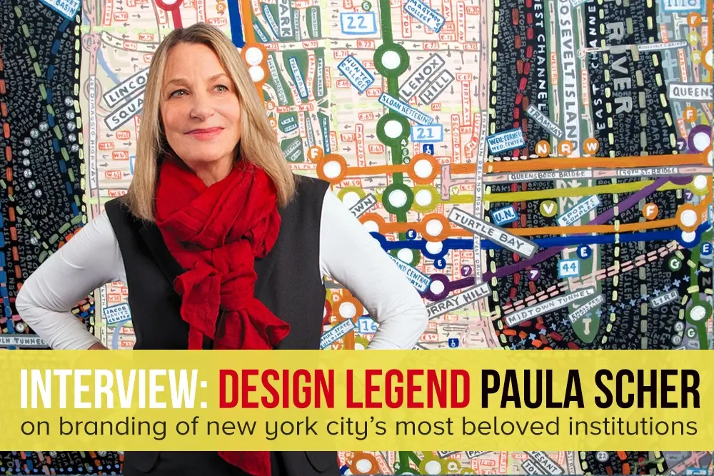
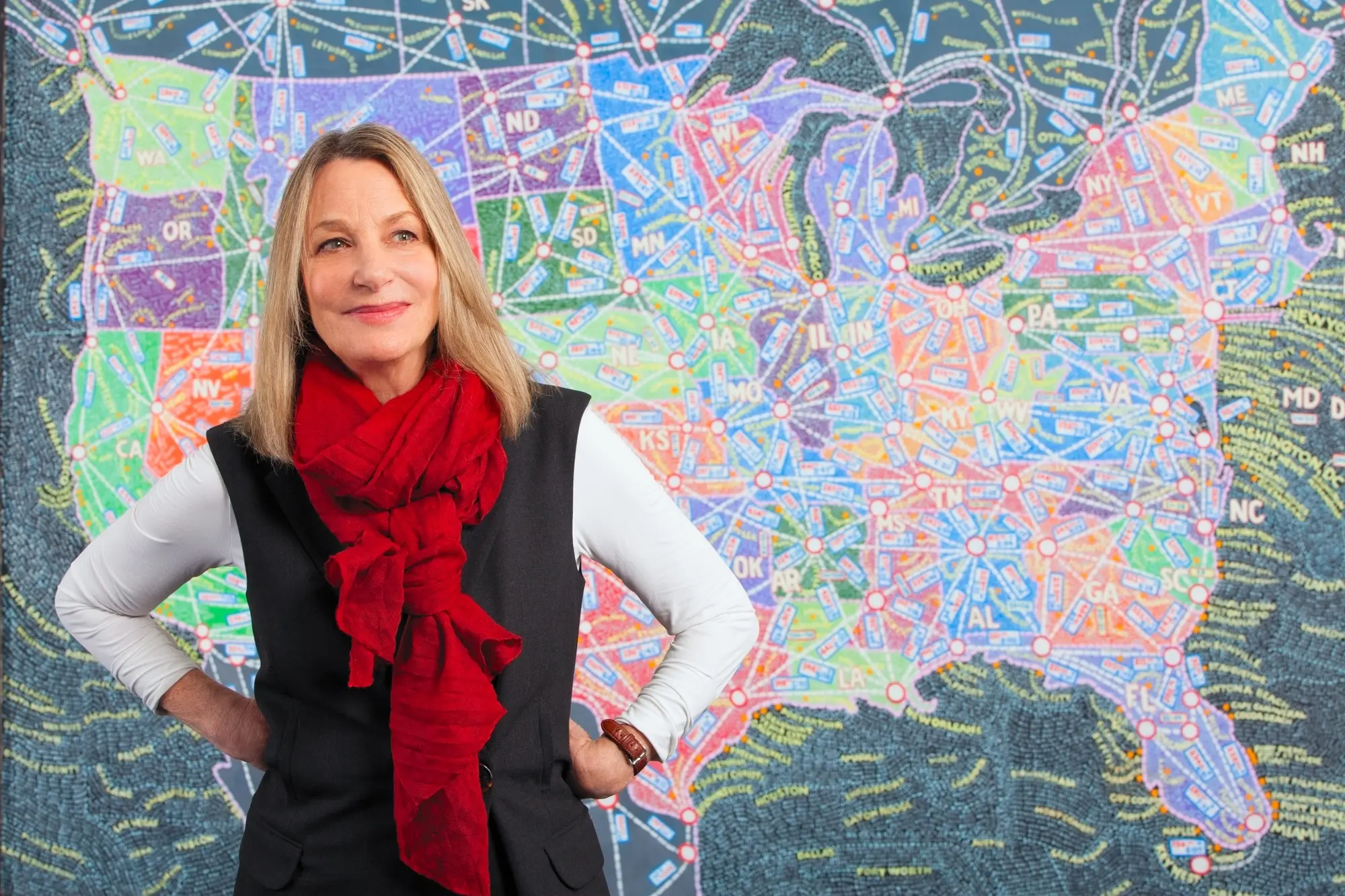
INTERVIEW: Paula Scher on designing the brands of New York’s most beloved institutions

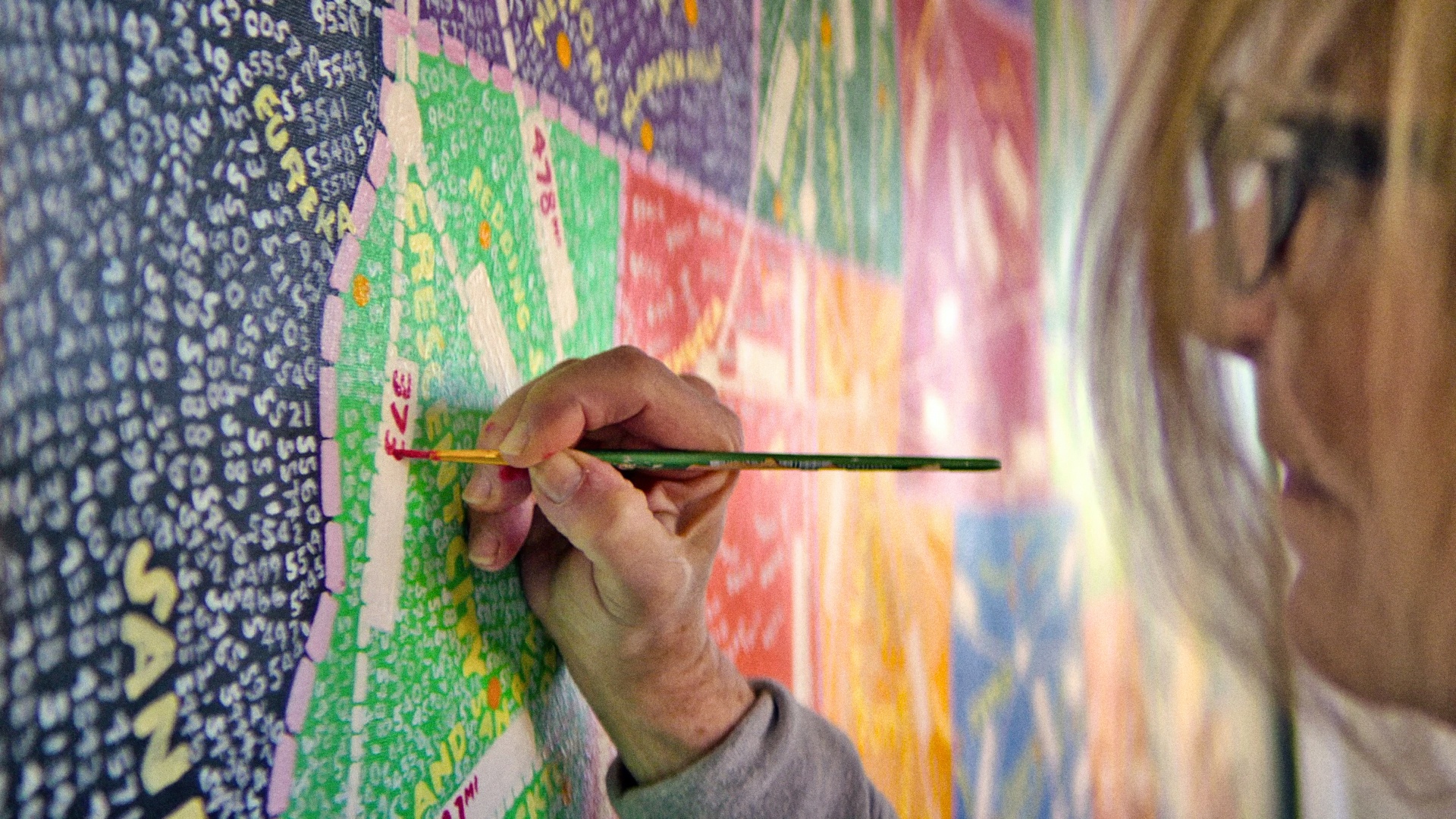
Paula Scher is one of the most recognizable names in the design world, considered legendary in the industry for creating the identities of major New York institutions. Scher moved to New York in the 1970s to begin her design career and got her start in the music industry. As art director for CBS, she designed around 150 albums a year and produced numerous ads and posters. Her record covers include everything from the Rolling Stones’ Still Life to Leonard Bernstein’s Stravinky, four of which were recognized with Grammy nominations. As a record designer, Scher was credited with reviving historical typefaces and design styles—and typefaces still play heavily in her work today.
Scher left Atlantic Records to begin her own design firm in 1982, and in 1991 she joined her current firm, Pentagram, as the company’s first female principal. Although Pentagram is an international design company, its New York office is behind the identities of some of the city’s most beloved establishments. It was at Pentagram Scher established her reputation as a New York designer who created unique, lasting identities.
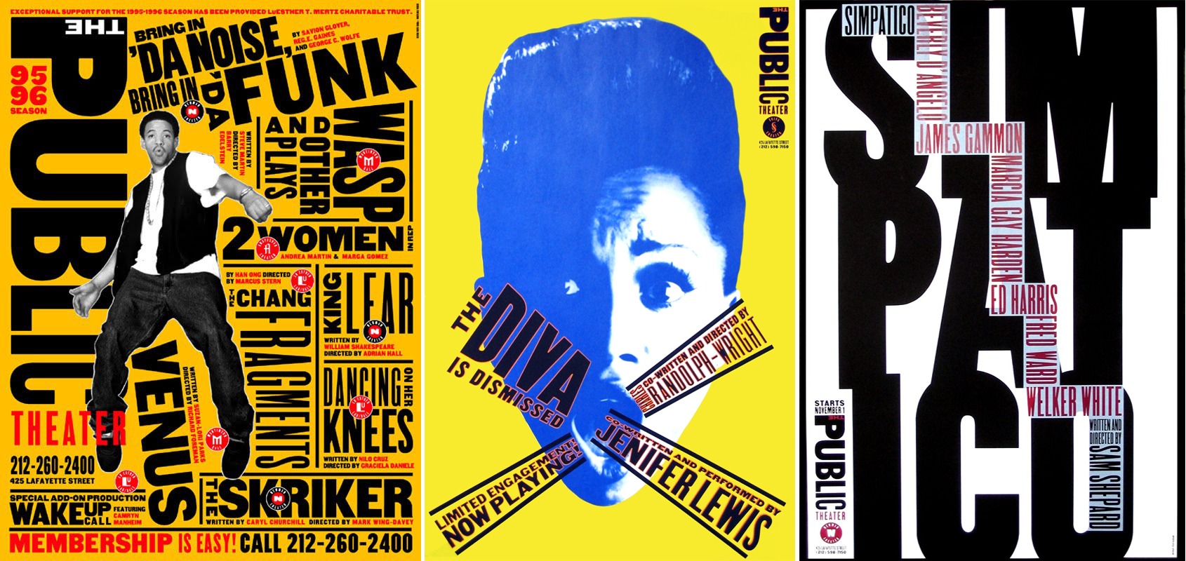
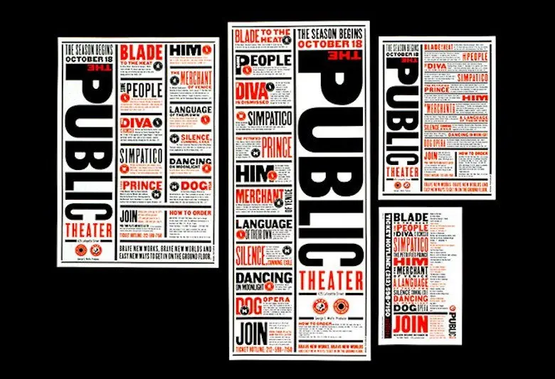
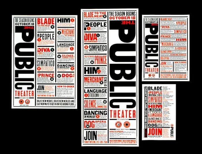
 Examples of Scher’s work for the Public Theater
Starting with the Public Theater, Scher’s relationship with the organization began in the mid-90s, as the Public sought to raise public awareness, attendance, and appeal to a broader audience from the city to the outer boroughs. To do so, Scher utilized street typography and graffiti-like juxtaposition in their branding, posters and advertisements. The Public still uses her designs and works with Scher today.
In 1994, Scher created the first poster campaign for the Public Theater’s Shakespeare in the Park, solidifying the institution’s new identity and its now massively popular summer series. Her work at the Public was followed by a long list of New York establishments: MoMA, the Metropolitan Opera, New York City Ballet, the New York Philharmonic, the New York Botanical Garden, Jazz at Lincoln Center, New Jersey Performing Arts Center, Shake Shack and the High Line. Her design expertise also goes beyond New York, as Scher helped create the identities for companies like Citibank, Tiffany & Co., Microsoft and the Philadelphia Museum of Art. Over her career, such designs have been awarded hundreds of industry honors.
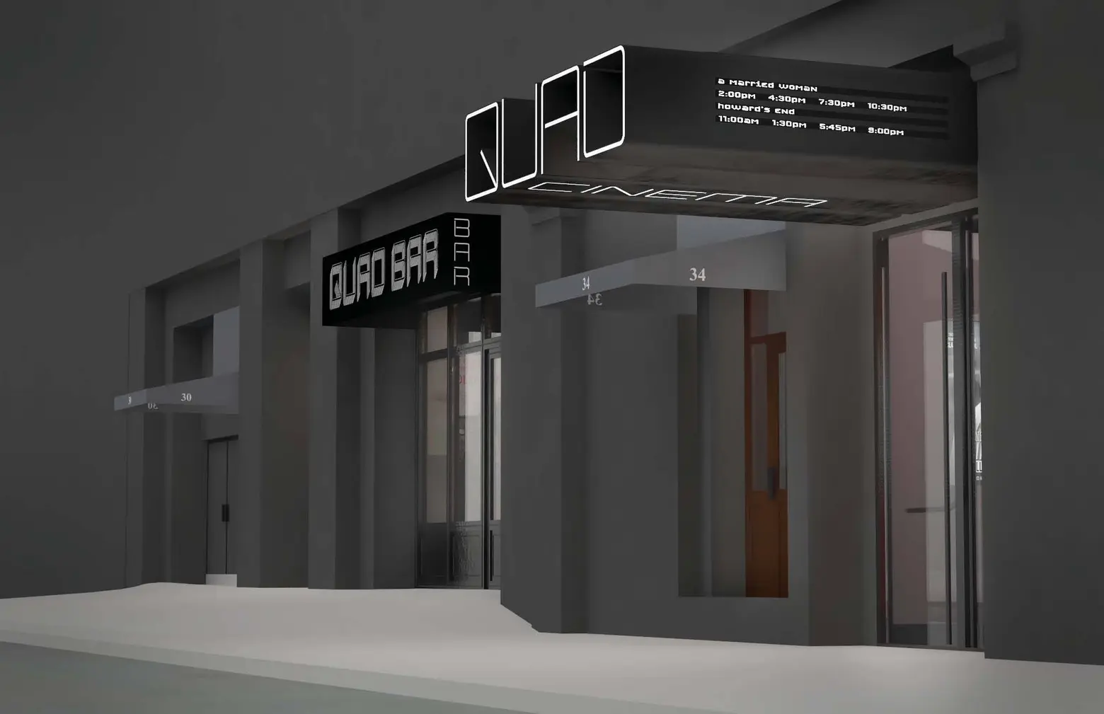
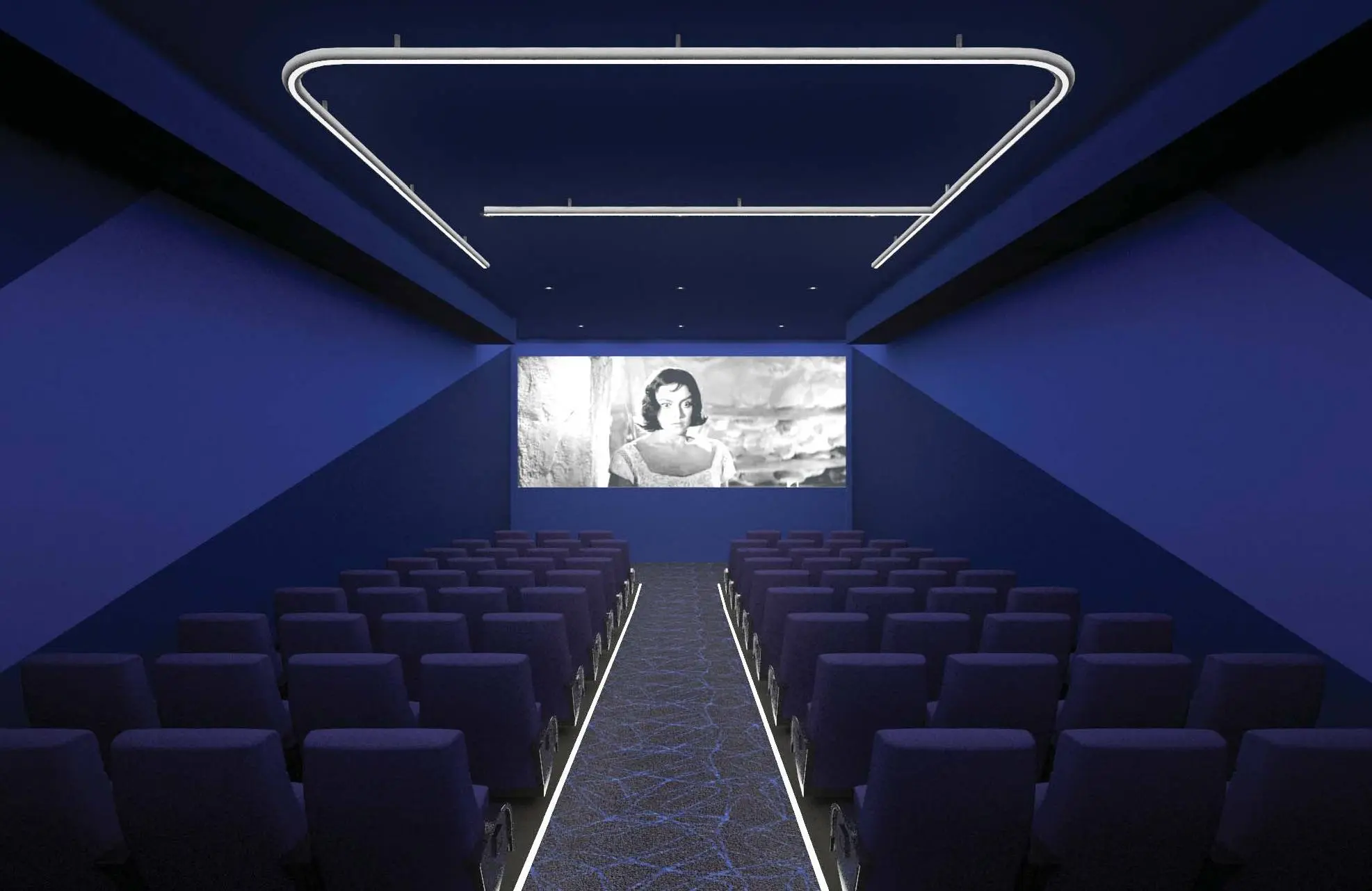
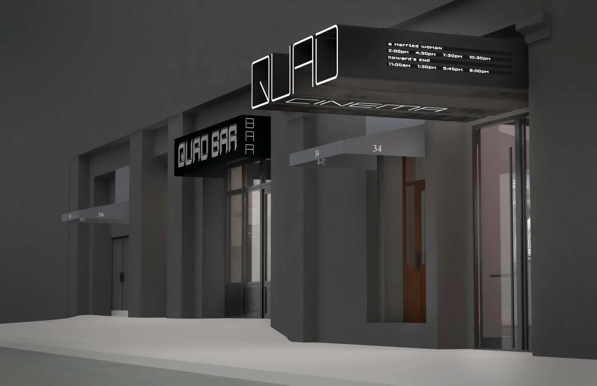
Her latest branding project is for the Quad Cinema, opening in Greenwich Village this month under the helm of Charles Cohen, real estate developer and founder of Cohen Media Group. The Quad, a four-screen indie film hub, opened in 1972 and sold to Cohen in 2014. To reinvent the theater for 2017, he asked Scher to work her branding magic. With 6sqft, Scher discusses her career path, her love of typography, and what it’s like creating lasting New York identities for clients like the Quad.
How did you initially get interested in design?
Paula: Well, I moved to New York in 1970 to design. I was from Washington, DC and went to school in Philadelphia and moved to New York in my very early 20s to become a designer. I was a record cover art director for about ten years and had my own business for seven. I joined Pentagram in 1991.
And why did you decide to join that particular firm?
Paula: I was a lone woman in a design firm, and I had a certain reputation designing for the entertainment industry and youth-oriented products. But I was getting older and realized I was likely to get the same work I was always getting if I was by myself. I needed help with a bigger firm. They invited me to join as a partner, so I joined. When I joined Pentagram, I began all these cultural and corporate accounts.
Can you share a bit about the process working with New York establishments with very New York identities? Where do you begin?
Paula: You really want to understand audiences and what the expectations of audiences are. At the same time, you have to understand the output of these individual organizations and how they want to be perceived by those audiences. You’re both creating a visual language for how they are inside, and how they want to be outside.
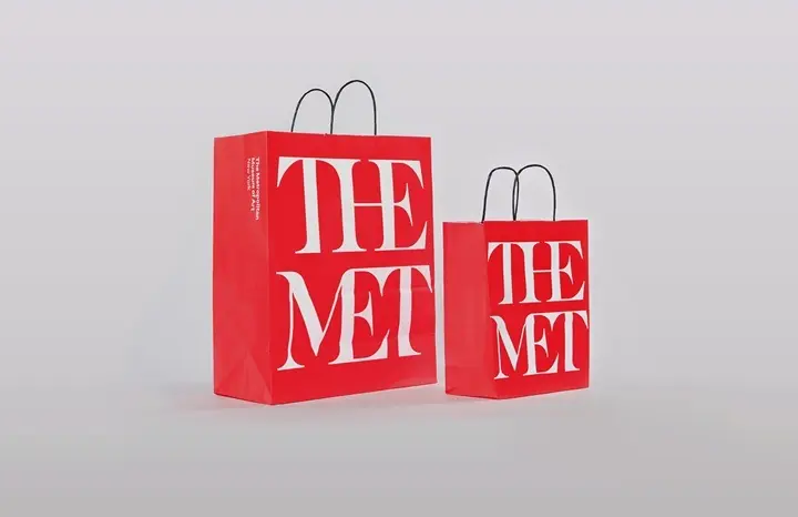
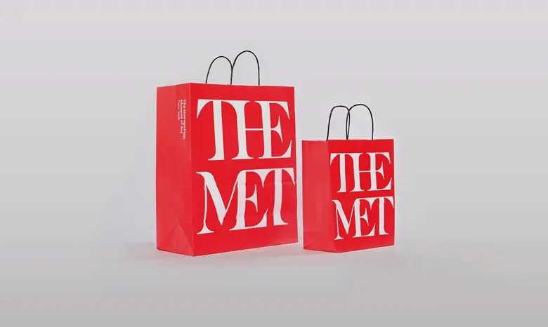
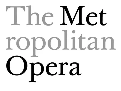
Different identities are driven by different issues. The logo for the Metropolitan Opera was designed really because the Met had lost its name to the Metropolitan Museum of Art—the Metropolitan Museum of Art had a better shopping bag. The shopping bag said “THE MET” in very large type, and it was everywhere. New Yorkers began to think the Met meant the art museum, not the opera.
 The Metropolitan Museum of Art’s storied shopping bag, via the Metropolitan Museum of Art
When Peter Gelb became head of the opera, he wanted to take a stab at getting back some of that nickname. We couldn’t get back the full name, but it could be “The Met Opera.” So the design of the logo was based on that name as much as anything else. “Met” and “Opera” are highlighted—the word “metropolitan” breaks so the “met” stands by itself, with “ropolitan” on the second line. It also served to make the logo more contemporary as it helped enforce the name.
Sometimes you’re designing to give something a specific feeling, sometimes you’re designing to make something clearly understood. That’s what design does.
 Scher’s work for the MET Opera’s logo
When working with a big client like the Metropolitan Opera, how much do you collaborate with them or how much do you take the reins and experiment with ideas?
Paula: With all clients, you want to know as much about them as you possibly can before you start designing. You want to know who they are, how they got to be where they are, what’s wrong with what they have, why did it get like that, where do they want to go? And then, you have to understand their audience and how your client can be their best selves in the future?
Sometimes, if it’s the right kind of organization, it’s phenomenally experimental and creative. Other times, it’s more conservative or constrictive. It’s really the nature of the company that determines that.
New York is a city that’s always changing, evolving, branding itself in new ways. How does that affect your practice?
Paula: My goal is to make things last. My identity for the Public Theater was designed in 1994. I still work for them and we’ve evolved it and made changes to the posters and advertisements, but it’s essentially the same identity. Jazz at Lincoln Center I first designed in 2000 and re-tweaked two years ago.
So what makes a design last?
Paula: I think it’s the ability to be recognized. Citi Bank was designed in 1998 with that arc you recognize. Logo designs have to be eccentric enough that you can recognize them, and simple enough that everyone can use them consistently.
What New York brands have inspired and influenced your work?
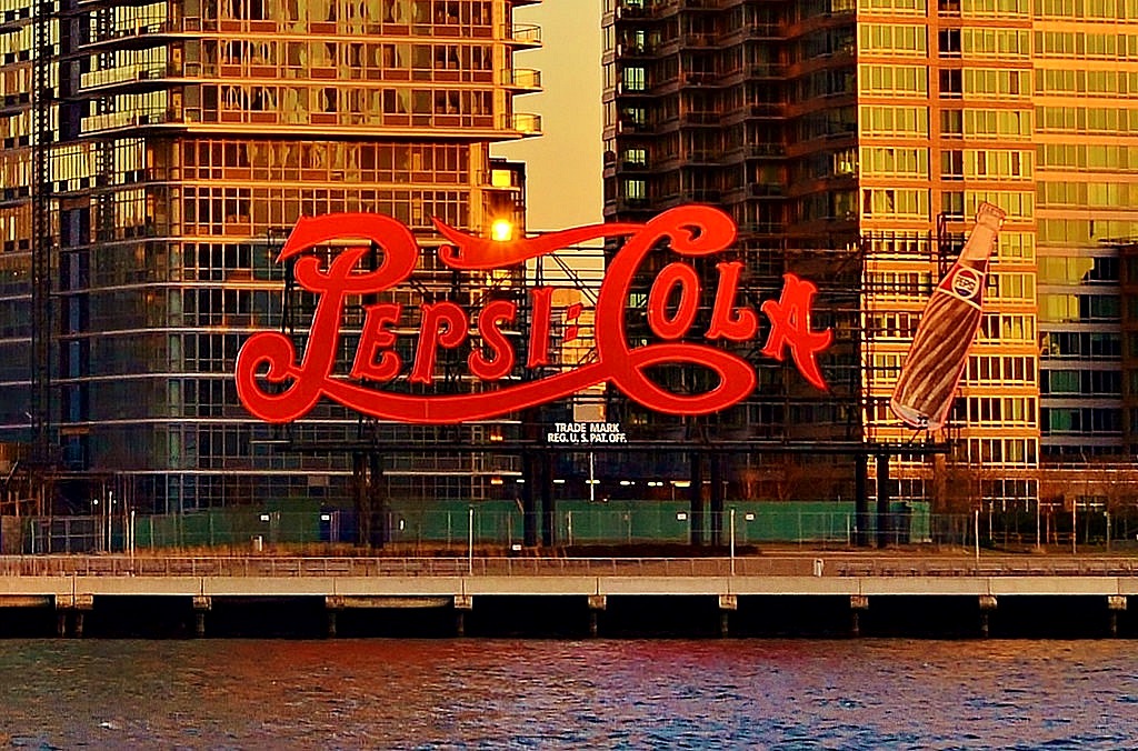
Paula: To be honest, the things that inspire me in New York City are the signs that were always here or the buildings that are always iconic. I’m in love with the Pepsi Cola sign you see on the East River. It’s totally heroic—I’m thrilled they finally landmarked it. I love the sign to the Holland Tunnel—those big words running across the cement of the entryway. And the Chrysler Building, it’s completely identifiable from wherever you see it. It’s amazing.
The newer buildings seem less so. They’ve lost their ability to be recognized. The notable exceptions, I’d say, are the Renzo Piano’s New York Times building, Foster’s Hearst Building, Gehry’s twisted apartment tower or the Calatrava train station. But so much of architecture and design is designed to look like other things like it.
Why do you think we’ve come to that place right now in New York?
Paula: We’ve come to that place with everything. Go to a party and every woman’s wearing black. It’s hard to stand out. It’s not my goal to make somebody comfortable in black wear a red dress. I couldn’t, but maybe I could wear a red belt.
Do New York architectural figures or images play into your work, or inspire you?
Paula: My work is very influenced by New York City. I gravitate towards caps, as opposed to upper and lower case. I wouldn’t describe my work as classical—I use geometric, gothic print usually from newspaper headline type. My work for the Public Theater is very New York influenced. But I’m a broad enough designer to move from the Public Theater to the Metropolitan Opera because they’re sort of design opposites.
What are other memorable branding projects of yours?
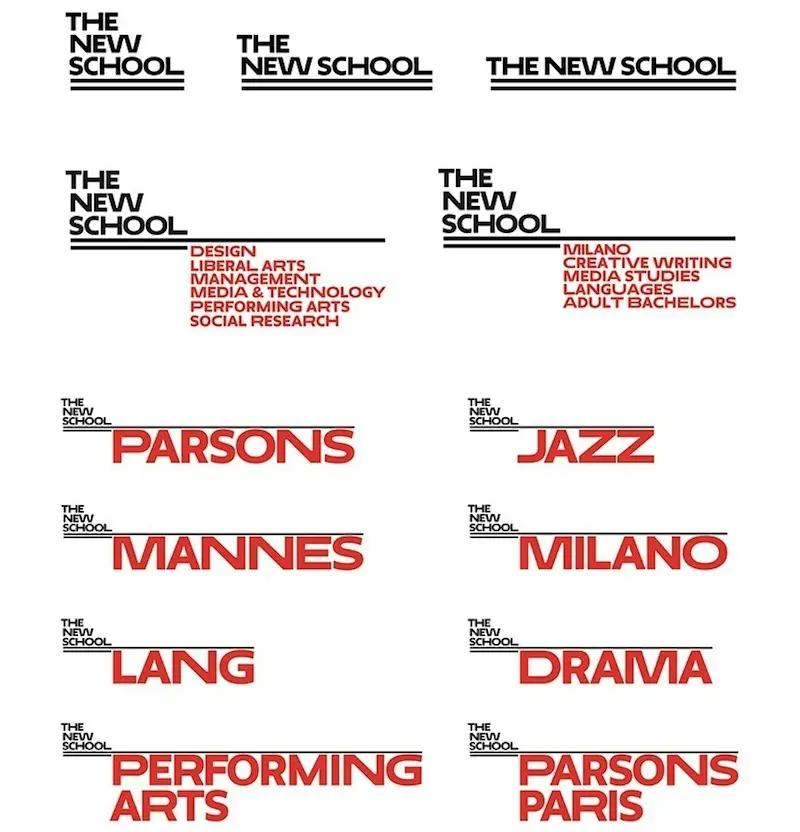
Paula: I liked my experience with Parsons, which has been out for one year. We rebranded the New School which was quite controversial and then it became fashionable. It is a very New York identity. The design relied on three different widths of typography to express itself. If you go down Fifth Avenue and see all the signage, you can recognize it as one place because the typography is so interrelated. It looks like itself.
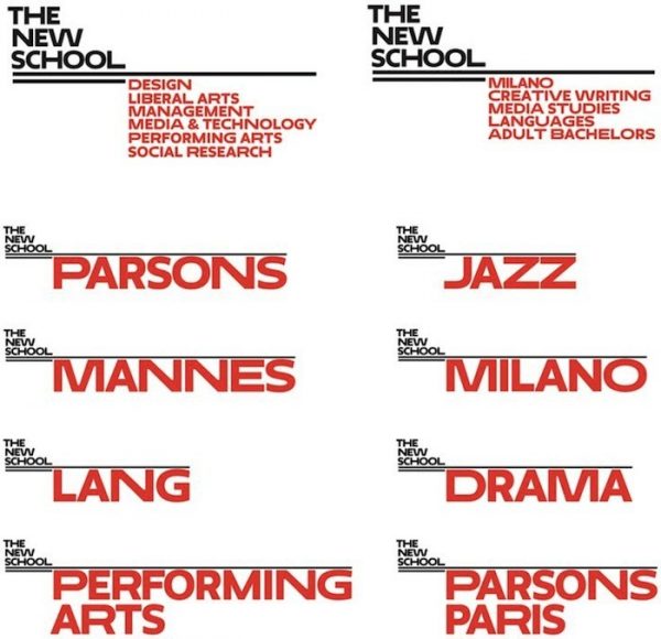 Scher’s design for The New School and Parsons
What was controversial about the design?
Paula: It got bad reviews. I can’t complain that it was totally smashed, though. Then there was a school campaign against it—the students thought I was paid millions of dollars to do this new identity. And then they graduated. The next class embraced it as completely their own, and that was the end of it.
When you introduce something new, there’s often pushback. There can be real rebellions against it.
Have you faced lots of hesitancy or pushback against rebranding?
Paula: Reviewing an identity when it first launches is like reviewing a play in the middle of the first act. You have to wait and see how it comes out! Identities, if they’re done well, should be a little bizarre when you first see them. You’re used to the other thing, and you have to get used to something new. You don’t know how you’ll feel about it until you’ve lived with it and it’s a real thing in the marketplace.
Let’s talk a bit about your latest project, the Quad Cinema. How did you join the team?
Paula: Charles Cohen is a longterm client of mine—I designed the identity for his media company Cohen Media and I’ve worked on a number of his buildings.
He’s a complete movie buff and this is a labor of love for him. He wanted to restore the arts cinema to its original glory—not necessarily the space but the action that goes on there. The goal was to put a public face on his passion.
So how did that look visually as you designed the brand?
Paula: It was a happy situation where it could easily design itself. There are four cinemas. It’s called the Quad. QUAD is four letters, and quads are squares. So the logo type is made of four rounded squares. The squares themselves are the Cohen Media Logo—which is a square “c” cut in half.
Inside the theater, we used the motif of the QUAD everywhere. The theaters are named Q, U, A and D. The Q theater has a neon-like, giant “Q” that fills the whole top ceiling. The different letters are listed on each ceiling. The awning is the word QUAD with the letter forms extruded into four steel tubes that run through the entryway and the door. The desk in the theater is also part of the letterform. The whole place is typographic.
Was there any discussion of changing the theater name?
Paula: No, why change the name? There are four theaters. What’s different about the Quad is that, now, the physical experience of it is nicer. There’s a bar to visit the theater. There’s a beautiful lobby and it’s a wonderful piece of design now. But the Quad Cinema is the Quad Cinema.
What is the experience like to introduce a new brand, or identity, to the world?
Paula: It’s always different depending on the project. I never know how someone will react to something, I only know how I feel about it. That’s what matters the most to me—do I feel like I did something terrific? Am I proud of it? In this instance, the answer is yes. Sometimes I get acclaim for things that I feel are really ordinary, and I don’t know what to say about that. I try not to be too worried about it.
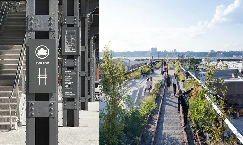
Tell me about designing the logo for the Highline.
Paula: They hired me to do their logo when I never thought they’d get the thing built. I thought they were crazy—these two guys running around raising money.
What kind of logo were they looking for so early on?
Paula: A free one! They were just starting the project. I told them, you’re railroad track and it starts with H. Here. And I gave them their logo—that’s how fast it was. And it worked. It just worked.
They’re still using it, right?
Paula: Absolutely. I did all the signage there, I’ve worked for them for years. Everything about the project was sort of surprising. The signage was a political football with the city, state and fundraisers. But it all got done.
RELATED:


Get Insider Updates with Our Newsletter!
Leave a reply
Your email address will not be published.


Rebranding in some situations should not be attempted such as Harlem to SoHa. As a long time resident and real estate broker SoHa strips away the universal identity of a people and culture. Leave Harlem alone. NO SoHa.
What an inspiring woman. Loved her episode on Netflix’s ‘Abstract’ too!