Tommi Moilanen’s New Subway Map Design Makes It Easier to Navigate the City

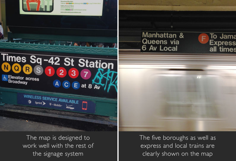
The subway is one of New York City’s greatest assets, but this only holds true if you can actually navigate through the various tunnels and platforms. And despite the countless transportation apps out there today, the good ‘ole subway map is still the best way to find your way around. There’s certainly been no shortage of map redesigns, but 6sqft is particularly impressed with the stylings of this new map by Tommi Moilanen, a Finnish industrial and interactive designer. His version uses the system’s existing design language, but incorporates a fresh, modern aesthetic.
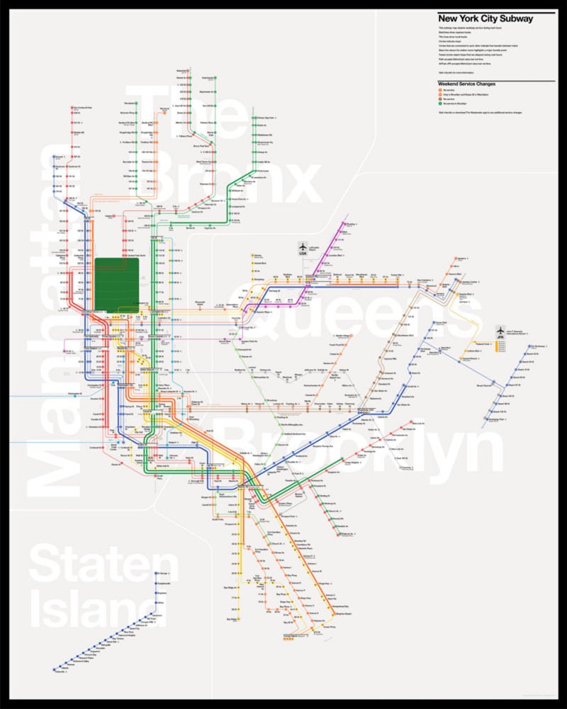
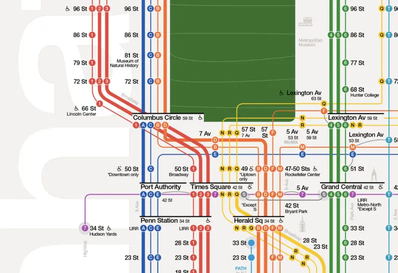
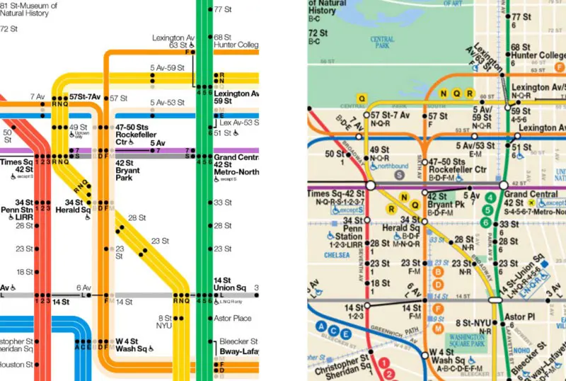
The NYC subway map has become an interesting piece of the city’s iconography, and the most celebrated is the 1972 version designed by Massimo Vignelli, the man also responsible for designing the signage (still used today). This version however isn’t what we currently see in subway stations as Vignelli’s map was replaced by a less abstract interpretation in 1978. The 1978 replacement was also more geographically accurate than Vignelli’s, but did not incorporate the graphic style from the existing system. What we love about Moilanen’s new design is that it is both geographically and systemically accurate. Plus, he successfully incorporates simple design details that make the map easier to read and the subway system easier to navigate.
Moilanean’s map (left) compared with the existing subway map (right)
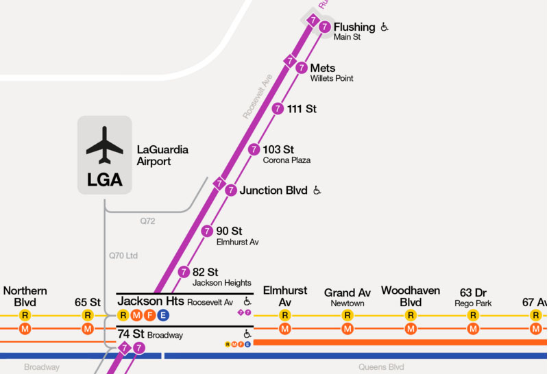
Moilanen lived in the city for a year prior to beginning the design of his map, and he used that time to identify major problems he wanted to address. One of them was finding a way to effectively communicate which lines run express and which local. His solution—the new design illustrates weekday peak hour services using thick lines to represent express services and thin lines for local. Additionally the skipped stops are tinted a lighter shade. To ensure that this clever detailing is understood, Moilanean’s map features a simple legend to efficiently define the rules of the map. Other notable features include the accurate location of the five boroughs to help riders know when they should be looking for a “Queens bound” or “Brooklyn bound” train.
To learn more about this useful map and Moilanen’s process, check out his project description and website.
[Via Medium]
RELATED:
- Map Enthusiast Creates a More Geographically Correct Version of Vignelli’s Old Subway Map
- See NYC’s Subway Lines Superimposed Over an Aerial Photo of the City
- New App Wheely Will Make the NYC Subway More Accessibilty Friendly
- The Subway That Could Have Been: Mapping Never-Built Train Lines and Abandoned Stations


Get Inspired by NYC.
Leave a reply
Your email address will not be published.


A great redesign that’s easier to figure out quickly. It resembles the London Tube map, which is the gold standard of city transport maps.