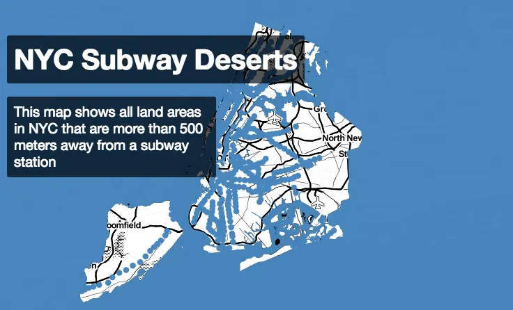
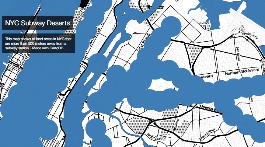
Map of ‘Subway Deserts’ Shows Outer Boroughs Left High and Dry

Though we may already know there are places in NYC that we can’t easily get to, transit data junkie Chris Whong lays it all out on a map that points out the city’s lesser-served regions, at least by underground means. The interactive map shows all NYC land areas more than 500 meters (about .3 miles) from one of the city’s 468 subway stations–that’s about two avenue blocks or six or seven shorter street blocks (around a seven-minute walk) according to Google maps. A big blue dot blots out this radius surrounding the station; everything outside the dot, well, you’re hoofing it (or taking a bus, car or rickshaw).
Some highlights: The boroughs that aren’t Manhattan have a lot more white space, particularly Staten Island and the eastern parts of Queens. In Manhattan, thin white sandbars on the east and west sides remind us of what we already know–and that we hope the 7 train extension and the 2nd Avenue line really do happen someday. The map also points out the lack of easy access to LaGuardia and JFK (AirTrain, where are you?).
Map courtesy of I Quant NY.
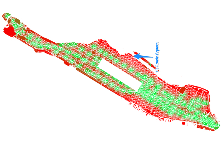
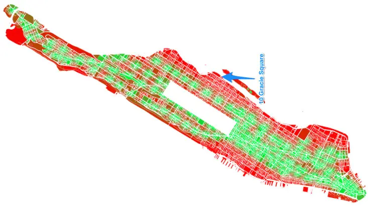
Within Manhattan, according to I Quant NY, who mapped the entire island on the basis of subway station distance, the building that’s farthest from any subway is 10 Gracie Square, stranded in glorious isolation at the end of 84th street by the FDR Drive; we’re guessing that residents, who have included Gloria Vanderbilt and Madame Chiang Kai-Shek and where a penthouse is currently on the market for $15 million, have other means of getting around.
We’ve heard that New Yorkers actually don’t mind walking; many actually credit the city’s sidewalks for keeping the whole family in shape. But while six blocks may not really seem like a terribly long walk to some, people with disabilities and the elderly have a much tougher time of it.
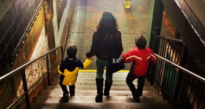 Image © Matthew Richmond
While the MTA continues their quest for funding, we’re hoping those aforementioned new additions bring a little rain to the desert. This animated map showing how the subway system has evolved over the past 100 years gives you an idea of how much more ground the subway covers compared to earlier days–and how cool it could be if it the trend continued.
Lest we forget, there are always buses: According to a report by the Regional Plan Association (PDF), around 97 percent of the city’s population is no more than a quarter-mile from a local bus stop.
[Via Citylab]
RELATED:
- REVEALED: East River Skyway Will Bring Brooklyn Commuters to Manhattan in Under Four Minutes
- Animated GIF Shows How NYC’s Subway Has Evolved over the Last 100 Years
- Subway Rent Map Shows Manhattan Rental Prices Along Each Train Line
- The Subway That Could Have Been: Mapping Never-Built Train Lines and Abandoned Stations
Get Inspired by NYC.
Leave a reply
Your email address will not be published.


Completely flawed map. 500 meters is not a long walk at all and way too expensive to put subway lines at 1km intervals everywhere in the city.