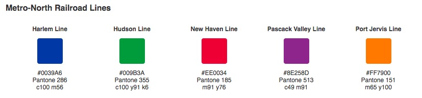
Did You Know the MTA Uses Pantone Colors to Distinguish Train Lines?

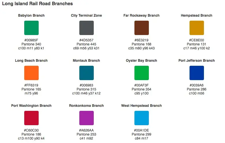
It’s likely that every subway rider can name the colors that mark each train line — blue for the A, C, E, red for the 1, 2, 3. But did you know that these aren’t just arbitrary hues pulled from some MTA Crayola box, but rather 10 Pantone® spot colors? Even E-Z Pass and the LIRR and Metro-North lines have their own specific colors.
The color coding dates back to the mid ’60s when the city was in an economic downturn and people were staying off the rundown, haphazardly organized subways. To give the system a fresh, user-friendly look, the Transit Authority turned to graphic design, then an up-and-coming profession. They hired Italian designer Massimo Vignelli and Dutch designer Bob Noorda, both of whom were proponents of the popular “Swiss” style that featured solid, bright colors, simplistic illustrations, typographic grids, and the sans-serif font Helvetica. The men combined these elements into the 364-page New York City Transit Authority Graphics Standards Manual, forming the basis for the subway design we know today.

Today, the MTA doesn’t take new color choices lightly. When the T line eventually opens, it will be marked by robin’s egg blue, described by most as teal. When the decision was made back in 2011, the MTA said it was based on the fact that the color had been used previously for the no-longer-in-service J.F.K. Express train. But Leatrice Eiseman, executive director of the Pantone Color Institute, told the Times, “It has a very upscale connotation. People with more discriminating tastes tend to choose that as a favorite color.”
RELATED:

Interested in similar content?
Leave a reply
Your email address will not be published.


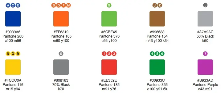
When these colors for the subways were first introduced in 1979, per the 1980 revision to the Graphics Standards Manual the colors were thus:
– 1, 2, 3 – PMS 185 Red
– 4, 5, 6 – PMS 355 Green
– 7 – PMS Purple
– A, AA, CC, E – PMS 300 Blue
– B, D, F – PMS 165 Orange
– GG – PMS 376 Green
– J, M – PMS 154 Brown
– LL, S – PMS 430 Grey
– N, QB, RR – PMS 130 Yellow
– JFK Express – PMS 312 Blue
PMS 130, 165, 185, 300 and 355 were holdovers from the older 1967 Vignelli color scheme (revised c.1972). PMS 312 had, as of 1970, been assigned to the 3, 8, E and M routes while PMS 354 would have signified CC, GG, RR and SS. However, around 1972 the light blue colors lightened up a bit to PMS 311 – and the green routes, darkened a shade to PMS 355. Besides those, ‘black’ routes – 5, B, QJ/J and LL – had PMS Black if against a white background, and PMS 401 Grey against a black background; and then there was PMS 239 Magenta which applied to the 4, AA and F lines. Looks like ‘T’ will use PMS 312 as well. The changeover of the Eighth Avenue lines’ color to PMS 286, and of the BMT Broadway lines to PMS 116, would have been around 1987 or ’88.