See how NYC’s urban density stacks up against other major cities

As part of their larger report “Developing Urban Futures,” the Cities Urban Age Program at the London School of Economics created a new series of digital density diagrams, 3D models that visually demonstrate the density of people in cities around the world. The maps combine a range of socio-economic data, including where people live, work, and commute to capture the key spatial dimensions of urban economic life. The taller spikes represent larger concentrations of people, while the flatter zones represent lower density concentrations, for example, residential or suburban neighborhoods.
In May, we highlighted the hypnotic, pulsating Manhattan Population Explorer map which efficiently and effectively showed how the New York City population doubles during the day with commuters and tourists. The Cities Urban Age Program’s diagrams are similar in that they visually demonstrate the density of cities based on the number of people living and working in a square kilometer (100×100 kilometers). The diagrams represent the average “ambient population density” over a 24-hour period.
The higher the density, the more urban infrastructure is needed. The lower the density with larger footprints, the more sprawl. The red spikes represent density in the city and the grey shows density outside the city limits. These maps can be used to help city planners and politicians understand city growth and find solutions for more effective management to minimize the negative impacts of overcrowding, stress, and pollution.
To give you an idea of how NYC’s density stacks up against similarly sized (in terms of population) cities, we took a look at six other urban centers with populations over 8 million.
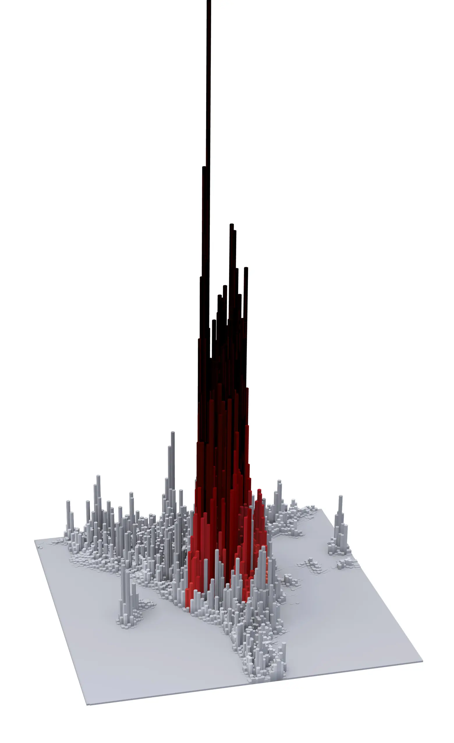
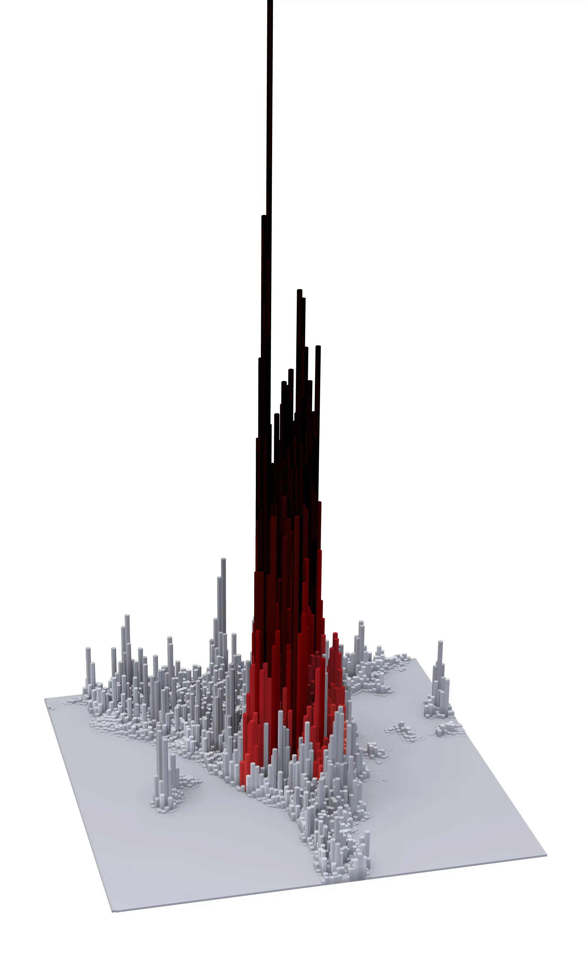
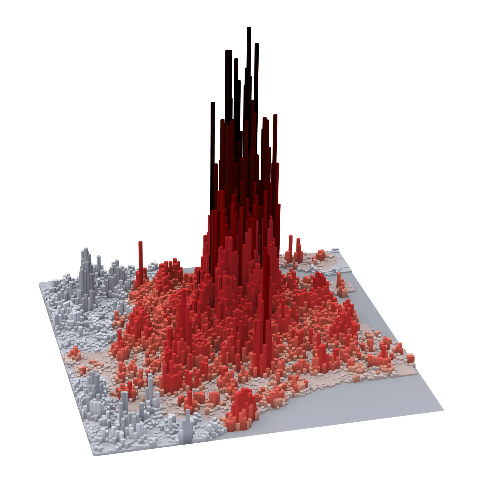
Cairo, with 153,606 people per square kilometer has the most extreme density with its super-tall spikes and narrow footprint.
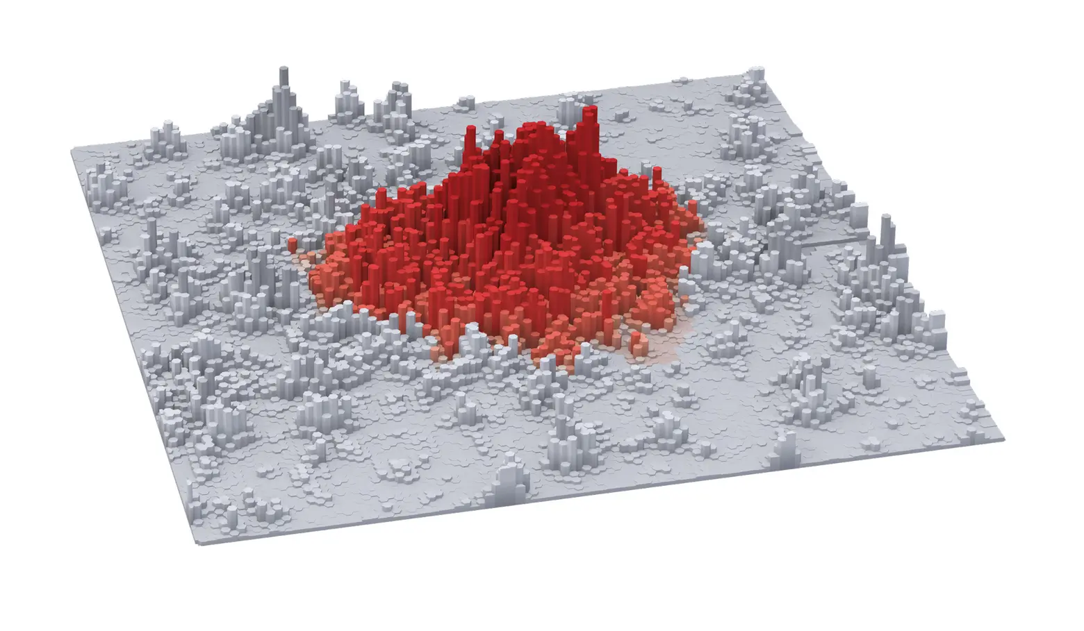
London, on the other extreme, is very low and spread out with 18,769 people per square kilometer.

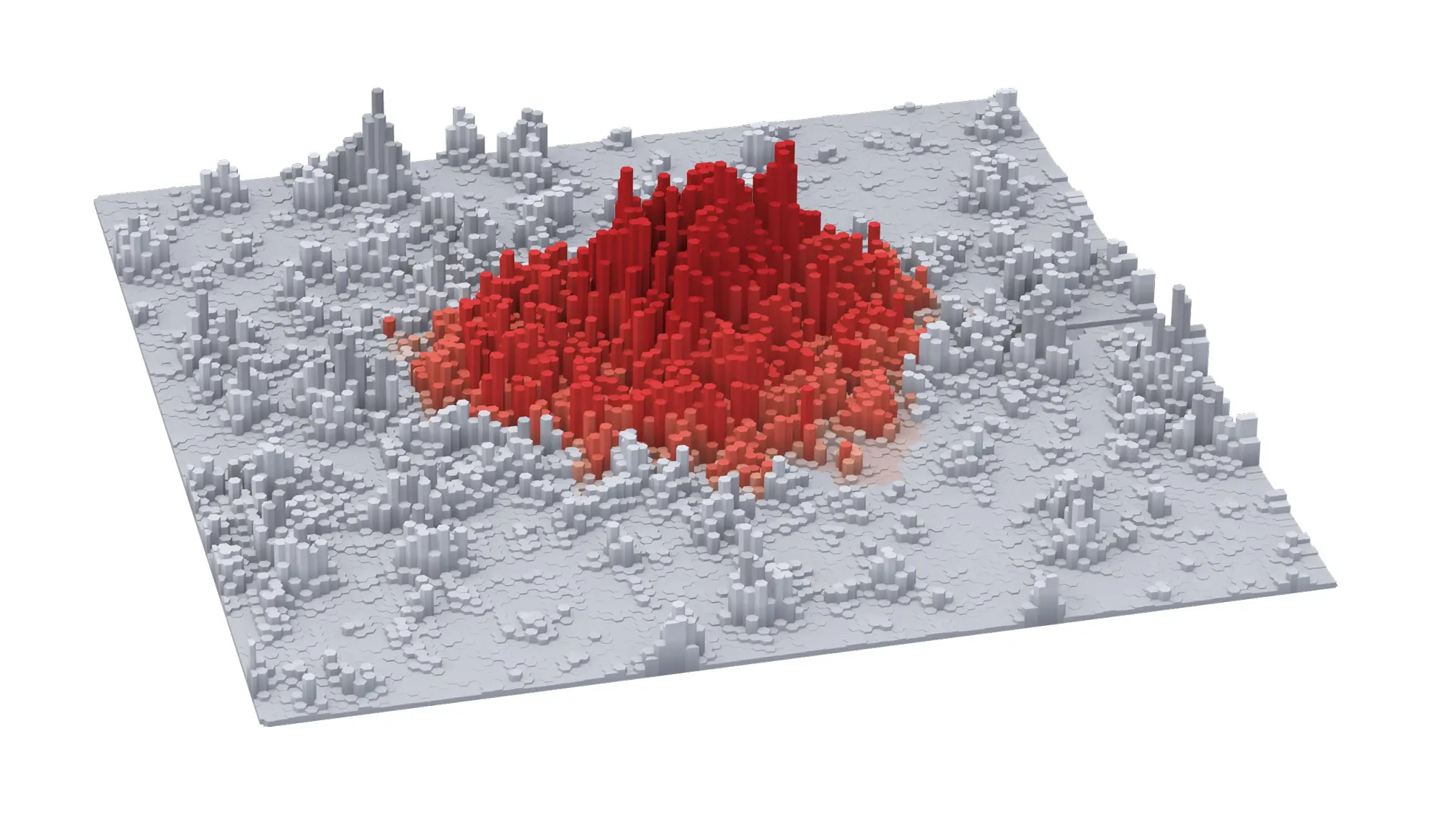
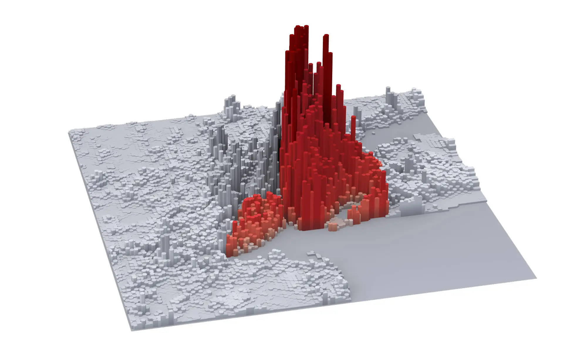
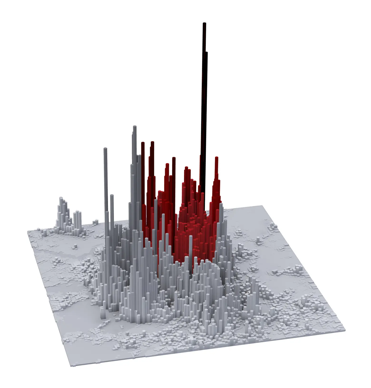
New York City (top); Mexico City (bottom)
New York City’s 38,242 people per square kilometer is most similar to Mexico City’s 31,598 people per square kilometer and their density diagrams look relatively similar.

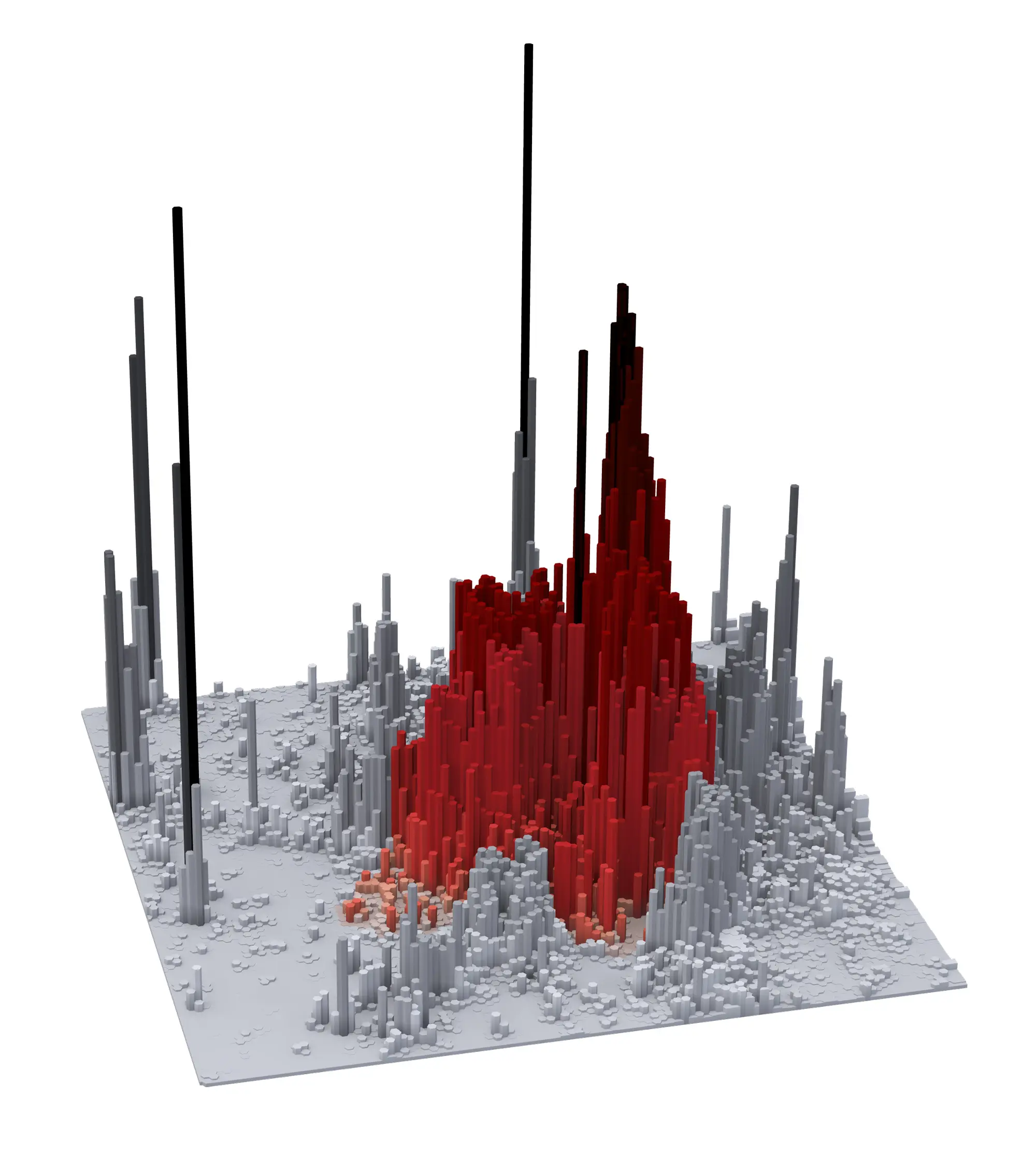
Delhi (top); Seoul (bottom)
Delhi (66,151 people per square kilometer) and Seoul (84,086 people per square kilometer) look quite similar, just with their red and grey colors flipped, therefore Delhi has a higher density in the city limits and Seoul has a higher concentration outside the city limits.

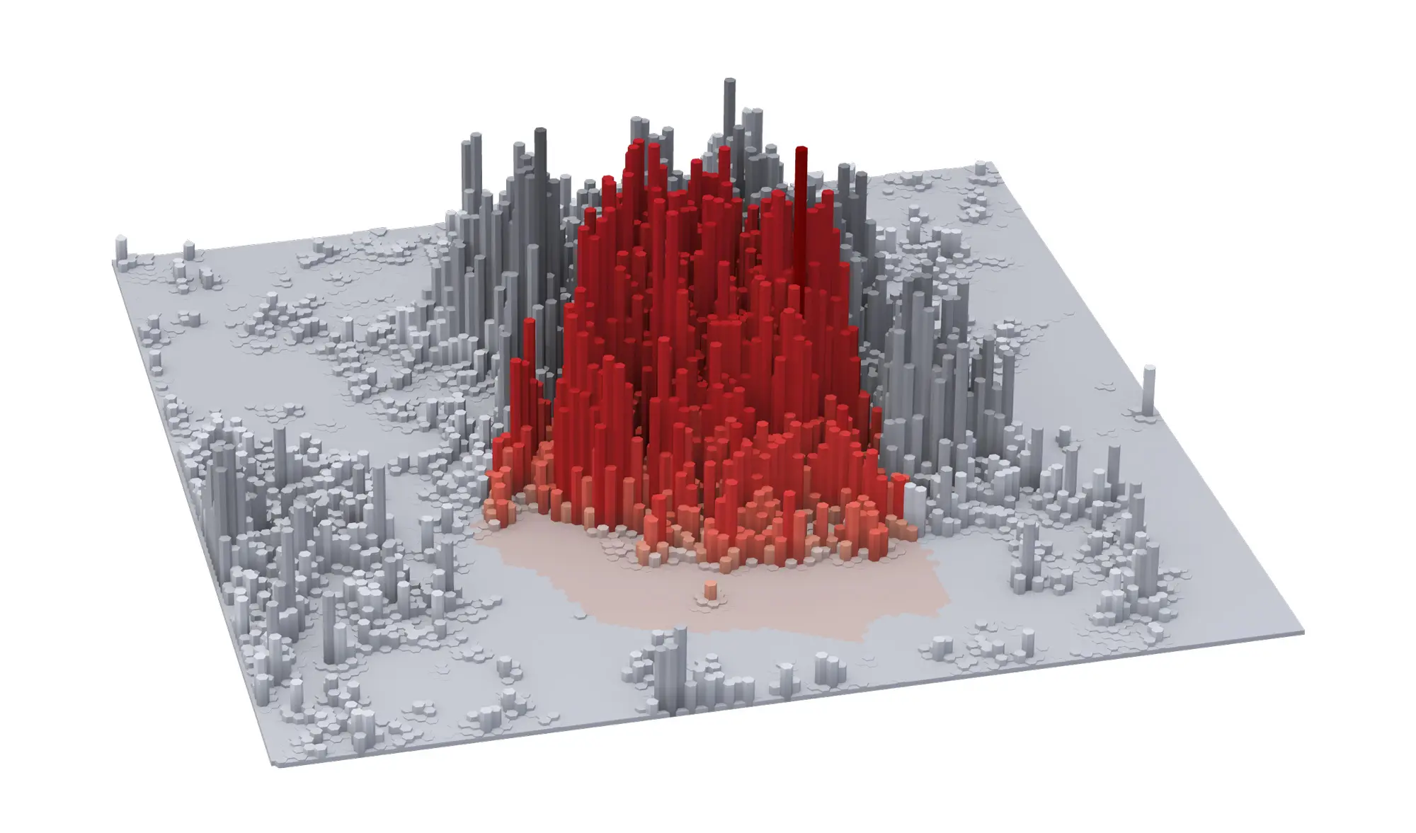
Shanghai
Shanghai (77,726 pp/k2) looks more like what one might expect New York City to look like, high density both inside and outside the city limits.
To read the full report on Developing Urban Futures, click here >>
RELATED:
- See Manhattan’s population pulse over 24 hours
- Day vs. Night: What NYC’s Population Looks Like
- Believe It or Not: The World’s Population Can Fit Inside New York City
All diagrams courtesy of the Cities Urban Age Program at the London School of Economics