Your Daily Commute Never Looked So Good As It Does in This Colorful Data Visualization

The daily commute to work and back might be the last thing you want to see more of, but sometimes it helps to see things in a new light: Here’s your daily traffic torment, subway sardine-fest or bus-stop hustle, represented in candy-colored motion. Michigan-based data wrangler Mark Evans shows us the workday migrations of American commuters using census data so that they resemble a jubilant gathering of rainbow dots, expanding and contracting from each county with the day’s open and close (h/t Citylab).
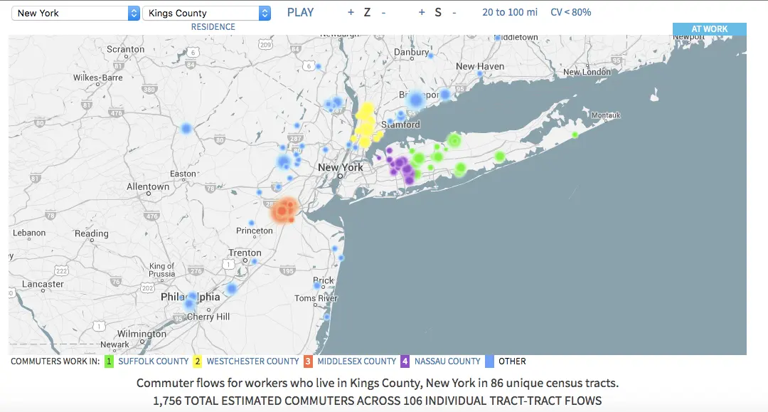
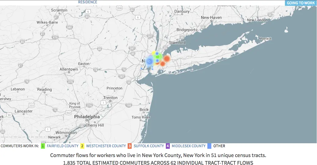
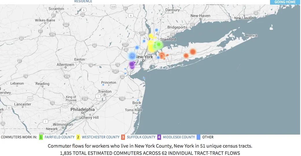
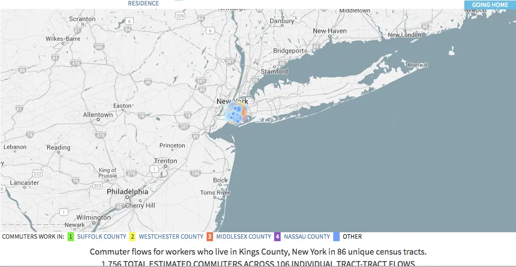
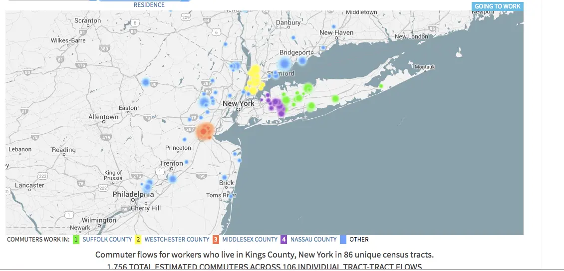
From Evans’ blog we’re instructed that the dots vary in size based on how many commuters there are, and are color-coded by the county from which they’re commuting. Select a county from the drop-down menu at the top of the map, and toggle between “home” and “workplace” to see what the back-and-forth looks like for those who live or work in that county.
If you want more information on a given commute flow or about the place it originates or ends up, pause the animation using the PAUSE/PLAY link and click on a dot. From there you’ll be instructed to open a tab in Google Maps to see either the home tract, the work tract, or the Google Maps driving directions between the two tracts.

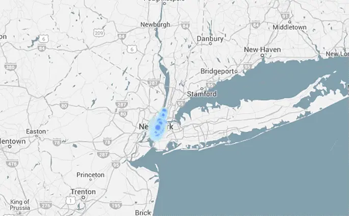
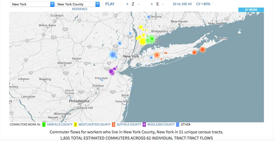
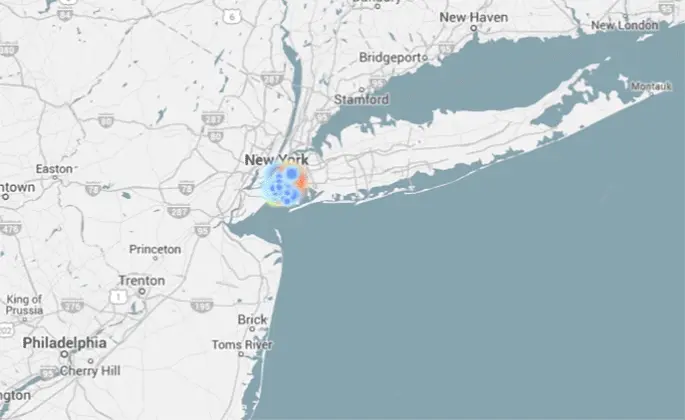
Commuter flow for New York County
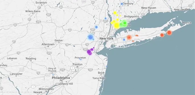
Commuter flow for Kings County
Says Evans, “This can sometimes help to see that a large dot is focused on an airport or university as a workplace. You also have the option to launch a tab in a great site called Loveland, based near my hometown of Ann Arbor in Detroit, that has detailed information on census tracts and will bring up a map of individual tracts so the size, shape, and contents of the tract can be examined.”
Evans was inspired by geographer and urban planner Alasdair Rae, who put together a set of maps to illustrate the hell of commuting in the SF Bay Area. The commuter data comes courtesy of the American Community Survey (ACS), an ongoing survey that replaced the US Census long form. This data is available to the public to aid non-profits, businesses, and government agencies to get a better geographic understanding of their plans and funding. The map itself uses Google Maps Javascript API as its basis. Watch the daily migration in action in your city and find out more here.
[Via Citylab]
RELATED: