MAP: See how demographics have shifted in every NYC neighborhood over 10 years

By now, we’re all well aware that New York City is changing, becoming ever more expensive and far less friendly to its middle and low-income inhabitants. But here’s a new interactive map from the Citizens Housing and Planning Council (CHPC) that offers us a snapshot view of how upper-income New Yorkers (the majority of whom are white, to be sure) have multiplied throughout the boroughs between 2000 and 2010 to alter the face of the city’s demographics.
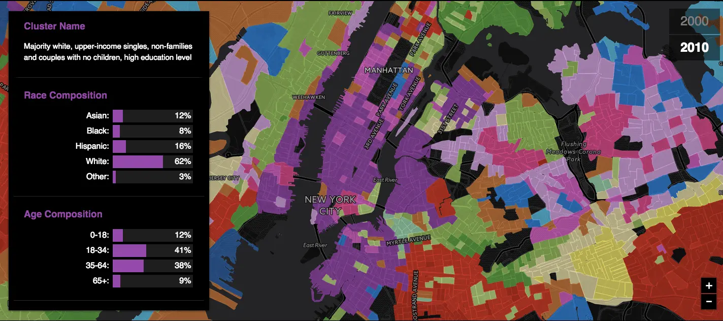
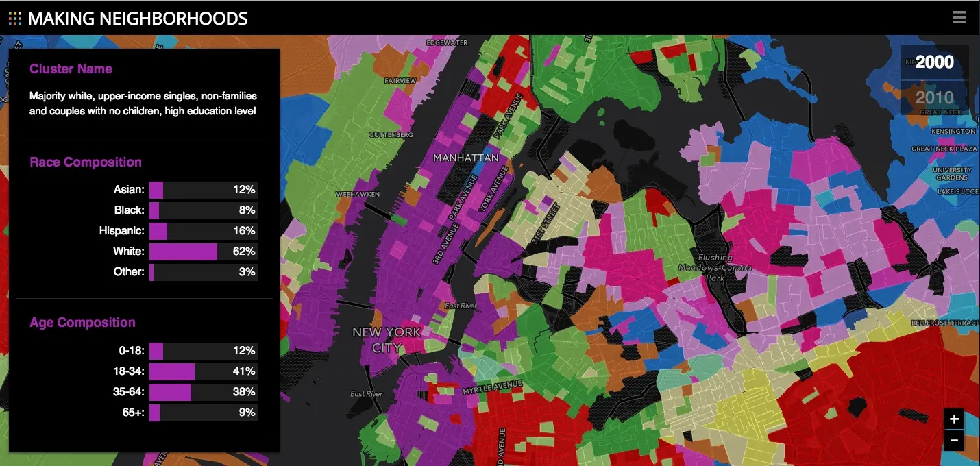
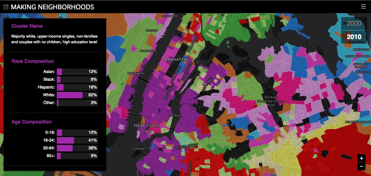
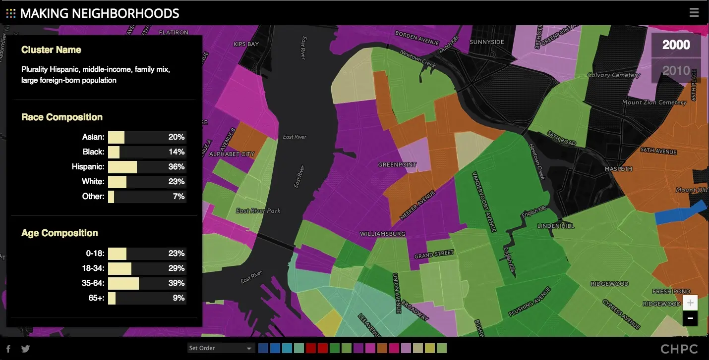
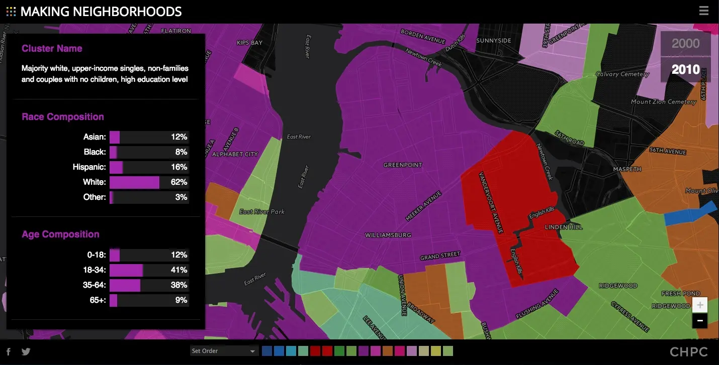
To create the map—which is part of a larger report you can read here—the CHPC used cluster analysis, applying 16 variables to measure race, age, foreign birth, household/family type, education level, and poverty. From there they identified 14 clusters of populations (eg. “Majority white, upper-income singles, non-families and couples with no children, high education level” or “Majority Asian, middle-income, couples and singles, large foreign-born population”) sharing the same measure of the aforementioned demographic markers, and then pinpointed the locations of all of these population clusters in 2000. They did this again 10 years later to determine how things changed.
[twentytwenty]


[/twentytwenty]
ex. Demographic changes in Greenpoint
As you will see when using the map, the neighborhoods showing the most notable transformations over 10 years are not surprising (eg. Williamsburg, Greenpoint, Hells Kitchen, Harlem, Astoria). But what is interesting is the definitive role that race and income has played in the population distribution. According to CHPC’s study, race and income were the most significant factors in determining population clusters, and they were the one major pattern that emerged in their findings. The two factors, in fact, varied more than any of the other demographic characteristics in their model.
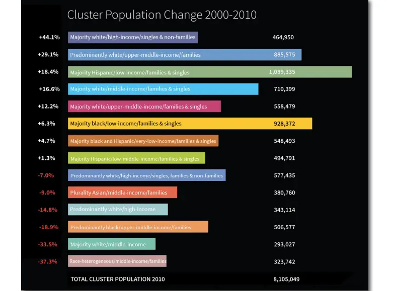
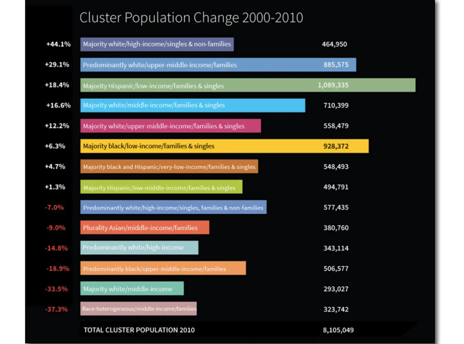
The CHPC also found that population clusters at the low and high ends of the income spectrum grew in both inhabitants and geographic area, confirming NYC’s middle class is indeed shrinking.
The creators do note that users should keep the date range depicted in mind, as 2010 is not totally reflective of 2017. “This work may reveal a transition at its end, mid-stream, or just beginning,” they also write.
If you want to see how your neighborhood demographics have shifted between 2000 and 2010, you can try out the map here.
The full “Making Neighborhoods” report can be accessed here.
[Via Google Maps Mania]
RELATED: