Live Data Map Lets You Watch the World’s Mass Transit Systems Move

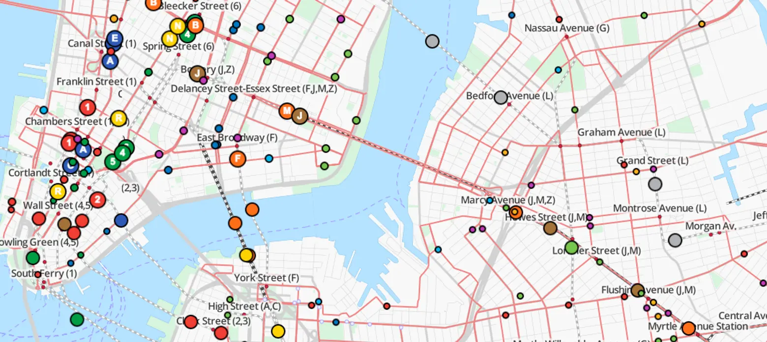
If you’ve ever marveled at how the world’s public transit systems keep people moving across town and back every day, TRAVIC (Transit Visualization Client), which shows scheduled routes of trains and buses as well as real-time positions (the MTA provides real-time data feeds) from more than 200 public transportation systems worldwide, will keep you busy for a while. The data map, created by Swiss-German IT company GeOps and the University of Freiburg, lets you watch the C train (or your own regular punishment) crawl slowly through its scheduled stops–and wonder why there seem to be so many more trains running on the Paris Metro.
The tracker, part of a master’s thesis at the University of Freiburg, offers a visualization of data that the world’s transit agencies and operators publish. It’s apparently a work in progress with more to come; though most of the movements are based on static schedule data, real-time data is used in the visualization wherever possible.
Click on “all feeds” on the map to see which locations are available. Though it may not help you with your commute–there are, in fact, a number of apps like Live Train NYC, that can follow real-time trains and buses along their routes–it’s pretty amazing to watch the world get from point A to point B without leaving your seat.
Explore the map here.
RELATED:


