Interactive Map Shows How Your Neighborhood Has Recovered From the Housing Market Crash

Most Americans are finally starting to feel a bit of relief that the economy is getting back on its feet, but when it comes to the housing market, it’s not as cut and dry as we might think. Analyzing data from Black Knight Financial Services from 2004 to 2015 (the bubble, burst, and recovery), the Washington Post asserts that the country’s housing arc has only worsened inequality. “It also helps explain why the economic recovery feels incomplete, especially in neighborhoods where the value of housing — often the biggest family asset — has recovered little, if at all,” they explain.
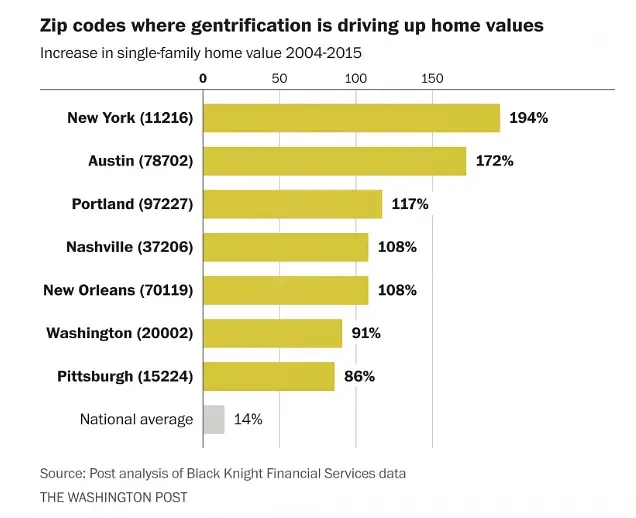
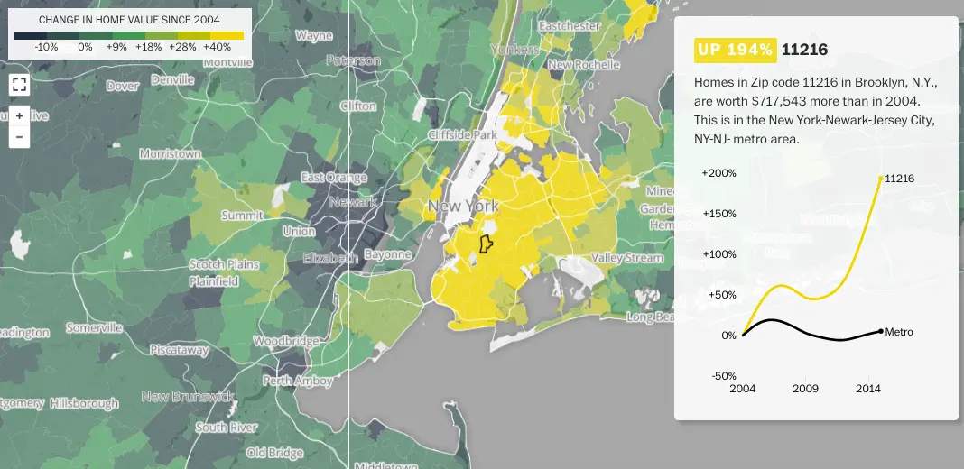
For example, an average single-family home gained less than 14 percent in value over the past 11 years, but homes in the nation’s priciest neighborhoods have gained 21 percent. And interestingly, in Bed-Stuy, Brooklyn, an area that saw a huge gentrification push during this time period, single-family home values have tripled and risen by 194 percent — the largest increase of any metro area in the country. The Post has taken the data and compiled it into an interactive map that lets users simply input a zipcode to see how the area has fared.

The Bed-Stuy record is quite interesting because although the median single-family home value is now over $1 million, the median income is only $44,000, a stark example of the inequality that can ensue along with gentrification. The neighborhood is home to many lower-middle-class retired homeowners and rent-stabilized tenants. And though the renewed interest in the area’s large stock of brownstones will benefit longtime homeowners, “this mismatch between runaway housing values and recent demographics doesn’t bode well for renters in the long run,” notes the Post.
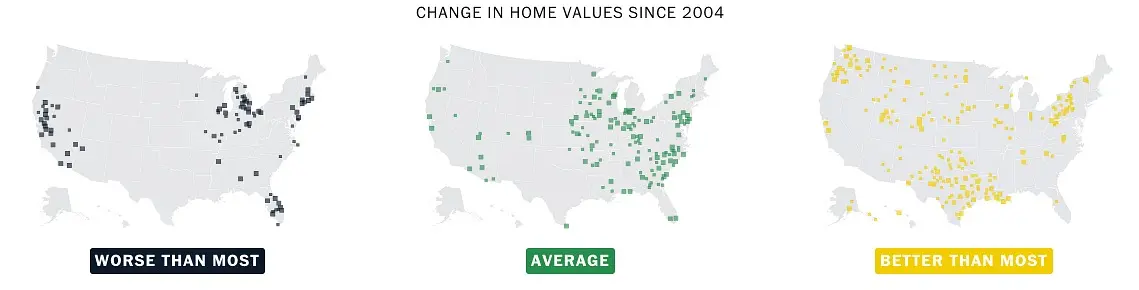
This is a pattern seen across the country — the zip copes with the largest value jumps are historically minority neighborhoods that are now gentrifying. On the other side of the spectrum, zip codes where the largest population group is black are more than twice as likely to have home values less than those in 2004.
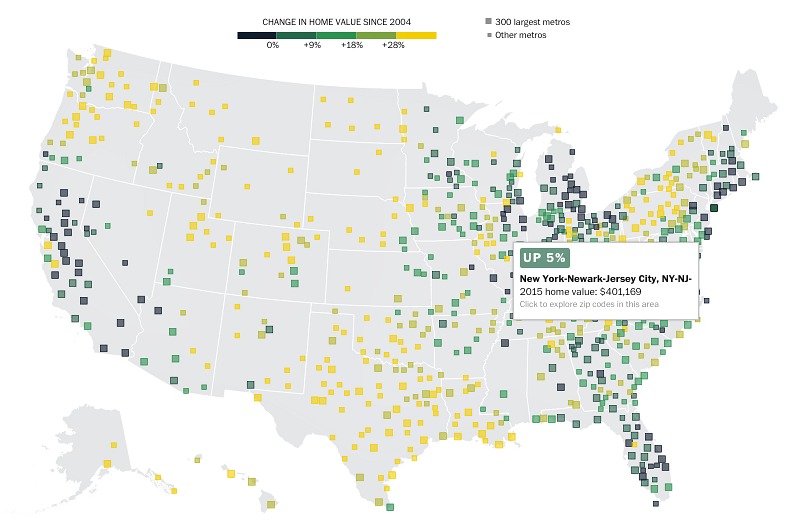
Generally, home values are on the rise from Texas up to the Northwest, but in California’s Central Valley, the upper Midwest, the Northeast’s suburbs, and Florida — metro areas “where a dramatic housing bubble was followed by a dramatic plunge” — values are struggling or altogether down. In a Stockton California zip code, where values are down a whopping 40 percent, San Francisco’s great wealth is to blame. As working- and middle-class people got priced out of the city, they moved east to cities like Stockton, creating a bubble. And in Atlanta, where overall home values have fallen the farthest, racial lines come into play. Many African-American professionals bought suburban homes in South DeKalb County during the boom, but they haven’t reaped the benefits of the recovery.
Explore the full interactive map here.
[Via Washington Post]
RELATED:
- Race Drives Gentrification and Neighborhood Boundaries, Study Finds
- It Only Makes Sense to Buy a Home in NYC After 18 Years, Longer Than Anywhere in the U.S.
- Americans Are Spending More on Rent and There’s No Relief in Sight
- New Maps Show How Much You Need to Work in Order to Own a Home in NYC and Other Major Metros
All maps via Washington Post