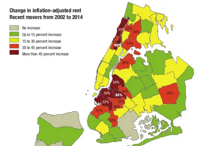
Harlem Rents Jump 90 Percent over the Past 12 Years, Bed-Stuy Not Much Better at 63 Percent

Take everything you think you know about “affordable” alternatives to pricey neighborhoods and throw it out the window. This map from the Community Service Society (first shared by the Daily News) analyzes newly released census data that compares median rents between 2002 and 2014. The data is drawn from a New York City Department of Housing Preservation and Urban Development survey of 18,000 New Yorkers every three years who had recently moved, which “eliminates the tendency of lower rents paid by long-time tenants to smooth out market changes and mask the changes that affect tenants who are looking for a place to live,” according to CSS.
The report shows that rents citywide have increased 32 percent over the past 12 years, not a new or surprising figure. But it also shows drastic increases in neighborhoods that have been traditionally thought of as more affordable. Central Harlem saw the biggest jump at 90 percent; the average rent in 2002 for new residents was $821 and now it’s skyrocketed to $1,560. Other no-longer-affordable neighborhoods are Bed-Stuy at a 63 percent increase and Washington Heights/Inwood at 55 percent. The other ‘hoods topping the list include less surprising areas like Brooklyn Heights/DUMBO/Fort Greene at 59 percent and Williamsburg/Greenpoint at 53 percent.
What led to this sharp jump? According to CSS:
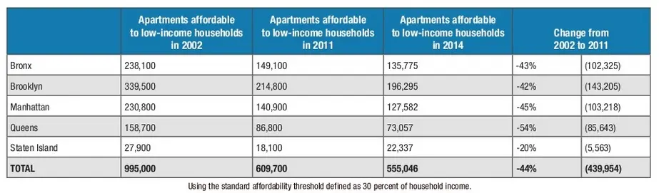
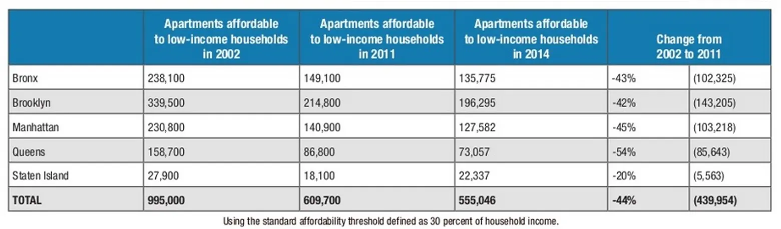
The loss of rent-regulated housing to vacancy deregulation is combining with the loss of subsidized housing and with rising rents overall to dramatically shrink the city’s supply of housing affordable to low-income households. Between 2002 and 2014, the city lost nearly 440,000 units of housing affordable to households with incomes below twice the federal poverty threshold.
The report was released just as the city’s controversial 421-a tax incentive program is set to expire along with rent stabilization laws, which Mayor de Blasio has said he seeks to strengthen.
Map and chart via Community Service Society
RELATED: