Mapping 22 Million Citi Bike Rides Across NYC

Software Engineer Todd W. Schneider is a super data geek in his spare time, analyzing New York City’s publicly available stats on topics like the transportation system. Recently, he took a closer look at the Citi Bike system (h/t Untapped), which clocked over 10 million rides in 2015–22.2 million rides from July 2013 through November 2015–making it one of the world’s largest bike share systems. Schneider’s findings spotlight general trends in Citi Bike usage and give us the big picture, via charts, maps and some fascinating animation, on the migrations and tendencies of our busy population of blue and white bikes.
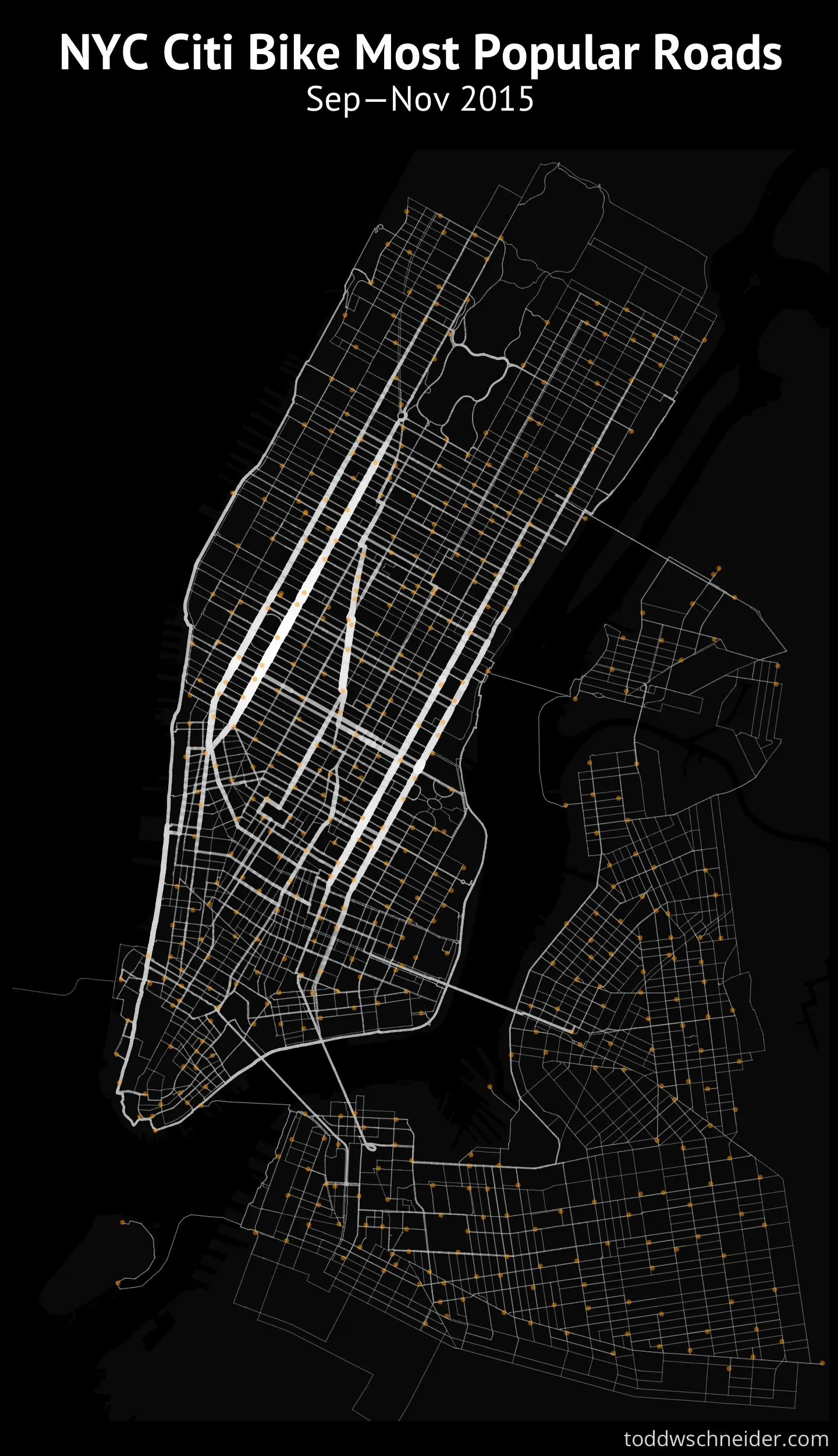
The animated map above shows rides taken on one randomly-chosen weekday (September 16, 2015), to show general trends in bike share usage. Each blue dot represents one Citi Bike trip. Light orange dots are Citi Bike stations. The map shows all trips logged, except those in which bikes leave and return to the same station, and assumes that the Google Map instructions are followed with each trip. You can see the time of day at the top right.
A couple of general trends: Commutes from outer boroughs to Manhattan are highest in the morning, and the reverse is true in the evening commute time; Eight and Ninth Avenues, First and Second Avenues, and Broadway and the West Side Greenway are the most popular bike roads.
Schneider found that most Citi Bike trips start and end in Manhattan. Since the program’s expansion in August 2015:
- 88% of trips start and end in Manhattan
- 8% of trips start and end in an outer borough
- 4% of trips travel between Manhattan and an outer borough
Regarding the most popular roads as mentioned, it’s important to remember that the map and animation assume people follow Google Maps’ directions, which, as we know, isn’t always the case. Google Maps shows a strong preference for roads with protected bike paths.
Other public data available includes station locations for where the ride started and ended, timestamps for when the ride started and ended, rider gender, rider birth year, whether the rider is an annual Citi Bike subscriber or a short-term customer, and a unique identifier for each bike used. Schneider also puts some of this information together to show us who’s using the bikes, when, and a little bit about why (or why not).
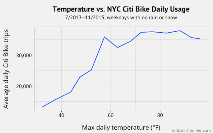
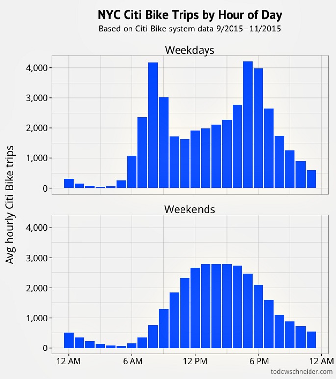
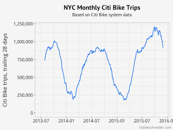
Clearly, ridership drops during the colder months. Also, the bikes get more use during weekdays, for commuting rather than fun. Weekend rides tend to peak in the more leisurely afternoon hours.
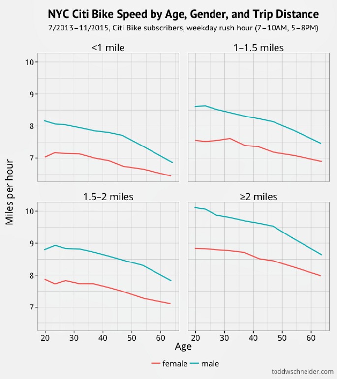
There’s also a breakdown of bike speed of Citi Bike Subscribers during the weekday rush hour based on age, gender, and trip distance. It’s interesting to note that trips covering longer distances have higher average speeds than shorter distance trips.
 Image: Peter Burka via flickr.
Another facet of the bike share system Schneider looks at is the way it actually works regarding the manual moving of bikes from station to station. He calls this the “magical transport” of bikes, presumably by Citi Bike operators.
You can see Schneider’s collection of fascinating findings on his website.
[Via Untapped]
RELATED: