MAP: See city owners vs. renters, block by block

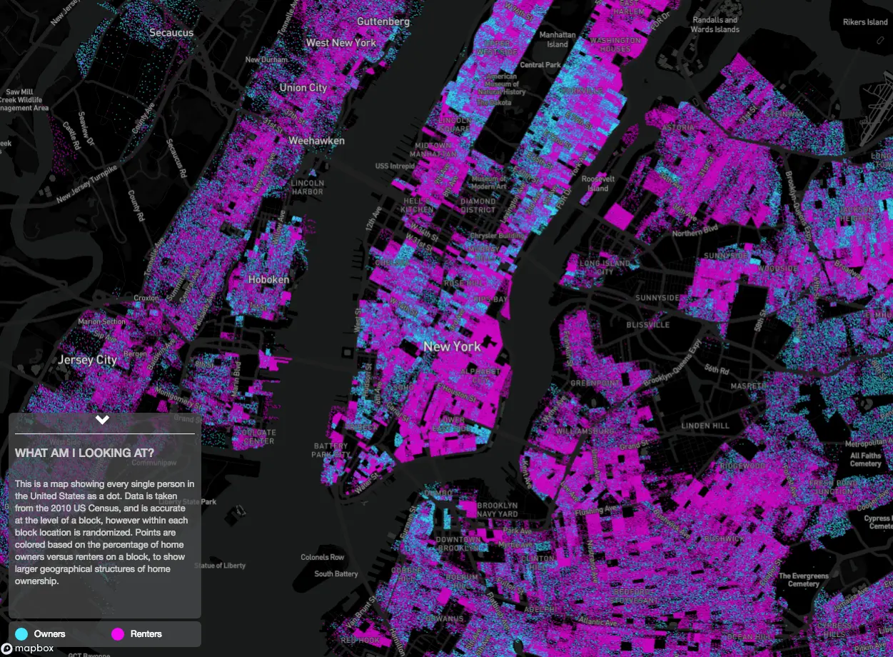
Renters and owners in Manhattan. Map by Ryan McCullough
New York has been called a city of renters and with good reason. The real estate rent vs. own breakdown here is far different than that of other parts of the country, for a multitude of complex reasons. But it’s also interesting to take a look at neighborhoods within the city. Ryan McCullough of Mapbox and Tippecanoe, the map geeks responsible for whizzing up this view of the U.S.A., was motivated to dig deeply into this particular data. The result was Owners vs. Renters, an interactive dot map showing every single homeowner and renter in the United States. You can zoom in on a major city hub and to see where more residents tend to be homeowners and where more people rent.
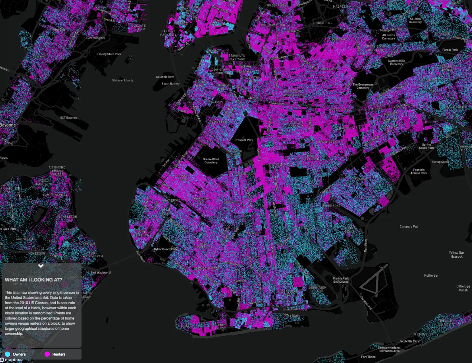
Renters and owners in Brooklyn. Map by Ryan McCullough
The maps shown in screenshots here show every single person in the United States as a dot. Data is taken from the 2010 US Census, and is accurate at the level of a block; within each block location is randomized. Points are colored based on the percentage of home owners versus renters on a block. Owners are shown in blue, renters in pink.
For personal privacy reasons, you won’t be able to tell where people are renting or owning on each block in your immediate neighborhood, but the map is effective at the city level, allowing us to see the mixture of renters and owners in various neighborhoods. The map data is particularly interesting in dense urban areas.
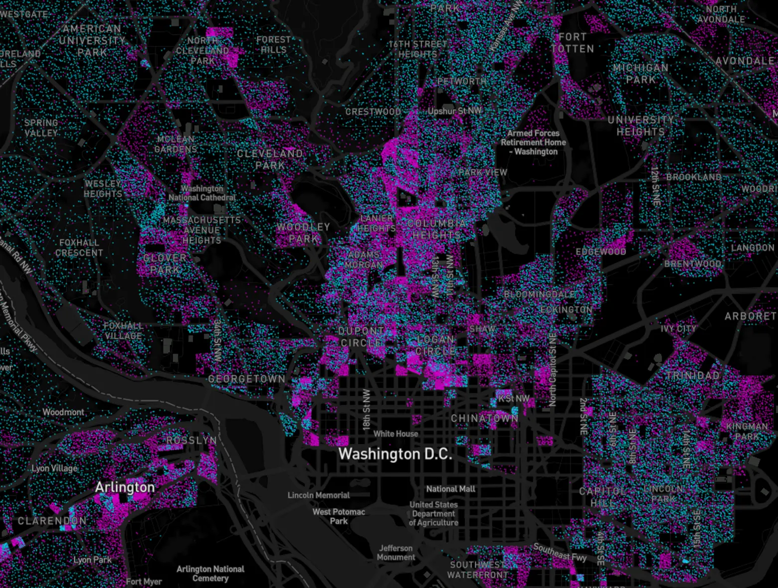
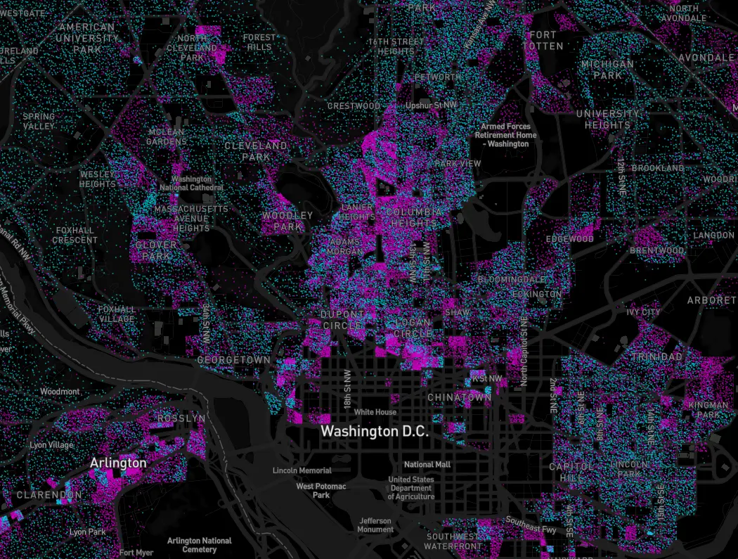
Renters and owners in Washington, D.C. Map by Ryan McCullough via Googlemapsmania.
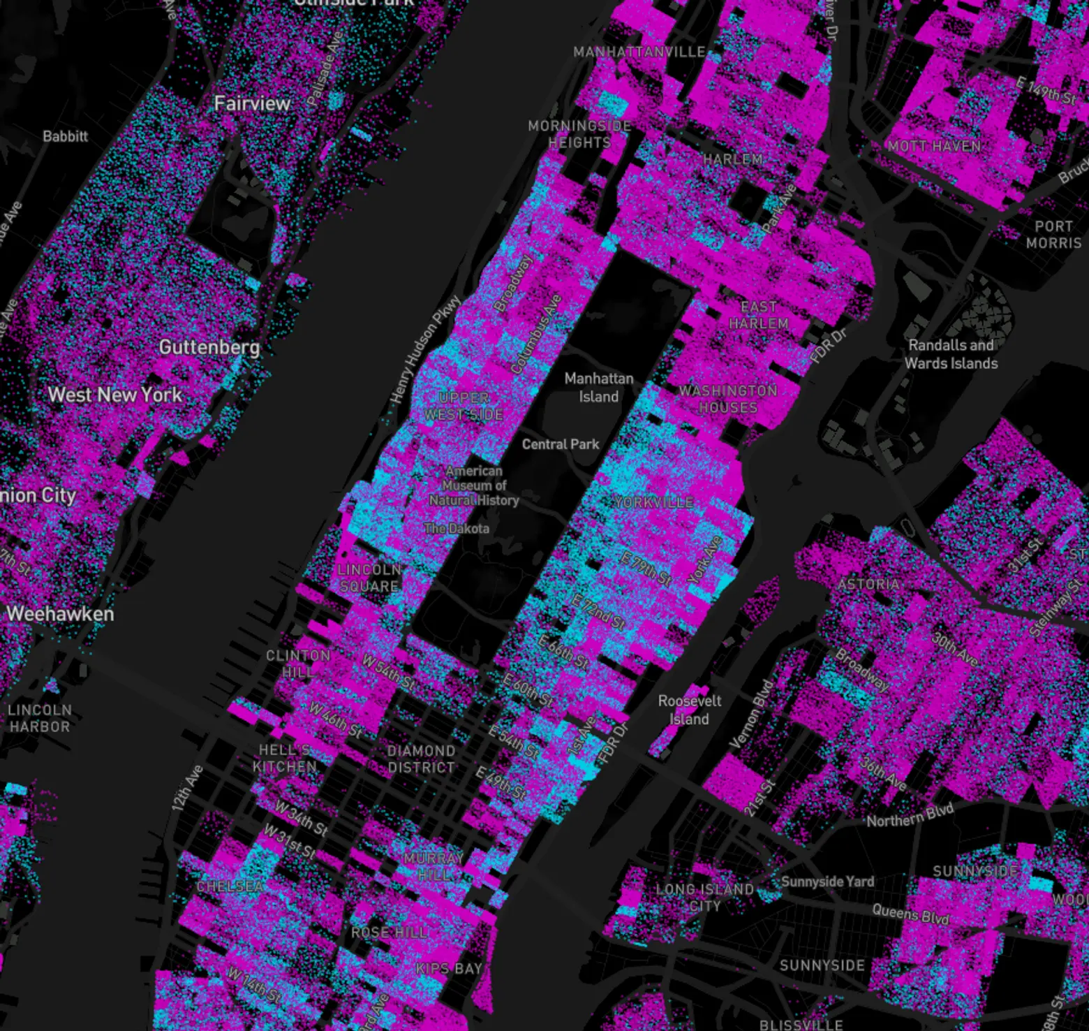
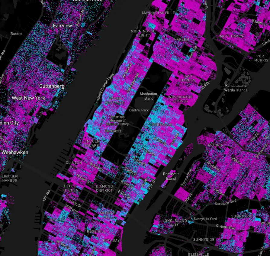
Renters and owners in Manhattan; note the ring around Central Park where homeowners outnumber renters compared to other areas of the city (the Lower East Side, for example). Map by Ryan McCullough via Googlemapsmania
When looking at dense major urban neighorhoods, for example, McCullough finds it interesting to compare how home ownership and rental prevalence stack up between neighborhoods. He notes that very dense locations like Manhattan vary from cities like Washington, D.C. (but admits he has no idea why).
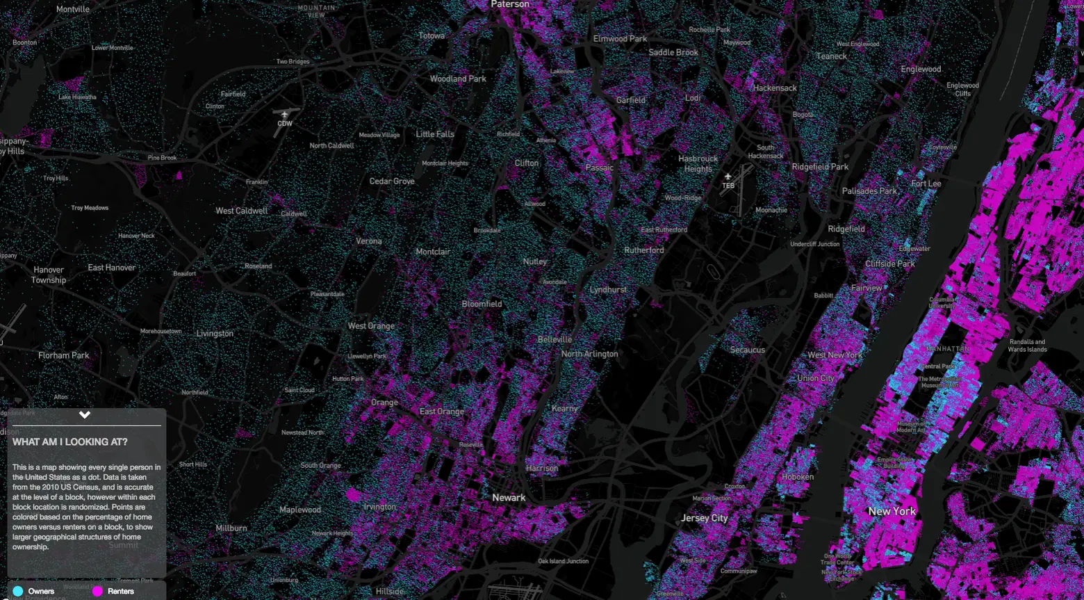
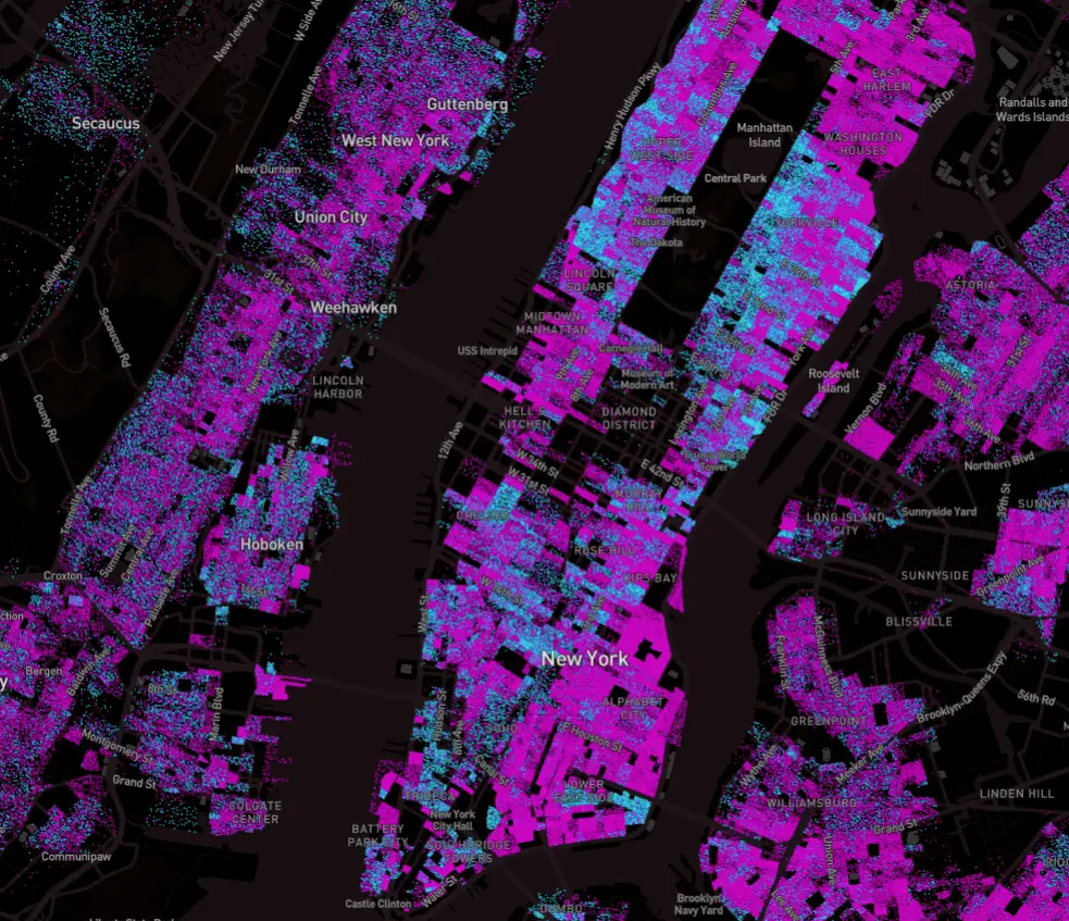
It’s even more interesting to compare the breakdown of Manhattan with New Jersey, just next door. Map by Ryan McCullough via Googlemapsmania.
The why may be easier than he thinks, though there are many reasons. In a dense area where space is at an extreme premium, barriers to purchasing real estate are likely to be prohibitive to a larger number of people. Owners and developers selling property likewise will command higher prices. And the number of people seeking temporary housing will also be higher; those people will also be more likely to rent for reasons of convenience.
You can find out more about how this fascinating data ended up mapped, here.
RELATED: