Grim Map Shows the Relationship Between Poverty and Pollution

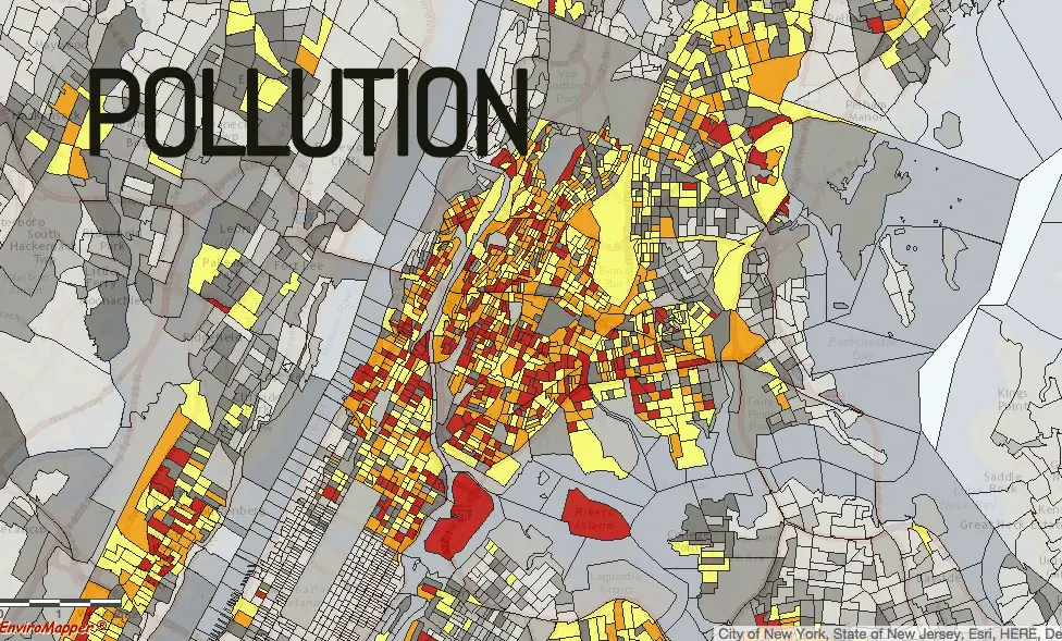
EJSCREEN is a new online mapping tool from the Environmental Protection Agency (EPA). What makes it different than other pollution maps, though, is that it also includes census data to show the relationship between negative environmental factors and demographic indicators like low-income and minority populations.
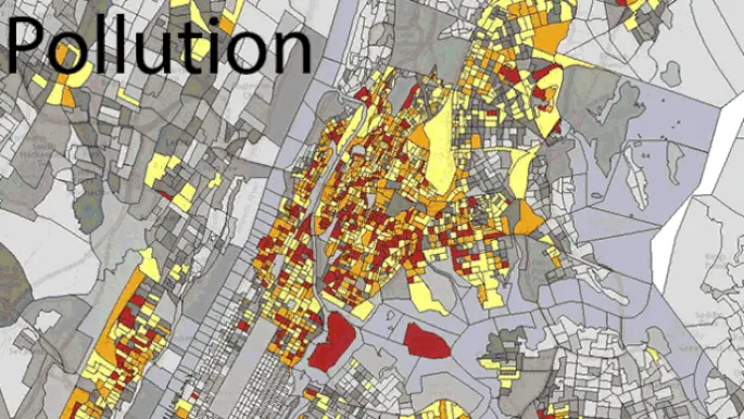
As Gizmodo reports, “The maps are color-coded to show poverty, and pollution (as measured by fine particle density). Grey is in area that’s below the 50th percentile, with the colors going up to yellow then red as the poverty (and pollution) increases.” And as is clear in the animated image above, high-poverty areas like East Harlem, Washington Heights, and much of the Bronx are among the most polluted in the city.
Unfortunately, the map doesn’t allow multiple layers to be checked off at once, so you need to toggle back and forth. There are 12 environmental indicators such as lead paint, ozone pollution, waterway discharge, and traffic proximity, as well as six demographic indicators including low income, minority, less than high school educated, and over age 64. There are also EJ indexes which, according to the EPA, are averages based on both groups of indicators that “are summarized as percentiles to put the information in perspective and facilitate comparisons between locations.”
The interactive map is the EPA’s latest step in trying to bring awareness to the fact that low-income populations have a higher environmental risk. You can explore the full map here.
[Via Gizmodo via Smithsonian]
Animated image via 6sqft
RELATED:
- ‘NYC Anthropocene’ Maps Visualize the City’s Oil and Chemical Spills Since 2010
- Do You Really Know Your Neighborhood? Interactive Map Helps You Find Out More on Who’s Around
- Subway Rent Map Shows Manhattan Rental Prices Along Each Train Line
- This Map Lets You Explore NYC’s 592,130 Street Trees by Species and Trunk Thickness