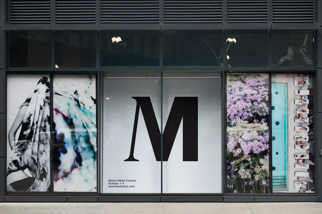
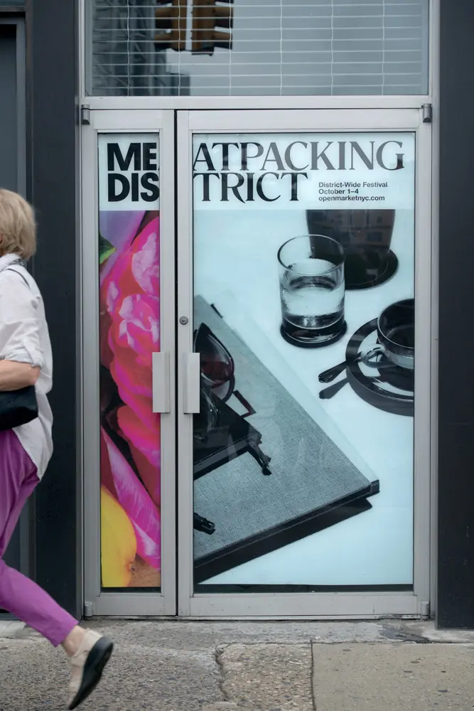
Meatpacking District Gets the Brooklyn-as-Brand Treatment

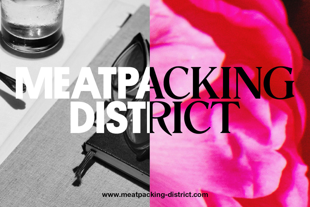
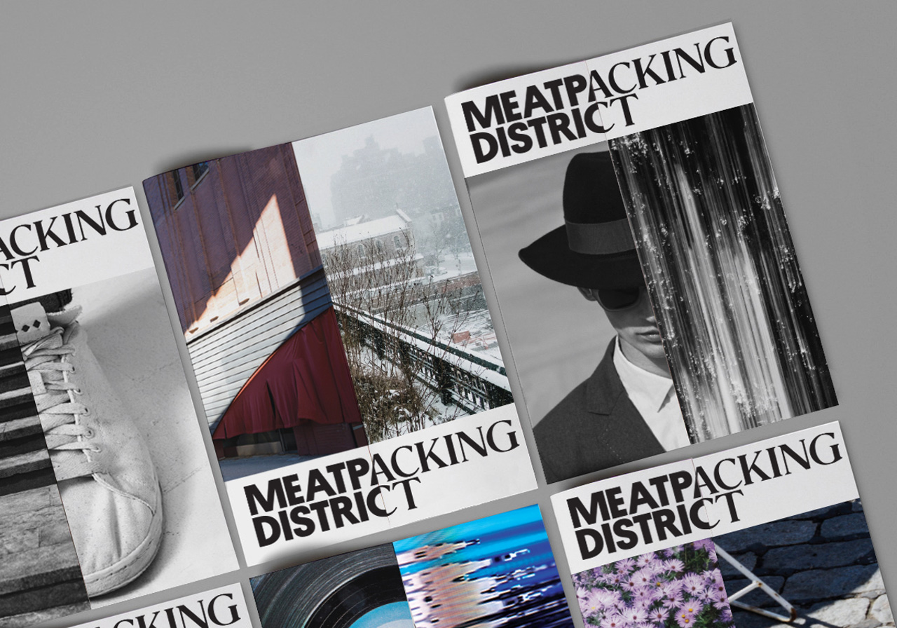
The Brooklyn-as-a-brand ship has long sailed, but we’ve lately seen other boroughs (take for example this Bronx Hot Sauce) and neighborhoods (see this candle that promises to make your home smell like Bushwick) trying to cash in on the action. Unsurprisingly, the increasingly trendy Meatpacking District is the latest locale to jump on the bandwagon. Fast Co. Design has a first look at the new visual identity of the neighborhood, commissioned by the Meatpacking Business Improvement District and created by Base Design. “Anchored by a wordmark that divides “Meatpacking District” into two different typefaces, it suggests a neighborhood with multiple personalities: equal parts ritzy and wild,” explains Fast Co. But the real reason behind the branding campaign may surprise you.
The Meatpacking BID embarked on the project as a way to change the perception that the ‘hood is simply a haven for debaucherous nightlife, instead trying to shift the conversation towards businesses that have moved in over the past five years. This likely refers to high-end fashion tenants and Google employees. But what allows the neighborhood to appeal to the wider masses is its arts and culture transformation in recent years (the High Line and new Whitney) and intact remnants of a former life (meatpacking hooks, cobblestone streets, and the piers of a seedy 1980s sub-culture).
Geoff Cook, a partner at Base, says the firm interviewed local businesses and residents to find out what they think sets their home apart. “The inspiration behind the identity is really this juxtaposition of history and the future, this kind of inherent contraction that exists,” he said.
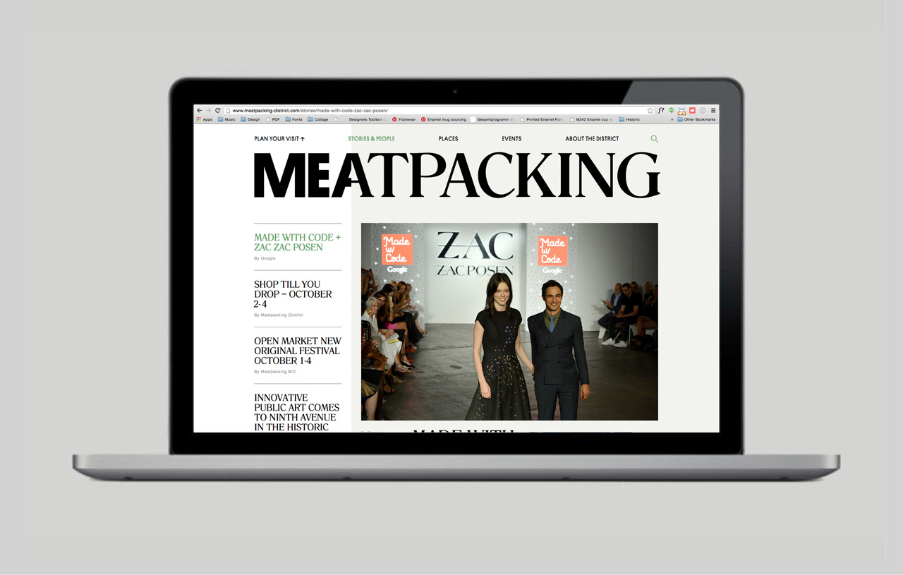
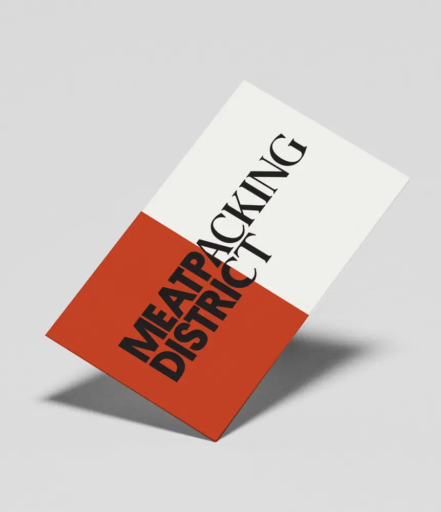
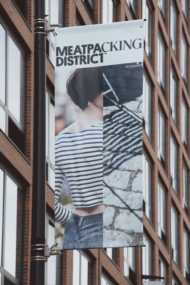
The vertical split of the two fonts, Platform and Romana, changes location depending on the outlet, “a nod to the dynamic nature of the neighborhood.” Along with this logo, the campaign features images of the new and old–fashion, cobblestone streets, and architectural details–and the slogan “The New Original.” The rebranding campaign has a neighborhood website that acts as a virtual bulletin board, storefront signage, and banners. It also includes T-shirts, sweatshirts, tote bags, water bottles, and notebooks, all of which can be purchased at the Whitney gift shop or clothing store Theory.
[Via Fast Co. Design]
All images via Base Design
RELATED:
- The Meatpacking District: From the Original Farmers’ Market to High-End Fashion Scene
- MADE IN BROOKLYN: A Rep for Authenticity and Excellence That’s Well-Earned–and Far from New
- Will the Bronx Be the Next Branded Borough? This Hot Sauce Says Yes