New interactive tool tracks transit ridership in America’s cities

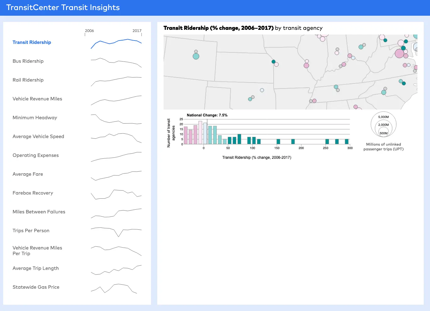
The story of public transit in America is an ongoing one: We need more of it, in more neighborhoods; we need to pay for it; ridership is declining in some places and growing in others. The state of transit often varies wildly depending on the city it serves. Transit Insights, a new visual tool from TransitCenter allows you to compare the country’s transit systems in recent years while looking into factors like regional population changes and density, fare prices, operating costs and how many miles the system covers. Transit Insights combines information from the National Transit Database, the U.S. Census and route maps from Transit.Land into a visual format so you can reference information quickly and easily.
Some interesting findings from Transit Insights that may surprise you:
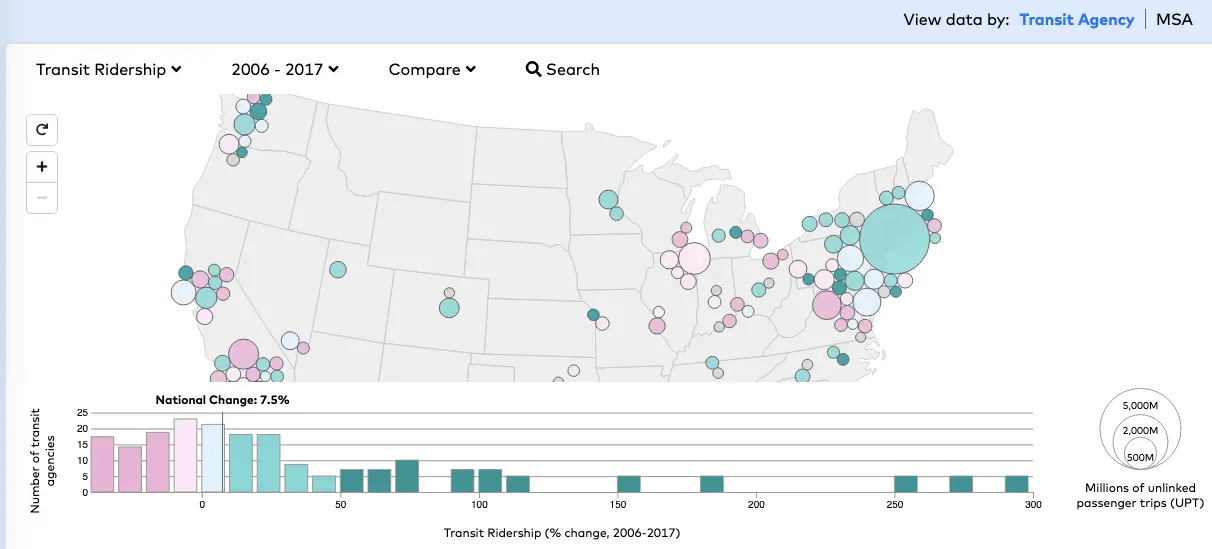
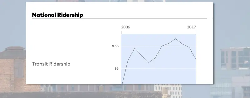
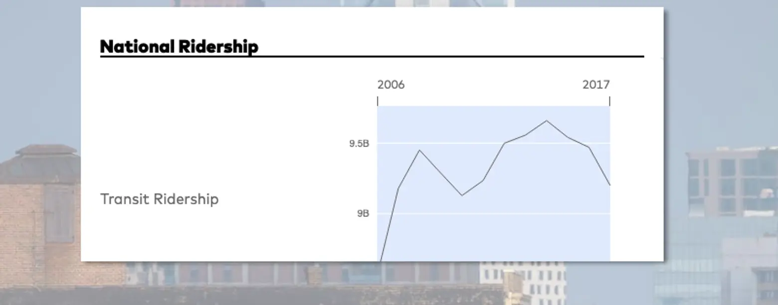
- From 2012 to 2017, transit ridership increased in just a quarter of the country’s largest urban areas. Population magnets Seattle and Phoenix experienced the fastest transit ridership growth.
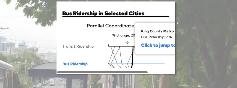
- Only a few transit agencies have increased bus ridership since 2012 — most prominently, King County Metro and Houston Metro, which substantially altered service patterns with bus network redesigns.
- Transit speeds have slowed down at many agencies as street congestion worsens. One exception is LA Metro, which expanded light rail service in 2010.
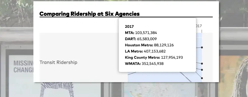
- Ridership loss notwithstanding, in 2017 New York City Transit provided an average of 400 trips to each person living in its service area — over 150 more rides per capita than the next-largest agency, San Francisco MTA.
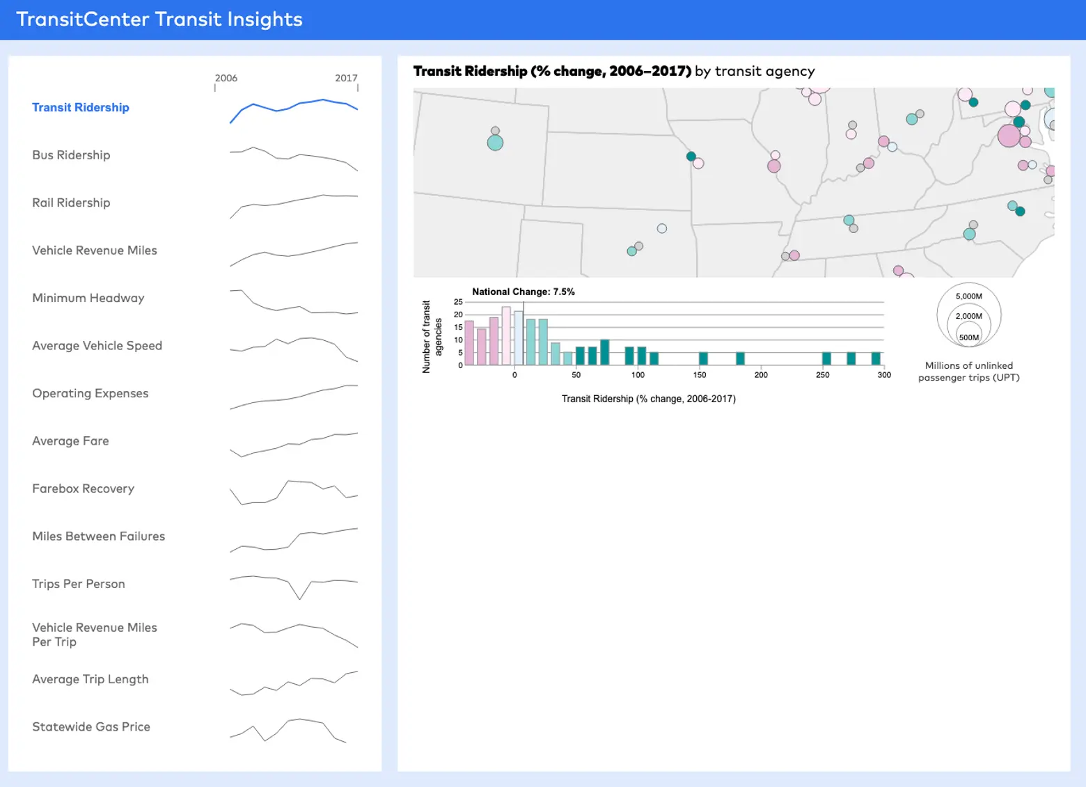
You can use the tool to learn more about each city’s transit story–and where it may be heading. View data from multiple transit agencies, with graphs that show trends over time.
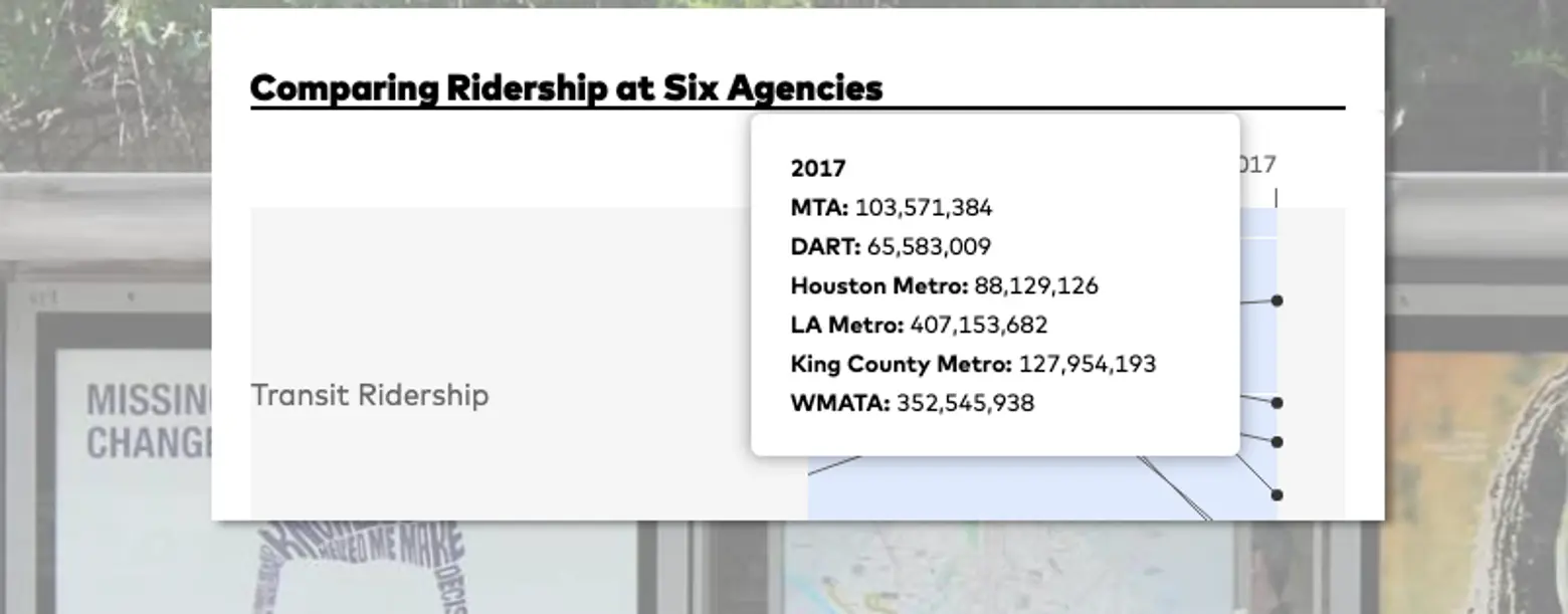
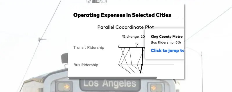
Compare multiple indicators like changes in ridership, operating budgets and fares.
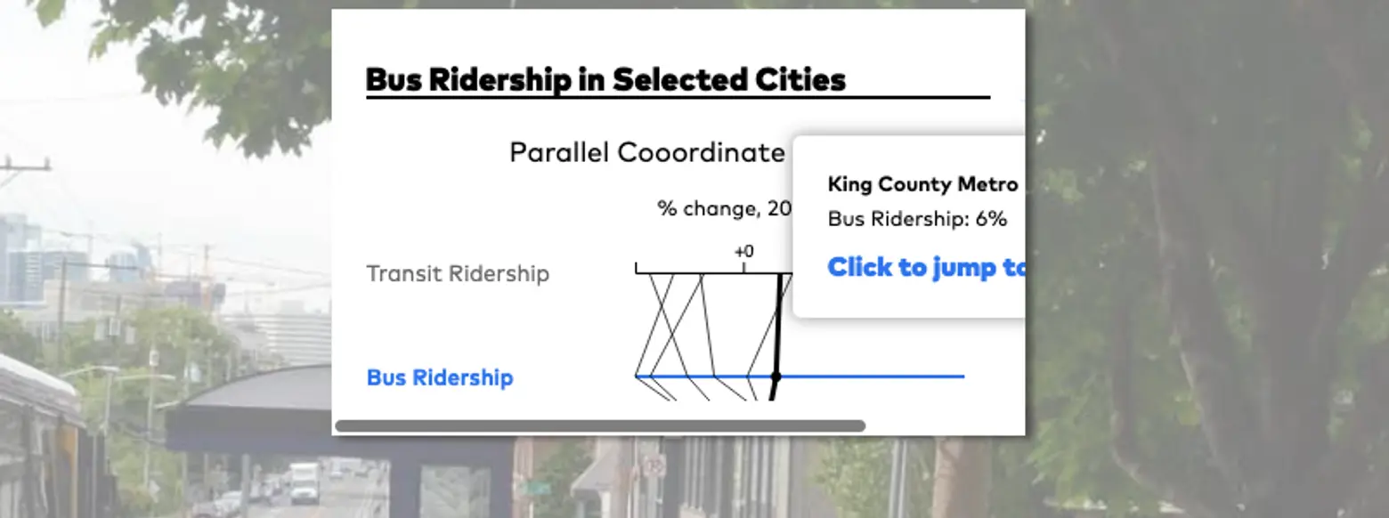
You can compare different transit agencies for each factor that may affect them, such as operating expenses or fare increases.
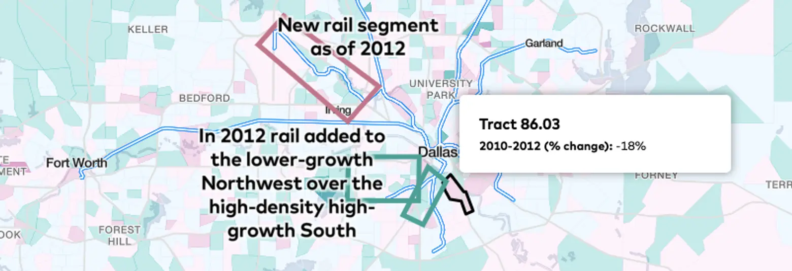
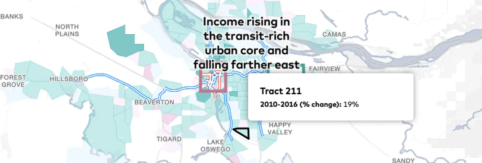
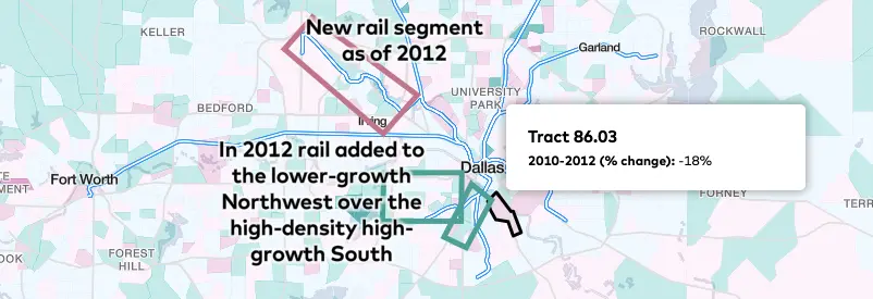
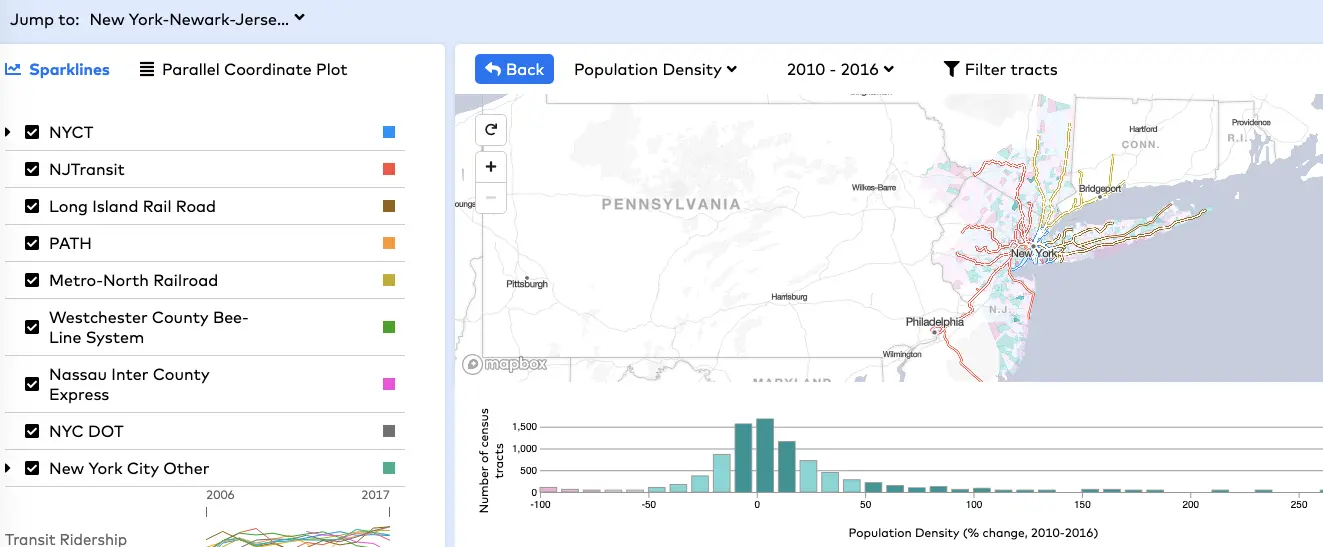
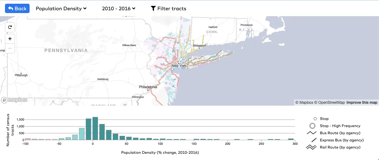
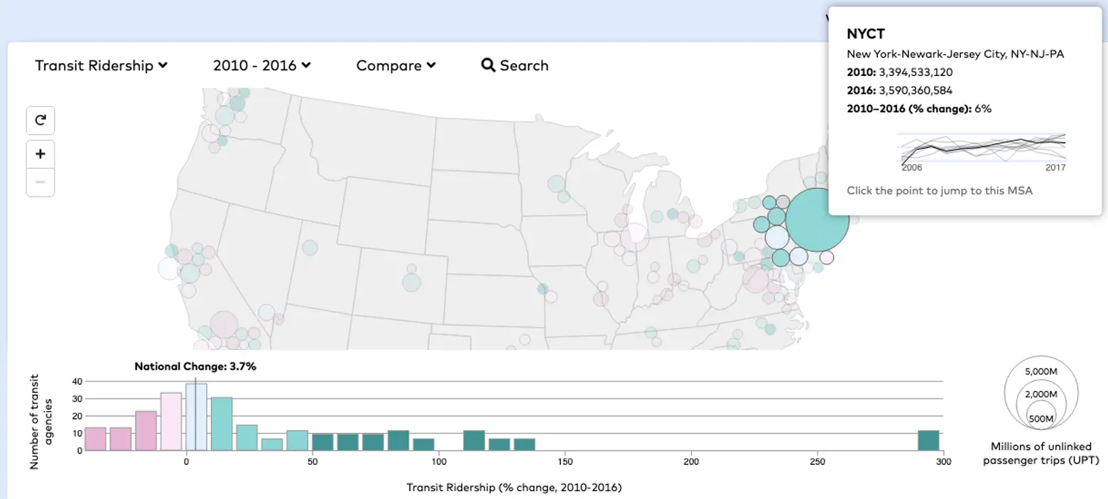
By clicking a circle on the map, you can view neighborhood-level demographics within regions and get details about where transit routes run. In the local map, for example, you can use the “Filter tracts” function to show neighborhoods within walking distance of frequent transit routes to more clearly convey the relationship between demographic change and access to transit. Learn more from Transit Insights, here.
[Via TransitCenter]
RELATED: