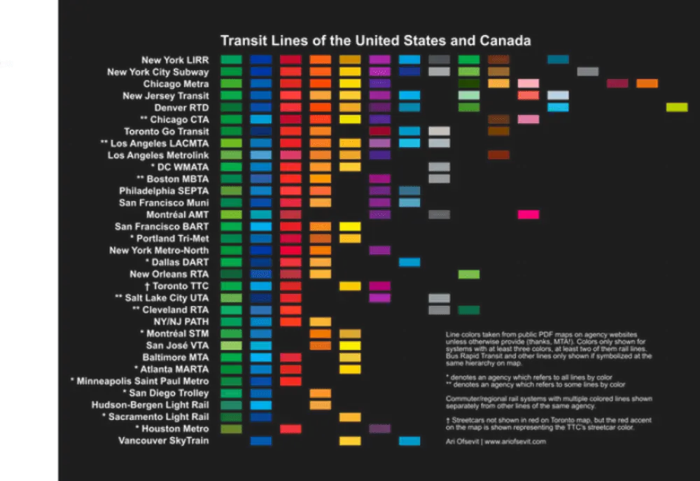
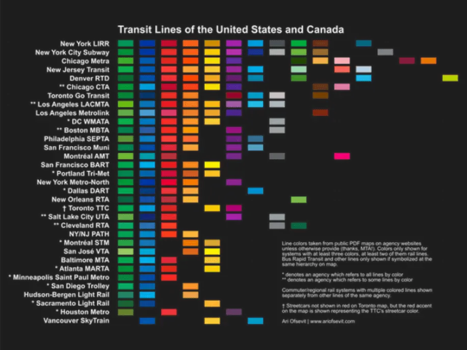
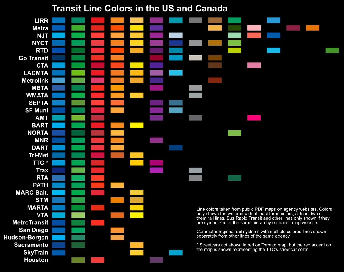
This graphic color codes major transit lines in North America

Like New York, Boston’s subway system is organized with a different color for each route. Unlike NYC, however, there’s no corresponding numbers, so the lines along the T are actually referred to by their respective hues. Which is why Boston resident Ari Ofsevit, a transportation engineering and urban planning graduate student at MIT, found it odd that the Massachusetts Bay Transit Authority didn’t use the same colors on their Twitter alerts as were found on their maps and signs. As Next City reported, this inspired him to create a graphic comparing the various colors of 13 major transit lines across the U.S. and Canada.
Ofsevit found that 13 transit systems use at least three colors, two of them from subway lines. The most common colors used include primary colors–blue, green, red, orange and yellow. For his next project, he hopes to color code a metro map for the entire world, which would focus on systems with at least four lines. He also wants to turn the maps into posters, and he launched a Kickstarter to fund them.
“Transit connects people to a place, and they identify with it,” Ofsevit said. “Look at Cubs fans walking around with T-shirts which say ‘Addison’ or people in New York with posters which are just the round ‘bullet’ of a train. It’s neat that transit can connect people not only physically, but in this manner as well.”
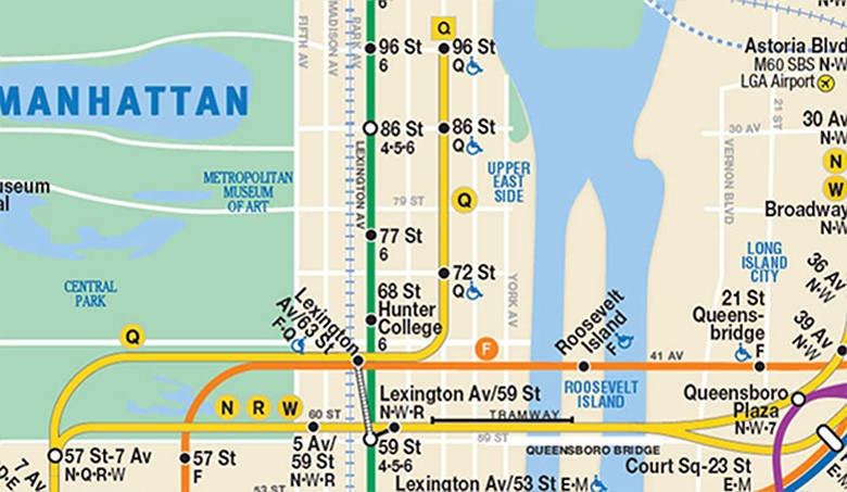
While naming the many subway lines as colors in New York City would be impractical because of the high number of routes, the color of the tiles in some of the stations can actually help riders navigate the city. Color-coded stations are grouped based on express stations or local stations, letting users know when to transfer. While almost all new subway stations feature their own colors now, some lines have a consistent color.
[Via Next City]
RELATED: