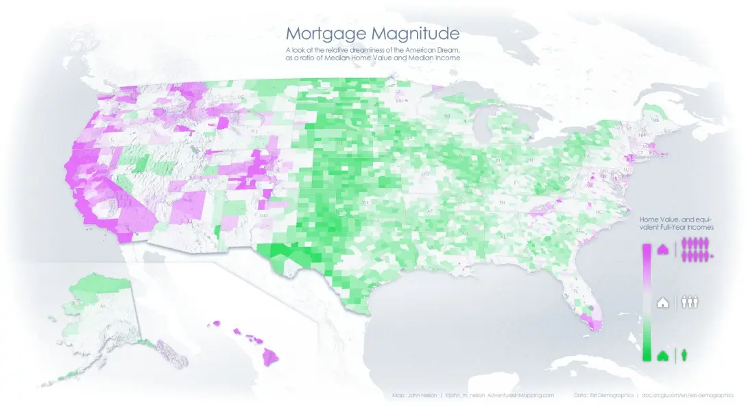
Map shows how many years of life a house costs, and in NYC the numbers aren’t pretty

New Yorkers know that taking on a mortgage in the city is no easy feat. But a recent map shows that, compared to the rest of the country, we’ll spend many more years than most everyone else (except San Franciscans) in our attempts to pay it off. This map, which measures “mortgage magnitude,” looked at the median local income and median local home value to show the relative affordability of property in each US county. The value of the average property was then expressed in the number of years salary it costs. In some counties, a house will only set you back a total of one year’s pay. But as you move out toward costal cities like New York, that number gets dramatically higher.
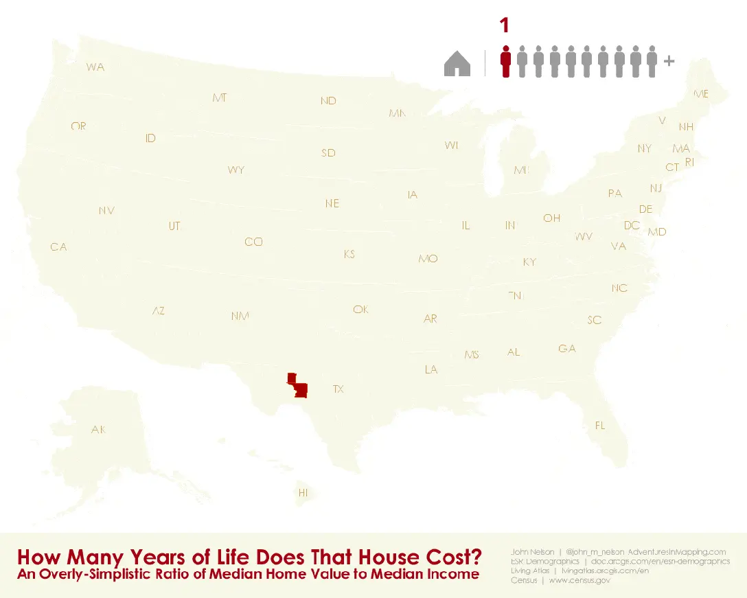
To find the most affordable housing in the nation you’d have to go to Texas. In the sparse counties of Crockett and Upton, there are median incomes of about $52,000 and $56,000, while the median home values are $49,000 and $53,000. That’s a home for less than one full year’s wage.
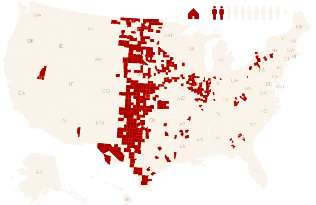 The mortgage magnitude across the Wheat Belt, via Esri
Cutting across the Wheat Belt–in states like Kansas, Oklahoma and Texas, Nebraska—the typical home can be had for between one and two years of typical incomes in the area. In much of the Eastern Seaboard, the average home will take up about five years of your life to pay off.
The income to housing ratio starts to get pricer in Hawaii, much of California, the scenic portions of Colorado, and some metropolitan counties in the east. Buying here will take between six and eight years.
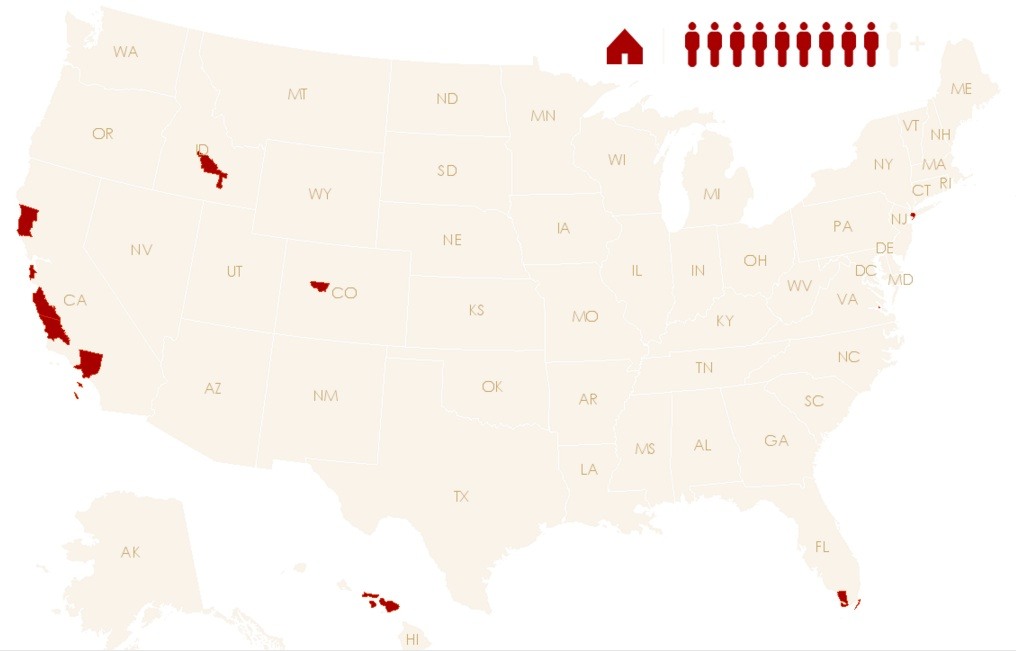 These areas will take 10 years to pay off, via Esri
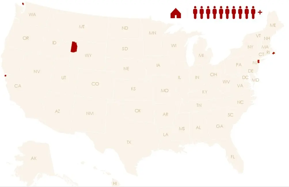
Now we’re hitting the ten year mark—homes that will take a full decade of income to pull off. Many areas of costal California, including Los Angeles, as well as the island of Nantucket are included here. And New York City makes its first appearance, with the inclusion of Queens County. “Many of the scattered counties are characterized by costly vacation homes far out of reach of the resident population,” according to the mapper.
 The least affordable counties in the country, via Esri
Here’s the moment New Yorkers on the hunt for an affordable home have dreaded—we have now surpassed the 1:10 ratio of mortgage magnitude, the end of the line. The median home in these counties costs up to 13 solid years of income, and the counties that comprise New York City make this list. New York is joined by its expensive west coast counterpart, San Francisco County. The other places that these two insanely expensive cities? San Juan, Washington, Teton County, Wyoming (comprised of Jackson Hole and much of Yellowstone), and Dukes County, Massachusetts, aka the island of Martha’s Vineyard.
If you’re curious to walk through the mapping of various county’s mortgage magnitude, go here. And read about a 2015 map, which estimated a home in New York City would take nearly six years of income to buy, here.
[Via Esri]
RELATED: