Map Mashup: The NYC Subway System Gets Re-Stylized as The London Tube

Pretty much everyone can appreciate a good map, and many of us are downright obsessed. Then there’s Cameron Booth, who has devoted a serious amount of his time to interweaving maps to transit systems all around the world with one another. The Portland, OR-based (by way of Syndey, Australia) graphic designer tweaks and reimagines the world’s city transit maps on his blog; Booth has also helped test and create map apps for cities throughout the world.
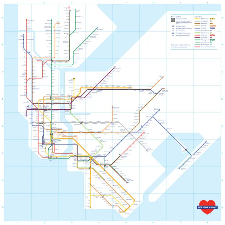
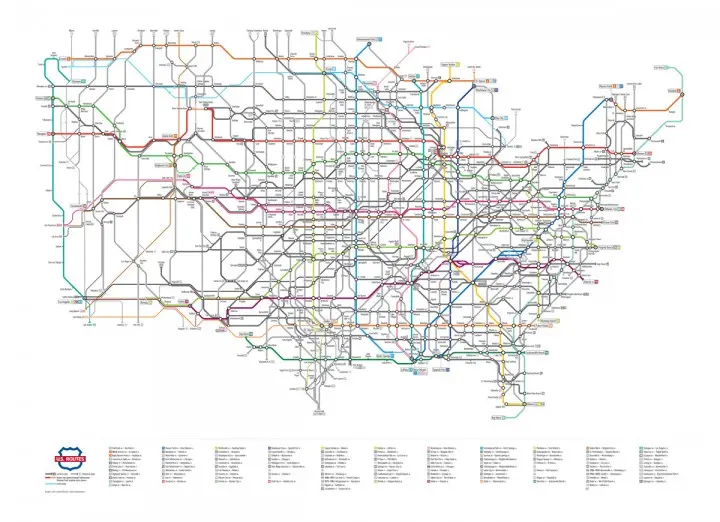
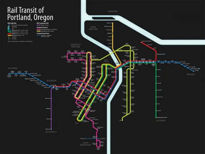
You could think of it as a way to travel everywhere at once, while not leaving home (as long as you stay within the bounds of this virtual transit system). Booth has tried his hand at versions of the transit systems of Paris and Portland, major U.S. highway routes and Amtrak train maps, and it’s both a graphic delight and an eye-opening way to see how cities’ transit systems get you from point a to point b. Take, for example, his project that combines the London tube diagram with the New York City subway system map.

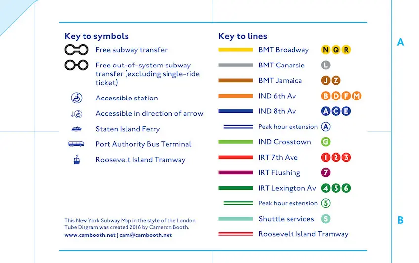
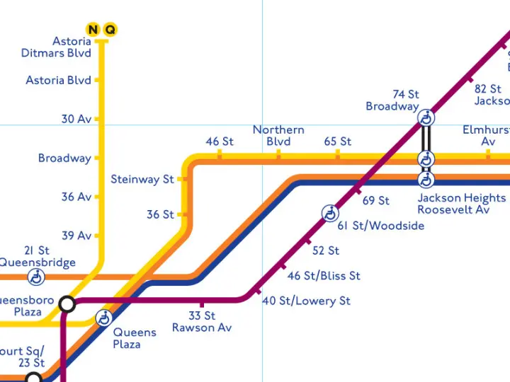
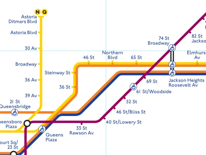
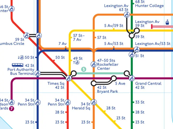
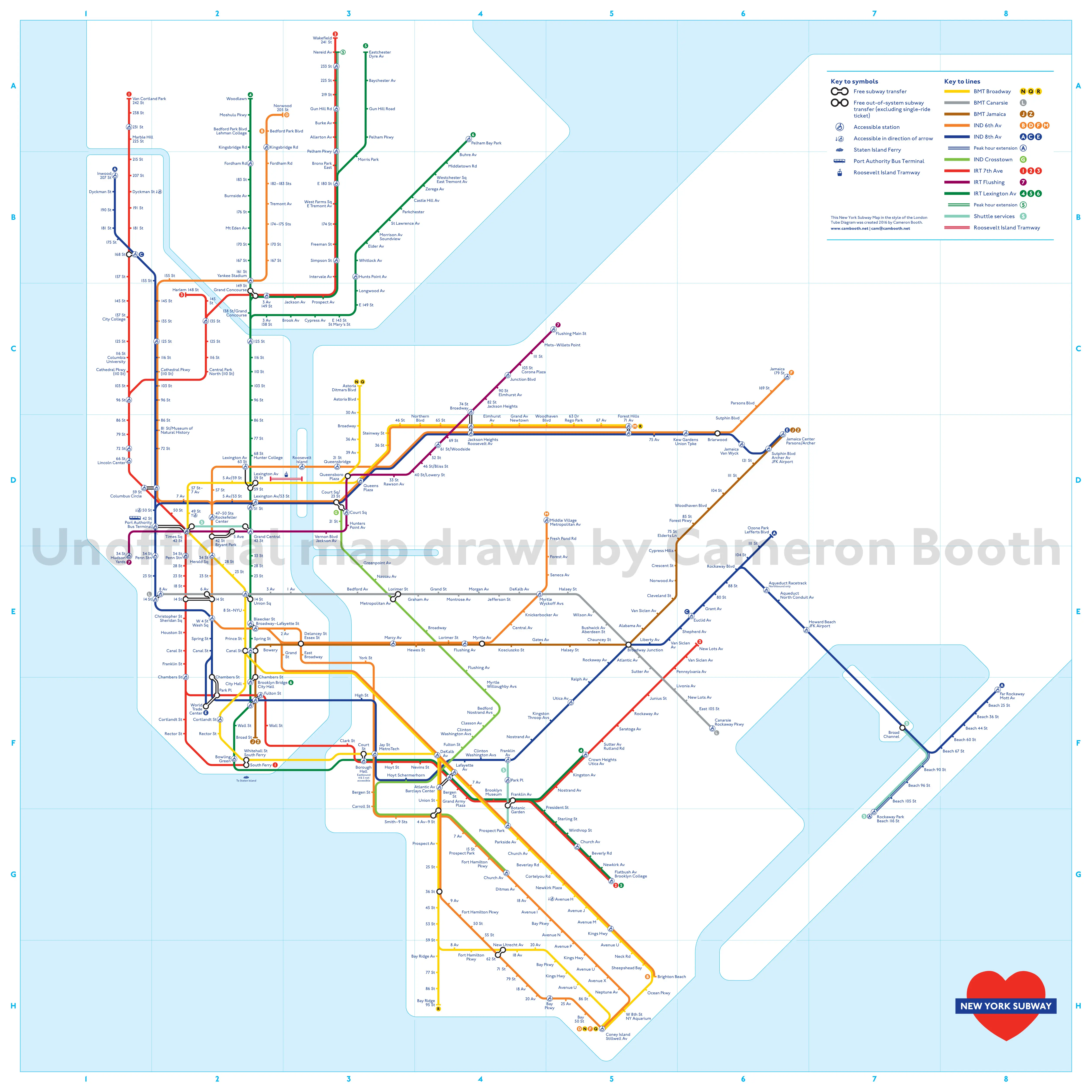
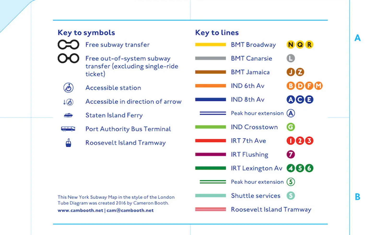
Booth outlined the subway-fication of the tube map thusly: “All of the subway trunk lines have been adapted to use their closest matching colour from the Tube Map: the BMT Broadway uses the Circle line’s yellow, the IND 6th Avenue uses the Overground’s orange, and so on. ” He even makes a note of how confusing the Seventh Avenue (red) and Lexington Avenue (green) lines must be for color-blind users when they’re running next to each other.

Booth also notes that in tube map style, service patterns (express, local, weekends or rush hours only, etc.) generally aren’t shown. He adds that this treatment “makes this map next to useless for actually navigating the subway,” though he did “make one tiny concession to New York’s complexity” by adding route designation bullets at terminus stations.

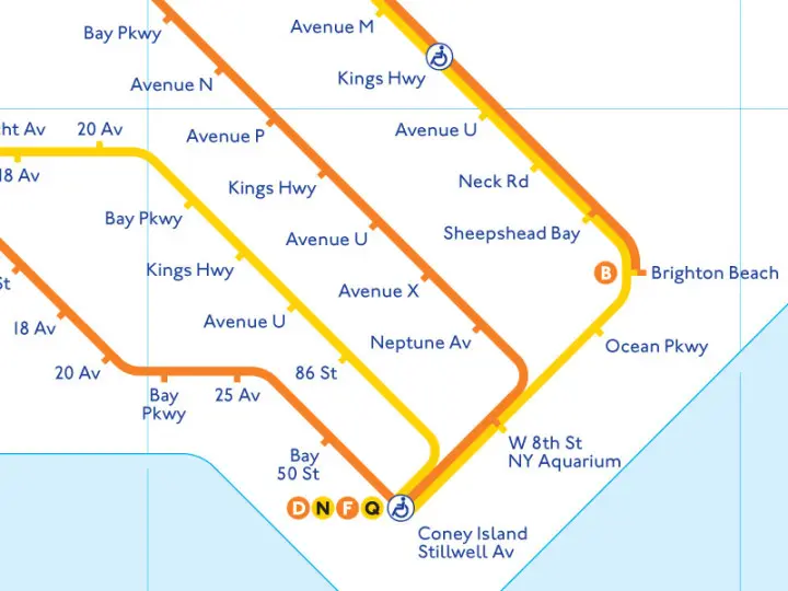
Booth also attempted to stick to Manhattan’s street grid, which, he says, “mostly works pretty well.” Once the map reaches the outer boroughs, more even spacing works better–he’s particularly fond of the section that goes into Coney Island.
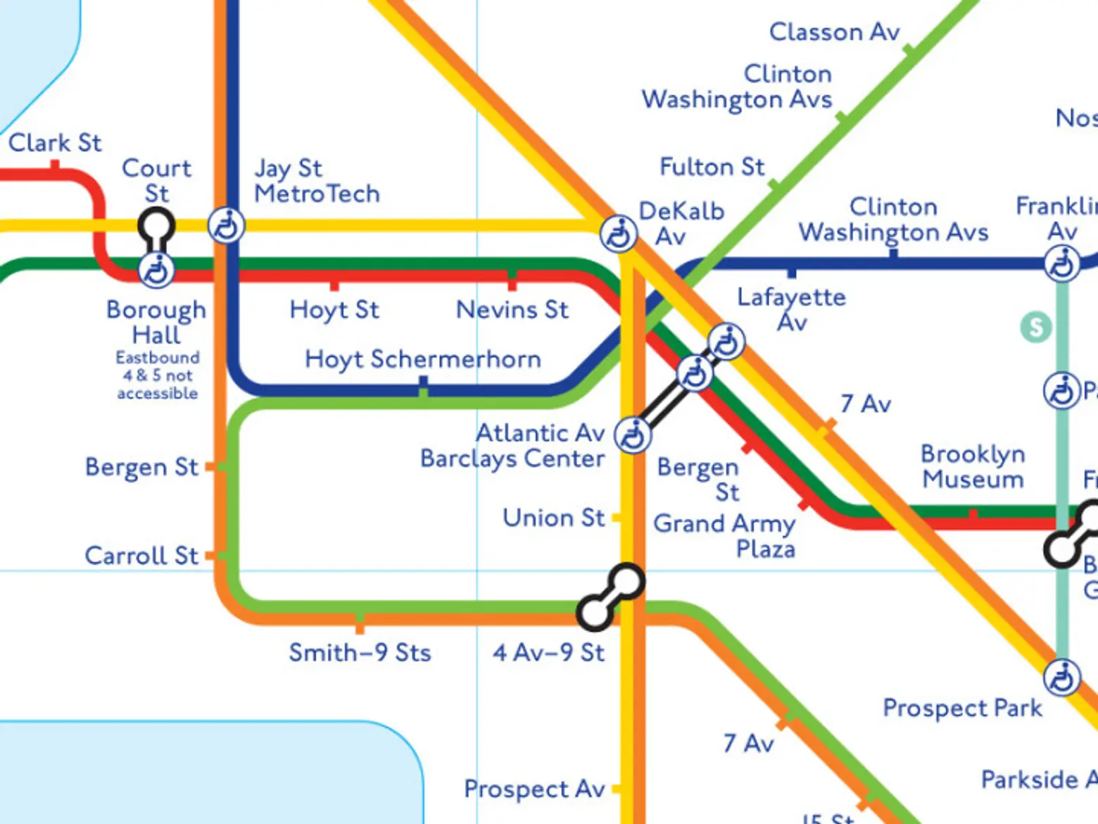
Other juxtapositions of the two lines do converge rather magically, others are more of a challenge. The “routing of lines near Atlantic Avenue/Barclays Center actually turned out pretty well. The Tube Map “dumbbell” interchange symbol is particularly ill-suited to the needs of the 4 Av–9 St station complex. Here, even an offset symbol fails to clearly show that the (orange) D service does not stop along the southbound Fourth Avenue line. The single red tick across the green route line at the Brooklyn Museum stop is also less than satisfactory, but space limitations demanded that approach.” He adds that “Little touches like this are immensely satisfying when putting a complex map like this together.”
His take on the project overall? “Applying the design language of one transit map rigorously to another system is always interesting, even though the results here are decidedly mixed.”
Visit Cameron Booth’s site for many, many more maps.
RELATED:
- Did You Know the MTA Uses Pantone Colors to Distinguish Train Lines?
- This Map Explains the Historic Tile Color System Used in NYC Subway Stations
- This Poster Displays All 468 Subway Station Signs
- Map Enthusiast Creates a More Geographically Correct Version of Vignelli’s Old Subway Map